After Part 1 and Part 2, I am back with a third article to explore more fancy shapes. Like the previous articles, we are going to combine CSS Grid with clipping and masking to create fancy layouts for image galleries.
CSS Grid and Custom Shapes series
Should I read the previous articles before?
It’s not mandatory but highly recommended to cover as many tricks as possible. You can also read them in any order, but following along in chronological is a good idea to see how we arrived here.
Enough talking, let’s jump straight to our first example.
The Die Cut Photo Gallery
Before digging into the CSS, let’s check the markup:
<div class="gallery"> <img src="..." alt="..."> <img src="..." alt="..."> <img src="..." alt="..."> <img src="..." alt="...">
</div>
Nothing but a few <img> tags in a div wrapper, right? Remember, the main challenge for this series is to work with the smallest amount of HTML possible. All the examples we’ve seen throughout this series use the exact same HTML markup. No extra divs, wrappers, and whatnot. All that we need are images contained in a wrapper element.
Let’s check the CSS now:
.gallery { --g: 6px; /* the gap */ display: grid; width: 450px; /* the size */ aspect-ratio: 1; /* equal height */ grid: auto-flow 1fr / repeat(3, 1fr); gap: var(--g);
}
.gallery img:nth-child(2) { grid-area: 1 / 2 / span 2 / span 2;
}
.gallery img:nth-child(3) { grid-area: 2 / 1 / span 2 / span 2;
}
Basically, this is a square grid with three equal columns. From there, all that’s happening is the second and third images are explicitly placed on the grid, allowing the first and last images to lay out automatically around them.
This automatic behavior is a powerful feature of CSS Grid called “auto-placement”. Same thing with the number of rows — none of them are explicitly defined. The browser “implicitly” creates them based on the placement of the items. I have a very detailed article that explores both concepts.
You might be wondering what’s going on with those grid and grid-area property values. They look strange and are tough to grok! That’s because I chose the CSS grid shorthand property, which is super useful but accepts an unseemly number of values from its constituent properties. You can see all of them in the Almanac.
But what you really need to know is this:
grid: auto-flow 1fr / repeat(3, 1fr);…is equivalent to this:
grid-template-columns: repeat(3, 1fr);
grid-auto-rows: 1fr;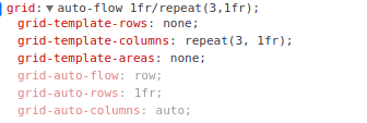
Same for the grid-area property. If we open DevTools and inspect our declaration: grid-area: 1/2/span 2/span 2; you will get the following:
grid-area: 1 / 2 / span 2 / span 2;…that is the same as writing all this out:
grid-row-start: 1; /* 1st row */
grid-column-start: 2; /* 2nd column */
grid-row-end: span 2; /* take 2 rows */
grid-column-end: span 2; /* take 2 columns */
Same deal for the other grid-area declaration. When we put it all together, here’s what we get:
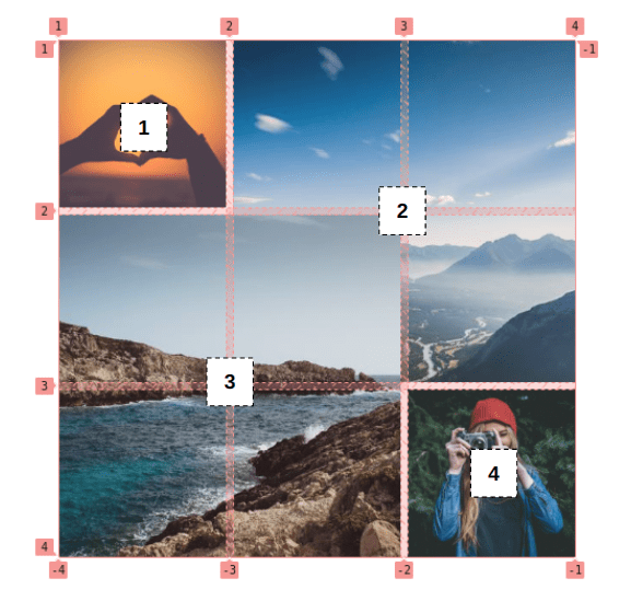
Yes, the second and third images are overlapped in the middle. That’s no mistake! I purposely spanned them on top of one another so that I can apply a clip-path to cut a portion from each one and get the final result:
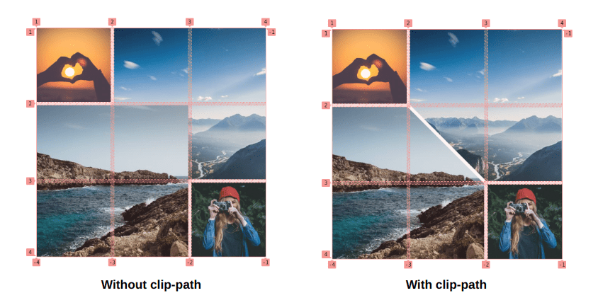
How do we do that? We can cut the bottom-left corner of the second image (img:nth-child(2)) with the CSS clip-path property:
clip-path: polygon(0 0, 100% 0, 100% 100%, calc(50% + var(--g) / 4) 100%, 0 calc(50% - var(--g) / 4))And the top-right corner of the third one:
clip-path: polygon(0 0, calc(50% - var(--g) / 4) 0, 100% calc(50% + var(--g) / 4), 100% 100%, 0 100%);I know, I know. That’s a lot of numbers and whatnot. I do have an article that details the technique.
That’s it, we have our first grid of images! I added a grayscale filter on the <img> selector to get that neat little hover effect.
The Split Image Reveal
Let’s try something different. We can take what we learned about clipping the corner of an image and combine it with a nice effect to reveal the full image on hover.
The grid configuration for this one is less intense than the last one, as all we need are two overlapping images:
.gallery { display: grid;
}
.gallery > img { grid-area: 1 / 1; width: 350px; /* the size */ aspect-ratio: 1; /* equal height */
}
Two images that are the same size are stacked on top of each other (thanks to grid-area: 1 / 1).
The hover effect relies on animating clip-path. We will dissect the code of the first image to see how it works, then plug the same thing into the second image with updated values. Notice, though that we have three different states:
- When no images are hovered, half of each image is revealed.
- When we hover over the first image, it is more fully revealed but retains a small corner clip.
- When we hover over the second image, the first one has only a small triangle visible.
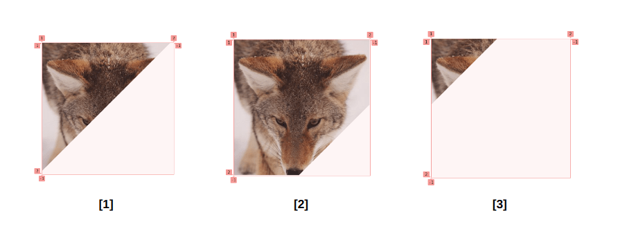
In each case, we have a triangular shape. That means we need a three-point polygon for the clip-path value.
What? The second state isn’t a triangle, but more of a square with a cut corner.
You are right, but if we look closely we can see a “hidden” triangle. Let’s add a box-shadow to the images.
A ha! Did you notice it?
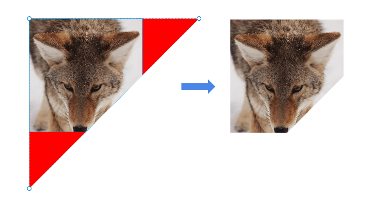
What sort of magic is this? It’s a little known fact that clip-path accepts values outside the 0%-100% range, which allows us to create “overflowing” shapes. (Yes, I just coined this. You’re welcome.) This way, we only have to work with three points instead of the five it would take to make the same shape from the visible parts. Optimized CSS for the win!
This is the code after we plug in the polygon values into the clip-path property:
.gallery > img:first-child { clip-path: polygon(0 0, calc(100% + var(--_p)) 0 , 0 calc(100% + var(--_p)))
}
.gallery > img:last-child { clip-path: polygon(100% 100%, 100% calc(0% - var(--_p)), calc(0% - var(--_p)) 100%)
}
Notice the --_p variable. I’m using that to optimize the code a bit as we add the hover transition. Instead of updating the whole clip-path we only update this variable to get the movement. Here is a video to see how the points should move between each state:
We can take slap a transition on the <img> selector, then update the --_p variable on the states to get the final effect:
.gallery { --g: 8px; /* the gap */
}
.gallery > img { /* etc. */ --_p: calc(-1 * var(--g)); transition: .4s .1s;
}
.gallery:hover > img:last-child,
.gallery:hover > img:first-child:hover{ --_p: calc(50% - var(--g));
}
.gallery:hover > img:first-child,
.gallery:hover > img:first-child:hover + img { --_p: calc(-50% - var(--g));
}
If we don’t consider the gap (defined as --g in the code) between the images, then the three values of --_p are 0%, 50%, and -50%. Each one defines one of the states we explained previously.
The Pie Image Reveal
Let’s increase the difficulty level from that last one and try to do the same trick but with four images instead of two.
Cool, right? Each image is a quarter of a circle and, on hover, we have an animation that transforms an image into a full circle that covers the remaining images. The effect may look impossible because there is no way to rotate points and transform them to fill the circle. In reality, though, we are not rotating any points at all. It’s an illusion!
For this example, I will only focus on the clip-path animation since the configuration of the grid is the same as the previous example: four equally-sized images stacked on top of each other.
And a video worth a boring and long explanation:
The clip-path is formed by seven points, where three of them are in a fixed position and the others move as shown in the video. The effect looks less cool when it’s running slowly but we can see how the clip-path morphs between shapes.
The effect is a little better if we add border-radius and we make it faster:
And by making it even faster like in the original example, we get the perfect illusion of one quarter of a circle morphing into a full circle. Here’s the polygon value for our clip-path on the first image in the sequence:
.gallery > img:nth-child(1) { clip-path: polygon(50% 50%, calc(50% * var(--_i, 0)) calc(120% * var(--_i, 0)), 0 calc(100% * var(--_i, 0)),0 0, 100% 0, 100% calc(100% * var(--_i, 0)), calc(100% - 50% * var(--_i, 0)) calc(120% * var(--_i, 0)));
}
.gallery > img:hover { --_i: 1;
}
As usual, I am using a variable to optimize the code. The variable will switch between 0 and 1 to update the polygon.
The same goes for the others image but with a different clip-path configuration. I know that the values may look hard to decipher but you can always use online tools like Clippy to visualize the values.
The Mosaic of Images
You know mosaics, right? It’s an art style that creates decorative designs out of smaller individual pieces, like colored stones. But it can also be a composite image made up of other smaller images.
And, you guessed it: we can totally do that sort of thing in CSS!
First, let’s imagine what things are like if clip-path were taken out of the mix and all we had were five overlapping images:
I am cheating a little in this video because I am inspecting the code to identify the area of each image, but this is what you need to do in your head. For each image, try to complete the missing part to see the full rectangle and, with this, we can identify the position and size of each one.
We need to find how many columns and rows we need for the grid:
- We have two big images placed next to each other that each fill half the grid width and the full grid height. That means will probably need two columns (one for both images) and one row (for the full height of the grid).
- We have the image in the middle that overlaps the two other images. That means we actually need four columns instead of two, though we still only need the one row.
- The last two images each fill half the grid, just like the first two images. But they’re only half the height of the grid. We can use the existing columns we already have, but we’re going to need two rows instead of one to account for these images being half the grid height.
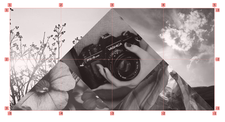
I don’t want you to think that the way I sliced this up is the only way to do it. This is merely how I’ve made sense of it. I am sure there are other configurations possible to get the same layout!
Let’s take that information and define our grid, then place the images on it:
.gallery { display: grid; grid: repeat(2, 1fr) / repeat(4, 1fr); aspect-ratio: 2;
}
.gallery img:nth-child(1) { grid-area: 1 / 1 / span 2 / span 2;
}
.gallery img:nth-child(2) { grid-area: 1 / 2 / span 2 / span 2;
}
.gallery img:nth-child(3) { grid-area: span 2 / span 2 / -1 / -1;
}
.gallery img:nth-child(4) { grid-area: 2 / 1 / span 1 / span 2;
}
.gallery img:nth-child(5) { grid-area: span 1 / span 2 / -1 / -1;
}
I think you get the idea of what’s happening here now that we’ve seen a few examples using the same approach. We define a grid and place images on it explicitly, using grid-area so the images overlap.
OK, but the
aspect-ratiois different this time.
It is! If you get back to the reasoning we made, we have the first two images that are square next to each other having the same size. This means that the width of the grid needs to be equal to twice its height. Hence, aspect-ratio: 2.
Now it’s time for the clip-path values. We have four triangles and a rhombus.
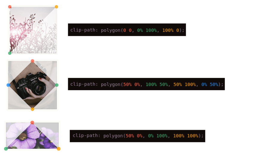
Again, I’m using Clippy for all this math-y stuff. But, honestly, I can write many simple shapes by hand, having spent several years working closely with clip-path, and I know you can too with practice!
The Complex Mosaic of Images
Let’s increase the difficulty and try another mosaic, this time with less symmetry and more complex shapes.
Don’t worry, you will see that it’s the same concept as the one we just made! Again, let’s imagine each image is a rectangle, then go about defining the grid based on what we see.
We’ll start with two images:

They are both squares. The first image is equal to half the size of the second image. The first image takes up less than one half of the grid width, while the second image takes up more than half giving us a total of two columns with a different size (the first one is equal to half the second one). The first image is half the height, so let’s automatically assume we need two rows as well.
Let’s add another image to the layout

This one makes things a bit more complex! We need to draw some lines to identify how to update the grid configuration.
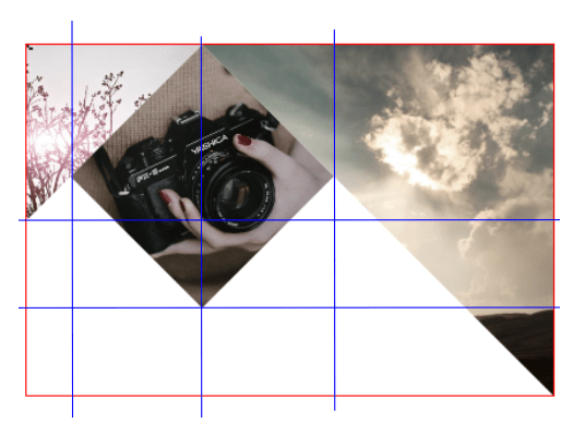
We will move from a 2×2 grid to four columns and three rows. Pretty asymmetric, right? Before we try to figure out that complete sizing, let’s see if the same layout holds up when we add the other images.
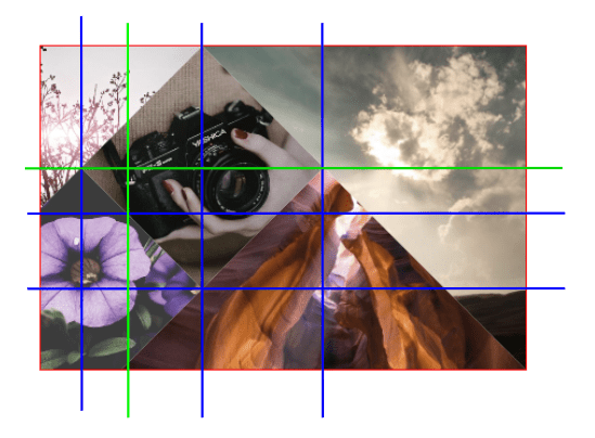
Looks like we still need more rows and columns for everything to fall into place. Based on the lines in that image, we’re going to have a total of five columns and four rows.
The logic is simple even though the layout is complex, right? We add the images one by one to find the right configuration that fits everything. Now we need to identify the size of each column and row.
If we say the smallest row/column is equal to one fraction of the grid (1fr) we will get:
grid-template-columns: 1fr 1fr 2fr 3fr 5fr;…for the columns, and:
grid-template-rows: 3fr 1fr 2fr 2fr;…for the rows. We can consolidate this using the grid shorthand property again:
grid: 3fr 1fr 2fr 2fr / 1fr 1fr 2fr 3fr 5fr;You know the drill! Place the images on the grid and apply a clip-path on them:
.gallery img:nth-child(1) { grid-area: 1 / 1 /span 2 / span 3; clip-path: polygon(0 0, 100% 0, 0 100%);
}
.gallery img:nth-child(2) { grid-area: 1/2/span 3/span 3; clip-path: polygon(50% 0, 100% 50%, 50% 100%, 0 50%);
}
.gallery img:nth-child(3) { grid-area: 1 / span 2 / -1 / -1; clip-path: polygon(0 0, 100% 0, 100% 100%);
}
.gallery img:nth-child(4) { grid-area: span 3 / 1 / -1 / span 3; clip-path: polygon(25% 0, 100% 60%, 50% 100%, 0 100%, 0 20%);
}
.gallery img:nth-child(5) { grid-area: span 3/span 3/-1/-1; clip-path: polygon(50% 0, 100% 100%, 0 100%);
}
We can stop here and our code is fine, but we will do a little more to optimize the clip-path values. Since we don’t have any gaps between our images, we can use the fact that our images overlap to slim things down. Here is a video to illustrate the idea:
As you can see, the image in the middle (the one with the camera) doesn’t need a clip-path. because the other images overlap it, giving us the shape without any additional work! And notice that we can use the same overflowing three-point clip-path concept we used earlier on the image in the bottom-left to keep the code smaller there as well.
In the end, we have a complex-looking grid of images with only four clip-path declarations — all of them are three-point polygons!
Wrapping up
Wow, right? I don’t know about you, but I never get bored of seeing what CSS can do these days. It wasn’t long ago that all of this would have taken verbose hackery and definitely some JavaScript.
Throughout this series, we explored many, many different types of image grids, from the basic stuff to the complex mosaics we made today. And we got a lot of hands-on experience working with CSS clipping — something that you will definitely be able to use on other projects!
But before we end this, I have some homework for you…
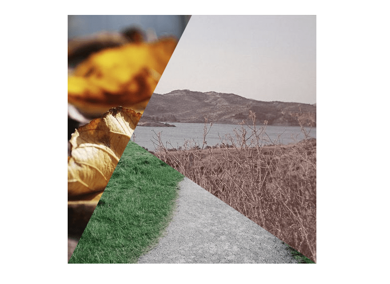
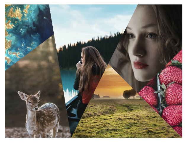
Here are two mosaics that I want you to make using what we covered here. One is on the “easier” side, and the other is a bit tricky. It would be really awesome to see your work in the comments, so link them up! I’m curious to see if your approach is different from how I’d go about it!


