An email newsletter design is an imperative tool for developing a design business. It is one of most valuable ways to share what type of work you are doing and seeking. Email newsletters are amazing marketing as well as communication tools with multipurpose functions and benefits that expand your reach into a user inbox. With the help of an email newsletter, you can make an additional connection with your viewers beyond the website, and in this way you can keep them in the loop with the latest news and happening to look out for.
Email newsletters, while building a relationship with your visitors or customers, can keep them coming back to your website. This will ultimately result in increased sales. So, without any further ado let us get a load of exceptional ideas to create appealing and engaging graphic email newsletter designs for your new campaign.
Table of Contents:
- Email Newsletter Design: List of 41 Inspirational Designs To Get Inspired For Your Next Newsletter!
- The Complete Guide to E-mail Marketing: You Won’t Believe what You Will Learn
- The Power of Email Lists for Web Designers and How to Get One Started
- Market and Sell Your Digital Goods the Right Way
Email Newsletter Design: List of 41 Inspirational Designs To Get Inspired For Your Next Newsletter!
Table of Contents
- 1 Email Newsletter Design: List of 41 Inspirational Designs To Get Inspired For Your Next Newsletter!
- 1.1 1. Elizabeth Davis
- 1.2 2. eMag
- 1.3 3. Heroes Over Europe
- 1.4 4. Nature Baby
- 1.5 5. Percept Brand Design
- 1.6 6. Michael Kors
- 1.7 7. Limes Farm
- 1.8 8. Disney Pixar
- 1.9 9. ScrapBlog
- 1.10 10. eMAG Newsletter
- 1.11 11. Icon Inc
- 1.12 12. Dress Up Diana
- 1.13 13. Sephora
- 1.14 14. Paul Frank Industries
- 1.15 15. IrelandHotels
- 1.16 16. Pizza
- 1.17 17. Apple
- 1.18 18. Bing
- 1.19 19. Miche Bag
- 1.20 20. MapMyRide.com
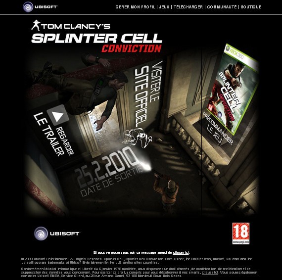
- 1.21 21. Splinter Cell
- 1.22 22. East London Design Show
- 1.23 23. Glasshouse
- 1.24 24. Nike
- 1.25 25. Cafe Diario
- 1.26 26. Steve and Co
- 1.27 27. One is enough
- 1.28 28. Look Hear
- 1.29 29. District Dining
- 1.30 30. The Beast Magazine
- 1.31 31. Appstrakt
- 1.32 32. Webfit
- 1.33 33. MarketSpace
- 1.34 34. Big Cartel
- 1.35 35. Sprowt’s
- 1.36 36. Chris Assaad
- 1.37 37. Hard Rock
- 1.38 38. Unica
- 1.39 39. Namesco
- 1.40 40. Sioux Chief Patriot
- 1.41 41. Lands End, Email Marketing
- 2 The Complete Guide to E-mail Marketing: You Won’t Believe what You Will Learn
- 3 The Power of Email Lists for Web Designers and How to Get One Started
- 4 WHAT are email lists?
- 5 WHEN do I start an email list?
- 6 WHY do I need an email list?
- 7 Are you ready to start a list?
- 8 How to Get People to Subscribe
- 9 The Opt-in Box/ Sign Up form
- 10 The Messages
- 11 What NOT to do
- 12 Are we done yet?
- 13 Success Stories
- 14 Let’s Get to It!
- 15 Market and Sell Your Digital Goods the Right Way
- 16 Basic Marketing
- 17 Social Media Traffic
- 18 Advertising
- 19 Word of Mouth
- 20 Use Your Own Website/Blog
- 21 Giving Away Free Files
- 22 Website Usage, the Clever Way
- 23 Set Up a Newsletter
- 24 Successful Stock Sellers
- 25 Musicians :
- 26 Photographers:
- 27 Conclusion
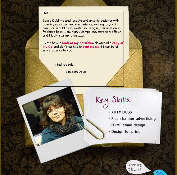
1. Elizabeth Davis
This newsletter design plays tremendously well with the color usage that makes this newsletter design visually alluring and attractive. Furthermore, the newsletter starts with a catchy tagline.
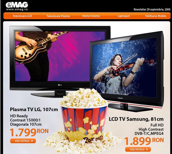
2. eMag
This newsletter design brings somewhat bright color into play with the amalgamation of black color to give it an attention grabbing look. You can easily notice how the call-to-action buttons are placed.
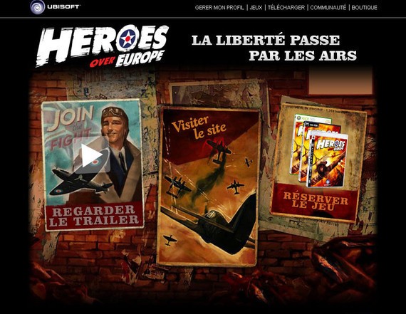
3. Heroes Over Europe
One of the most outstanding newsletter designs in this collection which sets itself apart from the other ordinary designs.
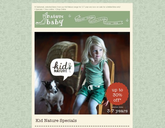
4. Nature Baby
This newsletter design brings beautiful typography and soothing color combination into play to create a compelling and persuasive newsletter design.
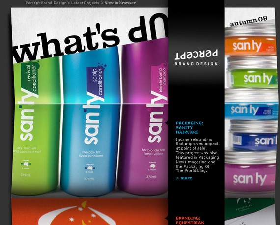
5. Percept Brand Design
This creative newsletter has been designed by keeping the target audience in mind and this is the reason why it successfully grabs the attention of the potential customers.
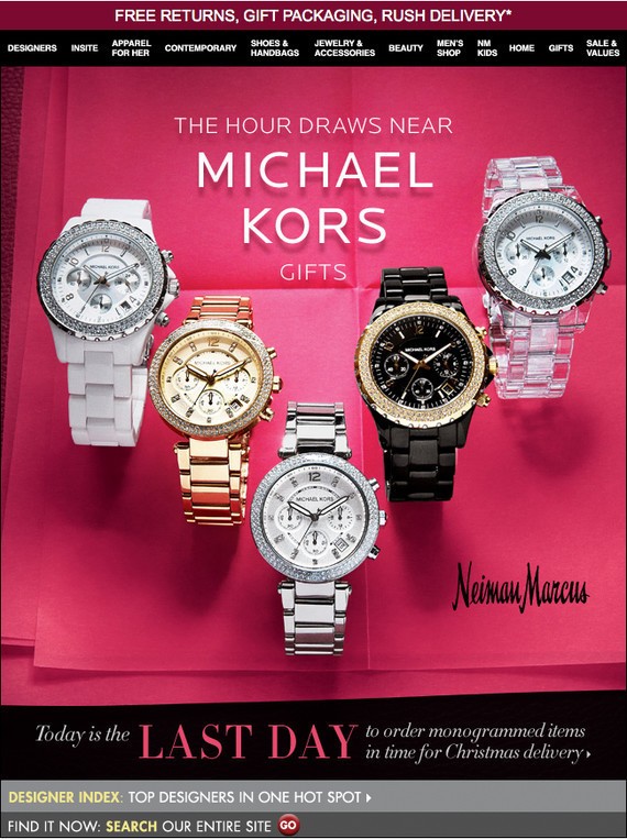
6. Michael Kors
Michael Kors makes use of spanking new and refreshing color and an interesting approach to differentiate the newsletter from others.
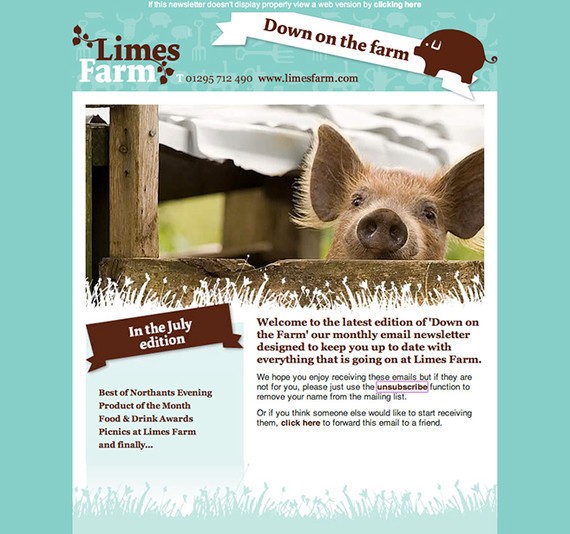
7. Limes Farm
The designer of this newsletter design has successfully kept this design simple and unfussy while giving it a very striking and appealing look.
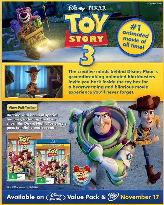
8. Disney Pixar
With this newsletter design, they tend to dazzle those who love animated movies. Apart from the design, the message of the newsletter is loud and clear.
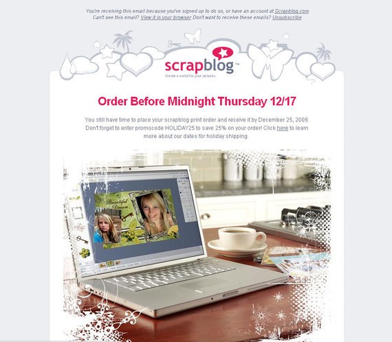
9. ScrapBlog
This newsletter apart from being visually appealing also fulfills the main purpose of a newsletter and that is informing its audience about the subject of the newsletter.
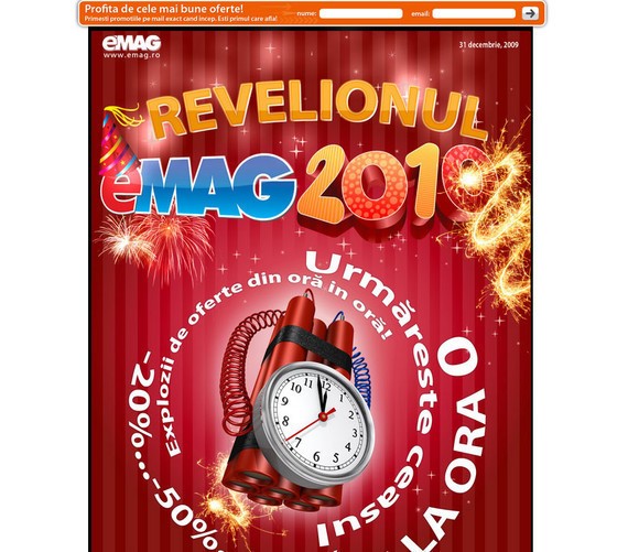
10. eMAG Newsletter
In this newsletter, you will see extremely high contrast colors along with top notch quality of graphics that looks simply stunning and grabs the attention of onlookers.
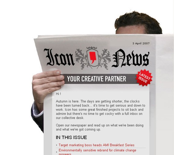
11. Icon Inc
This newsletter design goes well with their tagline “Your Creative Partner”. Further it brings a very innovative approach towards newsletter designs.
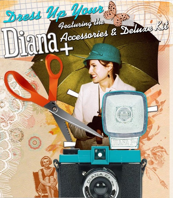
12. Dress Up Diana
This newsletter design perfectly defines the nature of this collage like newsletter design, and this newsletter fits well on the adage ‘A picture worth thousands words’.
13. Sephora
This is a magnificently designed newsletter for advertising beauty products. The use of excellent graphics and color contrast helps in making this newsletter more appealing and stylish.

14. Paul Frank Industries
Here you will notice excellent use of graphics that will grab the attention to their flat rate shipping.

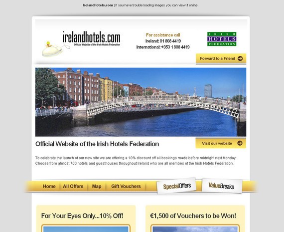
15. IrelandHotels
With a magnificent look at Ireland accompanied by the essential details on going, there is adequate creativity in this newsletter to attract potential tourists to look into the hotel for their next trip for sure.
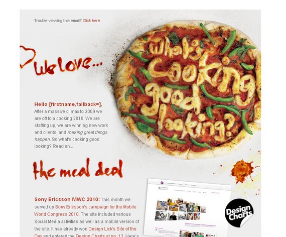
16. Pizza
This newsletter design showcases a yummy and delicious pizza on the plain background which is sufficient enough to fascinate the onlookers.
17. Apple
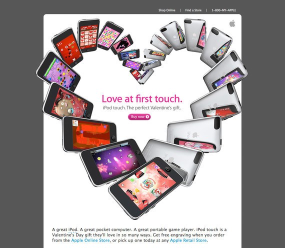
This newsletter brings imaginative use of beautiful graphics into play along with many iPhones that are placed in the shape of a heart in order to embody the love that we all have for the device.
18. Bing
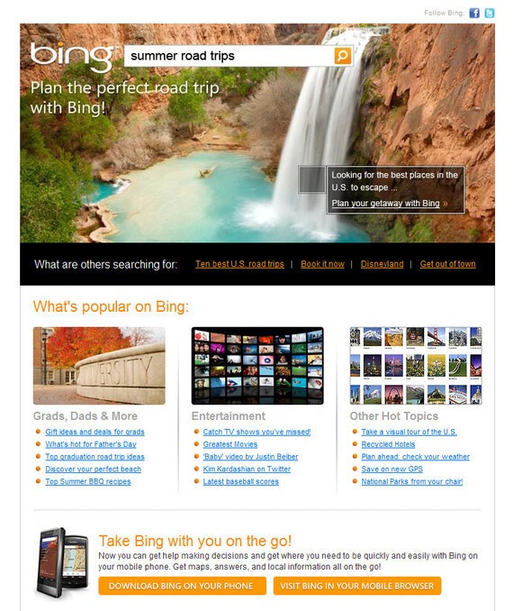
This newsletter demonstrates what Bing has introduced in the world of the internet. This newsletter invites its users to discover what is popular on Bing.
19. Miche Bag
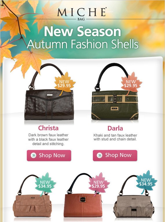
This is a well suited template deign for a newsletter that offers exciting deals through newsletter
20. MapMyRide.com
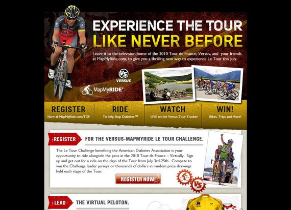
The tempting graphics and captivating tagline are the important components of this newsletter design that mainly focuses on the excitement of cycling.
21. Splinter Cell
Here the newsletter design is slightly more stylish as compared to other ordinary newsletter designs. The use of black and white colors is quite interesting and makes a distinction between different segments.
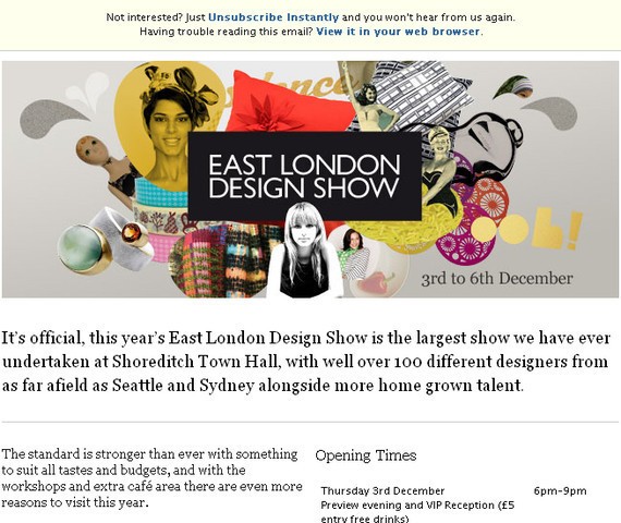
22. East London Design Show
The color theme of this newsletter is really comforting and delicate. The whole newsletter design has been given a very natural and well accepted look,
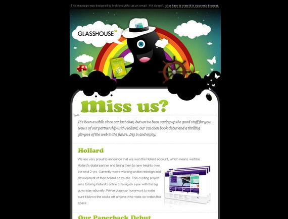
23. Glasshouse
Yet another great example of using black or dark colors to create a strong impression and grab the attention of the audience.
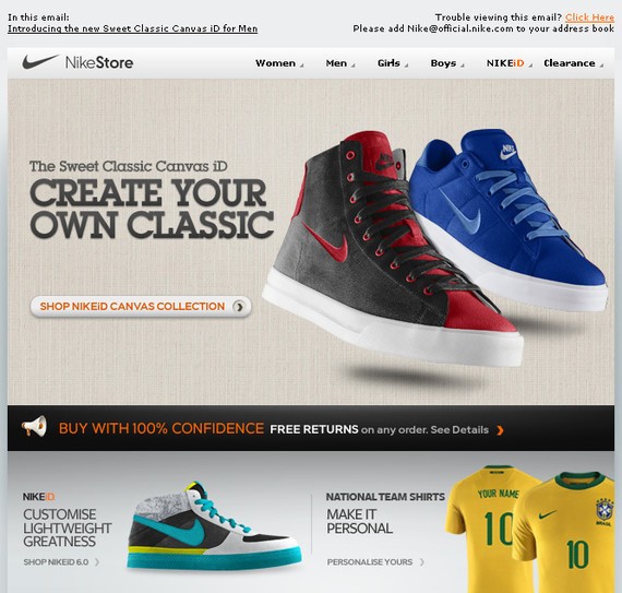
24. Nike
We can define this newsletter template as being simple, un-cluttered and fresh newsletter design with delicate and nice color combination.
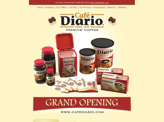
25. Cafe Diario
Tremendously simple and fresh design for a newsletter without too much graphical components being overstuffed in the design. The content of this newsletter is presented against the plain background giving it a very professional look.
26. Steve and Co
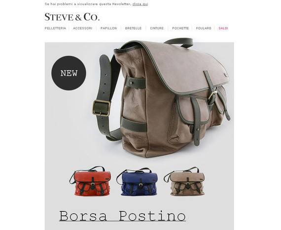
The designer effectively has created a very natural and lovely newsletter design for Steve and Co that not only gives you a revitalizing feeling but also is pleasing to eyes.
27. One is enough
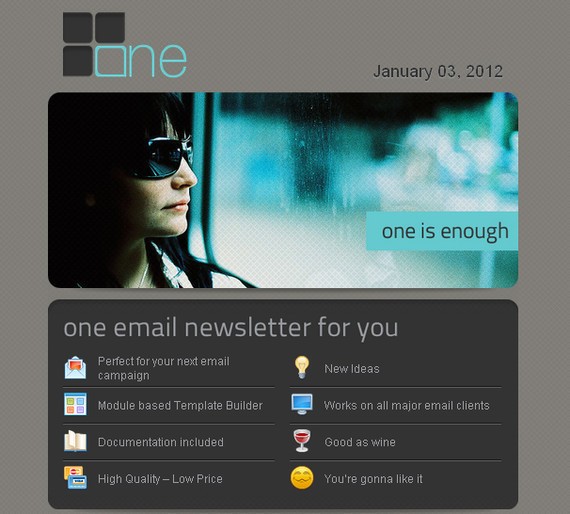
No more added graphical elements are used in this newsletter design rather the designer only takes advantage of nice typography to draw the difference between different elements.
28. Look Hear
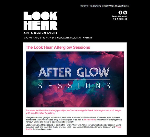
This creative newsletter design plays tremendously fine with the color handling that makes this newsletter design visually tempting and appealing.
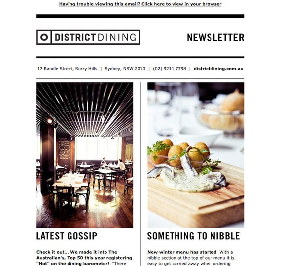
29. District Dining
District Dining newsletter design is simple, uncomplicated and has been designed with the concept of minimalism.
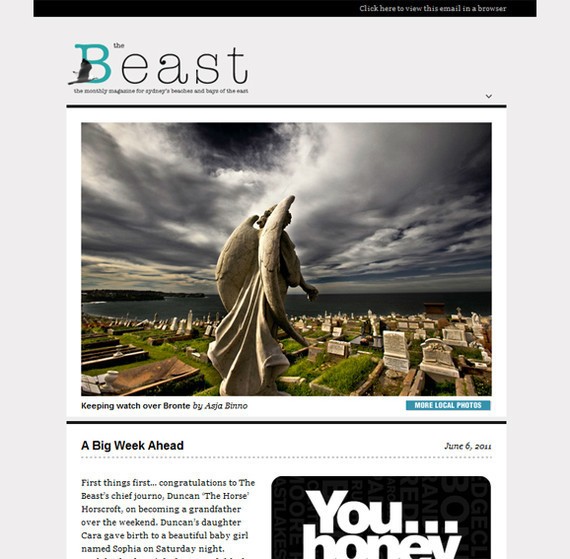
30. The Beast Magazine
Yet another excellent example of employing soft and delicate colors while making a strong notion.
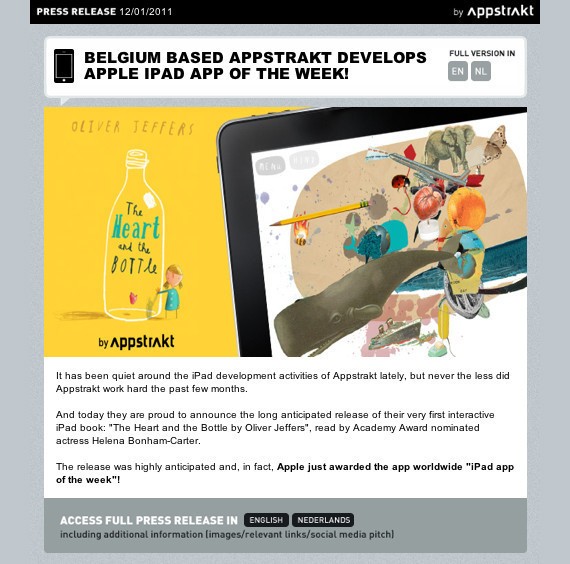
31. Appstrakt
Rather unique color contrast you will notice in this newsletter design. The designer has blended grey, yellow, black and white extremely well in a single design.
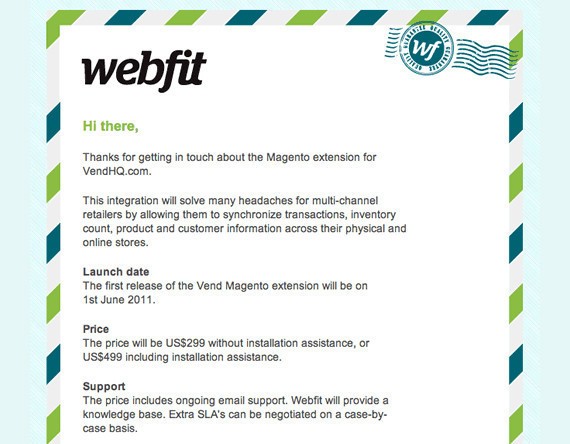
32. Webfit
This innovative newsletter design has been created by keeping the target audience and their expectations in mind and this is the reason why it effectively grabs the attention of the potential customers.
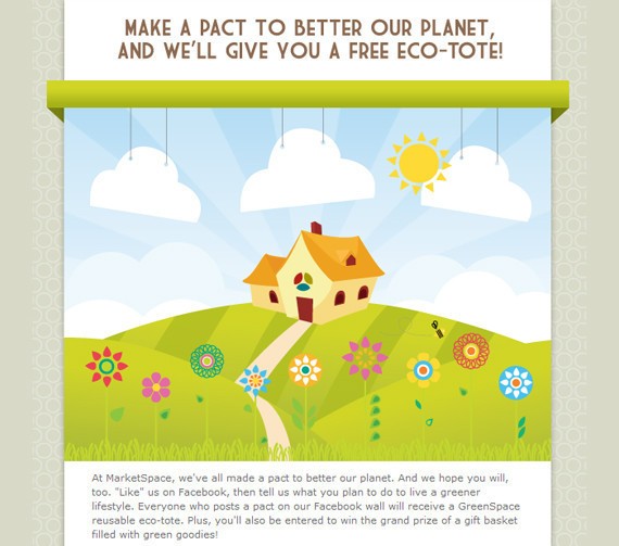
33. MarketSpace
Another beautiful example of the combination of creativity and skills that can be seen in this newsletter design that sets itself apart from others.
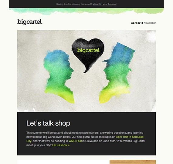
34. Big Cartel
Big Cartel design is comparatively different and unique from other newsletter designs as it has been designed with an extreme creative mind. The concept of this design
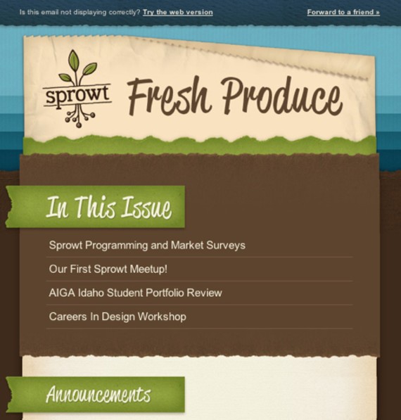
35. Sprowt’s
This creatively designed newsletter template is one of those templates that grabs the onlooker’s attention at the first glance and inform them about the subject of the newsletter in a very concise and engaging manner.
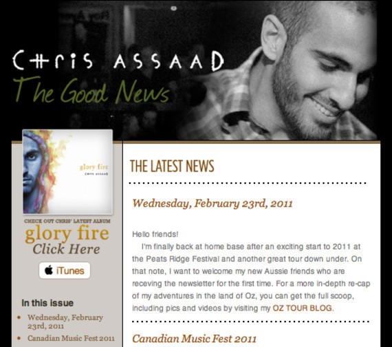
36. Chris Assaad
Chris Assaad makes use of fresh and energizing colors to distinguish the design of their newsletter from the others and creating a powerful first impression.
37. Hard Rock
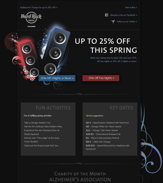
Another best example of the black newsletter design that looks simply stunning, eye-catching and highly appealing.
38. Unica
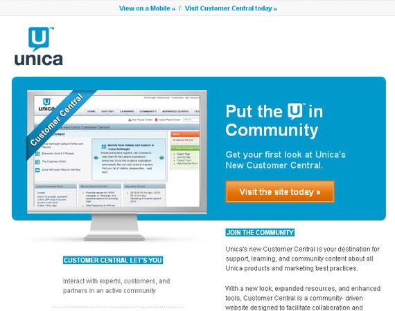
This design is somewhat simple and designed on the concept of minimalism. A beautifully designed and neat design.
39. Namesco
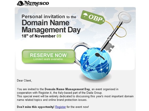
This interesting newsletter design is an excellent example of acquiring loads of information into a small space concurrently keeping the whole thing de-cluttered as well as user-friendly.
40. Sioux Chief Patriot
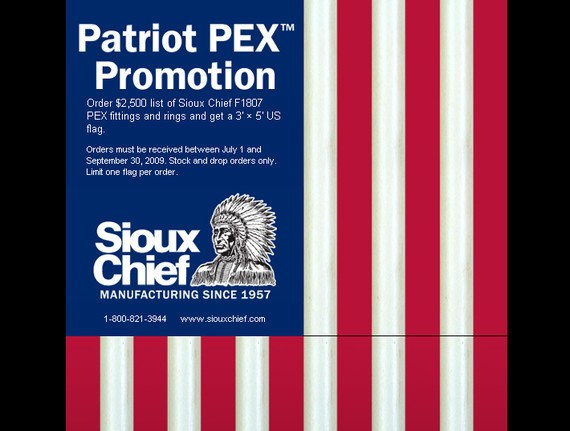
This particular template plays quite well with the eye catching color combination that makes this newsletter design visually appealing and soothing.
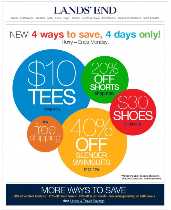
41. Lands End, Email Marketing
In this newsletter design, you will see how the designer has used a very simple concept in an extremely creative and innovative way.
Now let’s take on the e-mail marketing guide.
The Complete Guide to E-mail Marketing: You Won’t Believe what You Will Learn
Think of the number of times that you have submitted your e-mail address somewhere. It seems that whenever you visit some website you will most likely leave your e-mail address there: they ask you, they force you, they trick you – they will do anything to get this tiny piece of information. “The money is in the list” – that’s what marketers say.
Now I should probably start rambling about all the benefits of having a huge e-mail list to give you the necessary incentive to read this guide from start to finish. But I’d rather amaze you with this awesome infographic that we made for this post:
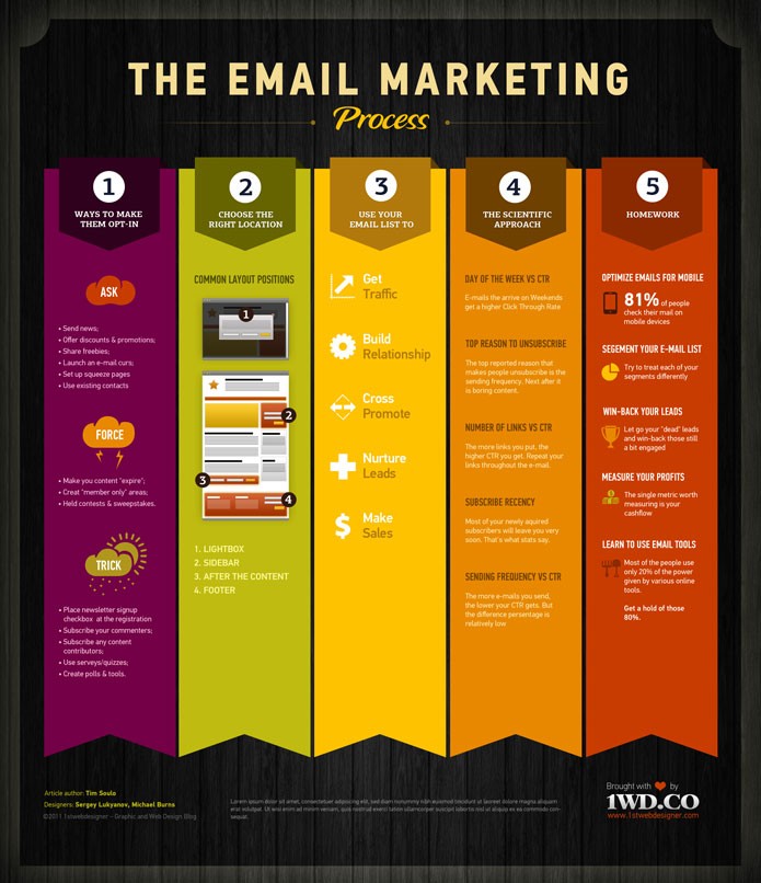

This pretty “litte” infographic is nothing else but the visual recap of what you’re about to read. If you’ve fallen in love with it from the first sight you can easily save the full version available under “click for full size” button. Ok. Enough about the infographic, let’s get to the actual post:

Your e-mail marketing campaign starts from getting people to opt-in to your e-mail list. Even if you are able to convert 10% of your visitors into sales (which is nonsense), 90% are leaving your site without a trace! That’s a huge opportunity being lost here! You have to get their e-mail and try to sell your product to them a bit later!
There is an infinite number of ways to have people tell you their e-mail addresses, however all of them seem to fall into 3 different categories: ask, force and trick.

News – visiting your website over and over for new updates might not be so handy, especially when you post them infrequently. Ask people to leave their e-mails to send the news directly to their inboxes and you’ll be amazed by the number of subscribers.
Discounts & Promotions – wouldn’t you like to receive a text message every time your favourite clothing store announces a 50% off sale? So are your visitors – offer them “e-mail only” discounts and watch your list grow.
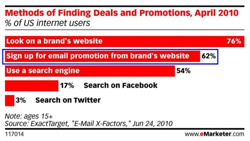
Freebies – did you ever submit your e-mail address to receive a link to download a free e-book? I bet most of you will say “Yes”. This is where you’re giving out your e-mail to get some value in return. If you have some piece of unique content (e-book, e-mail course, infographic, spreadsheet, cheatsheet, product guide, shopping guide, video, audio, podcast) – create an opt-in form, where people have to leave their e-mail addresses to receive that content.
Report – yes, it may also be considered as a freebie, but I felt like I should make a separate point out of it. Industry reports, which can really help people in their jobs/businesses are a holy grail which people are always looking for. I personally receive about a dozen different reports, and they are extremely helpful! Reports tend to have the biggest open rates, as people are actually looking forward to receiving them. The downside is that you need to work hard to keep the quality level of your reports as high as possible.

Do you happen to sell a product with a high learning curve? You’re lucky, as you can offer your customers a “tips & tricks” campaign right on the “Thank you for the purchase” page. Once they opt-in, you’ll be able to sell them accessories or related products with just a couple autoresponder e-mails being set up.
E-mail Course – is another widely spread tactic, worth a separate mention. An e-mail course is basically an auto-responder which consists of a certain number of e-mails. All you have to do is write the actual course about a specific topic, split it into several e-mails and setup the auto-responder to send an e-mail once in a while. A catchy course title and prominent placement of a subscription form will do the rest.
Squeeze pages – a simple “free newsletter” box in your sidebar may not work very well, instead you can pitch your subscription using one of those long sales letters. Then, once in a while, as you write a blog post, you can mention your newsletter and give a link to your squeeze page, which will do the job of convincing people to opt-in.

E-mail list brokers will most likely pitch you that the ROI from purchasing (or even rental) of some third-party e-mail list will cover all your expenses, but in most cases that is not true. Just like the search traffic is your most targeted and high converting of all, your own e-mail list will work much better than any rental one. Put your money and efforts into your own list, rather than purchasing if from third parties.
Existing contacts – you might already have a large contact list of your friends/colleagues/customers, you might as well collect contact information from your payment receipts. Well, adding everyone to your newsletter may get you into big trouble, as people might simply mark you as SPAM. What you CAN do, is e-mail them a link to your squeeze page and have them voluntarily opt-in to receive your newsletters in the future.

Expiration – once you have posted some free content, you may hide it behind an log-in form after some time. This way a returning visitor, who has watched your video, read your report or used your free tool will be forced to register and leave his e-mail to get access to this content again.
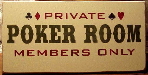
Members only – there might be a “members only” area on your website, which should be really attractive and be enough incentive that people leave their e-mails to get access to it.
Contests/Sweepstakes – you may list your newsletter subscription as an obligatory condition to enter, but note that this can somewhat decrease the number of participants.

Registration – speaking about the laziness, when was the last time you clicked the privacy policy link, which is given once you register somewhere? In most cases, you agree to receiving the newsletter of that company 🙂
Commenters – you can easily turn your commenters into subscribers by adding a checkbox to a comment form, which is checked by default. Again people are too lazy to be attentive, that’s why they will just leave a comment and opt-in.
Testimonials/Reviews/UGC – the trick is exactly the same as with comments, but this time you’re asking for a testimonial or some sort of review or feedback and put that tiny newsletter checkbox, which lots of people will overlook; (just in case – UGC stands for User Generated Content)

Once you have some people on your list, why not to use them to grow your list even more?
Add social buttons and endorse people to share the information with their friends. You’ll have to create a web-based version of your e-mail, so that once a person clicks the twitter icon in his e-mail, his friends will land on it’s web-based version, which can be equipped with a subscription box. According to MailChimp survey over 70% of people forward/share commercial e-mails less than once or month or never, but still a 30% chance is worth it!
Surveys/Quizzes – I bet many of you got really pissed off by a request to leave an e-mail in order to get a result of a 50-question-long quiz that you just thoroughly passed from start to finish. Well, “you just got punk’d” – either leave your e-mail, or you will never know the result and half an hour of your life will be lost 🙂

Polls/Tools – once you participate in a poll, the system may offer you to e-mail the final results once it ends, so that you can use them for future reference. Alternatively you can create a tool, like a price calculator, and add an option to e-mail the results to a customers inbox, so that he had an access to this information once he needs it.

Now you know the most common ways to get people to opt-in to your newsletter and the second logical part would be to actually implement them on your website. Ever heard of CRO (Conversion Rate Optimization)? This is basically a number of techniques to have your website visitors do what you want them to do. Newsletter signup forms are yet another object for CRO best practices, which mainly rely on location, size and color.

Lightbox – yes, that’s extremely irritating when the website you visit gets greyed out and some message appears above the fold. Yet studies show that this thing gathers e-mails like crazy! And besides, there are some cool plugins, that allow you to control whether to show the lightbox right away, or wait till a person visits two or three pages of your website (and lots of other things can be configured actually).

Sidebar – the most common place to put your newsletter subscription forms. This way they will be highly visible and won’t irritate anyone. What’s more important, is that you can actually have a number of different opt-ins in your sidebar: one for blog subscription, one for e-book download, one for a poll, etc.
 Don’t forget to enhance your newsletter subscription box with the so-called risk removals as: “no spam” & “not selling to third parties”.
After the content – once a person reads your piece of content till the very end, you can tell that he is very interested in your resource, so why not to offer them to sign up? I really like the way Neil Patel from QuickSprout does it:

 The e-mail opt-in process is usually full of the so-called “gate” pages that have close to no value – “thank you for registration” page, “please confirm your e-mail” page, etc. Try to put some call to action with a hot offer to those pages and see what the results will be.
Bottom – I’ve seen some websites having a newsletter subscription box sticking to the bottom of the browser window. If you ask me – that’s irritating. I wanted to show a screenshot of that practice, but it appears that those websites are no longer using it. But you can still try and see if it works for you.
 Feedburner actually allows you to get a hold of your subscribers’ e-mail addresses, so if all the above methods are too time-consuming for you, use the Feedburner plugins to grow your e-mail list.
 As a part of your signup box design, try using “Mad Libs” style for a chance of 25-40% conversion increase.
“I have the list, now what?” – that’s a fair question. Getting people to opt-in is actually not as hard as it may seem (especially following the above tips). The hard part is getting some value/revenue out of your list. The strategy (as well as the purpose) of your e-mail marketing campaign is mostly being determined by your business/niche, but here are some core things to do with your e-mail list:
Traffic – an e-mail to 10.000 people will obviously grant you an instant blast of a couple thousand visitors. Whatever you need this traffic for – you have it.
Cross Promotion – I did say that using a third-party list is way less effective as opposed to using your own one. However if you have a partner in your niche with a large e-mail list, and you know that his clients might be potentially interested in what you have to offer, you can ask him to mention you in his next e-mail newsletter. What you can do in return is mention him in yours. This practice is a sort of a cross promotion and it may give some really good results.
Relationship – being helpful and informative is a great way of building trust in your company/brand. Useful advice, product tips, industry reports – those are the things people are always looking for and you will surely get some credit for sharing those things.
 Lots of people like to use their e-mail box as an archive: all the important e-mails are being carefully archived, so that they can refer to them later. Your e-mails should be the ones people would want to store – use a lot of data, citations, references, useful information and people will come back to your e-mails over and over.
Lead Nurturing – once you have a person’s e-mail address, there’s one more chance to convince them to buy your product/service. Don’t send the gibberish sales stuff that everyone is already sick of – be wise and nurture your future customers carefully. People love exclusivity, make them feel like they are in a special club and you’ll make that sale!

Studies show that 70% of people will read the whole e-mail or most of it.
Sales – once you announce a new product, you can easily spread awareness and probably even get some instant sales. Other than that, you can include a discount code in your e-mail, which will be another incentive for people on your list to make a purchase.
 Pro bloggers often stuff their newsletters with affiliate links to refer people and get some money once they make a purchase. When you mention some product/service in your newsletter, maybe you should check if it has an affiliate program?
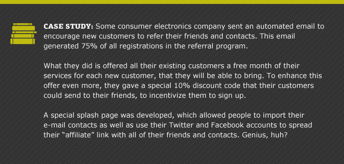
Support – There is a post of “The Dirty Dozen” Marketing Processes that every internet start-up must master. And seems like about a half of those processes require you to send an e-mail to your customer.

Most of the numbers and graphics that I am about to use were taken from a free webinar by my favourite social media scientist Dan Zarella who was granted a dataset of 9,5 BILLION e-mail sends within MailChimp.
I will mention and comment on only a few of his findings and I strongly insist that you go and spend an hour watching this webinar from start to finish.
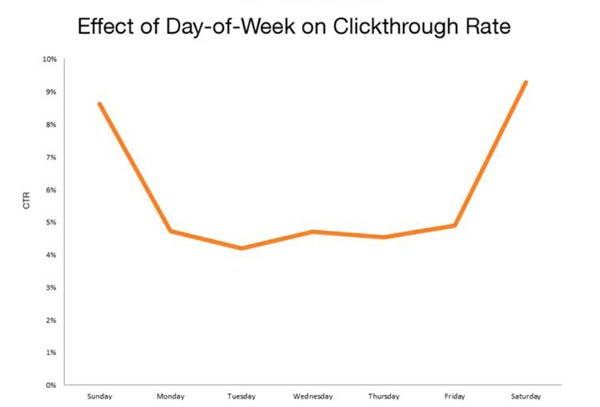
Timing – surprisingly, the highest possible Click Through Rate occurs on weekends. This is explained by the fact that on weekends people are not overloaded by incoming e-mails as well as have some free time to explore what’s there.
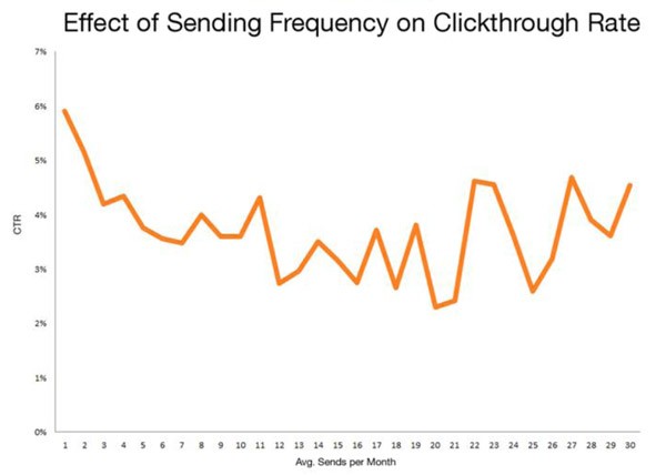
Frequency – The best frequency to get a higher Click Through Rate is the lowest one. However the graph shows that it won’t hurt to send an extra e-mail. And besides, you’ll get a lot more clicks from two e-mails with a slightly low CTR than from a one with a bigger CTR (simple math here).
Number of links – the more links you put in your e-mail, the higher CTR you get. Don’t be afraid to duplicate your links in the e-mail, present them in different type/context. It’s actually a good practice to list all your links with short comments at the very end of your e-mail.

Subscriber recency – your recent subscribers are likely to leave you real soon, and unfortunately that’s inevitable. Don’t panic when you see your numbers drop within the first few days after the campaign was launched, it’s totally ok.
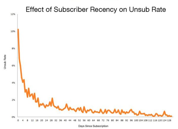

Most of them will leave you anyway and there’s nothing much that you can do about it. Though what you CAN do is make it easy to unsubscribe. Why? Because reports show that people who cannot find the “unsubscribe” button, or find the process too hard and complicated will simply click the Spam button, which will dramatically affect your reputation across the e-mail network. Just make it easy to unsubscribe.
Reasons – we have previously discussed that an extra e-mail will not decrease your Click Through Rate that much, but still you should be careful with sending too many e-mails to your subscribers, and here’s why:
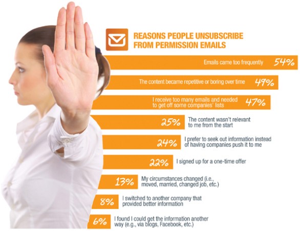
 Analyzing the graph above, you might come up with a logical solution to save a decent percentage of your subscribers. Instead of just providing two options (a) receive e-mails and (b) not receive e-mails, you can actually offer them to change the frequency of the newsletter, for that is the #1 factor that bothers them. Perhaps an e-mail once a month rather than a weekly e-mail will save you a subscriber.
This e-mail marketing guide is already quite big, but there are still hundreds of things that you need to learn in order to become a successful e-mail marketer. Test, Measure & Optimize – those are the core things that take about a half of your e-mail marketing efforts:
Don’t SPAM – here is the document I strongly recommend you to read before you ruin your very first e-mail marketing campaign. (And here’s another one for “black hat” e-mail marketers 🙂 )
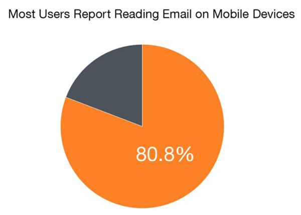
Optimize for mobile – welcome to the mobile era! Studies show that 81% of people read their e-mails on mobile devices. And here’s what you want to do:
- avoid large images (67% of people do not “automatically download images”);
- avoid tables/columns (or ensure they look nice when shrunk to an iPhone size);
- avoid long e-mails (you don’t want mobile phone owners to burn their fingers scrolling);
Segment – lots of different people opt-in to your e-mail list. Why would you send the exact same e-mail to everyone? Here is just a couple of most commonly used segments:
- buyers vs non-buyers – statistics show that people who have purchased your product once are much more likely to buy again than those who have not purchased anything. It’s bloody obvious that those two groups should receive quite different e-mails.
- one-time-buyers vs repeat-buyers – though the difference between these two is not as big as above, you should apply a different approach to each of them.
- engaged vs not – you can quite easily track which of your subscribers are not clicking your links and not opening/responding your e-mails. Create a special segment for them and try to catch their attention.
- relevancy – you need to target your customers with communication, which is relevant to them. If you are able to get some more information about them (demographic, psychographic, behavioral patterns) – use it to create relevant segments.
Win-back – once you determine your “unresponsive” segment, you can try to reactivate it with a win-back or re-engagement campaign. This includes e-mailing them some special offers, offering to toggle the newsletter frequency, or asking if they still want to receive your e-mails at all.
A/B Testing – there’s nothing new about split testing the pages of your site, but split testing e-mails is not that widely spread. There are many parts of your e-mail message that you might consider for testing, here are some of them:
- e-mail subject
- sending time
- the layout
- body text
- closing text
- images

This definitely deserves a separate post, so I will only give you a taste. The well-known 80/20 rule can be applied here: 8 out of 10 people will read the subject and only 2 of 10 will read the e-mail itself. This fact makes it obvious that you should work really hard to polish your e-mail subject till it gets a decent open rate. In general, people will open your e-mail because your subject promises some information of an exceptional relevance to them or either persuades that there’s something exciting and entertaining inside. There’s an exceptional series of posts by CopyBlogger called “Magnetic Headlines” and blog post headlines and e-mail subject lines are pretty close – this should get you started.
Measure – there is a ton of metrics available for measurement, but if I were to choose one, I’d definitely pick MONEY. That is the only metric that shows the success of your marketing efforts – whether it’s e-mail marketing, search engine marketing or social media marketing. Configure your analytics to track how much money you get and optimize your campaign solely around this metric.
Tools – most of the tips that I have mentioned in this guide may seem like a nightmare to implement. However with such great online e-mail marketing tools as MailChimp, Aweber, iContact, and others you can actually do anything with just a few clicks of a mouse.
Reputation – these days SPAM filter gets social. Passing the good ol’ SPAM filter of a Gmail user is now only the half of the job. Since the time Google released it’s Priority Inbox feature, you need to actually get your e-mail marked as “Priority” to get noticed.
Other than that many e-mail providers are now considering all the positive and negative interactions to decide whether to mark your e-mails as SPAM or not. People who rarely open your messages, never reply to them, never click the links inside can bring your reputation down. That is why those win-back campaigns are so important. You either re-engage your subscribers or remove them from the list to avoid trouble.

Just like my other guides this one is only an “intro” to the world of e-mail marketing as there’s so much left to learn. I really hope that my job on this guide will be a perfect starting point for you.
PS: Speaking of my other guides you might want to check the “Facebook Marketing: Ultimate Guide” published at SEOmoz (Top Post of 2010 by Thumbs-Up, Traffic and ReTweets) and my recent fancy “Twitter Marketing Guide: Bigger, Longer & Uncut” published here at 1WD.
PPS: I want to say thanks to @playgrey for his work on styling this post to make it look sexy 🙂
Next up are e-mail list and their power.
The Power of Email Lists for Web Designers and How to Get One Started
Imagine if you had a sea of potential clients who were one click away from working with you. How would it impact your web design business? The secret is building email lists that you can turn to to build relationships and generate leads.
There are many ways to grow and expand your freelance business and one of the most powerful is an email list. For little to no money, you can start a list, build your traffic, and gather more potential leads who will be pining to work with you.
If you are really serious about jumpstarting your web design business, consider email marketing as one of the strategies that will help you get to the top.
WHAT are email lists?
An electronic mailing list allows online webmasters and marketers to send electronic posts, announcements and messages to a list of subscribers at one time. Mailing list software saves subscribers’ email addresses and publishes messages automatically as determined by the webmaster’s schedule.
Twenty years ago, businesses had to stamp, address and physically send mailings to all of their customers. This not only cost money, but also required a lot of manpower.
Fast forward to today and email marketing not only costs pennies to implement, but it is also the one trend that has stood the test of time. While SEO, social media and even PPC have gone through major transformations, email marketing remains one of the most effective strategies to gaining leads and building an online reputation.
WHEN do I start an email list?
Most designers think they need to wait until they have a blog or more of an online presence before starting an email list. But, this simply is not true.
In fact, if you can manage to acquire some email addresses before you start your blog, you will have a number of readers ready to share. This will give you a head start along with instant traffic!
WHY do I need an email list?
Why would web designers need to build mailing lists? There are many reasons why, but we will cover the two most important here:
1. What happens to those potential leads/clients who visit your website but may not be ready to pull the trigger to contact you for services? The worst thing that can happen is they leave your website.
A potential client may be more inclined to give an email address than commit to starting a design job.
An email opt-in box will help you capture those leads and give you the ability to nurture them a little more to urge them to work with you. Your messages will be targeted towards giving helpful advice and also to remind them of your services.
2. Future Work – Potential clients may not need services the moment they subscribe to your list. But when they do, they will know where to come because they will remember who you are from your email messages.
An email list allows designers to build relationships with subscribers and offer advice which makes potential leads to want to work with them.
By building relationships you are creating a reputation for your business which leads to more customers and more revenue!
Are you ready to start a list?
First things first…
You will need an autoresponder. An autoresponder is the software that sends your messages to your subscribers.
Here are a few popular services:
Now that you are hopefully convinced about starting an email list, here are some first steps to get the ball rolling:
- Invite your current contacts – Chances are you already have a list of past clients and their email addresses. Do not automatically add these addresses to your email list. Politely send an email with a link to the page where they can subscribe. Tell them you are starting a newsletter and state the benefits they will receive.
- Subscribers – If you already have a blog, invite your current subscribers via a blog post to subscribe to your list.
How to Get People to Subscribe
To get people to opt in to your list, you must give them an incentive.
Some marketers simply offer updates and this strategy does work for popular websites. But, if you really want to boost your email marketing campaign, I recommend you give away a free gift.
Many marketers offer a free ebook, report, video or course. The gift can be anything as long as it offers value to the subscriber.
Here are some best practices to remember:
- Make it Valuable! You can wrap a green rock in an emerald cover to make it look like a rare gem, but once people receive it, they will know it is a fake. Don’t view your freebie as simply something to give away to get more subscribers. If you do, that’s all it will be and though you will acquire a few subscribers, you will do nothing for your reputation and potentially harm it.
- Who? Your freebie must solve a need for your subscribers. The first step to knowing what to offer is KNOWING your audience.
Who are your customers?
What are their needs?
What are their problems?
As web designers, your audience is not other web designers—unless you are a web design instructor or teacher. Therefore, giving away a report on web design that includes complex programming and tutorials will not be successful.
If your audience is composed of small business owners who run websites but need assistance with marketing, consider a report about optimizing websites for conversions, split testing, usability testing, or the latest internet trends.
The trick to nailing your conversions is to become intimately acquainted with the people you service!
Find out what their specific pain points are and you will find a stream of success.
- Make it substantial! This is not the time for a two-paragraph report on what Aunt Matilda said about web design. If you are giving away a free report, it should be at least eight pages in length and look professional. Use a company logo and professional graphics throughout.
- Edits are Crucial! Many of our readers hail from all over the world and we welcome a diverse group of people. Some, however, are not fluent in English, or they know English, but not well enough to write with perfect grammar. If you fall into these categories, I suggest you hire an English editor to proofread your report or ebook so it has maximum impact.
Hubspot published this short newsletter to further discuss Top Incentives for Driving Email Subscribers.
The Opt-in Box/ Sign Up form
The Opt-in box is the site of the email address query where subscribers add their email addresses. The design and look of this box is very important and will influence conversions.
Design
The design of the subscription box should look like an extension of your website, but stand out from the page just enough to be noticed.
Here are some important design elements to remember:
1. Attention-grabbing headline
The headline must catch your web visitors’ eyes immediately. It should be in a different typeface than the rest of the copy and solve a problem for your visitors. After reading your headline, your web visitors should feel that you know their problems and your newsletter/mailings will help them.
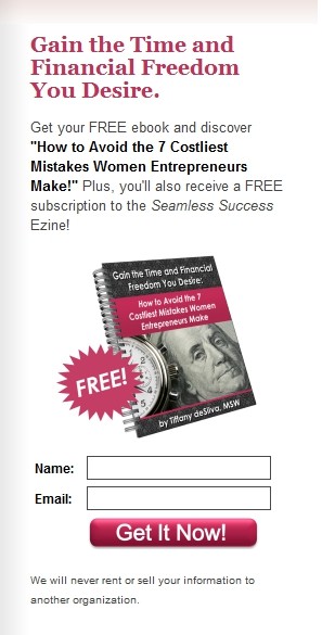
2. Graphics
The graphic is not necessary in all cases, but it is a good practice when you are giving away a report or ebook. The graphic should look like the 3D physical form of the item you are offering in return for a subscriber’s email address.
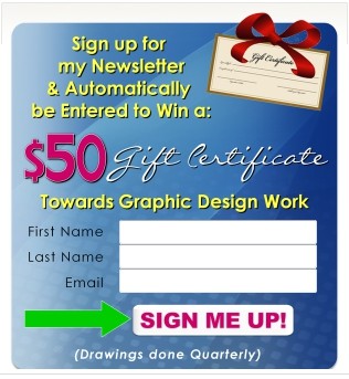
3. Benefits
Mention a few benefits or even one so visitors will know what to expect. Inform them of what they will receive and why they will want it. If you are not offering a freebie, use the copy space to tell potential subscribers the benefits of joining your newsletter and what they can expect.
Remember that an email address is someone’s private possession. You have to earn the right to receive it.
4. FREE
IF you are offering a freebie, add the word “Free” to make a bigger impact. Also, don’t forget to tell your visitors to enter their email to receive free access to their gift.
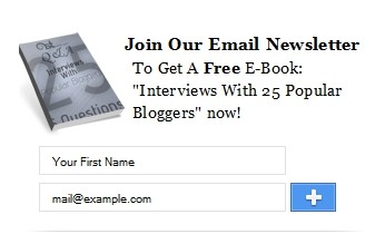
Tip: It’s a good practice to inform your subscribers that you will never share their email and you hate spam just as much as they do.
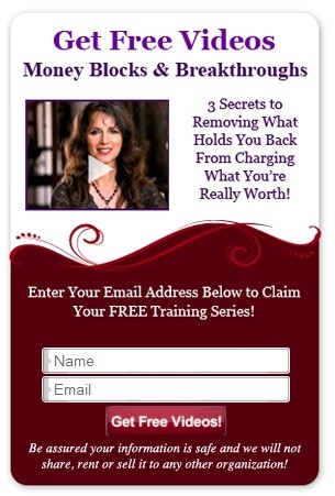
5. Call to Action
Your call to action should be interesting and attention-grabbing. Consider text like “Get Instant Access” or “Sign Me Up”.
Location
The location of the subscription form will also influence your conversions. It is recommended to test the placement to determine the optimal position.
Here are the most popular locations:
Below Blog Post

Notice how John Chow speaks DIRECTLY to the person by stating, “Did you enjoy this blog post?” This gets the reader’s attention more than a generic form.
Blog Sidebar
This is the most popular place to put an opt in because it is visible without being obtrusive to readers.
About Page
Don’t ignore the chance for conversions on your About page. As long as you are not overusing your opt-in box, the About page is a great place to capture email addresses.
Pat Flynn of SmartPassiveIncome.com performed a test and saw a marked increase in subscriber opt-ins when he added a form to his About page. He explains his results here.
Footer
Many marketers use a footer opt-in as a secondary source. However, some web designers use the footer opt-in exclusively. You will need to test to see which scenario works best. It may be a good place to start.
Pop Up
Popups actually perform very well even though they can be annoying. My advice is to use them at your own risk. Some very prominent marketers swear by them and others stay far away.
Dan Zarrella, social media scientist, has been using the popup for years now. It annoys me because every time I click on a new page it continues to disrupt my reading, but he offers incredible value with his information. If you want to try the popup, make sure to test different positions to see which location performs the best.

The Messages
The main goal of your email campaigns is to develop relationships, nurture leads and offer value WITHOUT selling repeatedly and spamming your subscribers’ inboxes.
What should the email messages consist of?
Here are some ideas:
- Recent blog posts
- Helpful industry tips
- Recent projects
- Links to helpful resources
- Company news
- Contests and promotions
- Special offers
- Incentivized surveys
- Personal stories (occasionally)
When composing your messages, here are some important tips to keep in mind:
- Don’t send the same old content everyone reads. Even if it is similar, find a way to make it creative and interesting.
- Keep it short! Use bullets and one to two sentence paragraphs.
- Make your subscribers feel exclusive. Use their name, and address them directly as if you are talking only to them. Similar to how people feel when they pay thousands of dollars to be part of a club membership, your subscribers will feel special if you make an extra effort.
- Don’t know where to start? Curate! If you are not a writer and you do not have the budget to hire anyone, consider researching the web for the top information and send the links to your readers.
- Give people the option to unsubscribe.
- Don’t take unsubscribes personally. Sometimes I unsubscribe from a list simply because I am trying to streamline my emails. It happens to everyone. However, when you notice a bundle of them at one time or a continuous flow, it may be time to adjust your campaign.
- Be careful not to use words that trigger SPAM filters or your email will end up in your subscribers’ junk mail. Here is an extensive list of email SPAM trigger words.
What NOT to do
Worried about making mistakes? Hubspot published this free Ebook that addresses the top 12 mistakes made by email marketers.
Dirty Dozen: Email Newsletter Mistakes Nearly Everyone Makes
Are we done yet?
We’ve just scratched the surface of the depth of email marketing. Here are some more fantastic resources to help you create highly effective, traffic-driving email marketing campaigns.
Need some more ideas on how to grow your email list?:
Success Stories
Here are three true life success stories of people just like you who grew their businesses by using email marketing:
Bella Web Design
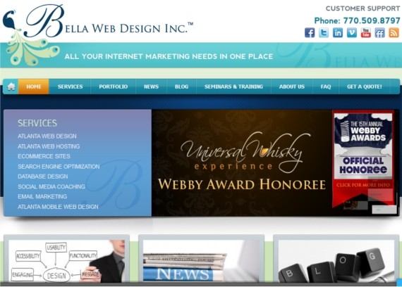
Desiree Scales started Bella Web Design as a tool to make money while staying home to spend more time with her growing family. She touts her email list as the turning point in her business and the tool that helped her generate more leads and expand her horizons. She was also able to attract bigger clients which increased her revenue.
QuickSprout
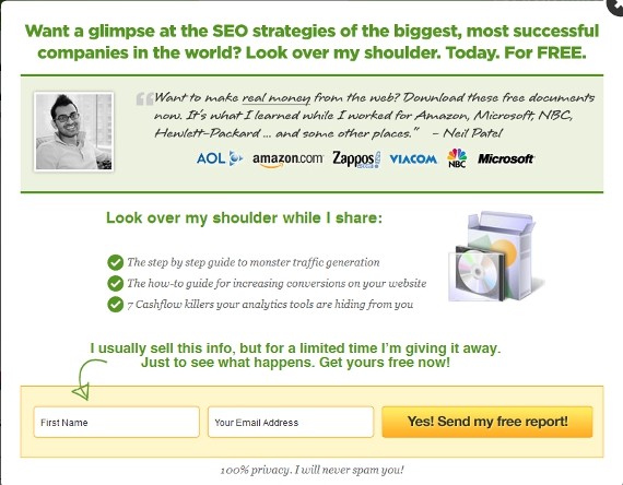
Neil Patel started QuickSprout as a blog to teach others how to market online. He also started many software companies such as Crazy Egg and KISSmetrics. He is known as a mover and a shaker in the industry and his huge subscriber list is proof of his success.
Smart Passive Income
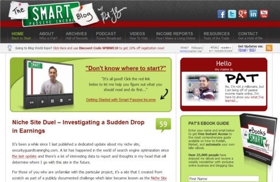
Pat Flynn started from nothing and has built his list to over 25,000 subscribers. With his blog he teaches people how to make a passive income online and he has built quite a reputation for himself in a short period of time.
Let’s Get to It!
So now that you have nothing holding you back from starting a list, let’s get going! Actually, I know how difficult it can be to focus and work on a new business building strategy. I am in the middle of creating my free download so I understand how hard it is to juggle more work into an already hectic schedule. But if we keep putting it off, we will never accomplish our goals.
Let’s be accountable to each other and make starting an email list our goal for the rest of 2012! Who’s with me?
While we are talking about newsletters and stuff, we can go beyond marketing your own digital products.
Market and Sell Your Digital Goods the Right Way
In previous years, digital marketplaces have evolved significantly. Day by day, more and more designers, developers, photographers and musicians of all levels have started to begin their experiences with marketplaces and selling digital files online. These ‘stock markets’ represent a good source of revenue for people of all skills, from beginners to advanced, that is why if you have not started your adventure with these places that are great for generating income, you should consider it right now.
Basic Marketing

Image Source
Most markets usually don’t ask you to pay a monthly fee; instead they take a cut of your profits which is at least 25%. This cut is spent on processing payments and doing some basic marketing. This basic marketing consists of online advertising, paid/guest posts and promotions. Such marketing intends to bring customers to the marketplace as a whole, not to your specific files, that is why you should not rely on it. You should fight to get sales on your files, but you must be in a friendly relationship with your fellow authors.
Social Media Traffic
Image Source
Most of the modern marketplaces allow you to put (if they aren’t there automatically) certain Facebook, Twitter, Google+ sharing buttons which can drive social media traffic. The social media traffic is not of the highest quality, and visitors from these sources are not likely to make an immediate purchase, however, if you set an affiliate link while sharing on social media websites, it has better chances of receiving a nice amount, either from the first purchase or the first deposit.
Advertising

Image Source
It is a well proven fact that, if advertising is done right, then it won’t be hard to drive high-quality and keyword-driven traffic to your files. It can be either, CPM or CPC — it’s totally up to you, however some authors from the well known flash files stock, ActiveDen, proved that Google Adwords CPC ads work excellent and can even double your profits!
Word of Mouth
A recommendation from a good friend will always be considered, that is why it’s good to be on cordial terms with everyone in the market. There are many authors who are happy to point their clients to other files, if they think the specific file is worth their attention and time. There is not much you can do about it, except producing high-quality and unique files which will be loved by everyone.
Use Your Own Website/Blog
Another simple yet effective way is spreading the word using your website. It can be a blog post, a link to your latest file in the header of your site (be sure to use some attention-grabbing techniques) or a link in the sidebar of your website. It is good to try different placements and ways of informing your readers about your new files, but it is extremely important not to abuse the concept of banners and announcements as it will drive away both visitors and potential clients.
Giving Away Free Files
Everyone loves getting free files, but it’s even more enjoyable to receive free copies of paid items. Giveaways are a great medium for promotion, and when thinking about giveaways, you would better think about organizing these giveaways on more popular websites than yours, as you may simply get more purchases and more promotion.
Website Usage, the Clever Way
It is a very powerful and very effective way of attracting customers on PremiumPixels. PP is a website where you can download free .psd files, however, after each download you are shown a nice message which encourages you to take a look at the author’s stock files. It is very powerful because the author is giving away free files, and hopefully you wouldn’t mind spending a few minutes of your time checking out their premium offerings. That’s how eventual customers are attracted!
Set Up a Newsletter
Orman Clark, who is well-known for his amazing WordPress themes, has recently set up a newsletter and started gathering subscribers. With every newsletter, you get an amazing (exclusive) freebie and a great deal. He has only sent 2 newsletters so far, but I suppose his success with this newsletter is far beyond the expected. Everyone loves free files, but exclusive free files are loved even more because you never know what’s going to be in there. It may be a file you really needed, or an amazing graphic set for which you would have paid a nice amount.
Successful Stock Sellers
Christian (Kriesi)

Visit Website
Peerapong
Visit Website
Brandon Jones
Visit Website
Musicians :
Soundroll Studio (Dmitry Lifshitz)

Visit Website
Tim McMorris

Visit Website
Beat the Beat

Visit Website
Photographers:
Yuri Arcurs

Visit Website
Pressmaster

Visit Website
Andresr Photos

Visit Website
Conclusion
A good file will always sell! Just make sure you focus more on the quality of your items rather than quantity or marketing. Marketing your files is an amazing source of revenue, but it should only be applied to high-quality files which would impress anyone easily. A simple file with lots of promotion efforts is going to get a lot less sales rather than a high-quality one, with just a bit of proper marketing.
This post may contain affiliate links. See our disclosure about affiliate links here.


