Generally, the most successful websites include headlines that support the website’s goals and are simple and easy to remember. By creating a unique and fun headline and tagline, you’re that much closer to separating yourself from the competition.
You also pique the visitors’ interest and encourage them to explore your website further.
Your Web Designer Toolbox
Unlimited Downloads: 500,000+ Web Templates, Icon Sets, Themes & Design Assets
Table of Contents
- 1 Your Web Designer ToolboxUnlimited Downloads: 500,000+ Web Templates, Icon Sets, Themes & Design Assets
- 2 Copywriting Tips and Creative Headline Examples
- 3 Tips:
- 4 Some Memorable Taglines
- 5 Examples
- 5.1 1. Dropr
- 5.2 2. Ryan & Sofia
- 5.3 3. Just Dot
- 5.4 4. DBA Products
- 5.5 5. Comwerks Interactive
- 5.6 6. Denise Chandler
- 5.7 7. Iceberg Quest
- 5.8 8. Solid Giant
- 5.9 9. Kunalchhajer
- 5.10 10. Sprout Fund
- 5.11 11. Pointy Design
- 5.12 12. Hey Indy
- 5.13 13. Tea Round
- 5.14 14. Jeroen Homan
- 5.15 15. Carsonified
- 5.16 16. Jar Design
- 5.17 17.Ben Darby
- 5.18 18.Ryan Keiser
- 5.19 19. Don’t Let Yourself
- 5.20 20. J Dawgs
- 5.21 21. Farrkling
- 5.22 22. Webeffectual
- 5.23 23. Creative Payne
- 5.24 24. Vince Angeloni

DOWNLOAD NOW![]()
You might also like to learn the Science Behind a Good Headline or Title.
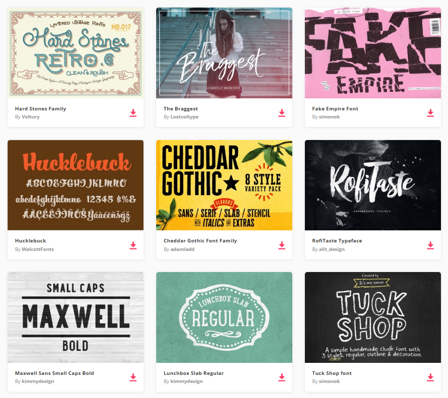
By joining Envato Elements you gain access to plenty of Fonts, as well as many other useful design elements. All of this is available for a single monthly subscription to Envato Elements. Join today, and gain access to a massive and growing library of 24,500+ creative assets with unlimited downloads.
Copywriting Tips and Creative Headline Examples
Choosing a headline can be a difficult task. Choosing the one that will make your visitors come back even harder.
That’s why we have prepared these tips and examples. Want to get inspired and learn more about choosing a headline, read on!
Tips:
- Choose a headline that summarizes what your website is about. Keep in mind it should incorporate your brand or at least be harmonious to what your brand is about.
- A tagline is your slogan and should speak directly to your audience and customer base. It’s not meant to be changed as frequently as a headline and is meant to be repeated over and over throughout advertising, websites, and even corporate stationary.
- Pick a headline and tagline that are catchy and interesting and will compel your visitors to keep reading.
- Keep the headline short – no more than eight words. Most visitors will scan the first few words before deciding to move on. If your headline/tagline combination is short but summarizes your content, visitors will be more likely to read on.

Some Memorable Taglines
Some instantly recognizable taglines include:
- Apple: Think different.
- Dunkin Donuts: America runs on Dunkin.
- General Electric: We bring good things to life.
- Nike: Just do it.
- Subway: Eat Fresh.
- Wheaties: The breakfast of champions.
If your brand is very well-known, sometimes the tagline can function as a headline as well.
Examples
In the following examples inspect how copy is used to convey a memorable brand experience. Through the use of type, color, and composition, the designers have given visitors a glimpse of their brand and accompanying services
Hopefully, through this careful emphasis on compelling copy the visitors stuck around. Do you feel these websites cut through the clutter?
1. Dropr
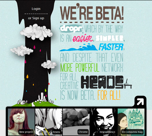
Hand drawn type is used effectively on the Dropr website – something not usually seen on a technology-based service.
2. Ryan & Sofia
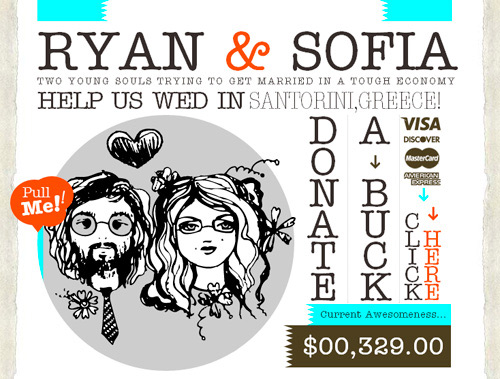
This couple manages to use a compelling typewriter font in their pursuit to collect donations for their wedding held in Greece.
3. Just Dot
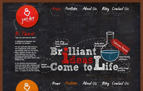
Typography is given real-life characteristics on a chalkboard, further exemplifying the concept behind the Just Dot brand.
4. DBA Products
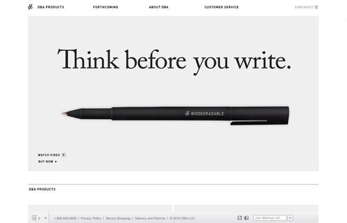
A play on words is used in this website for a company that sells pens – allowing the customer to consider just what they’re purchasing before they make the decision.
5. Comwerks Interactive
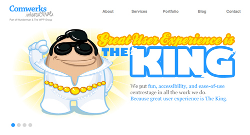
A fun illustration and accompanying headline relay to the visitor a compelling experience from this design studio.
6. Denise Chandler
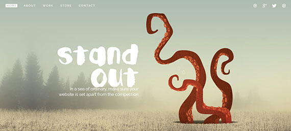
Larger than life typography is intertwined with sea life to give the visitor an image of what this designer is capable of.
7. Iceberg Quest
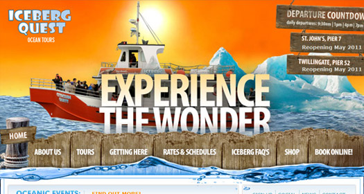
Bold typography is interplayed by an illustrative background, alluding to what’s in store for the potential tourist.

8. Solid Giant
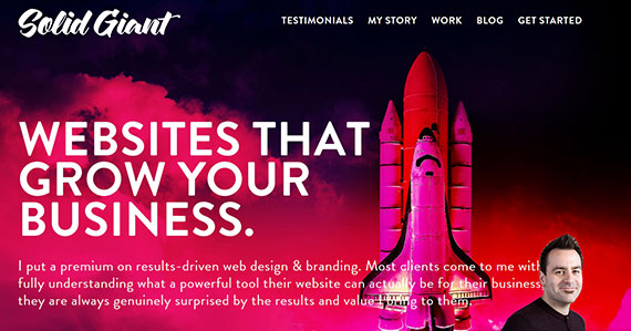
Bold, clean typography gives the user a glimpse of what this design studio has to offer.
9. Kunalchhajer
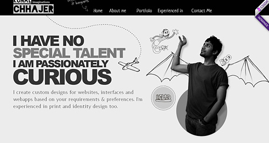
Through the use of both the designers illustration/self-portrait and headline, the visitor is given some genuine insight into the creator’s personality.
10. Sprout Fund
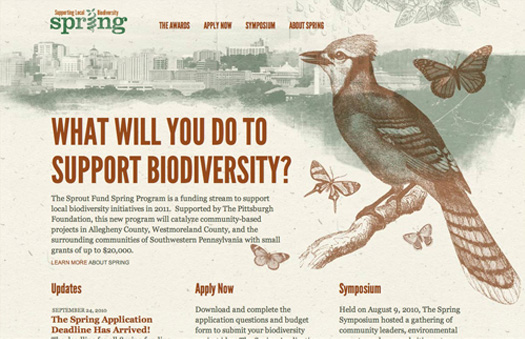
A botanical illustration is set off nicely by clean, sans-serif typography which encourages the visitor to support biodiversity.
11. Pointy Design
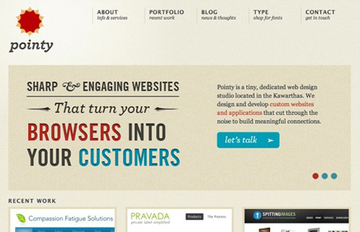
Simple, straightforward typography engages the viewer on this website for web design studio located in Kawarthas.
12. Hey Indy
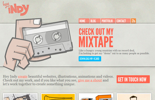
Typography is used to encourage the visitor to enact and download this animators reel. Unfortunately the site is not available live, but you can see the concept up close on Behance.
13. Tea Round
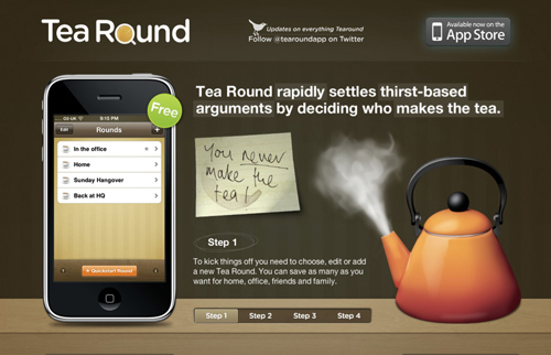
A catchy one-liner is used here to give you a glimpse inside the Tea Round brand and their iPhone app.
14. Jeroen Homan
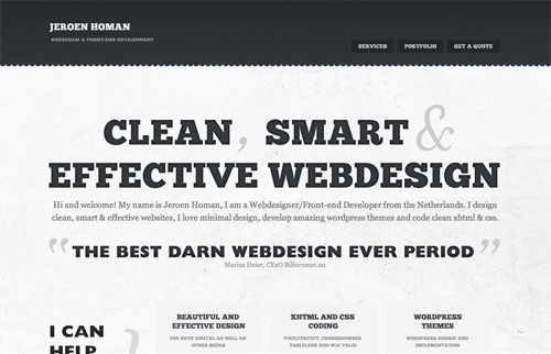
Bold, slab type catches the viewer’s attention on this website for a web designer/front-end developer.
15. Carsonified
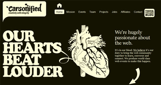
The headline used on the Carsonified website gives you a glimpse into the companies values and practices.
16. Jar Design
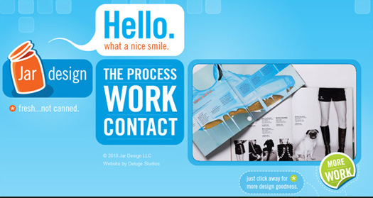
A fun, straightforward speech-bubble catches your attention and provokes you to what to understand more about this design studio.
17.Ben Darby
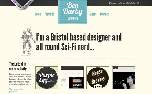
The headline for the U.K. based designer Ben Darby uses simple text to note his location and hobbies.
18.Ryan Keiser
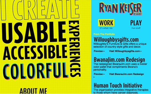
The website for Ryan Keiser emphasizes his services through the use of bold, large-scale typography.
19. Don’t Let Yourself
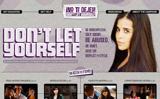
Stylized type is used to reach the demographic this website is aimed towards in hopes they’ll respond to this serious message and educate themselves.
20. J Dawgs
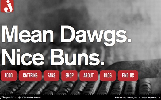
A play on words for this hot dog shop alludes to the tasty food it offers.
21. Farrkling
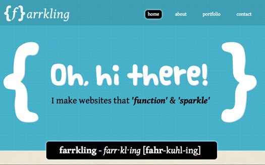
Bold, comic type is used to catch the visitor’s attention and explain the significance of their brand.
22. Webeffectual
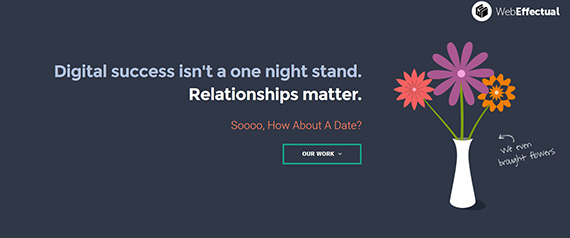
Through the use of bold sans-serif and script typography, we get the impression right away what this web designer specializes in.
23. Creative Payne
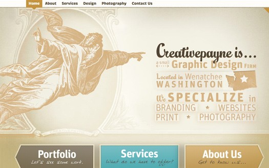
Creative Payne uses a mixture of typographic styles to tell visitors who they are, where they’re from, and what services they offer.
24. Vince Angeloni
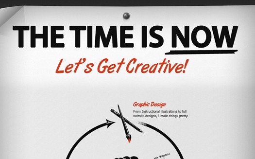
The website for this designer, Vince Angeloni, uses a call-out treatment similar to a flyer to encourage the visitor to pursue his services.
The use of clever and effective design is necessary in setting your brand apart from the rest. Through the use of clear and powerful copy, these websites are meant to catch your attention and captivate an audience. What are some unique visual or written tactics you use to make your website stand out? Share your opinions below!
As a bonus, we also found this cool copywriting tips for beginners video, that will help you even more with headline creation!!
Good luck – what was the one tip, lesson you took away from this guide?
This post may contain affiliate links. See our disclosure about affiliate links here.


