But FAQ’s are a different type of content. Just like search and a sitemap, it has its own particularities and things that you can do to improve user experience.
You have to keep in mind, for instance, that users don’t go to Frequently Asked Questions pages, you have to lead them there.
Your Designer Toolbox
Unlimited Downloads: 500,000+ Web Templates, Icon Sets, Themes & Design Assets
Table of Contents
- 1 Your Designer ToolboxUnlimited Downloads: 500,000+ Web Templates, Icon Sets, Themes & Design Assets
- 2 Check Points of FAQ Page Design
- 3 Implementation tips
- 4 Design Inspiring Examples
- 5 How to Create a Better FAQ Page For End Users
- 6 Tutorial Requirements
- 7 Step 1 – Structuring our Html
- 8 Step 2 – Creating our layout and typography with Css
- 9 Step 4 – Creating a static sidebar with Jquery
- 10 Step 5 – Making a smooth page scrolling effect

DOWNLOAD NOW![]()
Here we’ll see a couple of thoughts about it, good practices, inspiration and tools.
So, let’s rock!
Quick Jump:
- Check Points of FAQ Page Design
- Implementation Tips
- Design Inspiring Examples
- How to Create a Better FAQ Page
Check Points of FAQ Page Design
1. Keywords
Ok, first thing you need to keep in mind: Users don’t read on the web. They scan the page trying to find main keywords about something that may be important to them (just like 90% of you are doing right now). So use good headlines and questions keywords, avoid clichés and keep them short.
If you can, outline main keywords, like searched terms, or main topics.
2. FAQ or WAQ?
For a long time FAQs have been misused, instead of real and relevant content, companies put questions they “wished” users would ask (WAQ, Wished to be Asked Questions).
It’s very important to put users needs first, just cover topics that are really important to them. Otherwise it’ll be just another page trying to hide the solution from them. Which, by the way, won’t solve the problem at all, leading to future problems, like unnecessary support requests, or lost sales.
3. People don’t go to Frequently Asked Questions pages
People don’t go looking for FAQs. It’s not a common workflow thinking “Hey, I need to know about their refund policy.. Let’s go to FAQ”. Sounds strange, huh?
So you have to interlink it wisely in places where users may need help. Like using them along with search pages. Or using them as a “wall” before chat with real attendants: Ask the user what kind of problem they have, then suggest a few FAQ searched items based on the users keywords.
4. Sometimes you don’t need to lead them to FAQ, just use tooltips instead
FAQ are great to provide complete answers, but if you just want to tell users how features work, or which type of data they should put in a registration form just go with tooltips or something like that.
Oh, and don’t forget to make it easy and mobile friendly, or in other words, don’t use just a simple hovering element or title attribute. You may use a plugin or add it as a plain text right above your field or button.
5. Do you really need an FAQ?
I know I’m saying that it’s important, but it has its place in websites. It’s a good idea for sales websites, services, apps… But if you have a simple blog or simple company website, just create an “about” page and you’ll be fine.
6. SEO
Have you ever thought about it? If you have a single page with good keyword density about your product and link it in several places inside your website, it can be a really good landing page.
So, think carefully about it, it may lead a lot of users to your website.
7. KISS
Again, Keep It Simple, Stupid my friend .You don’t need to clarify every single question that may pop up about your product. You may categorize questions (if you have a huge amount of them), show content just when users need it.
Just keep in mind that landing page idea, you have to talk about the most main topics and solve users problems fast, if not they will just leave website.
Implementation tips
jQuery / Javascript enhancements
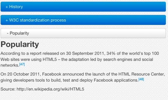
Like I said above, you may hide content by default and just show it when a user wants/requires it. You can use, for instance, jQuey Collapsible panels plugin and create dynamically collapsible panels. You can also use jQuery accordion plugins.
Another good thing to do, is add a “Table of contents” with smooth scrolling, so users can reach what they want easily and with a pretty cool effect.
Scrolling like a boss
You may use smooth scrolling scripts or something like LocalScroll so you’ll get a better organized and easier to use FAQ pages.
How about reading a tutorial on it?
Well, Matthew Corner wrote a tutorial with smooth scrolling, table of contents and good looking, and you can just download and edit it to better fit your needs.
Doing the right markup
Although many people use simple headings (h2,h3) for questions and paragraphs for answers, I think that it’s much more semantically correct using definition lists for them. So you may use definition title(s) and definition description(s) to wrap them up accordingly.
Another option, really good one actually, is to use the &<details&> HTML5 element, which gives you those good looking collapsible panels by default (with browsers that support it, of course).
Design Inspiring Examples
Search + FAQ
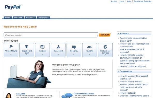
Paypal uses a really good system where users can see their FAQ or search by keywords, as well.
FAQ preventing unnecessary support
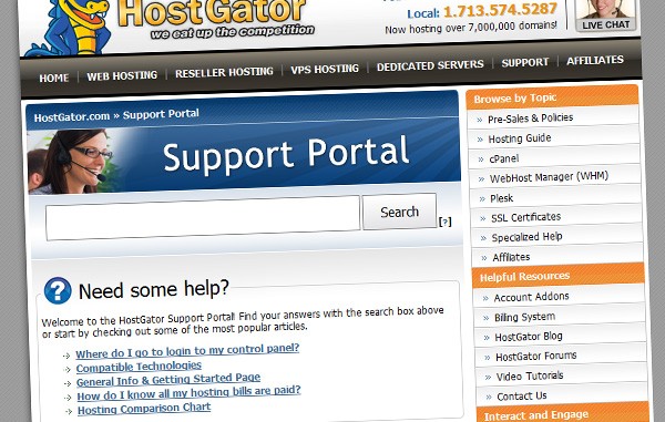
It pretty common to have users asking you really dumb questions. Don’t get me wrong, but sometimes they could easily find the answer themselves, if we gave them a chance.
Doing the easy way
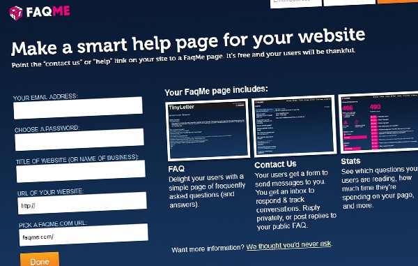
Did you know that we have a tool for FAQ development? Pretty cool, huh? It’s called FAQme, and worth trying!
FAQ, the Social Way
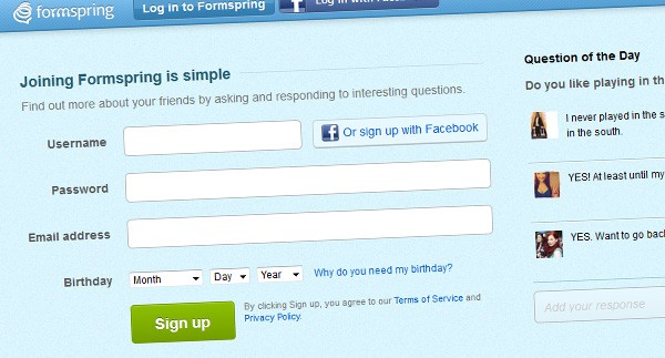
If you’re more of a social company, why not use a tool that integrates questions and people? Well, I’ve seen a couple of (young) companies using FormSpring as a simple way to answer real questions and let them be easily accessed by other clients
Now let’s take some of that knowledge to action in the tutorial below.
How to Create a Better FAQ Page For End Users
FAQ (Frequently Asked Question) pages have become commonplace on many websites for many reasons. The main, is that they offer a way to provide support, most commonly, customer support, without having to re-iterate solutions to common problems.
For larger companies, a good FAQ page can even have an effect on the amount of support staff that are needed to be hired, yet browsing the internet, I continually find FAQ pages to be neglected, and a navigational nightmare. Similarly, Google for some articles on FAQ page design, and you’ll find near to nothing that’s helpful.
While designing a recent project in Photoshop (a software sales theme), I decided the support area was something I wanted to get right, with the focus falling heavily on the FAQ page. I wanted to get a feel for how I wanted it to work, and so I got thinking; What is it that the end-user wants when they arrive. I came up with these thoughts,
- Ease of reading – the hierarchy of the text needs to be distinct
- Organization – questions should be split into categories
- Navigation – finding their way to the information they want should be made easy, and quick
With these three points in mind, I came up with a tidy, and importantly clean FAQ page concept, the demo of which can be found below. I’m going to talk you through how it was made, and teach you how to build it yourself.
Click this link for a demo of the FAQ page we are going to make. You can also download the source code here.
Tutorial Requirements
This tutorial assumes you are fairly comfortable using the following languages
- Html
- Css
- jQuery
Step 1 – Structuring our Html
Our html is split into two main sections. Within our wrapper, we have a primary column, and a sidebar column.
<div id="wrapper"> <div id="primary></div> <!-- Main content column --> <div id="sidebar"></div> <!-- Sidebar Column -->
</div>
The primary content column is where we are going to split our questions into simple categories. Each category will have a title, a list of the questions with links, and then the questions split up using a definition list. The markup we are looking for goes like this. (This shows a category with two columns)
<h3 id="1">Lacus pulvinar <ul class="section_menu"> <li><a href="#1_1">Lectus massa adipiscing, mattis. Turpis integer massa.</a></li> <li><a href="#1_2">Integer enim montes mauris, arcu est.</a></li> <!--<span class="hiddenSpellError" pre=""-->ul> <dl class="faq"> <dt id="1_1">Lectus massa adipiscing, mattis. Turpis integer massa.</dt> <dd>Ultricies in mus, magna rhoncus augue, nec magnis facilisis integer ut pellentesque aliquam sit! Enim odio, porta augue, sed turpis dolor ultrices porttitor arcu massa cum elementum hac in vel, magna magnis, enim scelerisque? Amet aliquam, magna dis porta platea. Cras aliquet. Arcu mid eros aenean parturient cras ac egestas tempor? Lundium parturient dapibus, ridiculus ridiculus dapibus! Quis eros amet.</dd> <dt id="1_2">Integer enim montes mauris, arcu est.</dt> <dd>Et ridiculus vut dis vel integer pid? Adipiscing nec tristique dictumst tristique duis rhoncus sed, scelerisque. Porta, diam augue vel augue porta enim. Et! Tristique montes. Auctor! Pid tristique purus montes. Quis? Sit, enim. Egestas! Tristique amet mattis adipiscing, proin elit adipiscing integer! Enim, odio. Etiam ac, nunc est purus turpis. Nunc! Pid cras scelerisque mid habitasse. Cum magnis.</dd> </dl>
It is important that you match up the navigational links for each category of questions with their ID’s. Notice that the first question in this category has an id of “1_1”, and the link the first question has a href of that id. This is important in solving our navigational problems for the user. Similarly, notice that the category title has a numerical id, to show that this is the first category. These id’s need not be numerical, they can be whatever you want, as long as they are unique to the category / question.
Moving onto the sidebar, this is where navigating the bigger picture comes into place. We’ve linked up out category questions, but how to users navigate to the categories themselves? Through the sidebar is how.
Within the sidebar, we are going to include a header, and another navigational menu linking to our categories. You can build upon, this of course, and add whatever you want to your sidebar, possibly a quick contact form, or support contact details.
<div id="sidebar"> <h3>Select Category</h3> <ul class="section_menu"> <li><a href="#1">Lectus facilisis vel</a></li> <li><a href="#2">Vut magna</a></li> <li><a href="#3">Lacus pulvinar</a></li> </ul> </div>
Step 2 – Creating our layout and typography with Css
First off, we want our FAQ page to look universal in all browsers, so as always we will apply a css reset. We also want the FAQ page to be easily readable, and look stunning yet simple. For this I’ve used a modified version of the text.css that comes with 960.gs, instead using Myriad Pro, and Helvetica as our fonts. Since this section of css is large, and very basic, you can copy and paste it from here.
Starting off with our basic styles, we are going to create our layout columns, and center our page in the middle of our window.
/** Center our page in the middle of the window **/
div#wrapper{ width:960px; margin: 0 auto; position:relative; /** Important later on **/
} /** Give our primary column a width and float it to the left width a right margin **/
div#primary{ width:720px; margin: 20px 40px 0 0; float:left; display:inline;
} /** Position our sidebar to the right of the primary content bar **/
#sidebar { left:760px; position: absolute;
}
You’ll notice that we have absolutely positioned our sidebar rather than float it to the left of our primary content column. This is important for something special we are going to do with our sidebar later on.
Now it’s time to start adding some subtle styling to our page content to bring it up to standard and make viewing it extra eye pleasing. We’ll start off with two basic styles on our h3 and a tags.
/** Give our category headers room to breath **/
h3{ padding-top:30px;
} /** Color our links blue **/
a{ color:#0986e3; text-decoration:none;
} /** Add a hover effect to links **/
a:hover{ text-decoration:underline;
}
You’ll have noticed some of the class names I dropped into the html when we created it. These include section_menu and faq. They’re used to style our navigational menus (sidebar included), and our questions themselves.
/** Styling the navigational menus by adding a subtle background, and padding **/
ul.section_menu{ background:#ededed; padding:20px 10px;
} /** Style our faq questions **/
dl.faq{ margin-bottom:30px;
} /** Make the question itself stand out **/
dl.faq dt{ font-weight:bold; color:#000000; padding:25px 0 5px 0; display:block;
} /** Add a divisor below the question answer **/
dl.faq dd{ padding-bottom:25px; border-bottom:1px solid #cccccc; display:block;
}
Now we are going to start using Jquery to improve the usability of our page. Currently it looks nice, and works well for a page without any javascript, but we can make it so much better! Start by including jquery in the had of your page. We are going to load it directly from google.
<script><!--mce:0--></script>
Secondly we are going to add slightly the html of our sidebar. Add another div wrapping all the content of your sidebar. In our case, I’m going to give it an id of “sidebar_content”.
<div id="sidebar"> <div id="sidebar_content"> <!-- Sidebar content in here --> </div> </div>
We also need a bit extra css, and css for our sidebar for when it becomes fixed.
/** Position our sidebar content at the top of our sidebar, and give it the width of the full sidebar **/
#sidebar_content { position: absolute; top: 0; margin-top: 20px; width:200px;
} /** When the sidebar becomes fixed, it'll fix to the top of the page **/
#sidebar_content.fixed { position: fixed; top: 0;
}
You may not understand the fixed class yet, but the following Jquery will help clear that up for you. Create a script tag in the head of your document, below, the Jquery we are loading from Google, and insert this code.
$(document).ready(function () { var sidebar = $('#sidebar_content'); var top = sidebar.offset().top - parseFloat(sidebar.css('marginTop')); $(window).scroll(function (event) { var ypos = $(this).scrollTop(); if (ypos >= top) { sidebar.addClass('fixed'); } else { sidebar.removeClass('fixed'); } });
});
This may look daunting if you’ve never touched Jquery before, but don’t worry, we’ll step through it line by line. We start off with the Jquery basic of when the document is ready, run this code. The create two variables.
var sidebar = $('#sidebar_content'); var top = sidebar.offset().top - parseFloat(sidebar.css('marginTop'));
Our first variable, “sidebar”, assigns the variable sidebar, with the selector pointing to our inner sidebar div. We called it “sidebar_inner”, but you may have called it something different.
Our second variable, top, calculates the distance of the sidebar from the top the top of the page, minus any top margin that we have applied.
$(window).scroll(function (event) { var ypos = $(this).scrollTop(); if (ypos >= top) { sidebar.addClass('fixed'); } else { sidebar.removeClass('fixed'); }
});
This snippet of code starts off by saying, if the window is scrolled, carry out this code. I starts again by creating another variable by calculating how far from the top of the page we are, and assigning it to the variable “ypos” (position on the y-axis).
We then enter an if statement, that says: If the distance to scroll to the top is greater than the distance that the sidebar is from the top, give it to class of fixed. If not, don’t give it the class of fixed. This is where the fixed class we created earlier on comes into play. Easy huh? =)
Step 5 – Making a smooth page scrolling effect
So we have a lovely fixed sidebar as we scroll, without the traditional glitchy jumping that used to be commonplace with fixed sidebars, but out internal page linking still jumps directly to the destination, and while this is good, it isn’t very eye pleasing, so we are going to add an animated page scroll. Since the jquery to achieve this is too complex for us to hand write, we are going to use a plugin called localScroll, and another called ScrollTo for our animation. Download them both from here, and include them in the head of your document again, this time between our Google hosted Jquery, and our custom written Jquery.
<script src="jquery.scrollTo-1.4.2-min.js"></script>
<script src="jquery.localscroll-1.2.7-min.js"></script>
The implementation of this is stunningly easy. Simply add to our custom Jquery this one line of code.
$.localScroll();
Note : Make sure you place this line of code within the jquery wrapper,
$(document).ready(function () { // Somewhere in here!
});
And there you have it! A fantastically usable, and simply beautiful FAQ page that means the user can easily navigate between categories and questions, without having to spend ages scrolling through search pages, and loading page after page for different categories, or even clicking to open a single question.
This post may contain affiliate links. See our disclosure about affiliate links here.


