The 1980s brought us the likes of He-Man, Punky Brewster and John Hughes movies. All of these pop culture icons ingrained ideas of video games, crazy hair and neon spandex into the minds of fans. The internet was technically created in the 80s as well, but we never saw the World Wide Web (like we know it today) until the mid 90s. That said, the 80s designs are too hard to resist, so it’s no wonder we’re seeing these types of bold fonts, extreme colors and pre-internet computer writing in some designs today.
Many of the 1980s inspired designs we’ve discovered have an incredible amount of creativity involved with them, showing just how powerful the style can be. Not only that, 80s inspired designs show passion for a period of time that many people fell in love with.
Keep on reading to see some of our favorite 1980s inspired designs.
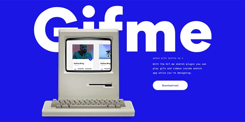
The Gifme website features a plugin that lets you embed videos and GIFs inside the Sketch app when creating designs. As you can see, the website itself has a rather 1980s inspired design, with the extremely large fonts, high-contrast colors and the classic blue you might have seen on a standard computer back then. The retro computer font pairs well with the overall design, while the computer graphic needs no explanation.
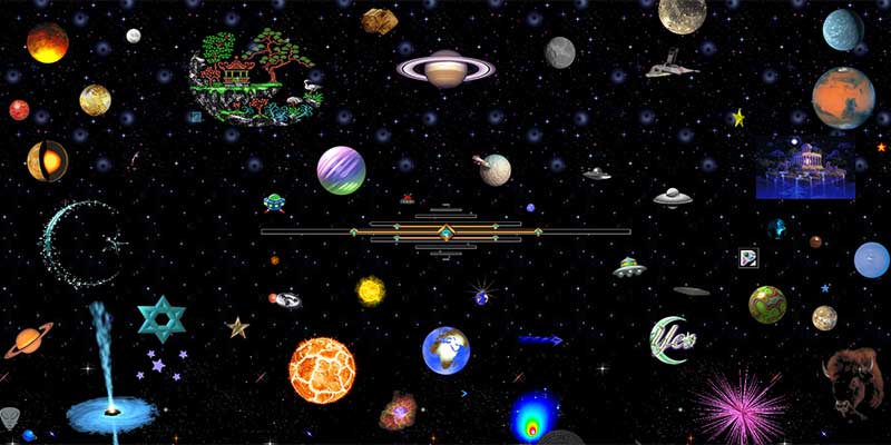
The homepage of the Cameron’s World page features a video game layout, with spinning aircraft, alien ships and moving planets. The colors and icons reflect what you might have seen on a 1980s video game screen. As for the functionality of Cameron’s World, it compiles a complete web collage with images and text from the archives of old GeoCities pages. You can’t get more retro than that.
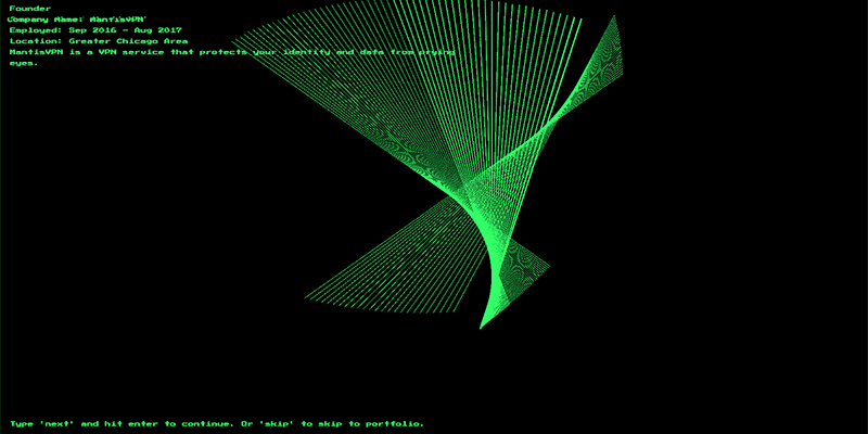
The Brandon Barber website is a personal resume, but the guy takes it a step further by including a 1980s-styled interactive computer interface. So, the website visitor is sent through a chain of commands that must be typed in on the keyboard, each of which opens a new page on the resume.
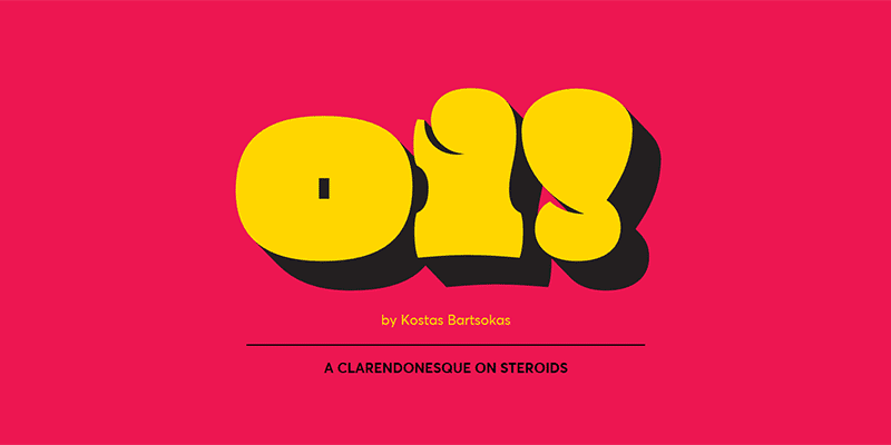
Oi is a type of font created by Kostas Bartsokas and meant to highly exaggerate the clarendonesque font. Overall, it’s bawdy and somewhat obnoxious, but that’s in line with what you would have seen during the 1980s anyway, right?
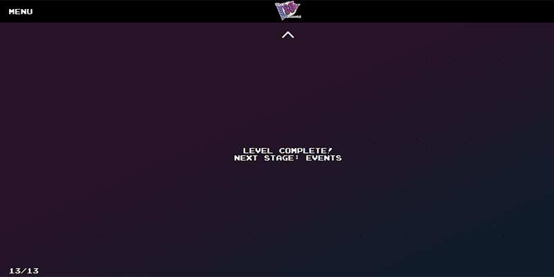
The Fifty-Two 80’s website is an online store filled with all sorts of collectables, toys and memorabilia. The great part is that the store is actually a mini-video game, where you click on the Start button and complete stages to move onto things like the Events page or the entire online store. It’s a little slow and tedious, but that’s how video games were in the 80s.
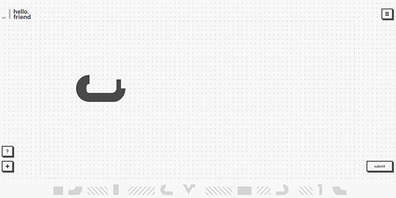
This Friendly Projects game/design experience offers up an area for designers to improve on their framework styles while also competing with others. In short, it allows you to program a fragment and place it into the matrix.
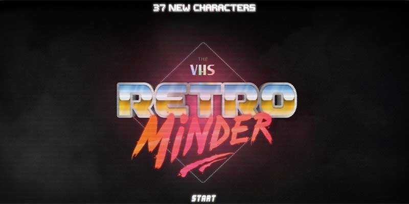
RetroMinder is one of our favorite 1980s inspired designs, since it has the music, logo and overall vibe you expect from a 80s arcade game. The website is actually a 80s trivia program, where you need to type in the answer exactly right (similar to old computers) or you can’t move on. Most of the game is pretty easy, but it can get fairly intense with the jumpy music and flashing graphics.
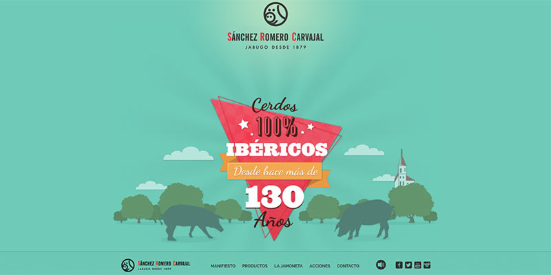
The Sánchez Romero Carvajal site features a classic old road sign you might have seen for a diner or hotel in the American 80s. It definitely includes some modern elements, but the colors, bold fonts and hard lines make you feel like you’re driving down a highway. The website is actually for Spanish Ham products, but it still has that taste of the 80s.
This post may contain affiliate links. See our disclosure about affiliate links here.

