What’s more important than your about page? Letting your site’s visitors know who you are encourages them to trust you and learn more about your brand! You can talk about yourself, why you started your website and what your goals are – all in a stylish way. It’s an extra personal touch that many people will appreciate.
Need some inspiration? Here are a few about pages that will blow you away!
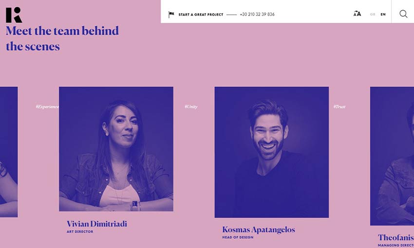
Kommigraphics’ about page contains a fun team portrait scroller. Hovering an image stops the scroll effect and allows you to get more info on that employee. The strong palette is inverted as you scroll down, offering a visually interesting but consistent effect.
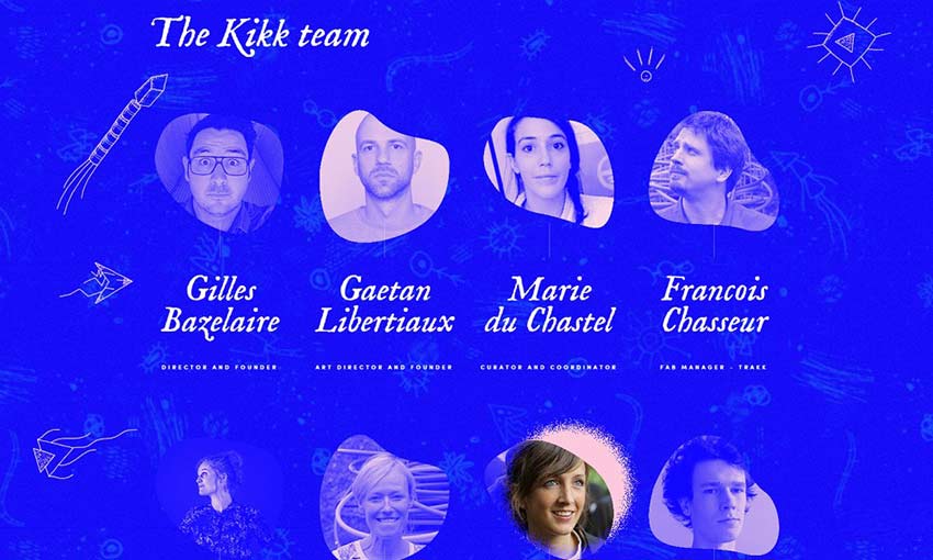
This is a fun website to browse, and the about page is no exception. Use your mouse to hover over the various objects and reveal cute animations and colors! Even the buttons and clickable text lights up. Hover over the team’s faces to see their photos in full color and trigger an animation!
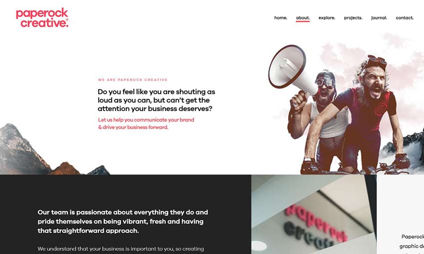
Animations everywhere! This about page is a longer-than-average read. But it breaks up the text with clearly labelled sections and parallax animations at every turn. You’ll want to scroll down and see what happens next. The black, white and red color palette looks great, too!

Woodwork’s about page opens with a short blurb about the business and a shot of the working space. Scroll down and you’ll be greeted with an awesome animation that makes it look like each person is rotating! Everyone here shows off their character and there’s no way you can’t trust them with your next design project!
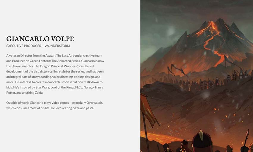
It’s always great to learn more not just about the people behind a project, but a little bit about what they do and where they find inspiration! It’s great to get some behind-the-scenes in an about page and this website delivers.
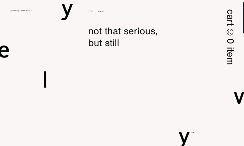
Yelvy’s about page gets straight to the point; a bold mission statement in large text and some quick info on the company’s origins. From there, you can get right back to shopping. This brand is about self-expression and application, and that’s all there is to say about it.

This website puts animations and effects to good use. The about page, though beautiful, is short, sweet and to the point. They state who they are, what they do and why they do it well. All on classical light text that occasionally takes on a dynamic pastel sheen.
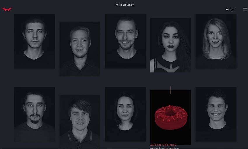
It’s always a good idea to open with a glimpse into your workplace. And Red Collar nails the short blurb about itself, describing both what the business is and its philosophy in a few elegant words. The black and white team photos fit the site’s darker design. Hovering their faces reveals a quick animation showing various objects!
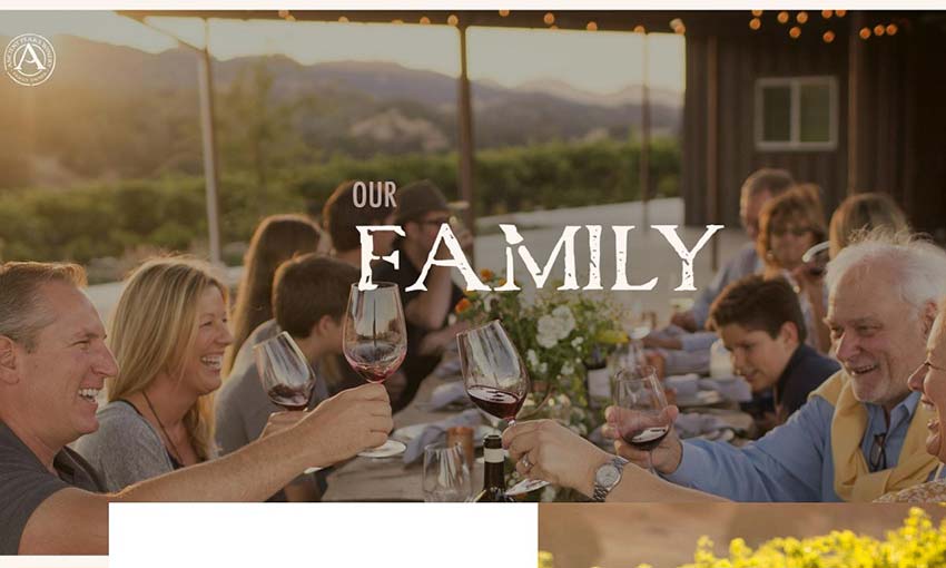
Rather than being a simple about page for a business statement and a few photos of employees, this page is all about family. You can get a lot of info on the company’s founders as well as the winery team workers. This is interspersed with photos and videos of the family at parties, fishing or toasting with wine. It gives you a more personal glimpse into the lives of the people behind the business.
Create a Personalized About Page
It’s no good being a faceless business. People want to connect, to feel like there’s a real person behind the screen. It makes you seem more trustworthy and genuine, and allows you to clearly state your message and goals. So, design an about page you’re proud of and show off yourself and your colleagues to the world! Hopefully these great examples offered some inspiration and guidance for your own about page.
This post may contain affiliate links. See our disclosure about affiliate links here.

