If you’re looking for a great way to show off your skills, have you considered a one-page portfolio? They’re concise and to the point, which is good for potential employers who may be short on time.
And in a smaller sandbox, you have more reign to creatively show off your design expertise. One-page portfolios tend to have some of the most interesting and well-made layouts in web design. With a single page, you can make your site less like a static webpage and more like an experience sure to thrill anyone who comes across it.
Looking to create your own one-page portfolio? Here’s a bit of inspiration from some of the best designers and developers online!
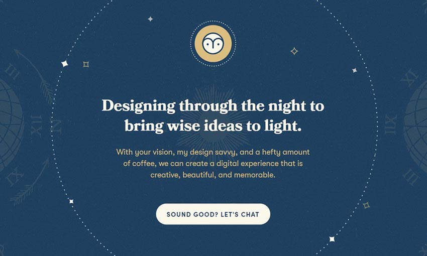
With a charming duotone palette and beautiful starry space theme, this is one fantastic example of a one-page site. There’s plenty of links to case studies, past projects, and the designer’s social media accounts. Frequent use of a call to action leading to the contact form means that clients won’t ever have to scroll far to send a message.
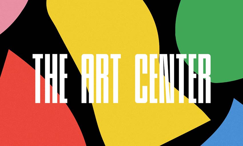
This portfolio wastes no time at all in diving into the project showcase. As you scroll, you’ll get to see various pages, logos, and parts of the UI that were designed for each website or app. If you’ve seen enough, just use the menu to snap to the bottom, or click the hovering email button that’s always on the left.
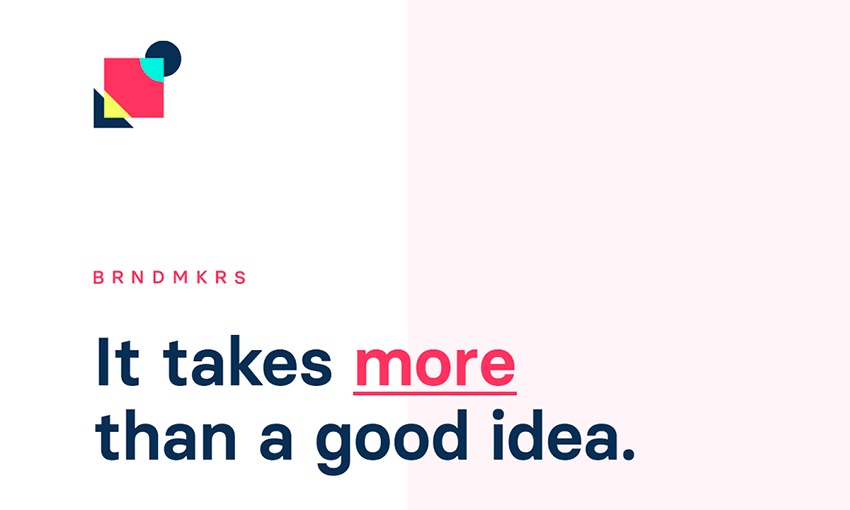
Big ideas need a big website, and this full width page features huge typography, large videos, and full screen images. There are even a few interactive elements, like a service checklist that lets you see an estimated cost for what you want.
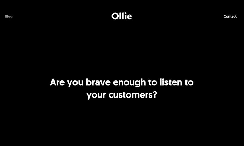
Bold and dark design are what this portfolio is all about. The black background makes the more colorful images pop, and the custom cursor is a nice touch. This one is a good example of an image-focused portfolio without too much text.
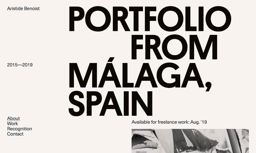
Gigantic text is certainly one way to grab attention. Once you’re interested and start scrolling down, you’re immediately introduced to the developer and his work. Hover the image and you’ll get a taste of this dev’s experience in interactive design.
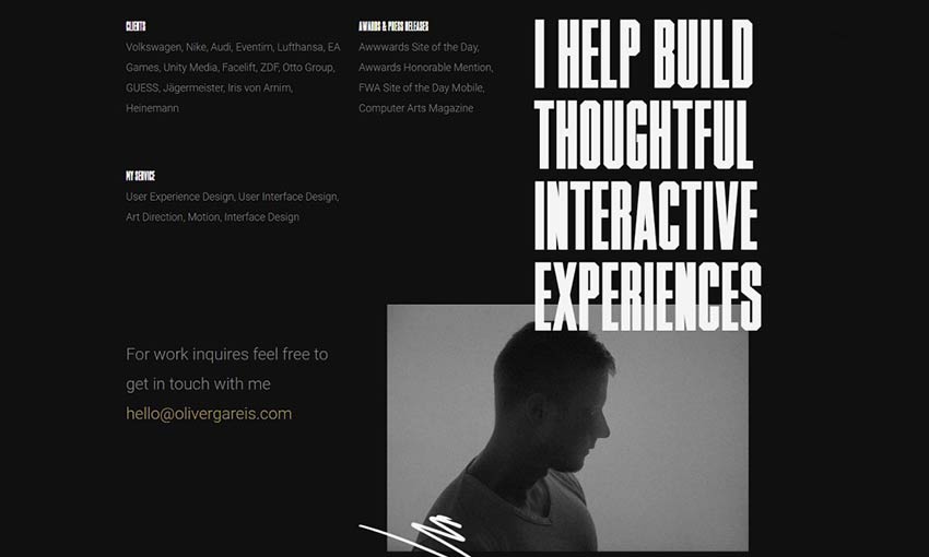
Oliver Gareis’ portfolio opens with a brief about and awards section before getting right into the portfolio. Each project includes a brief description of what the designer was going for, showing off his expertise. There’s quite a bit of content, but you can use the sticky header to scroll right to the contact info at any time.

One of the best parts of this portfolio is the bright white design, accentuated by a single splash of color that strategically highlights certain areas. The red draws attention to banners, links, and contact info against the white and gray background. Meanwhile, the portfolio section uses animations to the same effect.
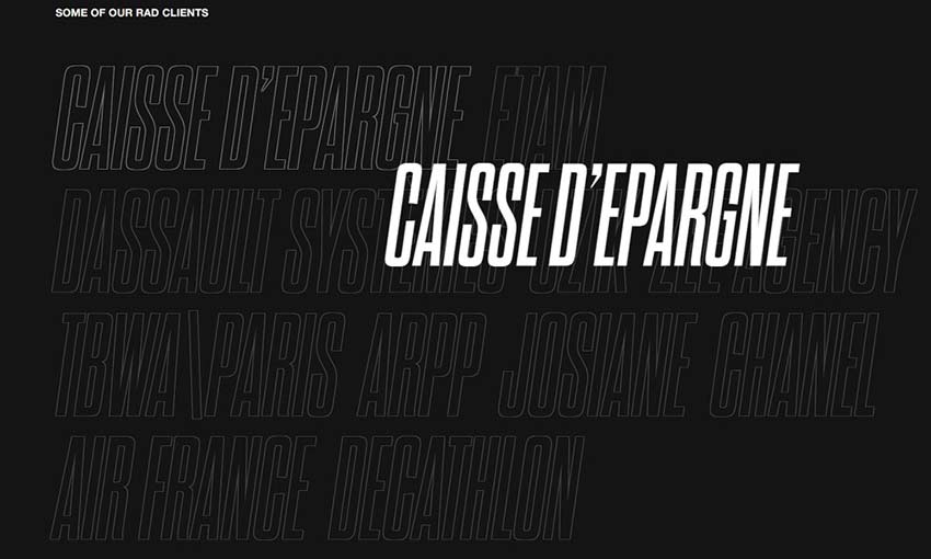
The moment you enter this site, you’re plunged into a page of striking animations that are impossible to ignore. Text flies dramatically to your cursor, loading screens shake, and project videos play in the background. Unlikely makes a bold statement from the very beginning.
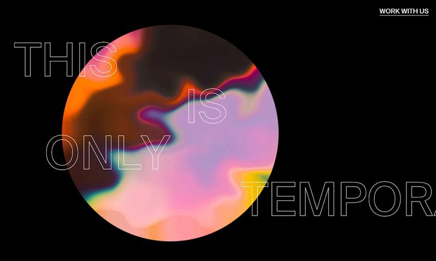
On sites like this, it’s easy to forget you’re on a webpage. Animations play and hovering images ripple and distort as you scroll. It’s more like exploring an art gallery than visiting a website.
Amazing One-Page Designs
A one-page website is a bit like a business card. You need to explain who you are, what you do, and why an employer should choose you, all in a small amount of space.
It takes a lot of skill and design expertise to build something that gets the point across while leaving room for inspiring design, but these people pulled it off perfectly. Now it’s your turn to create your own inspiring one-page portfolio.
This post may contain affiliate links. See our disclosure about affiliate links here.

