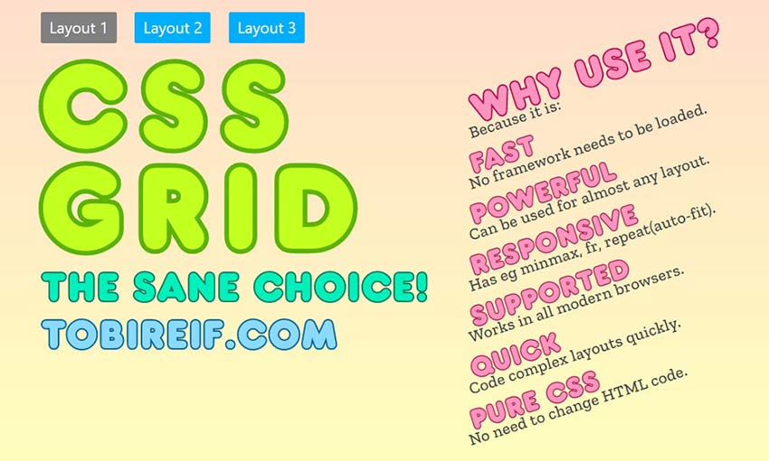
CSS Grid is one of the most powerful tools available to developers. The simple module allows you to create entire website layouts, responsive galleries, and other cool effects. With enough creativity, you can do a lot of interesting things using CSS grid.
Unlike flexboxes which can only work with a row or a column, CSS grids work in a fully 2D space, allowing you to divide a page into regions of columns and rows. This sounds simple, but it’s a huge deal since you can create web pages, tables, galleries, or other creative modules and layouts.
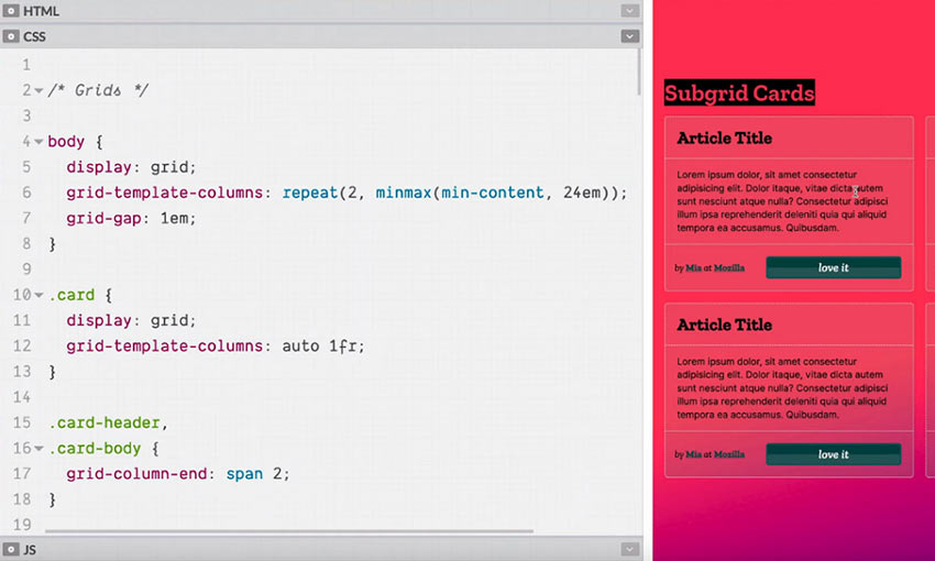
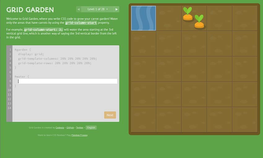
Developers have done a lot of cool experiments with CSS grids. Here are a few of the most fascinating CSS grid layouts and tutorials across the web.
Your Web Designer Toolbox
Unlimited Downloads: 500,000+ Web Templates, Icon Sets, Themes & Design Assets
Starting at only $16.50/month!

DOWNLOAD NOW
See the Pen CSS Grid Template Builder by Anthony Dugois (@anthonydugois)
on CodePen.
See the Pen CSS Grid: Restaurant Website by Olivia Ng (@oliviale)
on CodePen.
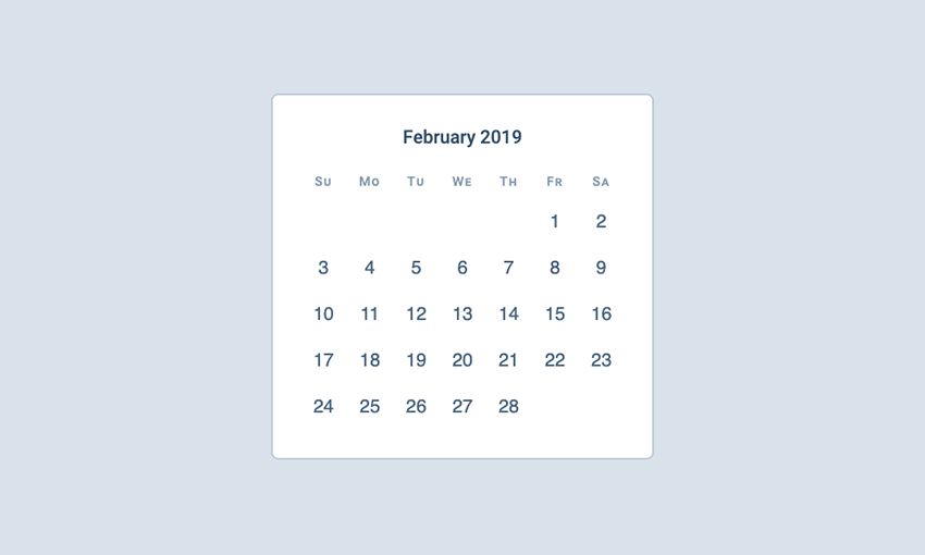
See the Pen CSS grid calendar by Mert Cukuren (@knyttneve)
on CodePen.
See the Pen Isometric eCommerce CSS Grid by Andy Barefoot (@andybarefoot)
on CodePen.
See the Pen CSS Grid Layout with @support flexbox fallback by Gustaf Holm (@primalivet)
on CodePen.
See the Pen Apple Keyboard by Jon Kantner (@jkantner)
on CodePen.
See the Pen CSS Grid: Train Ticket by Olivia Ng (@oliviale)
on CodePen.
See the Pen CSS Grid: Periodic Table by Olivia Ng (@oliviale)
on CodePen.
See the Pen CSS Grid: Floor Plan by Olivia Ng (@oliviale)
on CodePen.
See the Pen Geometric business card with CSS Grid by Liz Wendling (@Elwend)
on CodePen.
Experiment with CSS Grid
Not enough designers use CSS grid. The responsive system is relatively new, but there are a lot of both fun and practical things you can do with it. From creating appealing page layouts to designing interesting modules, CSS grid is an untapped goldmine for web design.
Want to try it yourself? Follow these tutorials and learn how to use grids, or fork some of these pens and do some experimenting. See what you can pull off with a little CSS grid magic.
This post may contain affiliate links. See our disclosure about affiliate links here.