Advertisement
Audi is one of the most important and the best automotive brands at the moment and it has been for decades now. It is one of the best designers of top-quality automobiles and the brand has today reached the peak of its existence and is considered as one of the biggest companies in the world.
With the outstanding and attractive exterior design mixed with efficient and top-quality interior and engineering work, it is no wonder that Audi is so important today. And that’s why we all know what the Audi logo looks like.
Audi was a strong company from its very inception in 1910. The company first worked in a conglomerate named Auto Union, but soon Audi started to produce its own cars – the first one was launched in 1910 with the name Audi. Ever since the company has been one of the largest companies in the world. It has had its ups and downs just like every company, but it has always been up there.
Usually, the most fascinating company logos are those logos that tend to capture some meaning behind it, when it has some profound meaning and a story behind it. The Audi logo is exactly that, and that is why it has been so successful at capturing the essence of Audi. You might be surprised at what the logo actually represents and in this article, you will learn the story behind it.
The story of the Audi logo
Table of Contents


Behind the four rings of the Audi logo, there lies an interesting story of companies intertwining and connecting together. It is one of the oldest logos not just in German automotive industry, but in the whole world.
The whole story started in the early 20th century, namely in the 1930s, when four independent car companies joined together into one. This happened in 1932 when Audi, DKW, Horch, and Wanderer joined together into what is known today as Audi AG.
/*div{padding-right:0!important;padding-bottom:10px}.ml-form-formContent.horozintalForm .ml-button-horizontal{width:100%!important}.ml-form-formContent.horozintalForm .ml-button-horizontal.labelsOn{padding-top:0!important}}
/*]]>*/
/**/
![]()
![]()
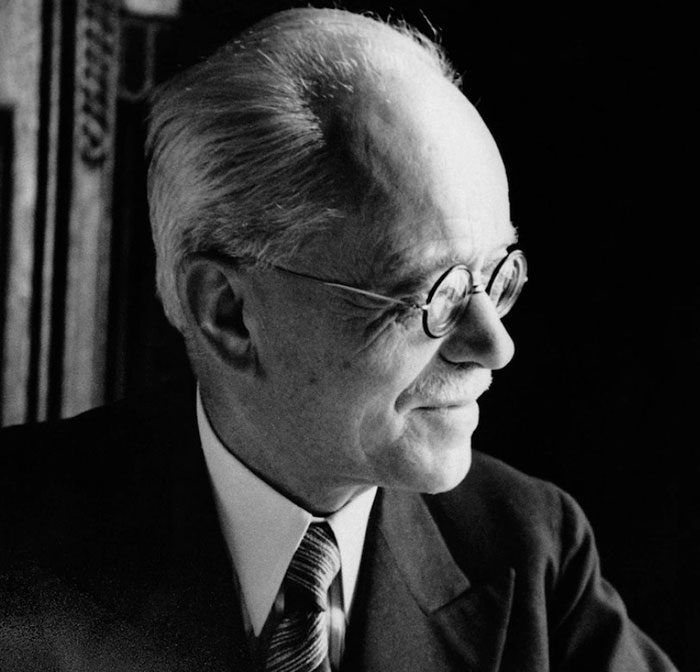

Audi was one of the first automobile companies in Germany, but it was not the first. Audi was established by August Horch in Zwickau. Horch, however, was caught in two companies – Audi AG, and Horch&Cie, which was his own company and it was also the first company in this field in Germany. So in 1910, Horch decided to leave his first company and establish Audi.
In 1932, the Horch&Cie, which was the first company of Horch, Audi, DKW, and Wanderer joined together into Auto Union AG, which later became known as Audi AG, after the acquisition of the Volkswagen group. This is where the Audi logo stems from – it represents the four merger companies that joined together in 1932 to form Audi AG.
The merger
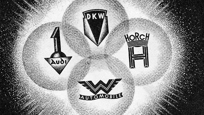

After the companies merged together, each branch of the company was assigned to produce its own class of cars. This way, DKW was assigned to work on small cars and motorcycles, Wanderer was assigned to deal with mid-size cars, Horch would produce top end luxury cars, while Audi’s job was to produce deluxe midsize cars. This is the history of Audi itself.
So different companies were experts in different fields of production – DKW was specialists for producing two-stroke smaller engines that were produced in bulk and became highly popular, while Horch, on the other hand, were experts in producing top-quality cars and design.
DKW was practically assigned for the engineering part of the production, and they developed a great system for front-wheel drive cars. These engines became very popular and were quickly used in stationary vehicles such as fire engines and military vehicles, as well as for road construction engines.


Wanderer, on the other hand, focused on midsize cars and sporty models of the Auto Union conglomerate, and it was very successful as well. The W 51 and W 25 K were two very popular versions of the Wanderer brand and were supercharged and equipped with the Auto Union branding.
Audi, meanwhile, worked on new six-cylinder engines for front-wheel drive cars and were active at it until the Second world war broke out.
The evolution of the Audi logo
The first logo of the Auto Union before 1932 was an upside-down equilateral triangle and there was another logo that featured a gearshift represented with numbers from behind.
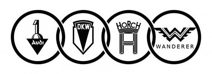

It was not until 1932 that we saw the first glimpse of the current Audi logo. This happened when the four companies merged together and we saw the Audi logo which represented the four companies that joined together. This was the first instance of the Audi symbol as we know it today.
Advertisement
There have been several modifications to the original Audi logo until today, and the last one occurred in 2009.
The first logo was designed with four rings in mind and the four logos of the merger companies – it represents the coalition and cooperation of the four companies, which still stands today.


The logos of the four companies were initially deleted from the insides of the four rings, and it is still so today.
The latest Audi logo was designed in 2009, on the 100th anniversary of the company, when they decided to refresh the logo a bit and make it more modern and in line with the company’s ideals. It is designed so that it represents its moto – VorsprungdurchTechnik, which translates to “Progress through technology”.
This new logo is meant to represent the ideals of the company, but also tries to modernize the logo with a new font for the moto. It appears simple, but it still displays a sort of grandiose appearance that makes Audi a big company – it has presence and it attempts to connect to the customers.
Description of the Audi logo
Shape
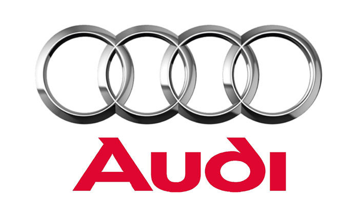

The four rings in the logo are today three-dimensional and appear as more sharply-cut and styled with a chromium look, which gives it a premium feel. The sign represents the merger of 1932 and represents security and safety, while also displaying the qualities of power and succeeds in capturing the size of the whole company.
Color

The new Audi logo uses darker colors and a more aluminium look to it, which gives it a more shiny look overall and displays the size of the company, and also more power and the innovative power that the company has that sets it apart from the rest. It features a modern design with colors that display a slick and bright design that just screams of sophistication and a high class. The spectrum of the colors in the design are very modern and up to date.
Ties to Volkswagen


Not many people may know this fact, but Audi is actually a part of the Volkswagen conglomerate nowadays and is actually the luxury brand of Volkswagen. This is an interesting fact, but Audi has definitely retained its rich history. Before this, Audi was owned by Daimler-Benz, the same company that produces Mercedes Benz.
Nowadays, Audi is known to bring high-quality luxury cars to the market and is one of the most popular brands in the world. This popularity is often represented by the Audi logo, and many people recognize the company solely by the logo, which means that the Audi symbol is one of the best symbols in the world. It is a simple, yet effective logo with plenty of history behind it.
If you enjoyed reading this article about the Audi logo, you should read these as well:


