Although it may sound obsolete, a flyer is still one of the most effective and inexpensive ways to promote a business. They are also very easy to distribute.
So, if you want your flyers to be impactful, you have to make sure you choose the right size, the right font, colors, and message. Depending on your needs, these parameters will change. Let’s see together how you can create the ultimate flyer by choosing the right size and design.
General Tips
Table of Contents
Planning an Effective Flyer
Before we get started, though, we should settle a few things. First, you have to decide what you need the flyer for – is it to promote your business, is it a flyer to announce an event, or just for general awareness? Because your overall design and size will depend greatly on this particular piece of information.
Then, you need to set your budget. Regardless of the reason you need to design a flyer, you have to set your budget, so you can know right from the start what you are dealing with and what options you have available.
Last, but not least, you have to know where and how you are going to distribute these flyers. This is also an important aspect that needs to be taken into consideration if you want to reap the most benefits out of this endeavor.
Writing tips
There are many things you need to know when creating a flyer, especially when it comes to writing. But I’m going to make a short list of tips that is going to give you a good idea about the most important things you need to keep in mind when writing a flyer.
- Brief is always better – whatever you do, make sure you keep your content brief. Learning how to synthesize your information is key when writing flyers; don’t overwhelm your readers with a long block of text – it’s never appealing and your flyer will miss its purpose;
- Use bullet points – a short text can be made more appealing if it’s structured. You should aim for balance – succinct text and structured data using bullet points or charts.
- Divide your content into sections – if you have ever seen a flyer, you know that less is more when it comes to written content. Try not to overcrowd it with large blocks of text. Instead, separate text into sections, that way you can ensure readability and easy understanding of your message.
- Come up with a catchy headline – nothing hooks a reader better than a catchy headline. Having an interesting title will also ensure that your readers will keep on reading your flyer.
- Always proofread – I don’t know what you’ve heard before, but bad grammar and spelling are never sexy. Show that you care about readers and even yourself by putting forward only high-quality content that has been proofread before printing.
- Include contact info – although you may think it’s funny, many people forget to add this important piece of information to their flyers. Never forget to include your contact information.
Simple and straightforward – two things that you should take into consideration when writing your flyer. Regardless of the information, you want to include, make sure it’s concise, well-written, and readable. Give your readers the chance to find the information quickly, don’t let them get lost in the details.
Ultimate Size Guide for the Perfect Flyer
Ok, so you’ve got your text all planned out. Now it’s time you chose the perfect size for your flyer. As discussed, depending on the reason you want to create this flyer, you will have to decide on the best size it should have. A promotional flyer won’t have the same size as a general awareness flyer. Let’s see together that size fits what purpose.
What Flyer Size Should You Use?
There are a few standard sizes people and businesses use when they create flyers. Here’s a list of the most popular flyer sizes:
- A7 – 105mm x 74mm
- A6 – 148mm x 105mm
- A5 – 210mm x 148mm
- A4 – 297mm x 210mm
- DL – ? the size of the A4
- Square – 140mm x 140mm, 148mm x 148mm, or 210mm x 210mm.
Let’s take it one at a time so you can better understand which flyer size is used for which type of flyer, depending on your marketing needs.
The A7 and A6 are probably the most popular flyer sizes because they’re the smallest and they’re easy to fill out with information. But just because they’re easy to fill out, it doesn’t mean it’s an easy task to create the perfect text. Because the flyer is so small, the information on it should not only be on point, but it should catch the attention of whoever is reading it, and quickly! These flyer sizes are perfect for promotional purposes or announcements, regardless of their type.
For flyers that are intended to provide more information, the A5 is the better choice. Ranking as high as the A7 and the A6 in popularity, the A5 allows you to be more playful with your texts and illustrations. Used for promoting products or services, the A5 is the go-to size for businesses that want to make use of all the marketing strategies available.
The A4 might not be considered a flyer by many, but rather a poster. The standard paper size, the A4 is also used for flyers, but it’s less popular. The reason is evident, the paper is too big and it’s hard to hand out. Most companies wouldn’t even go for A4, let alone past it, into A3 territory (which is definitely a POSTER!). Make sure you have enough information to add to an A4. Don’t just use it because it’s convenient or easy to find. It’s safer and better to use a smaller size of paper when creating a flyer.
The DL fits perfectly into an envelope and this is what makes it the perfect flyer size. Whether you want to use it for a mail campaign or just to hand out, the DL fits in every pocket and mailbox, so it’s the perfect choice. Another important aspect of the DL is that it’s the most cost-effective flyer size available, so if you’re on a budget, the DL is for you.
Square paper flyers are very specific. They stand out and, if the text is on point and the design is great, it can work wonders for businesses. If you want to give your face-to-face marketing a little oomph, this is the right choice for you.
Basically, you have a flyer size for any type of need you may have. Make sure you take full advantage of this aspect when you create your flyer.
Design Tips for the Perfect Flyer
You have settled on the size, on the text and now it’s time you decided upon the overall aspect of your flyer. While it may sound like too much, because it’s only a flyer, you need to know that design is the most important element of your flyer.
Regardless of how interesting the text is, how perfectly you have chosen your flyer size, or how engaging your call-to-action is if the design of your flyer is icky, you may already deem it useless. There’s nothing worse than a boring flyer.
So what can you do to make sure that your flyer rocks?
Anatomy of the Flyer
Although flyers can be extremely different from one another, their main anatomy and starting point are basically the same. Let’s see what this anatomy looks like:
- Headline – every flyer should have a title that stands out! This is what decides whether the rest of your flyer is going to be read or not. So make sure you have a great headline for your flyer.
- Body text – while some flyers might skip this step and only need a headline, the general rule is that you need some sort of text on your flyer, to explain why you’re handing it out or what you are promoting. Remember to make it snappy, short, and sweet.
- Fonts – try not to use more than 2 fonts on one flyer, as it can be overwhelming and counterproductive. Instead, try to find a font that is suitable for the message you want to send and make sure to integrate it well with your other design elements. The font you use can easily catch the attention of your target audience and that is an enormous plus.
- Call-to-action – whatever you are using this flyer for, you will surely need to explain to your readers what the next step is. Add the contact information, time, and address (if needed), and make sure you tell them specifically what you want them to do next.
- Design – we just talked about it and you already know how important it is to tie it all together. Make sure you put together a wonderful design or, if you lack inspiration, you can even use a readily-made template to design a flyer online, it’s surely going to make the whole endeavor easier.
As you can see, there aren’t many things that should be part of your flyer, but each and every one of these elements is important for the end result.
I know it can sometimes feel overwhelming or even a difficult task to create a flyer from scratch, but there are enough online tools that can help you with that, just make sure you have the text on point and everything else can be easily taken care of.
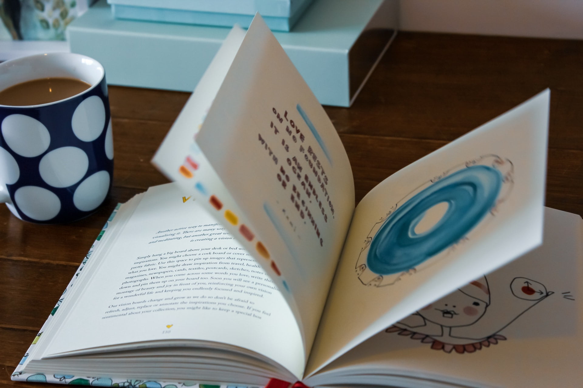
Photo by Nao Takabayashi on Unsplash

