Building a website is relatively easy; driving traffic to a website is hard work. Whichever channel you use, be it search engines and search engine optimization (SEO), Google Ads, and/or social media, honing in on your target market and getting them to visit your website takes a lot of effort. In some instances, it also takes a substantial amount of money.
At the same time, as you deliver your SEO, PPC and social campaigns, you should also be looking to optimize your website for conversions. Conversion Rate Optimization (CRO) is the process of designing your website, so an increasing percentage of visitors take a desired action. This action or “conversion” typically involves a visitor making a purchase or getting in touch via a form completion or telephone call.
This article will look at some of the fundamental methods used by CRO professionals to turn visitors into customers and clients. We will also look at some of the most common errors that designers make in regards to CRO.
Be Specific
Each page on your website should have a specific audience and a specific action in mind. This specificity is essential when you are creating “landing pages” for specific campaigns. For example, if you make a Facebook Ad to promote your SEO services, the landing page will be the page people go to when they click on your Facebook Ad. This page should specifically promote SEO services and nothing else.
The page should not promote any general digital marketing services, our PPC services; keep it specific to SEO. In addition, if the Facebook Ads were aimed at small business owners, ensure that the page copy and all other elements of the landing page appeal to small business owners.
Identifying your target market and your ideal customer persona is essential for CRO. By understanding exactly who you want to bring your website, and their wants, needs and pain points, you can customize an experience specifically for that audience.
Understanding your target market – for example, small business owners in California is vital. It can help to find out where they spend time online and research discussion points. For example, head over to Facebook and find relevant Facebook Groups and go to Reddit and see if there are any appropriate Reddit forums/subReddits. If there are, take a look at what common topics and discussion points come up. What are people struggling with in terms of marketing, and specifically SEO? Once you understand this, you can add imagery and copy to address any issues you identify.
Page Speed
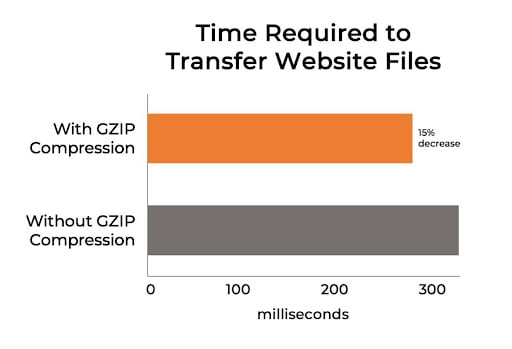
Page speed is essential for both CRO and SEO. Page speed is officially a ranking factor of Google’s. Research suggests that if people have to wait for more than 3 seconds for a page to load, over a quarter of visitors will click away and visit a competitor’s website.
Images are usually the bottleneck when it comes to page speed but using a tool such as Pingdom and Google’s page speed test with help identify any potential issues that might cause your site to load slowly.
The AIDA Framework
Created way back in the 19th Century by Elias St. Elmo Lewis, the AIDA framework can be used as a foundational strategy for several different forms of marketing.
Lewis wrote that:
“The mission of an advertisement is to attract a reader so that he will look at the advertisement and start to read it; then to interest him, so that he will continue to read it; then to convince him so that when he has read it, he will believe it. If an advertisement contains these three qualities of success, it is a successful advertisement.”
Quote source
It is also a great framework when it comes to optimizing a website for conversion rate.
AIDA stands for
– Attention
– Interest
– Desire
– Action
Attention
With the AIDA framework in mind, the first thing that a webpage or landing page should do is grab the visitor’s attention. Research suggests that you have around 3 seconds to grab a visitor’s attention.
At the top of your landing page, for example, you can grab the visitor’s attention by clearly communicating with imagery and copy what the product or service on offer is. Keep the landing page free from clutter so that visitors know precisely what the page is about.
Interest
Next, communicate the benefits of the product or service on offer. Do this in the simplest way possible by, for example, using imagery and bullet points.
While you want to keep the layout simple and easy to scan-read, you can also use rich media such as imagery and videos to provide further information. A video demonstrating the benefits of the product or service, for example, could pique or maintain the visitor’s interest.
Ensure that all information is presented clearly and that everything a visitor needs to make a decision about your product or service is straightforward to find.
Make sure that you are speaking to your target market as well – if you are targeting small business owners, communicate in a way that will appeal and resonate with them.
An excellent example of a landing page that engages the visitor and speaks to business owners is the Moneypenny phone answering page. With prominent, horizontal bullet points outlining the benefits to business owners, testimonials inspire trust and images that help explain what the product does and entails.
Desire
Now that visitors are interested, you need to give them a reason to convert to a lead or a customer. Change the visitor’s mind from “I’m interested” to “I want this!”
Make the visitor feel appreciated, inspire trust and a feeling of safety and give them enough information to make a decision.
To do this, you can create urgency with a time-limited special offer. You can show competitors who are benefiting from using your product or service. It can also help provide complete information, including the price – so that potential customers know exactly what is on offer.
Displaying awards and accolades can also help inspire trust, and including “social proof” such as review scores can also help convince a visitor that they need what you are offering. For eCommerce landing pages, clearly display your payment methods, shipping information and returns policies. Display your company address and registration number near the page’s footer to further trust with transparency about your business.
Action
Next, you want the visitor to take the primary action – usually, this will be to sign up for a service, call your company, or make a purchase.
Ensure that the primary action is as easy as possible to complete. For example, if you want visitors to fill in a form, ensure the form is large, clear and does not have too many fields to fill in. ensure that there is a primary “call to action” as well, such as “Add to Cart” or “Inquire Now.”
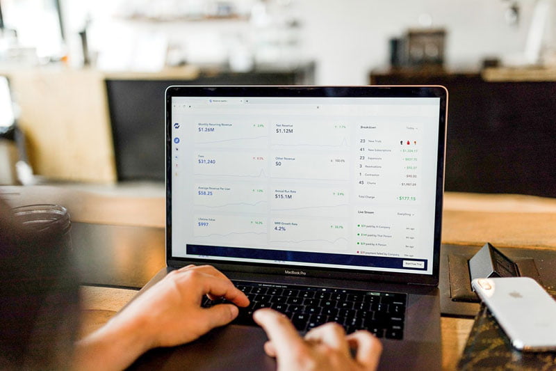
Track & Test Everything
Whether you decide to use the AIDA framework or not, it is crucial to track and test everything. For example, you can use a tool such as Google Optimize or VWO to chance elements of your landing page design or compare the performance of each.
There are two ways, commonly utilized, to go about “split testing” your designs. Either change one small element at a time, such as the color of a call to action button and compare how each design performs. Alternatively, start with two completely different designs, with lots of distinctive differences, and work ‘inwards’ as you assess the reports and see what parts of the page are interacted with the most and appear to help conversions and which don’t.