Clipping and masking have been around for a while now in CSS and even have pretty decent browser support. I recently worked on a project that needed to use a clipping technique for tooltips showing above links in text.
Those tooltips have two designs based on their content:
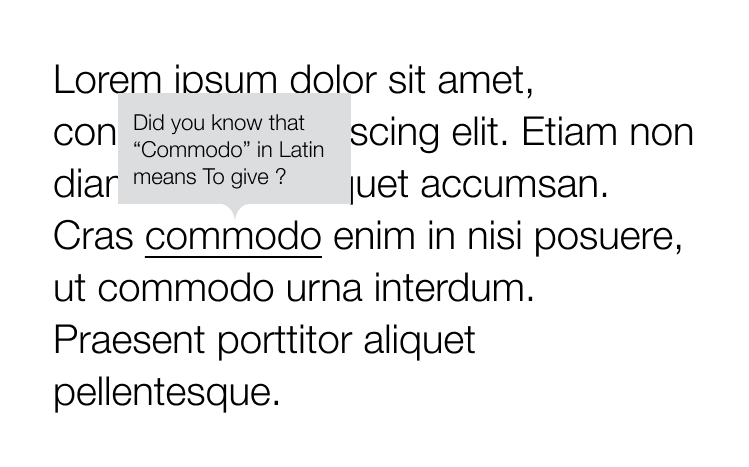
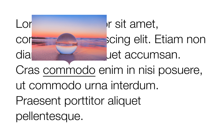
You might not think the text tooltip requires any clipping at all. A pseudo-element can be positioned at the bottom to add the little notch, right? You are indeed absolutely right! Because the background of the tooltip is a a plain color, there’s really no need for CSS trickery and whatnot.
But clipping the image in the second design is where things get interesting…
Here’s the thought process my mind followed when I started the task.
Idea 1: clip-path & polygon
Table of Contents
The CSS clip-path property allows us to define a custom polygon with percentage values to make the path we want.
This solution is often enough if the shape of your path is simple enough. In the demo below, I’m using calc() values to make sure the clip is fully responsive, while the little triangle stays the same size no matter how stretched the parent is.
.tooltip { clip-path: polygon( 0% 0%, // Top left point 100% 0%, // Top right point 100% calc(100% - 10px), // Bottom right point calc(50% + 10px) calc(100% - 10px), // Center right of the triangle 50% 100%, // Tip of the triangle calc(50% - 10px) calc(100% - 10px), // Center left of the triangle 0% calc(100% - 10px) // Bottom left point );
}
This solution is very clean but, in my case, not good enough as I don’t have a straight triangle notch, but rather a custom shape.
Idea 2: clip-path and SVG
Using an SVG path seemed like a good solution. First, you export your SVG clipping path, then use it in your CSS with the url(#clipPathId) value.
Check the demo below. Do you see any issue with the path?
The arrow is stretched based on the image ratio. Since the little notch is part of the whole path shape, it is as stretched as the rectangle part of the path stretches in size.
Idea 3: mask-image
Now here is the thing I discovered with the CSS mask-image property in CSS: You can combine mask layers! Think about it like a background-image in CSS. You can apply multiple gradients or images on a single element. Now, what if you combine all those layers to generate the final mask you need?
This is exactly what we are going to do here with two layers:
- A large rectangle that cover the whole block except for a stripe at the bottom (shown in green)
- An image of the arrow (shown in pink)
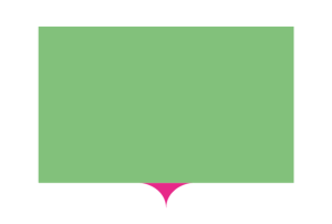
With that solution, the rectangle can stretch according to our tooltip’s dimensions, and the arrow will always keep its fixed size.
All the code and demos below are prefix free and the demos are using Autoprefixer. At the time I’m writing this article, Edge, Chrome & Safari require prefixes.
Just as we would with background properties, we are going to use three different mask properties to define our two layers:
mask-image: This property lets us draw the rectangle with a linear background and the arrow with an inline SVG.mask-position: The rectangle doesn’t need a position (as it starts from the top-left), but the arrow needs to be positioned at the center-bottom.mask-repeat: We need to avoid repeating both layers; otherwise, the linear gradient would cover the whole element when it repeats.
.tooltip { mask-image: linear-gradient(#fff, #fff), /* Rectangle */ url('data:image/svg+xml;utf8,'); /* Bottom arrow mask-position: */ 0 0, /* Rectangle */ 50% 100%; /* Bottom arrow */ mask-size: 100% calc(100% - 18px), /* Rectangle */ 38px 18px; /* Bottom arrow */ mask-repeat: no-repeat;
}
Tada! Change the tooltip dimensions or replace the image and the bottom arrow will keep its original ratio.
More complex shapes
Let’s get a little fancy and go deeper with this technique. I was inspired by the iMessage app on iOS and tried to reproduce the same tooltips with this masking technique.
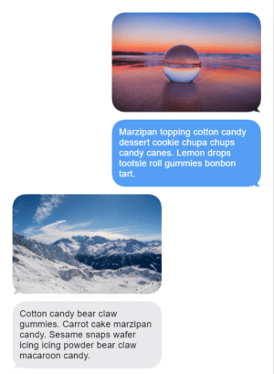
I had to draw more layers for my mask to render every rounded corner:
- four circles, one for each corner (shown in red)
- one horizontal rectangle (shown in blue)
- one vertical rectangle (shown in green)
- one SVG for the arrow (shown in yellow)
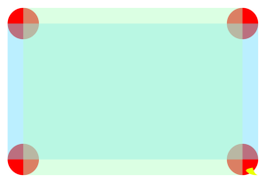
The full code is going to be a bit longer as we have more layers to draw, but the logic stays the same. The corners are drawn using four radial gradients. To fill the rectangle, we need two rectangles (one vertical, one horizontal) as shown above. And finally, our little arrow that is using an inline SVG.
.tooltip { --radius: 25px; mask-image: radial-gradient(#fff (var(--radius) - 1), #fff0 var(--radius)), /* Top left corner */ radial-gradient(#fff (var(--radius) - 1), #fff0 var(--radius)), /* Top right corner */ radial-gradient(#fff (var(--radius) - 1), #fff0 var(--radius)), /* Bottom left corner */ radial-gradient(#fff (var(--radius) - 1), #fff0 var(--radius)), /* Bottom right corner */ linear-gradient(#fff, #fff), /* Horizontal gradient */ linear-gradient(#fff, #fff), /* Vertical gradient */ url('data:image/svg+xml;utf8,'); /* Bottom right icon */ mask-position: 0 0, /* Top left corner */ 100% 0, /* Top right corner */ 0 100%, /* Bottom left corner */ 100% 100%, /* Bottom right corner */ 0 var(--radius), /* Horizontal gradient */ var(--radius) 0, /* Vertical gradient */ 100% 100%; /* Bottom right icon */ mask-size: (var(--radius) * 2) (var(--radius) * 2), /* Top left corner */ (var(--radius) * 2) (var(--radius) * 2), /* Top right corner */ (var(--radius) * 2) (var(--radius) * 2), /* Bottom left corner */ (var(--radius) * 2) (var(--radius) * 2), /* Bottom right corner */ 100% calc(100% - #{var(--radius) * 2}), /* Horizontal gradient */ calc(100% - #{var(--radius) * 2}) 100%, /* Vertical gradient */ (39px / 2) (25px / 2); /* Bottom right icon */ mask-repeat: no-repeat;
}
As you see, we can create a version with the arrow on the left or right by using a flipped version of the arrow and positioning it in a different corner. The trick is working fine on tooltips without images too. But like I said at the beginning of this article, you probably don’t need that much CSS if you only have a plain background to style.
If you want to learn more about clipping and masking in CSS, there are lots of other great articles right here on CSS-Tricks worth checking out.


