The thought of preparing and giving a presentation to fellow peers whether it be internally or to clients is not always a welcome one. However, there’s a lot more available online nowadays to help with your presentation. From various softwares and tools to help you create a professional and inspiring presentation.
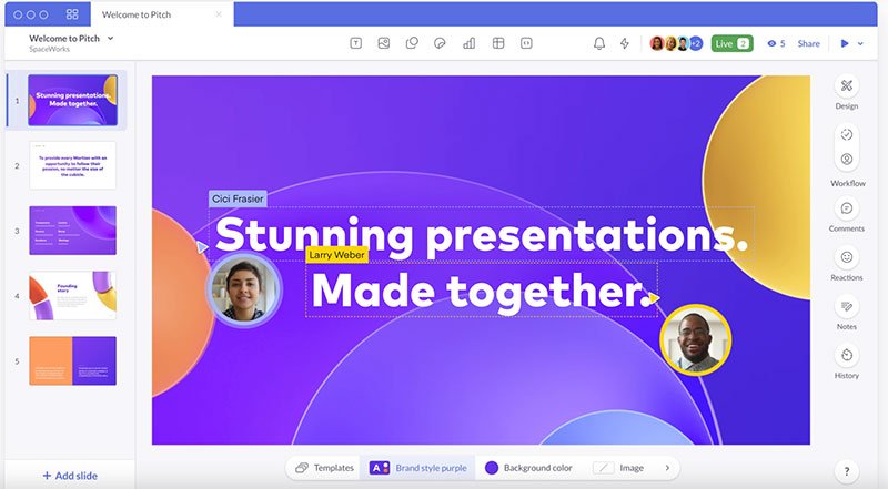
Image Source
The importance of a presentation
Table of Contents
- 1 The importance of a presentation
- 2 1. Outline an easy-to-follow structure
- 3 2. Be wary of too much content on one slide
- 4 3. Use grammar and spelling tools to correct any mistakes
- 5 4. Get comfortable with white space
- 6 5. Use design tools to make it attractive
- 7 6. Have several draft versions before the final one
- 8 7. Study your presentation before the big day
- 9 Extra tips and tricks for a A+ design presentation
It’s been found that most people will create on average one presentation a week. This can vary from person to person depending on what industry or job role they fall into. The importance of a presentation helps demonstrate professionalism within the company and of those presenting it.
For many businesses and individuals, it can help successfully acquire new clients or secure funding and other opportunities. In this case, a design presentation is a crucial part of the process when it comes to providing brand visuals.
So if you’ve been assigned with creating one, this article will help with several tips on how to prepare a design presentation.
1. Outline an easy-to-follow structure
Before you start creating the slides to your presentation, it’s important to have an awareness of the structure. Structure is going to provide a journey for those seeing it, as well as keeping them fully engaged from the beginning to end.
Outlining a structure is also going to make it a lot easier on yourself when it comes to conveying what it is you want to say.
With that being said, here are a couple of good pointers to help:
- A catchy introduction.
- Provide plenty of evidence and insights throughout.
- Sum it up with key takeaways.
- Limit the slides to no more than ten where possible.
A great presentation is going to ensure all that you intended to get across, is communicated successfully.
2. Be wary of too much content on one slide
It’s important that everything needed for the presentation is put into the slides. However, that can often lead to information being crammed in, to the point that it’s excessive. You want to avoid putting too much on one slide because it will likely be a distraction from some of the key points you’re trying to explain.
This is partly how you structure the content in relation to things like font size or paragraphs that need separating because they’re too big. Remember, the attention span for most of us today is around 8.25 seconds. That’s not a lot of time to communicate everything you want, so it’s helpful to be careful of how much content you’re placing on each of the slides.
A useful guide is to aim for a few lines on each and that it’s sectioned into bite-sized chunks of information or visual imagery. This will hopefully keep your audience engaged for longer and less likely to switch off. Visuals are inherently good for humans at keeping us engaged, so use them where possible!
3. Use grammar and spelling tools to correct any mistakes
We’re all capable of human error and so the odd spelling or grammar mistake is likely to slip through the net. However, the expectation for good grammar and spelling within the workplace especially is heightened due to having access to tools like Grammarly.
Grammarly is just one of many online tools and browser add-ons where you can scan your content for spelling mistakes and grammar corrections. When giving a presentation, there’s nothing more embarrassing than seeing your errors blown up on the big screen.
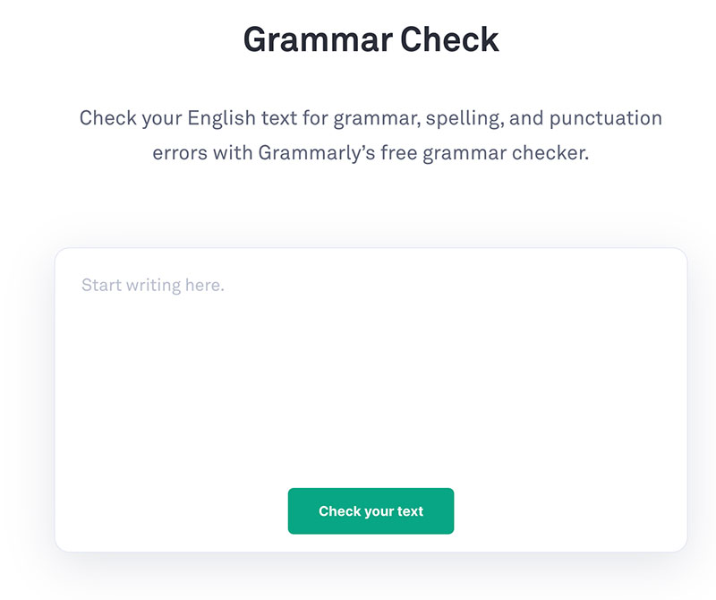
Image Source
So, in order to continue your professionalism within the workplace, it’s worth investing in such a useful tool. Grammarly for the most part is free to use but if you’re looking for more advanced features in the way of grammatical fixes, then it might be worth getting the premium subscription.
Having very little spelling or grammatical errors will also be beneficial if you’re sending this presentation to others who couldn’t make the meeting. There may also be instances where your presentation is cemented in workplace history on a shared drive for future use, so make use of Grammarly and other relevant online tools.
4. Get comfortable with white space
There’s something quite satisfying about seeing white space on a screen. Whether that’s a web page, a social media post or a presentation, it pays to get comfortable using it. White space is pretty much self-explanatory – it’s the portion that’s been left bare.
In a slide, it’s the portion or portions of it that have been left untouched by anything, whether it’s text or imagery. For designers, white space is important to use. There’s a lot of power that can come from incorporating it into your slides.
Focus and attention
With white space, it can help guide your audience through the content that you’re showing them on each slide. It highlights focal points that you’re wanting your audience to pick up on.
Reading performance
Changing the white space and incorporating it into a slide is going to help provide a more successful performance for the reader who is engaging with it. They’re more likely to remember the content you provide them, rather than it lasting a mere few seconds in their memory before being forgotten about.
Whilst getting all the content in your presentation is crucial, be less restrictive with white space if that’s something you’re currently doing.
5. Use design tools to make it attractive
With your presentation design, it’s useful to make it visually appealing. A design presentation without a design seems a little bit like a criminal act in itself. So when it comes to tools for design, platforms like Canva can prove very helpful.
Canva offers a wealth of pre-made templates that you can tailor to align with your brand imagery and house styles. There’s also a catalogue of presentation types to pick from when it comes to these templates.
Image Source
With a section dedicated to presentation designs, you should have no problem injecting some life into your own presentation. The platform is also great for those who perhaps have a limited knowledge of design and could benefit from getting an extra hand with this tool.
There are some other great design tools that you can use to make it more attractive. These include:
- Adobe Photoshop
- Fotor
- Coolers
- Desygner
The list is endless and these might be just what you need in order to take a basic presentation to a memorable one.
6. Have several draft versions before the final one
Never assume that a piece of work is complete without going through at least one draft version first. For a presentation, it’s necessary to have several draft versions before you run with the final one on the day.
The reason for this is that when you spend so long working on a project, you can easily get tunnel vision. It means you can miss out on obvious mistakes that if you’d come away and looked at it again, you’d hopefully spot it.
This is why it’s useful to make the creation of a presentation, a collaborative one where possible. By having a first, second or third draft version, you’ll iron out all the kinks within the presentation so that eventually you’re left with something that you can honestly say is ready to be seen.
When you’ve gone through it with a fine tooth comb and you’re satisfied that nothing more can be added or tweaked, only then is it done.
7. Study your presentation before the big day
Before the day of the presentation, it’s beneficial to study what you’re presenting. This might seem somewhat unnecessary to some, seeing as you may have contributed all of it by yourself.
However, it can still prove useful to go through each slide so that when it comes to presenting it, you don’t need to actively be staring at the screen whilst speaking to your audience. Instead, you can focus on who you’re speaking to instead.
A good presentation is often one that has been practiced a few times before the real thing. Make the effort to study your work before the big day for your sake and for those listening to you.
Extra tips and tricks for a A+ design presentation
As well as the above tips, there are a few extras that are worth mentioning when it comes to creating A+ design presentations.
Try to collaborate where you can, rather than simply taking on the task yourself. Sometimes having a few eyes on the presentation, it can help spot problems or pain points that you might not have noticed.
Remember that perfection doesn’t exist and progress takes time. This may be your first design presentation or your tenth but there’s always room to get better. Whatever you do in your work life or personal one, there’s always room for improvement.
And finally, remember to focus on your delivery of the presentation. Perform it to fellow colleagues, friends, or family members for practice. How you deliver the presentation is just as important as how well prepared it is. Without the confidence or poise, it can easily fall apart.
Author Bio

Natalie Redman (LinkedIn)
Email – natalieannredman92@gmail.com
Freelance writer for many clients across multiple industries. Natalie has two years of copywriting experience. Natalie has a wide range of experience copywriting for web pages for businesses across many industries. She’s also an owner of two blog websites and a Youtube content creator.