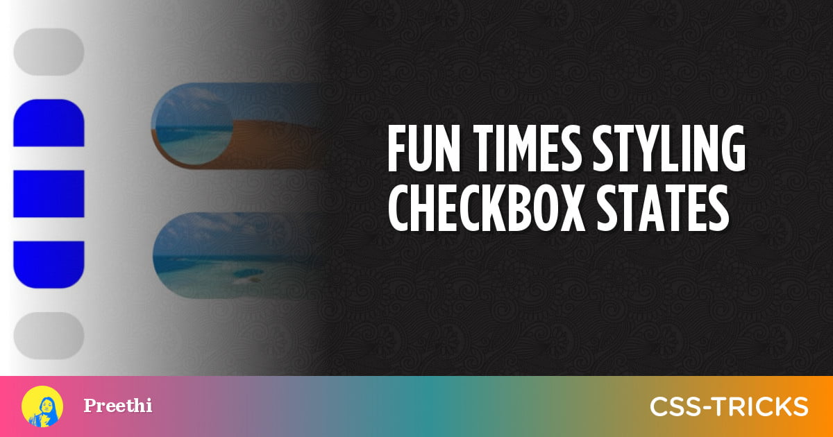
We might leave a text input unstyled. We might leave a link unstyled. Even a button. But checkboxes… we don’t leave them alone. That’s why styling checkboxes never gets old.
Although designing checkboxes is not that complicated, we also don’t have to settle for simple background color changes, or adding and removing borders, to indicate state changes. We also don’t have to pull out any fancy design skills — that we don’t possess — to make this work. I’ll show you how.
Basics
Table of Contents
In the following demos, the checkboxes pretty much have the same three-stack layout — at the bottom is a checkbox, and on top of it are two stacked elements, or pseudo-elements. The checkbox is indicated as checked or unchecked depending on which of the two is visible.
If you look at the CSS code in the pens you’ll notice all the layouts — including the one for the checkboxes — are grids. You can use other layouts that feel right for your use case (and learn more in the CSS-Tricks Grid Guide). Additional notes on code and design alternatives are at the end of the source code inside the pens.
In addition, any elements stacked on top of the checkbox have pointer-events: none so they don’t prevent users from clicking or tapping the checkbox.
Let’s now get to the first method.
Idea 1: Blended backgrounds as a state
Blending in CSS is a versatile technique. Manipulating colors relative to two or more elements or backgrounds can be handy in contexts you might not have thought of.
One such instance is the checkbox.
<input id="un" type="checkbox"> <label for="un">un</label>
<!-- more checkboxes -->
input[type=checkbox]::before,
input[type=checkbox]::after { mix-blend-mode: hard-light; pointer-events: none; /* more style */
}
input[type=checkbox]::before { background: green; content: '✓'; color: white; /* more style */
}
input[type=checkbox]::after { background: blue; content: '⨯'; /* more style */
}
input[type=checkbox]:checked::after { mix-blend-mode: unset; color: transparent;
}In this demo, I’ve styled the checkbox’s pseudo-elements green and blue, stacked them up, and gave them each a mix-blend-mode value. This means the background of each element blends with its backdrop.
I used the hard-light value, which emulates the result of either multiply or screen depending on if the top color is darker or lighter. You can learn in depth about different blend modes over at MDN.
When the box is checked, the ::after pseudo-element’s mix blend mode value is unset, resulting in a different visual.
Idea 2: Make a 3D animation
Animating a block of color is fun. Make them seem 3D and it’s even better. CSS has the means to render elements along an emulated 3D space. So using that, we make a 3D box and rotate it to indicate the checkbox state change.
<div class="c-checkbox"> <input type="checkbox" id="un"> <!-- cube design --> <div><i></i><i></i><i></i><i></i></div>
</div>
<label for="un">un</label>
<!-- more checkboxes -->
.c-checkbox > div { transition: transform .6s cubic-bezier(.8, .5, .2, 1.4); transform-style: preserve-3d; pointer-events: none; /* more style */
}
/* front face */
.c-checkbox > div > i:first-child { background: #ddd; transform: translateZ( -10px );
}
/* back face */
.c-checkbox > div > i:last-child { background: blue; transform: translateZ( 10px );
}
/* side faces */
.c-checkbox > div > i:nth-of-type(2),
.c-checkbox > div > i:nth-of-type(3) { transform: rotateX(90deg)rotateY(90deg); position: relative; height: 20px; top: 10px;
}
.c-checkbox > div > i:nth-of-type(2) { background: navy; right: 20px;
}
.c-checkbox > div > i:nth-of-type(3) { background: darkslategray; left: 20px;
}The <div> after the checkbox becomes a container of a 3D space — its child elements can be placed along the x, y and z axes — after it’s given transform-style: preserve-3d;.
Using the transform property, we place two <i> elements (grey and blue colored) with some distance between them across the z-axis. Two more are wedged between them, covering their left and right sides. It’s like a cardboard box that’s covered except at the top and bottom.
When the checkbox is checked, this grey and blue box is rotated sideways to face the other side. Since I’ve already added a transition to the <div>, its rotation is animated.
input:checked + div { transform: rotateY( 180deg ); }Idea 3: Playing with border radius
Changing a checked box’s border radius? Not that fun. Changing also the border radius of other boxes near it? Now we have something.
<input type="checkbox" id="un"> <label for="un">un</label>
<!-- more rows of checkboxes -->
input { background: #ddd; border-radius: 20px; /* more style */
}
input:not(:first-of-type)::before { content: ''; transform: translateY(-60px); /* move up a row */ pointer-events: none;
}
input:checked + * + input::before,
input:last-of-type:checked { border-radius: 20px; background: blue;
}
input:checked + * + input:checked + * + input::before { border-top-left-radius: unset !important; border-top-right-radius: unset !important;
}
input:checked::before { border-bottom-left-radius: unset !important; border-bottom-right-radius: unset !important;
}
/* between the second-last and last boxes */ input:nth-of-type(4):checked + * + input:checked { border-top-left-radius: unset; border-top-right-radius: unset;
}If you’d just interacted with the demo before, you’ll notice that when you click or tap a checkbox, it not only can change its own borders but also the borders of the boxes after and before it.
Now, we don’t have selectors that can select elements prior, only the ones after. So what we did to control the appearance of a preceding box is use the pseudo-element of a checkbox to style the box before it. With exception of the first box, every other box gets a pseudo-element that’s moved to the top of the box before it.
Let’s say boxes A, B and C are one after another. If I click B, I can change the appearance of A by styling B’s pseudo-element, B by styling C’s pseudo-element, and C by styling D’s pseudo-element.
From B, the pseudo-elements of B, C and D are accessible — as long as the next element selector can be used between them in the layout.
The four corners of each checkbox are initially rounded when checked and unchecked. But if a box is checked, the following box’s top corners and preceding box’s bottom corners are straightened (by overriding and removing their border radii).
Idea 4: Using a CSS mask
Toggles, switches… they are also checkboxes as far as the code goes. So we can style the boxes as toggles for this one, and it’s done with a CSS mask, which Chris has written about before. But in a nutshell, it’s a technique where we use an image to filter out portions of its backdrop.
<input type="checkbox">
<div class="skin one"></div>
<div class="skin two"></div>
.one.skin { background: no-repeat center -40px url('photo-1584107662774-8d575e8f3550?w=350&q=100');
}
.two.skin { background: no-repeat center -110px url('photo-1531430550463-9658d67c492d?w=350&q=100'); --mask: radial-gradient(circle at 45px 45px , rgba(0,0,0,0) 40px, rgba(0,0,0,1) 40px); mask-image: var(--mask); -webkit-mask-image: var(--mask);
}Two skins (displaying landscape photos) are on top of a checkbox. The topmost one gets a mask-image that’s in the shape of a typical toggle switch — a transparent circle at the left, and the rest is a fully opaque color. Through the transparent circle we see the photo below while the rest of the mask image shows the photo at the top.
When a checkbox is clicked, the transparent circle is moved to the right, so we see the image at the top through the circle while the rest shows the photo at the bottom.
input:checked ~ .two.skin { --mask: radial-gradient(circle at 305px 45px, rgba(0,0,0,1) 40px, rgba(0,0,0,0) 40px); mask-image: var(--mask); -webkit-mask-image: var(--mask);
}
Idea 5: Using box shadow
Let’s end with the simplest — but what I consider to be the most effective — method of them all: an animated inset box-shadow.
<input id="un" type="checkbox"> <label for="un">un</label>input { transition: box-shadow .3s; background: lightgrey; /* more style */
}
input:checked { box-shadow: inset 0 0 0 20px blue;
}There are some CSS properties that can be animated by default and one of them is box-shadow. This type of subtle animation goes well with a minimalist theme.
That’s it! I hope this sparks some inspiration the next time you find yourself working with checkboxes. CSS gives us so many possibilities to indicate state changes, so have a little fun and please share if you have any interesting ideas.


