Getting your web design right is crucial. Even more so when you are running an eCommerce or online business!
Since it is the place you meet your customers for the first time, your website needs to be in top shape and present all the information they need to see. Making a good impression on your potential customers is a priority. According to a study, it only takes up to 50 milliseconds to decide whether they want to stay or leave your website.
Many companies have realized its importance and as the 2018 Digital Trends report shows, over 70 percent of US businesses use website design to differentiate themselves from their competitors.
But what goes into the actual designing process of your website? And, how can you improve its performance?
This article presents some visual design tips to help you improve the performance of your website and boost your sales at large.
Let’s dive in!
1. Define your branding
Table of Contents
What is the first thing that comes to mind, when people think about your brand? To make it easily recognizable and memorable you have to build a website that reflects the personality of your business. This defines your brand.
Having clear branding starts with your logo and then moves on to more detailed information like the colors you choose to present your copy and blog content, the typography, and the layout of your website.
Before you change anything on your site, first consider color psychology and handpick your fonts so that they match your style and those emotions you want people to associate with your business.
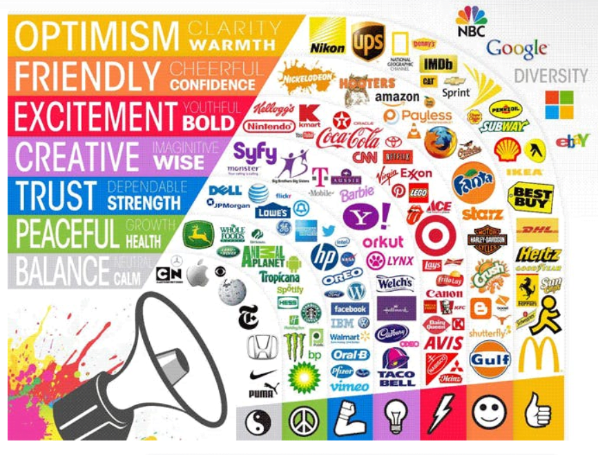

If it helps, you can work with a graphic designer to find the one(s) that best represent your brand, and appeal to your target audience.
2. Give it some white space
Any high-converting website needs the right amount of white space, text, and visuals. Filling up your website with too much information, different patterns, and shapes, creates clutter that is not only confusing but also unpleasant to the eye.
White space – which refers to the area between the elements – images, text, and other visuals of your page, helps to create a clean and minimalistic feel to your website.
Adding more white space means that you will:
- Improve interaction
- Create more balance
- Separate sections
- Increase legibility
- Highlight your CTAs
Adding more space will create some structure inside the website and the different pages and sections. This will allow people to move in a logical order while navigating your website and naturally follow the visual cues to your conversion point aka your call-to-action (CTA) button.
White space between paragraphs and in the left and right margins can also increase comprehension. So make sure you make the best out of it.
Here are some good examples of the use of white space from OwlLabs and Quip.
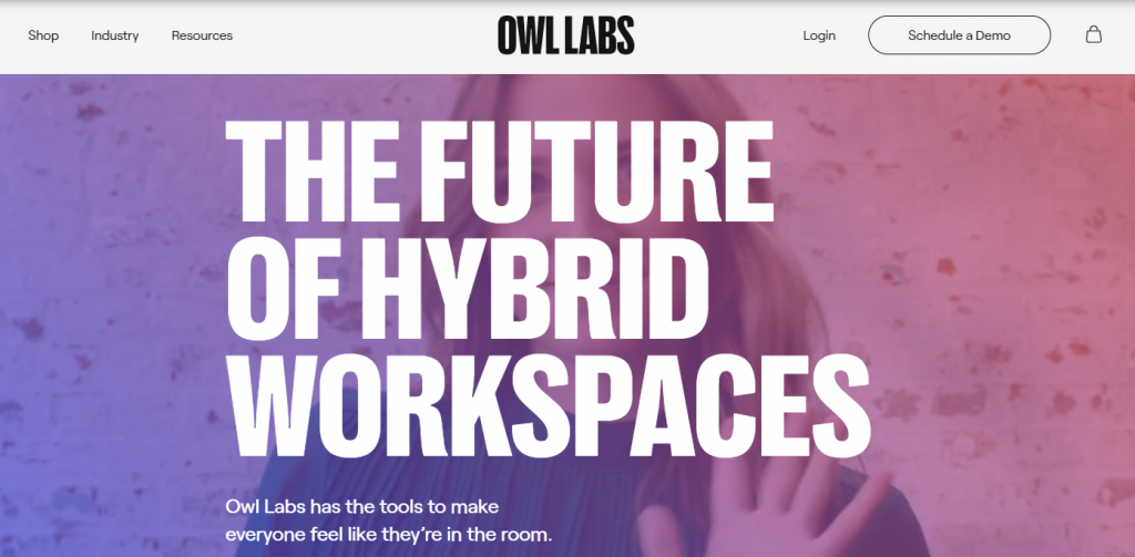

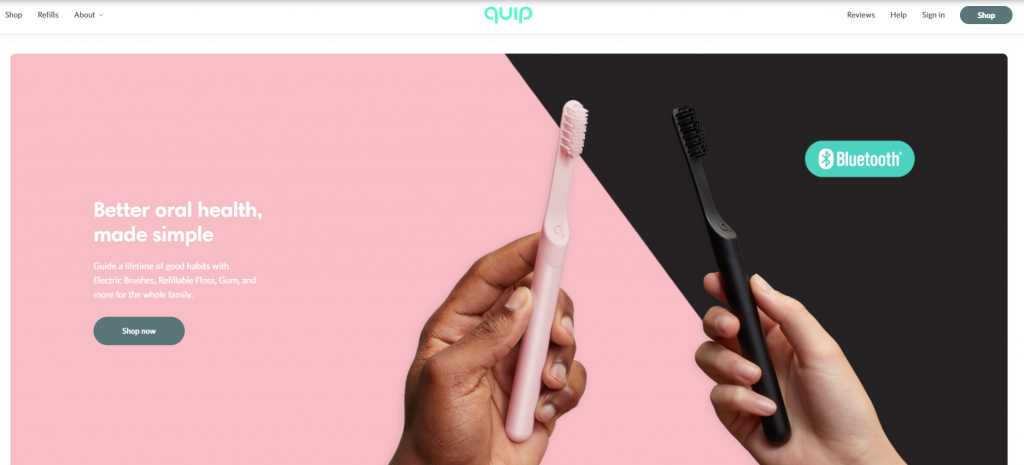

Both examples show how less is more, without saying too much but also making use of all the white space they can get from the background.
3. Choose high-quality images
A huge part of getting people to stay on your website for longer is choosing the right images. The ‘right’ image is an image that is most suitable to your brand and relates to the message you want to convey.
The ‘right’ image also helps to build trust and rapport with your target audience. Along with a story-telling bio about how you got your business up and running, adding a professional image that shows the human element is always a winning practice.
Check out free stock photography sites like Unsplash and Pexels to find some high-quality images.
4. Focus on your above-the-fold
Your above-the-fold section needs to welcome your site visitors to your website. It’s the first thing they get to see, so it is the one element that ‘sets the scene’.
The best way to make it stand out is to include it in your branding message. Clearly present your value proposition and give a reason to visitors to keep scrolling through your site. This is huge, since as user experience – UX evidence shows, people like to scroll.
Select a powerful hero image and prefer to use high-contrasting colors that will bring out those elements you want to emphasize.
5. Optimize your images
One of the most important things to look into when you want to boost website performance is responsiveness.
Site responsiveness dictates your page speed, which is an important parameter for people to stay on your website. According to Google and Microsoft Bing research, each 2 seconds delay in page load time reduces ad revenues by 4.3 percent. That’s a lot.
Optimizing your images will not only make your website load quicker but will also make it appear higher in search results. You can do that by choosing the appropriate file types for your visuals – JPEG, GIF, PNG, and HTML, compressing or resizing your images.
To compress images check out Tiny PNG – a web-based compression tool that deals with PNG and JPEG files.
Best Website Building Tools to Choose From
Having the right tools can help you achieve the best design results for your website.
Many website-building tools allow you to customize your pages with their unique features. If you haven’t found what you are looking for just yet, you can try:
WordPress
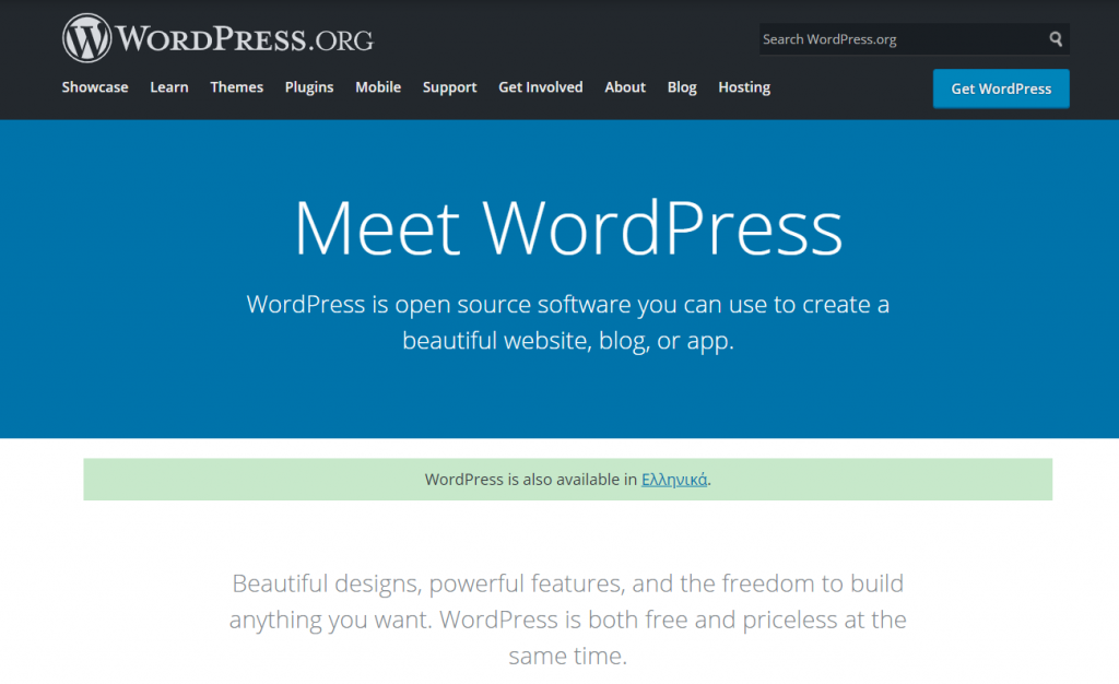

WordPress is the most popular choice for building a website from scratch. It has some powerful features and some pre-made themes you can choose for your website’s design. What’s great about WordPress is that it comes with drag-and-drop page builders which allow you to easily design your own page layouts.
Wix.com
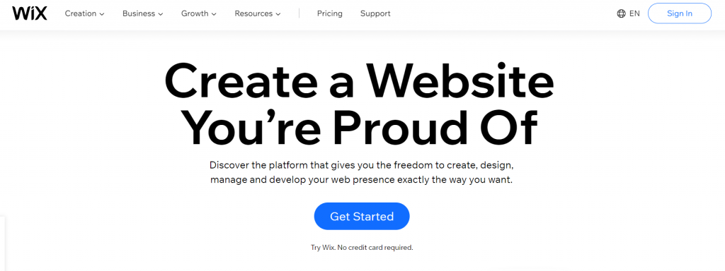

Wix is another popular option for building a business website. With this tool, you get to choose from a large variety of templates that can be customized to fit the unique needs of your business using design as your biggest asset. Wix is perfect for creative individuals, and with its rich artificial design intelligence capabilities – Wix ADI, you can design a beautiful website in minutes.
HubSpot Website Builder


If you are a marketer or small business owner, HubSpot’s CMS is all you need. HubSpot comes with an all-in-one website builder, which allows you to choose from conversion-optimized website templates that can boost your website’s performance. With it, you can run adaptive tests that present 5 different page variations to help you chose the one that brings the best results.
LearnWorlds Website Builder
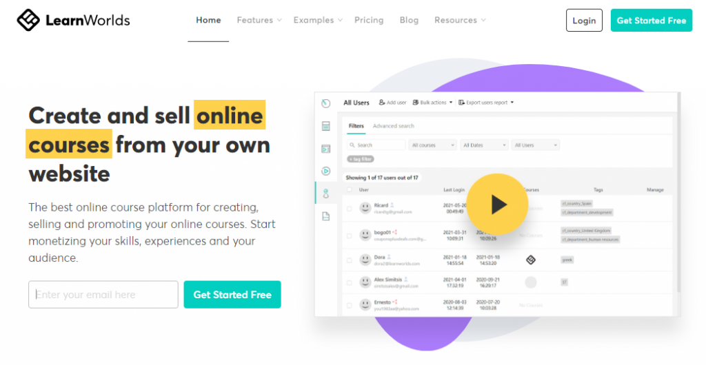

If you are looking for a website builder that can host your eLearning business or online school, your best solution is LearnWorlds. LearnWorlds comes with a website builder that allows you to choose from ready-made templates that match your industry. Reinforce your brand’s power through elements like typography, color palettes, different shapes, widgets, CTA buttons, beautiful layouts, and many more.
Shopify
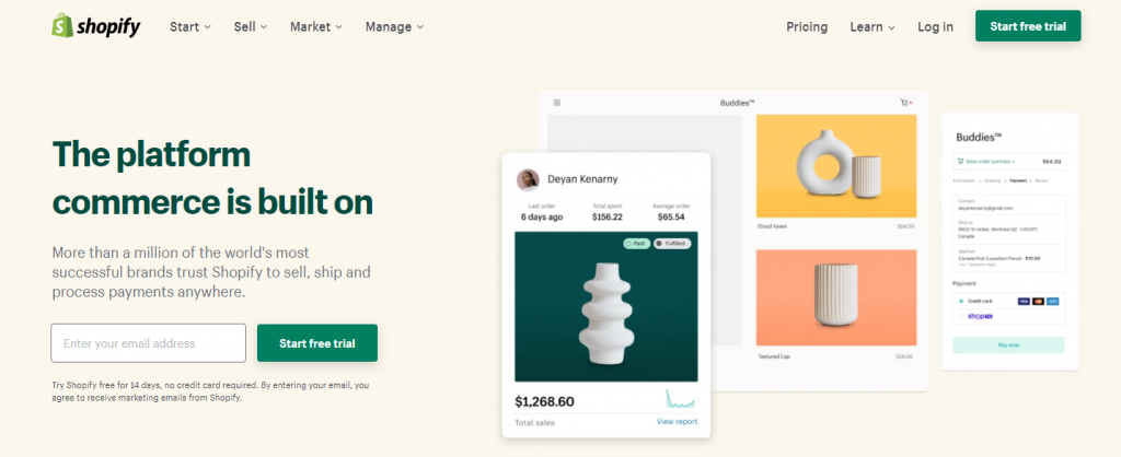

If you are running an eCommerce business and want to build your online store, then you should try out Shopify. The platform has an intuitive drag-and-drop builder that makes it easy to build an eCommerce website in minutes. Shopify integrates with WordPress and comes with many shipping, marketing, and management tools.
Ready to Boost Your Sales With Better Design?
A lot of factors come into play that creates the first impression including structure and layout, colors, spacing, symmetry, the amount of text it presents, and fonts amongst many others.
This means that tackling down and paying attention to each one can help you improve the way people interact and engage with your site. The longer people stay on your site, the higher the possibility of reaching out to you either to buy your product, request support help, or simply ask for additional information.
Once you change these key factors and invest in the right tools, you will see a boost in your website’s traffic in no time, which will bring valuable leads and ultimately more sales!


