Each day, 4 billion email users receive 300 billion emails. No wonder most people experience email fatigue, which makes it harder for marketers to build customer loyalty and increase sales via email. Although the rivalry is fierce, email is still one of the most effective marketing channels. For example, in the first half of 2021, conversions for ecommerce automated emails increased to 33.19%.
To create an email worth your subscribers’ attention, make sure that it either offers quality benefits or entertains the subscribers. Sounds easy, right? In practice, you’ll probably have to fine-tune your newsletter a dozen times to make it follow these two simple rules.
In this article, I’m going to make your email marketing journey a little less bumpy by sharing practical advice and illustrating it with examples. This article will be helpful for both newbies and experienced email specialists who are looking for inspiration.
We’ll start by looking at the elements of an email, showing both good and bad examples.
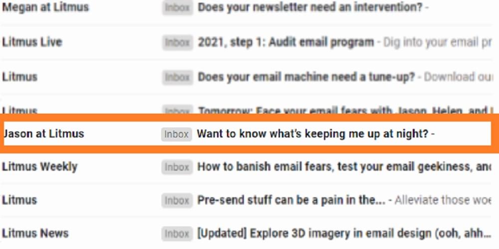
The Subject Line
Table of Contents
Let’s start with the all-important subject line in emails. The rule of thumb here is that the first impression is the last impression.
I won’t be able to teach you here any spells that will hypnotize readers and make them open your newsletter. But can show you good strategies that are likely to improve your subject lines and increase your email open rate.
Tips and good examples of appealing subject lines
-
Keep your subject lines succinct. Remember that most mobile device users won’t see the whole subject if it’s longer than 25–30 characters. Also, a short and catchy subject line is more likely to capture users’ attention without reminding them of a teaser ad.
-
Personalize your subject lines. It’s a good idea to add a subscriber’s name to the subject line or congratulate them on a happy event (be it their birthday or the first purchase on your website).
-
Use your imagination to engage subscribers. I love using creative techniques in subject lines. They’re not just fun, but also effective. You can make an allusion to a popular TV series, refer to a recent event, or create suspense to intrigue your subscribers.

-
Offer benefits. If creative strategies puzzle you, don’t worry: you still can make your subject line catchy by offering something beneficial.
Cringe strategies you’d better never use in your emails
-
Avoid caps lock and don’t use a dozen exclamation marks in one subject line. Subjects that offer “90% LAST CHANCE SALES ONLY TODAY!!!!” not only make subscribers feel uncomfortable but are also likely to end up in the spam folder.
-
Emojis aren’t a magic pill that guarantees your emails will be opened. In fact, it’s quite the opposite: in some cases, they might harm user experience by making a subject line look impersonal and annoying.
-
Yes, I know I’ve recommended personalizing your subject lines, but don’t take personalization too far. Perhaps the “don’t overdo it” rule works for all marketing strategies.
Last thought: you can’t rely on a single metric (like open rate) to estimate the success of email campaigns, and the recent updates on Apple Mail Privacy Protection have demonstrated this clearly.
Images in Emails
The golden rule when using images in emails is keep the quality of visual information.
Did you know that about 40% of people perceive visual information better than plain text? That’s why maintaining the quality of your visual email content is a must. Let’s briefly discuss the basic rules and then dive into common issues connected with images in emails.
Rules of user-friendly images in emails
-
Keep the size of images in your emails small (not larger than 500 Kb, but preferably much lower). Otherwise, some of the users might fail to see the images because they’re loading too slowly. Use services like TinyPNG or iLoveIMG to compress your images.
-
Remember to adjust the size of your email banner to the width of the template for better user experience.
-
Consider image accessibility: make the text placed over images easy to read, and don’t forget to add alternative text (we’ll touch upon it later).
How to reduce the chance that your image gets blocked
-
Take care of your email domain reputation, as some email clients (such as Outlook) block images sent by “suspicious” addresses.
-
I’ll repeat myself: you don’t need high-quality pictures. Always compress your images to ensure your emails won’t get trimmed or blocked.
-
Test your emails before sending them to the whole email list. You can use EmailOnAcid or Litmus to check them faster. However, some businesses may need specialists to perform tests on real devices.
What if your images still get blocked by some email clients?
Sometimes your images may still get blocked regardless of your efforts (or they can simply fail to be displayed because of a poor connection). You need to be prepared for images not loading. Here are some tips to follow:
-
Don’t send the whole email in one or several pictures with no text.
-
Write ALT-text (alternative text) that describes the images. It’s not only about you playing safe, but also about your email being disability-friendly.
-
Add a link to a web version of your email in case the images won’t display for some reason.
Email Copy
The goal with your email content is to achieve unity of form and content. Let’s look at what that means.
How you should align your email copy
-
Never justify your email copy. Although some people find justified text more pleasant to look at, justification decreases reading speed. Also, justified text isn’t dyslexia-friendly.
-
You can right-align your contact details in the header or footer.
-
You can center the lines you want to emphasize.
-
I recommend using flush left alignment in all the other cases. Studies prove that left-aligned text is easier to read and remember.
Tone of voice
Your content’s tone of voice should be an integral part of your brand identity. If your style is generally light and friendly, you may confuse your subscribers by suddenly going all official. And vice versa: if you’ve chosen a formal communication style for your website, you shouldn’t switch to sending memes.
Note that the same style has different performances for various businesses. Sometimes you have to study your audience before you understand what communication strategy will build customer loyalty in your case.
Continue reading How to Create Emails that Foster Customer Loyalty on SitePoint.


