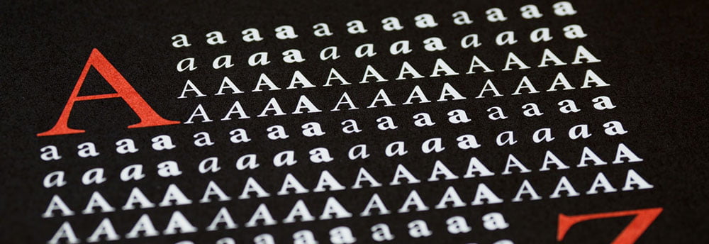
For decades, the rule was that you never used a serif font for body text on screen if you could avoid it. While typographers and printers agreed that these little decorations on the ends of letters could help readers follow one word to the next on physical paper, they tended to look rather muddy on screen. The fact that most displays were relatively low-resolution tended to make it so any font that was particularly decorative would turn into a mess.
Today, however, even relatively small displays put up impressive DPI numbers, so this prohibition might finally be over. New York, Iowan Old Style and Times New Roman are all now recommended typeface options in Safari, so Apple must have some faith in their retina display technology to render these fonts correctly. Perhaps more notably, however, user interface designers are now starting to reexamine the use of serif fonts on the web and the desktop.
Old Style Type for a New Age
Part of the reason stems from the fact that a number of specialized serif fonts were developed specifically for use on screens. Ironically, New York has its roots in the old City Fonts that were common on bitmap displays in the past, but far more recent and attractive options have taken center stage. Georgia is probably one of the most dramatic cases, and it’s also one of the most widely used considering that it’s included with the Core Fonts package that many GNU/Linux users install when setting up their workstations. It’s a rare example of a Scotch Roman typeface, which is designed in the style of William Miller’s work in the early 19th century.
Since Georgia has a remarkably high x-height as well as a very dark bold option, it’s almost as good for screen reading as a humanist sans serif typeface. Matthew Carter, who is perhaps better known for his work on the Charter font used by Medium, designed Georgia for the dreadful CRT displays in use back in 1993. While the typeface didn’t see a full release for another three years, time has certainly been kind to it. Chances are that you currently have it on your workstation, and you’re more than likely able to use it effectively in documents that are never going to end up on actual hard copies.
Since Georgia is installed on so many machines, it’s considered relatively safe to specify it when designing a CSS style sheet. Though remote delivery of fonts from Alphabet’s servers has become popular in recent years, some cybersecurity specialists like those at Trustwave and Aura have recommended the use of traditional client-side digital type for security reasons. This is one of the big reasons that people are starting to explore the use of serif screen fonts all over again.
Embedded document technologies are also spurring on rebellious designers to break these dated rules.
Embedding Serif Fonts into a Document
While some people might suggest that you shouldn’t embed any typefaces at all into a PDF, you sometimes have to in order to ensure that a document renders the same way on every device that users might open it on. Typesetters who have access to something like the Adobe Fonts gallery can select almost whichever typeface they’d like to, so there’s little stopping them from using a serif font that has a sufficiently tall x-height for use on digital screens. That being said, some other rules of design still apply in this case.
You want to make sure that any document only has two or three typefaces in it at the most. In many cases, they can make a document look busy. Those shared over a network can end up rather bloated as well. Over time, adding in different typefaces can even obscure a message. Readers might become too distracted by the business of a design to focus on what it represents.
Give some thought to this before you start to go crazy and eliminate every design rule you held to in the past. While those heavy metal-inspired headings might look awesome at first, they can really bog down what you’re trying to do. That being said, stodgy traditional designers might be surprised to see how good a document set in several weights of one serif typeface actually looks on screen.
The irony of this is the fact that in the dark ages of the Internet, serif faces were actually used as the default in most browsers. While this may no longer be the case, it certainly looks as though they’re enjoying a whole new lease on life in the world of professional content production.


