I was playing this game on Apple Arcade the other day called wurdweb. It’s a fun little game! Little touches like the little shape dudes that walk around the screen (but otherwise don’t do anything) give it a lot of character. I kinda want little shape dudes that walk around on websites. But another UI choice caught my eye, the way that transitions between screens have these diagonal lines that grow and fill the screen, like window blinds closing, kinda.
Here’s a quick screencast showing how those wipes work:
I wanted to have a crack at building this.
The first thing that went through my mind is repeating-linear-gradient and how that can be used to build stripes. So say we set up like this:
.gradient { background-image: repeating-linear-gradient( 45deg, #ff8a00, #ff8a00 10px, #e52e71 10px, #e52e71 20px );
}
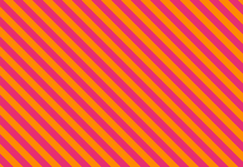
That would buy us stripes like this:
We can use transparent as a color though. Meaning if we covered the screen with stripes like these, we could see through where that color is. Say like this:
In that gradient definition, we use 10px as the “start” and 20px as the “end” of the gradient before it repeats. Part of the trick here is keeping that 20px “end” the same and animating the “start” number up to it. When we do that, it actually covers the screen in a solid color. The problem is… how do you animate it? You can’t do this:
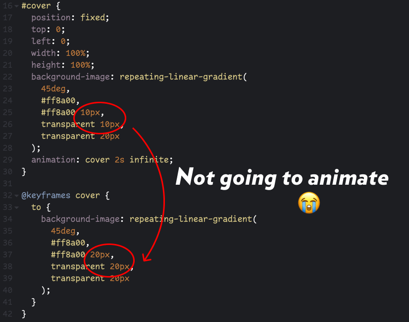
What we need to do is animate that “start” pixel value number alone. We can use a custom property, but it’s a little tricky because without declaring them, custom properties are just strings, and not animatable lengths. So we’d have to do it like this.
@property --start { syntax: "<length>"; inherits: false; initial-value: 10px;
}
#cover { position: fixed; top: 0; left: 0; width: 100%; height: 100%; background-image: repeating-linear-gradient( 45deg, #ff8a00, #ff8a00 var(--start), transparent var(--start), transparent var(--end, 20px) ); animation: cover 1s linear infinite;
}
@keyframes cover { to { --start: 20px; }
}
We’ve got to use @property here to do this, which I really like but, sadly, has limited browser support. It does work though! I’ve got all that set up, including a quick prefers-reduced-motion media query. I’m using a smidge of JavaScript to change the background halfway through the animation (while the screen is covered) so you can see how it might be used for a screen transition. Again, note that this is only working in Chromium-based browsers at the moment:
Notice I’ve used CSS custom properties for other things as well, like the angle and size of the stripes and the speed of the animation. They are both very trivial to change! I’ve chucked in knobs so you can adjust things to your liking. Knobs? Yeah, they are cool:
[embedded content]
This whole thing started as a tweet. In this case, I’m glad I did as Temani Afif chimed in with a way to do it with masks as well, meaning pretty solid support across all browsers:
I don’t think animating background color stops or a mask position is particularly performant, but since we’re talking “screen wipes” here, one could imagine that the page isn’t likely to be interacted with anymore until the page transition is over, so maybe that’s not the world’s biggest deal.


