How do you make a great website? Everyone has an answer at the ready: Flashy animations! The latest punk-rock CSS trick! Gradients! Illustrations! Colors to pack a punch! Vite! And, sure, all these things might make a website better. But no matter how fancy the application is or how dazzling the technology will ever be under the hood, a great website will always require great text.
So, whenever I’m stuck pondering the question: “how do I make this website better?” I know the answer is always this:
care for the text.
Without great writing, a website is harder to read, extremely difficult to navigate, and impossible to remember. Without great writing, it’s hardly a website at all. But it’s tough to remember this day in and day out—especially when it’s not our job to care about the text—yet each and every <p> tag and <button> element is an opportunity for great writing. It’s a moment to inject some humor or add a considerate note that helps people.
So: care for the text. Got it. But there are so many ways to care! From commas and smart quotes, to labels in our forms, to typography, and even the placeholders in our inputs. It’s a dizzying amount of responsibility—but it’s worth every second of our time.
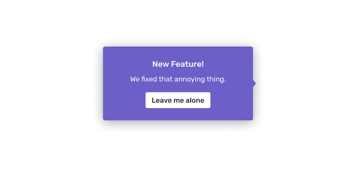
Here’s one example: a while ago, we needed to explain a new feature to our users and point to it in the UI. We could use our pop-up component to explain how our team just fixed something for a ton of folks—but!—I knew that no matter what the fancy new feature was, our customers would be annoyed by a pop-up.
After thinking about it for far too long I realized that this was an opportunity to acknowledge how annoying this popup was:

With this project, I could’ve just thrown some text in that button that says “Dismiss” but our little team of writers at Sentry constantly remind me that even the smallest, most boring block of text can be a playground. Each string has potential, even in this dumb example. It doesn’t change the world or anything, but it improves something that would otherwise be yawn-worthy, predictable.
Not every bit of text in a website needs to be passive-aggressive though. When you’re in the checkout ordering medicine, you likely don’t want to be reading a quirky story or a poem, and you don’t want to click a button that insults you. In this context, caring for the text means something entirely different. It’s about not getting in the way but being as efficient and empathetic as possible. And this is true of every link in the footer, every navigation item, every <alt> tag, and subtitle—they all require care and attention. Because all of these details add up.
These are the details that make a good website great.


