Your mission — should you decide to accept it — is to build a Button component in four frameworks, but, only use one button.css file!
This idea is very important to me. I’ve been working on a component library called AgnosticUI where the purpose is building UI components that aren’t tied to any one particular JavaScript framework. AgnosticUI works in React, Vue 3, Angular, and Svelte. So that’s exactly what we’ll do today in this article: build a button component that works across all these frameworks.
The source code for this article is available on GitHub on the the-little-button-that-could-series branch.
Table of contents
Table of Contents
Why a monorepo?
We’re going to set up a tiny Yarn workspaces-based monorepo. Why? Chris actually has a nice outline of the benefits in another post. But here’s my own biased list of benefits that I feel are relevant for our little buttons endeavor:
Coupling
We’re trying to build a single button component that uses just one button.css file across multiple frameworks. So, by nature, there’s some purposeful coupling going on between the various framework implementations and the single-source-of-truth CSS file. A monorepo setup provides a convenient structure that facilitates copying our single button.css component into various framework-based projects.
Workflow
Let’s say the button needs a tweak — like the “focus-ring” implementation, or we screwed up the use of aria in the component templates. Ideally, we’d like to correct things in one place rather than making individual fixes in separate repositories.
Testing
We want the convenience of firing up all four button implementations at the same time for testing. As this sort of project grows, it’s safe to assume there will be more proper testing. In AgnosticUI, for example, I’m currently using Storybook and often kick off all the framework Storybooks, or run snapshot testing across the entire monorepo.
I like what Leonardo Losoviz has to say about the monorepo approach. (And it just so happens to align with with everything we’ve talked about so far.)
I believe the monorepo is particularly useful when all packages are coded in the same programming language, tightly coupled, and relying on the same tooling.
Setting up
Time to dive into code — start by creating a top-level directory on the command-line to house the project and then cd into it. (Can’t think of a name? mkdir buttons && cd buttons will work fine.)
First off, let’s initialize the project:
$ yarn init
yarn init v1.22.15
question name (articles): littlebutton
question version (1.0.0): question description: my little button project
question entry point (index.js): question repository url: question author (Rob Levin): question license (MIT): question private: success Saved package.json
That gives us a package.json file with something like this:
{ "name": "littlebutton", "version": "1.0.0", "description": "my little button project", "main": "index.js", "author": "Rob Levin", "license": "MIT"
}
Creating the baseline workspace
We can set the first one up with this command:
mkdir -p ./littlebutton-cssNext, we need to add the two following lines to the monorepo’s top-level package.json file so that we keep the monorepo itself private. It also declares our workspaces:
// ... "private": true, "workspaces": ["littlebutton-react", "littlebutton-vue", "littlebutton-svelte", "littlebutton-angular", "littlebutton-css"]Now descend into the littlebutton-css directory. We’ll again want to generate a package.json with yarn init. Since we’ve named our directory littlebutton-css (the same as how we specified it in our workspaces in package.json) we can simply hit the Return key and accept all the prompts:
$ cd ./littlebutton-css && yarn init
yarn init v1.22.15
question name (littlebutton-css): question version (1.0.0): question description: question entry point (index.js): question repository url: question author (Rob Levin): question license (MIT): question private: success Saved package.json
At this point, the directory structure should look like this:
├── littlebutton-css
│ └── package.json
└── package.json
We’ve only created the CSS package workspace at this point as we’ll be generating our framework implementations with tools like vite which, in turn, generate a package.json and project directory for you. We will have to remember that the name we choose for these generated projects must match the name we’ve specified in the package.json for our earlier workspaces to work.
Baseline HTML & CSS
Let’s stay in the ./littlebutton-css workspace and create our simple button component using vanilla HTML and CSS files.
touch index.html ./css/button.cssNow our project directory should look like this:
littlebutton-css
├── css
│ └── button.css
├── index.html
└── package.json
Let’s go ahead and connect some dots with some boilerplate HTML in ./index.html:
<!doctype html>
<html lang="en">
<head> <meta charset="utf-8"> <title>The Little Button That Could</title> <meta name="description" content=""> <meta name="viewport" content="width=device-width, initial-scale=1"> <link rel="stylesheet" href="css/button.css">
</head>
<body> <main> <button class="btn">Go</button> </main>
</body>
</html>
And, just so we have something visual to test, we can add a little color in ./css/button.css:
.btn { color: hotpink;
}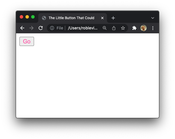
Now open up that index.html page in the browser. If you see an ugly generic button with hotpink text… success!
Framework-specific workspaces
So what we just accomplished is the baseline for our button component. What we want to do now is abstract it a bit so it’s extensible for other frameworks and such. For example, what if we want to use the button in a React project? We’re going to need workspaces in our monorepo for each one. We’ll start with React, then follow suit for Vue 3, Angular, and Svelte.
React
We’re going to generate our React project using vite, a very lightweight and blazingly fast builder. Be forewarned that if you attempt to do this with create-react-app, there’s a very good chance you will run into conflicts later with react-scripts and conflicting webpack or Babel configurations from other frameworks, like Angular.
To get our React workspace going, let’s go back into the terminal and cd back up to the top-level directory. From there, we’ll use vite to initialize a new project — let’s call it littlebutton-react — and, of course, we’ll select react as the framework and variant at the prompts:
$ yarn create vite
yarn create v1.22.15
[1/4] ???? Resolving packages...
[2/4] ???? Fetching packages...
[3/4] ???? Linking dependencies...
[4/4] ???? Building fresh packages... success Installed "[email protected]" with binaries: - create-vite - cva
✔ Project name: … littlebutton-react
✔ Select a framework: › react
✔ Select a variant: › react Scaffolding project in /Users/roblevin/workspace/opensource/guest-posts/articles/littlebutton-react... Done. Now run: cd littlebutton-react yarn yarn dev ✨ Done in 17.90s.
We initialize the React app with these commands next:
cd littlebutton-react
yarn
yarn dev
With React installed and verified, let’s replace the contents of src/App.jsx to house our button with the following code:
import "./App.css"; const Button = () => { return <button>Go</button>;
}; function App() { return ( <div className="App"> <Button /> </div> );
} export default App;
Now we’re going to write a small Node script that copies our littlebutton-css/css/button.css right into our React application for us. This step is probably the most interesting one to me because it’s both magical and ugly at the same time. It’s magical because it means our React button component is truly deriving its styles from the same CSS written in the baseline project. It’s ugly because, well, we are reaching up out of one workspace and grabbing a file from another. ¯_(ツ)_/¯
Add the following little Node script to littlebutton-react/copystyles.js:
const fs = require("fs");
let css = fs.readFileSync("../littlebutton-css/css/button.css", "utf8");
fs.writeFileSync("./src/button.css", css, "utf8");
Let’s place a node command to run that in a package.json script that happens before the dev script in littlebutton-react/package.json. We’ll add a syncStyles and update the dev to call syncStyles before vite:
"syncStyles": "node copystyles.js", "dev": "yarn syncStyles && vite",Now, anytime we fire up our React application with yarn dev, we’ll first be copying the CSS file over. In essence, we’re “forcing” ourselves to not diverge from the CSS package’s button.css in our React button.
But we want to also leverage CSS Modules to prevent name collisions and global CSS leakage, so we have one more step to do to get that wired up (from the same littlebutton-react directory):
touch src/button.module.cssNext, add the following to the new src/button.module.css file:
.btn { composes: btn from './button.css';
}
I find composes (also known as composition) to be one of the coolest features of CSS Modules. In a nutshell, we’re copying our HTML/CSS version of button.css over wholesale then composing from our one .btn style rule.
With that, we can go back to our src/App.jsx and import the CSS Modules styles into our React component with this:
import "./App.css";
import styles from "./button.module.css"; const Button = () => { return <button className={styles.btn}>Go</button>;
}; function App() { return ( <div className="App"> <Button /> </div> );
} export default App;
Whew! Let’s pause and try to run our React app again:
yarn devIf all went well, you should see that same generic button, but with hotpink text. Before we move on to the next framework, let’s move back up to our top-level monorepo directory and update its package.json:
{ "name": "littlebutton", "version": "1.0.0", "description": "toy project", "main": "index.js", "author": "Rob Levin", "license": "MIT", "private": true, "workspaces": ["littlebutton-react", "littlebutton-vue", "littlebutton-svelte", "littlebutton-angular"], "scripts": { "start:react": "yarn workspace littlebutton-react dev" }
}
Run the yarn command from the top-level directory to get the monorepo-hoisted dependencies installed.
The only change we’ve made to this package.json is a new scripts section with a single script to start the React app. By adding start:react we can now run yarn start:react from our top-level directory and it will fire up the project we just built in ./littlebutton-react without the need for cd‘ing — super convenient!
We’ll tackle Vue and Svelte next. It turns out that we can take a pretty similar approach for these as they both use single file components (SFC). Basically, we get to mix HTML, CSS, and JavaScript all into one single file. Whether you like the SFC approach or not, it’s certainly adequate enough for building out presentational or primitive UI components.
Vue
Following the steps from vite’s scaffolding docs we’ll run the following command from the monorepo’s top-level directory to initialize a Vue app:
yarn create vite littlebutton-vue --template vueThis generates scaffolding with some provided instructions to run the starter Vue app:
cd littlebutton-vue
yarn
yarn dev
This should fire up a starter page in the browser with some heading like “Hello Vue 3 + Vite.” From here, we can update src/App.vue to:
<template> <div id="app"> <Button class="btn">Go</Button> </div>
</template> <script>
import Button from './components/Button.vue' export default { name: 'App', components: { Button }
}
</script>
And we’ll replace any src/components/* with src/components/Button.vue:
<template> <button :class="classes"><slot /></button>
</template> <script>
export default { name: 'Button', computed: { classes() { return { [this.$style.btn]: true, } } }
}
</script> <style module>
.btn { color: slateblue;
}
</style>
Let’s break this down a bit:
:class="classes"is using Vue’s binding to call the computedclassesmethod.- The
classesmethod, in turn, is utilizing CSS Modules in Vue with thethis.$style.btnsyntax which will use styles contained in a<style module>tag.
For now, we’re hardcoding color: slateblue simply to test that things are working properly within the component. Try firing up the app again with yarn dev. If you see the button with our declared test color, then it’s working!
Now we’re going to write a Node script that copies our littlebutton-css/css/button.css into our Button.vue file similar to the one we did for the React implementation. As mentioned, this component is a SFC so we’re going to have to do this a little differently using a simple regular expression.
Add the following little Node.js script to littlebutton-vue/copystyles.js:
const fs = require("fs");
let css = fs.readFileSync("../littlebutton-css/css/button.css", "utf8");
const vue = fs.readFileSync("./src/components/Button.vue", "utf8");
// Take everything between the starting and closing style tag and replace
const styleRegex = /<style module>([sS]*?)</style>/;
let withSynchronizedStyles = vue.replace(styleRegex, `<style module>n${css}n</style>`);
fs.writeFileSync("./src/components/Button.vue", withSynchronizedStyles, "utf8");
There’s a bit more complexity in this script, but using replace to copy text between opening and closing style tags via regex isn’t too bad.
Now let’s add the following two scripts to the scripts clause in the littlebutton-vue/package.json file:
"syncStyles": "node copystyles.js", "dev": "yarn syncStyles && vite",Now run yarn syncStyles and look at ./src/components/Button.vue again. You should see that our style module gets replaced with this:
<style module>
.btn { color: hotpink;
}
</style>
Run the Vue app again with yarn dev and verify you get the expected results — yes, a button with hotpink text. If so, we’re good to move on to the next framework workspace!
Svelte
Per the Svelte docs, we should kick off our littlebutton-svelte workspace with the following, starting from the monorepo’s top-level directory:
npx degit sveltejs/template littlebutton-svelte
cd littlebutton-svelte
yarn && yarn dev
Confirm you can hit the “Hello World” start page at http://localhost:5000. Then, update littlebutton-svelte/src/App.svelte:
<script> import Button from './Button.svelte';
</script>
<main> <Button>Go</Button>
</main>
Also, in littlebutton-svelte/src/main.js, we want to remove the name prop so it looks like this:
import App from './App.svelte'; const app = new App({ target: document.body
}); export default app;
And finally, add littlebutton-svelte/src/Button.svelte with the following:
<button class="btn"> <slot></slot>
</button> <script>
</script> <style> .btn { color: saddlebrown; }
</style>
One last thing: Svelte appears to name our app: "name": "svelte-app" in the package.json. Change that to "name": "littlebutton-svelte" so it’s consistent with the workspaces name in our top-level package.json file.
Once again, we can copy our baseline littlebutton-css/css/button.css into our Button.svelte. As mentioned, this component is a SFC, so we’re going to have to do this using a regular expression. Add the following Node script to littlebutton-svelte/copystyles.js:
const fs = require("fs");
let css = fs.readFileSync("../littlebutton-css/css/button.css", "utf8");
const svelte = fs.readFileSync("./src/Button.svelte", "utf8");
const styleRegex = /<style>([sS]*?)</style>/;
let withSynchronizedStyles = svelte.replace(styleRegex, `<style>n${css}n</style>`);
fs.writeFileSync("./src/Button.svelte", withSynchronizedStyles, "utf8");
This is super similar to the copy script we used with Vue, isn’t it? We’ll add similar scripts to our package.json script:
"dev": "yarn syncStyles && rollup -c -w", "syncStyles": "node copystyles.js",Now run yarn syncStyles && yarn dev. If all is good, we once again should see a button with hotpink text.
If this is starting to feel repetitive, all I have to say is welcome to my world. What I’m showing you here is essentially the same process I’ve been using to build my AgnosticUI project!
Angular
You probably know the drill by now. From the monorepo’s top-level directory, install Angular and create an Angular app. If we were creating a full-blown UI library we’d likely use ng generate library or even nx. But to keep things as straightforward as possible we’ll set up a boilerplate Angular app as follows:
npm install -g @angular/cli ### unless you already have installed
ng new littlebutton-angular ### choose no for routing and CSS
? Would you like to add Angular routing? (y/N) N
❯ CSS SCSS [ https://sass-lang.com/documentation/syntax#scss ] Sass [ https://sass-lang.com/documentation/syntax#the-indented-syntax ] Less [ http://lesscss.org ] cd littlebutton-angular && ng serve --open
With the Angular setup confirmed, let’s update some files. cd littlebutton-angular, delete the src/app/app.component.spec.ts file, and add a button component in src/components/button.component.ts, like this:
import { Component } from '@angular/core'; @Component({ selector: 'little-button', templateUrl: './button.component.html', styleUrls: ['./button.component.css'],
})
export class ButtonComponent {}
Add the following to src/components/button.component.html:
<button class="btn">Go</button>And put this in the src/components/button.component.css file for testing:
.btn { color: fuchsia;
}
In src/app/app.module.ts:
import { NgModule } from '@angular/core';
import { BrowserModule } from '@angular/platform-browser'; import { AppComponent } from './app.component';
import { ButtonComponent } from '../components/button.component'; @NgModule({ declarations: [AppComponent, ButtonComponent], imports: [BrowserModule], providers: [], bootstrap: [AppComponent],
})
export class AppModule {}
Next, replace src/app/app.component.ts with:
import { Component } from '@angular/core'; @Component({ selector: 'app-root', templateUrl: './app.component.html', styleUrls: ['./app.component.css'],
})
export class AppComponent {}
Then, replace src/app/app.component.html with:
<main> <little-button>Go</little-button>
</main>
With that, let’s run yarn start and verify our button with fuchsia text renders as expected.
Again, we want to copy over the CSS from our baseline workspace. We can do that by adding this to littlebutton-angular/copystyles.js:
const fs = require("fs");
let css = fs.readFileSync("../littlebutton-css/css/button.css", "utf8");
fs.writeFileSync("./src/components/button.component.css", css, "utf8");
Angular is nice in that it uses ViewEncapsulation that defaults to to emulate which mimics, according to the docs,
[…] the behavior of shadow DOM by preprocessing (and renaming) the CSS code to effectively scope the CSS to the component’s view.
This basically means we can literally copy over button.css and use it as-is.
Finally, update the package.json file by adding these two lines in the scripts section:
"start": "yarn syncStyles && ng serve", "syncStyles": "node copystyles.js",With that, we can now run yarn start once more and verify our button text color (which was fuchsia) is now hotpink.
What have we just done?
Let’s take a break from coding and think about the bigger picture and what we’ve just done. Basically, we’ve set up a system where any changes to our CSS package’s button.css will get copied over into all the framework implementations as a result of our copystyles.js Node scripts. Further, we’ve incorporated idiomatic conventions for each of the frameworks:
SFCfor Vue and SvelteCSS Modulesfor React (and Vue within the SFC<style module>setup)ViewEncapsulationfor Angular
Of course I state the obvious that these aren’t the only ways to do CSS in each of the above frameworks (e.g. CSS-in-JS is a popular choice), but they are certainly accepted practices and are working quite well for our greater goal — to have a single CSS source of truth to drive all framework implementations.
If, for example, our button was in use and our design team decided we wanted to change from 4px to 3px border-radius, we could update the one file, and any separate implementations would stay synced.
This is compelling if you have a polyglot team of developers that enjoy working in multiple frameworks, or, say an offshore team (that’s 3× productive in Angular) that’s being tasked to build a back-office application, but your flagship product is built in React. Or, you’re building an interim admin console and you’d love to experiment with using Vue or Svelte. You get the picture.
Finishing touches
OK, so we have the monorepo architecture in a really good spot. But there’s a few things we can do to make it even more useful as far as the developer experience goes.
Better start scripts
Let’s move back up to our top-level monorepo directory and update its package.json scripts section with the following so we can kick any framework implementation without cd‘ing:
// ... "scripts": { "start:react": "yarn workspace littlebutton-react dev", "start:vue": "yarn workspace littlebutton-vue dev ", "start:svelte": "yarn workspace littlebutton-svelte dev", "start:angular": "yarn workspace littlebutton-angular start"
},
Better baseline styles
We can also provide a better set of baseline styles for the button so it starts from a nice, neutral place. Here’s what I did in the littlebutton-css/css/button.css file.
View Full Snippet
.btn { --button-dark: #333; --button-line-height: 1.25rem; --button-font-size: 1rem; --button-light: #e9e9e9; --button-transition-duration: 200ms; --button-font-stack: system-ui, -apple-system, BlinkMacSystemFont, "Segoe UI", Roboto, Ubuntu, "Helvetica Neue", sans-serif; display: inline-flex; align-items: center; justify-content: center; white-space: nowrap; user-select: none; appearance: none; cursor: pointer; box-sizing: border-box; transition-property: all; transition-duration: var(--button-transition-duration); color: var(--button-dark); background-color: var(--button-light); border-color: var(--button-light); border-style: solid; border-width: 1px; font-family: var(--button-font-stack); font-weight: 400; font-size: var(--button-font-size); line-height: var(--button-line-height); padding-block-start: 0.5rem; padding-block-end: 0.5rem; padding-inline-start: 0.75rem; padding-inline-end: 0.75rem; text-decoration: none; text-align: center;
} /* Respect users reduced motion preferences */
@media (prefers-reduced-motion) { .btn { transition-duration: 0.001ms !important; }
}
Let’s test this out! Fire up each of the four framework implementations with the new and improved start scripts and confirm the styling changes are in effect.
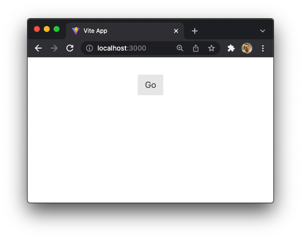
One CSS file update proliferated to four frameworks — pretty cool, eh!?
Set a primary mode
We’re going to add a mode prop to each of our button’s and implement primary mode next. A primary button could be any color but we’ll go with a shade of green for the background and white text. Again, in the baseline stylesheet:
.btn { --button-primary: #14775d; --button-primary-color: #fff; /* ... */
}
Then, just before the @media (prefers-reduced-motion) query, add the following btn-primary to the same baseline stylesheet:
.btn-primary { background-color: var(--button-primary); border-color: var(--button-primary); color: var(--button-primary-color);
}
There we go! Some developer conveniences and better baseline styles!
Updating each component to take a mode property
Now that we’ve added our new primary mode represented by the .btn-primary class, we want to sync the styles for all four framework implementations. So, let’s add some more package.json scripts to our top level scripts:
"sync:react": "yarn workspace littlebutton-react syncStyles", "sync:vue": "yarn workspace littlebutton-vue syncStyles", "sync:svelte": "yarn workspace littlebutton-svelte syncStyles", "sync:angular": "yarn workspace littlebutton-angular syncStyles"Be sure to respect JSON’s comma rules! Depending on where you place these lines within your scripts: {...}, you’ll want to make sure there are no missing or trailing commas.
Go ahead and run the following to fully synchronize the styles:
yarn sync:angular && yarn sync:react && yarn sync:vue && yarn sync:svelteRunning this doesn’t change anything because we haven’t applied the primary class yet, but you should at least see the CSS has been copied over if you go look at the framework’s button component CSS.
React
If you haven’t already, double-check that the updated CSS got copied over into littlebutton-react/src/button.css. If not, you can run yarn syncStyles. Note that if you forget to run yarn syncStyles our dev script will do this for us when we next start the application anyway:
"dev": "yarn syncStyles && vite",For our React implementation, we additionally need to add a composed CSS Modules class in littlebutton-react/src/button.module.css that is composed from the new .btn-primary:
.btnPrimary { composes: btn-primary from './button.css';
}
We’ll also update littlebutton-react/src/App.jsx:
import "./App.css";
import styles from "./button.module.css"; const Button = ({ mode }) => { const primaryClass = mode ? styles[`btn${mode.charAt(0).toUpperCase()}${mode.slice(1)}`] : ''; const classes = primaryClass ? `${styles.btn} ${primaryClass}` : styles.btn; return <button className={classes}>Go</button>;
}; function App() { return ( <div className="App"> <Button mode="primary" /> </div> );
} export default App;
Fire up the React app with yarn start:react from the top-level directory. If all goes well, you should now see your green primary button.
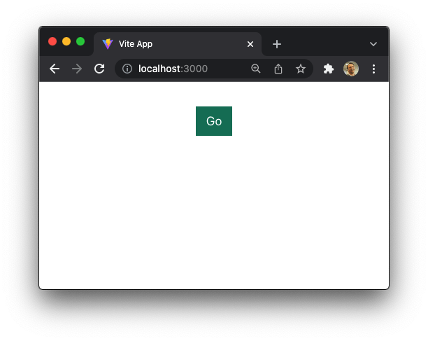
As a note, I’m keeping the Button component in App.jsx for brevity. Feel free to tease out the Button component into its own file if that bothers you.
Vue
Again, double-check that the button styles were copied over and, if not, run yarn syncStyles.
Next, make the following changes to the <script> section of littlebutton-vue/src/components/Button.vue:
<script>
export default { name: 'Button', props: { mode: { type: String, required: false, default: '', validator: (value) => { const isValid = ['primary'].includes(value); if (!isValid) { console.warn(`Allowed types for Button are primary`); } return isValid; }, } }, computed: { classes() { return { [this.$style.btn]: true, [this.$style['btn-primary']]: this.mode === 'primary', } } }
}
</script>
Now we can update the markup in littlebutton-vue/src/App.vue to use the new mode prop:
<Button mode="primary">Go</Button>Now you can yarn start:vue from the top-level directory and check for the same green button.
Svelte
Let’s cd into littlebutton-svelte and verify that the styles in littlebutton-svelte/src/Button.svelte have the new .btn-primary class copied over, and yarn syncStyles if you need to. Again, the dev script will do that for us anyway on the next startup if you happen to forget.
Next, update the Svelte template to pass the mode of primary. In src/App.svelte:
<script> import Button from './Button.svelte';
</script>
<main> <Button mode="primary">Go</Button>
</main>
We also need to update the top of our src/Button.svelte component itself to accept the mode prop and apply the CSS Modules class:
<button class="{classes}"> <slot></slot>
</button>
<script> export let mode = ""; const classes = [ "btn", mode ? `btn-${mode}` : "", ].filter(cls => cls.length).join(" ");
</script>
Note that the <styles> section of our Svelte component shouldn’t be touched in this step.
And now, you can yarn dev from littlebutton-svelte (or yarn start:svelte from a higher directory) to confirm the green button made it!
Angular
Same thing, different framework: check that the styles are copied over and run yarn syncStyles if needed.
Let’s add the mode prop to the littlebutton-angular/src/app/app.component.html file:
<main> <little-button mode="primary">Go</little-button>
</main>
Now we need to set up a binding to a classes getter to compute the correct classes based on if the mode was passed in to the component or not. Add this to littlebutton-angular/src/components/button.component.html (and note the binding is happening with the square brackets):
<button [class]="classes">Go</button>Next, we actually need to create the classes binding in our component at littlebutton-angular/src/components/button.component.ts:
import { Component, Input } from '@angular/core'; @Component({ selector: 'little-button', templateUrl: './button.component.html', styleUrls: ['./button.component.css'],
})
export class ButtonComponent { @Input() mode: 'primary' | undefined = undefined; public get classes(): string { const modeClass = this.mode ? `btn-${this.mode}` : ''; return [ 'btn', modeClass, ].filter(cl => cl.length).join(' '); }
}
We use the Input directive to take in the mode prop, then we create a classes accessor which adds the mode class if it’s been passed in.
Fire it up and look for the green button!
Code complete
If you’ve made it this far, congratulations — you’ve reached code complete! If something went awry, I’d encourage you to cross-reference the source code over at GitHub on the the-little-button-that-could-series branch. As bundlers and packages have a tendency to change abruptly, you might want to pin your package versions to the ones in this branch if you happen to experience any dependency issues.
Take a moment to go back and compare the four framework-based button component implementations we just built. They’re still small enough to quickly notice some interesting differences in how props get passed in, how we bind to props, and how CSS name collisions are prevented among other subtle differences. As I continue to add components to AgnosticUI (which supports these exact same four frameworks), I’m continually pondering which offers the best developer experience. What do you think?
Homework
If you’re the type that likes to figure things out on your own or enjoys digging in deeper, here are ideas.
Button states
The current button styles do not account for various states, like :hover. I believe that’s a good first exercise.
/* You should really implement the following states but I will leave it as an exercise for you to decide how to and what values to use.
*/
.btn:focus { /* If you elect to remove the outline, replace it with another proper affordance and research how to use transparent outlines to support windows high contrast */
}
.btn:hover { }
.btn:visited { }
.btn:active { }
.btn:disabled { }
Variants
Most button libraries support many button variations for things like sizes, shapes, and colors. Try creating more than the primary mode we already have. Maybe a secondary variation? A warning or success? Maybe filled and outline? Again, you can look at AgnosticUI’s buttons page for ideas.
CSS custom properties
If you haven’t started using CSS custom properties yet, I’d strongly recommend it. You can start by having a look at AgnosticUI’s common styles. I heavily lean on custom properties in there. Here are some great articles that cover what custom properties are and how you might leverage them:
Types
No… not typings, but the <button> element’s type attribute. We didn’t cover that in our component but there’s an opportunity to extend the component to other use cases with valid types, like button, submit, and reset. This is pretty easy to do and will greatly improve the button’s API.
More ideas
Gosh, you could do so much — add linting, convert it to Typescript, audit the accessibility, etc.
The current Svelte implementation is suffering from some pretty loose assumptions as we have no defense if the valid primary mode isn’t passed — that would produce a garbage CSS class:
mode ? `btn-${mode}` : "",You could say, “Well, .btn-garbage as a class isn’t exactly harmful.” But it’s probably a good idea to style defensively when and where possible.
Potential pitfalls
There are some things you should be aware of before taking this approach further:
- Positional CSS based on the structure of the markup will not work well for the CSS Modules based techniques used here.
- Angular makes positional techniques even harder as it generates :host element representing each component view. This means you have these extra elements in between your template or markup structure. You’ll need to work around that.
- Copying styles across workspace packages is a bit of an anti-pattern to some folks. I justify it because I believe the benefits outweigh the costs; also, when I think about how monorepos use symlinks and (not-so-failproof) hoisting, I don’t feel so bad about this approach.
- You’ll have to subscribe to the decoupled techniques used here, so no CSS-in-JS.
I believe that all approaches to software development have their pros and cons and you ultimately have to decide if sharing a single CSS file across frameworks works for you or your specific project. There are certainly other ways you could do this (e.g. using littlebuttons-css as an npm package dependency) if needed.
Conclusion
Hopefully I’ve whet your appetite and you’re now really intrigued to create UI component libraries and/or design systems that are not tied to a particular framework. Maybe you have a better idea on how to achieve this — I’d love to hear your thoughts in the comments!
I’m sure you’ve seen the venerable TodoMVC project and how many framework implementations have been created for it. Similarly, wouldn’t it be nice to have a UI component library of primitives available for many frameworks? Open UI is making great strides to properly standardize native UI component defaults, but I believe we’ll always need to insert ourselves to some extent. Certainly, taking a good year to build a custom design system is quickly falling out of favor and companies are seriously questioning their ROI. Some sort of scaffolding is required to make the endeavor practical.
The vision of AgnosticUI is to have a relatively agnostic way to build design systems quickly that are not tied down to a particular frontend framework. If you’re compelled to get involved, the project is still very early and approachable and I’d love some help! Plus, you’re already pretty familiar with the how the project works now that you’ve gone through this tutorial!


