If you’re disciplined and make use of the inheritance that the CSS cascade provides, you’ll end up writing less CSS. But because our styles often comes from all kinds of sources — and can be a pain to structure and maintain—the cascade can be a source of frustration, and the reason we end up with more CSS than necessary.
Some years ago, Harry Roberts came up with ITCSS and it’s a clever way of structuring CSS.
Mixed with BEM, ITCSS has become a popular way that people write and organize CSS.
However, even with ITCSS and BEM, there are still times where we still struggle with the cascade. For example, I’m sure you’ve had to @import external CSS components at a specific location to prevent breaking things, or reach for the dreaded !important at some point in time.
Recently, some new tools were added to our CSS toolbox, and they allow us to finally control the cascade. Let’s look at them.
O cascade, :where art thou?
Table of Contents
Using the :where pseudo-selector allows us to remove specificity to “just after the user-agent default styles,” no matter where or when the CSS is loaded into the document. That means the specificity of the whole thing is literally zero — totally wiped out. This is handy for generic components, which we’ll look into in a moment.
First, imagine some generic <table> styles, using :where:
:where(table) { background-color: tan;
}
Now, if you add some other table styles before the :where selector, like this:
table { background-color: hotpink;
} :where(table) { background-color: tan;
}
…the table background becomes hotpink, even though the table selector is specified before the :where selector in the cascade. That’s the beauty of :where, and why it’s already being used for CSS resets.
:where has a sibling, which has almost the exact opposite effect: the :is selector.
The specificity of the
:is()pseudo-class is replaced by the specificity of its most specific argument. Thus, a selector written with:is()does not necessarily have equivalent specificity to the equivalent selector written without:is(). Selectors Level 4 specification
Expanding on our previous example:
:is(table) { --tbl-bgc: orange;
}
table { --tbl-bgc: tan;
}
:where(table) { --tbl-bgc: hotpink; background-color: var(--tbl-bgc);
}
The <table class="c-tbl"> background color will be tan because the specificity of :is is the same as table, but table is placed after.
However, if we were to change it to this:
:is(table, .c-tbl) { --tbl-bgc: orange;
}
…the background color will be orange, since :is has the weight of it’s heaviest selector, which is .c-tbl.
Example: A configurable table component
Now, let’s see how we can use :where in our components. We’ll be building a table component, starting with the HTML:
Let’s wrap .c-tbl in a :where-selector and, just for fun, add rounded corners to the table. That means we need border-collapse: separate, as we can’t use border-radius on table cells when the table is using border-collapse: collapse:
:where(.c-tbl) { border-collapse: separate; border-spacing: 0; table-layout: auto; width: 99.9%;
}
The cells use different styling for the <thead> and <tbody>-cells:
:where(.c-tbl thead th) { background-color: hsl(200, 60%, 40%); border-style: solid; border-block-start-width: 0; border-inline-end-width: 1px; border-block-end-width: 0; border-inline-start-width: 0; color: hsl(200, 60%, 99%); padding-block: 1.25ch; padding-inline: 2ch; text-transform: uppercase;
}
:where(.c-tbl tbody td) { background-color: #FFF; border-color: hsl(200, 60%, 80%); border-style: solid; border-block-start-width: 0; border-inline-end-width: 1px; border-block-end-width: 1px; border-inline-start-width: 0; padding-block: 1.25ch; padding-inline: 2ch;
}
And, because of our rounded corners and the missing border-collapse: collapse, we need to add some extra styles, specifically for the table borders and a hover state on the cells:
:where(.c-tbl tr td:first-of-type) { border-inline-start-width: 1px;
}
:where(.c-tbl tr th:last-of-type) { border-inline-color: hsl(200, 60%, 40%);
}
:where(.c-tbl tr th:first-of-type) { border-inline-start-color: hsl(200, 60%, 40%);
}
:where(.c-tbl thead th:first-of-type) { border-start-start-radius: 0.5rem;
}
:where(.c-tbl thead th:last-of-type) { border-start-end-radius: 0.5rem;
}
:where(.c-tbl tbody tr:last-of-type td:first-of-type) { border-end-start-radius: 0.5rem;
}
:where(.c-tbl tr:last-of-type td:last-of-type) { border-end-end-radius: 0.5rem;
}
/* hover */
@media (hover: hover) { :where(.c-tbl) tr:hover td { background-color: hsl(200, 60%, 95%); }
}
Now we can create variations of our table component by injecting other styles before or after our generic styles (courtesy of the specificity-stripping powers of :where), either by overwriting the .c-tbl element or by adding a BEM-style modifier-class (e.g. c-tbl--purple):
<table class="c-tbl c-tbl--purple">.c-tbl--purple th { background-color: hsl(330, 50%, 40%)
}
.c-tbl--purple td { border-color: hsl(330, 40%, 80%);
}
.c-tbl--purple tr th:last-of-type { border-inline-color: hsl(330, 50%, 40%);
}
.c-tbl--purple tr th:first-of-type { border-inline-start-color: hsl(330, 50%, 40%);
}Cool! But notice how we keep repeating colors? And what if we want to change the border-radius or the border-width? That would end up with a lot of repeated CSS.
Let’s move all of these to CSS custom properties and, while we’re at it, we can move all configurable properties to the top of the component’s “scope“ — which is the table element itself — so we can easily play around with them later.
CSS Custom Properties
I’m going to switch things up in the HTML and use a data-component attribute on the table element that can be targeted for styling.
<table data-component="table" id="table">That data-component will hold the generic styles that we can use on any instance of the component, i.e. the styles the table needs no matter what color variation we apply. The styles for a specific table component instance will be contained in a regular class, using custom properties from the generic component.
[data-component="table"] { /* Styles needed for all table variations */
}
.c-tbl--purple { /* Styles for the purple variation */
}
If we place all the generic styles in a data-attribute, we can use whatever naming convention we want. This way, we don’t have to worry if your boss insists on naming the table’s classes something like .BIGCORP__TABLE, .table-component or something else.
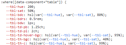
In the generic component, each CSS property points to a custom property. Properties, that have to work on child-elements, like border-color, are specified at the root of the generic component:
:where([data-component="table"]) { /* These will will be used multiple times, and in other selectors */ --tbl-hue: 200; --tbl-sat: 50%; --tbl-bdc: hsl(var(--tbl-hue), var(--tbl-sat), 80%);
} /* Here, it's used on a child-node: */
:where([data-component="table"] td) { border-color: var(--tbl-bdc);
}
For other properties, decide whether it should have a static value, or be configurable with its own custom property. If you’re using custom properties, remember to define a default value that the table can fall back to in the event that a variation class is missing.
:where([data-component="table"]) { /* These are optional, with fallbacks */ background-color: var(--tbl-bgc, transparent); border-collapse: var(--tbl-bdcl, separate);
}
If you’re wondering how I’m naming the custom properties, I’m using a component-prefix (e.g. --tbl) followed by an Emmett-abbreviation (e.g. -bgc). In this case, --tbl is the component-prefix, -bgc is the background color, and -bdcl is the border collapse. So, for example, --tbl-bgc is the table component’s background color. I only use this naming convention when working with component properties, as opposed to global properties which I tend to keep more general.
Now, if we open up DevTools, we can play around with the custom properties. For example, We can change --tbl-hue to a different hue value in the HSL color, set --tbl-bdrs: 0 to remove border-radius, and so on.

When working with your own components, this is the point in time you’ll discover which parameters (i.e. the custom property values) the component needs to make things look just right.
We can also use custom properties to control column alignment and width:
:where[data-component="table"] tr > *:nth-of-type(1)) { text-align: var(--ca1, initial); width: var(--cw1, initial); /* repeat for column 2 and 3, or use a SCSS-loop ... */
}
In DevTools, select the table and add these to the element.styles selector:
element.style { --ca2: center; /* Align second column center */ --ca3: right; /* Align third column right */
}
Now, let’s create our specific component styles, using a regular class, .c-tbl (which stands for “component-table” in BEM parlance). Let’s toss that class in the table markup.
<table class="c-tbl" data-component="table" id="table">Now, let’s change the --tbl-hue value in the CSS just to see how this works before we start messing around with all of the property values:
.c-tbl { --tbl-hue: 330;
}
Notice, that we only need to update properties rather than writing entirely new CSS! Changing one little property updates the table’s color — no new classes or overriding properties lower in the cascade.

--tbl-hue variableWe can write a more complex selector, but still update a single property, to get something like zebra-striping:
.c-tbl tr:nth-child(even) td { --tbl-td-bgc: hsl(var(--tbl-hue), var(--tbl-sat), 95%);
}
And remember: It doesn’t matter where you load the class. Because our generic styles are using :where, the specificity is wiped out, and any custom styles for a specific variation will be applied no matter where they are used. That’s the beauty of using :where to take control of the cascade!
And best of all, we can create all kinds of table components from the generic styles with a few lines of CSS.


Adding parameters with another data-attribute
So far, so good! The generic table component is very simple. But what if it requires something more akin to real parameters? Perhaps for things like:
- zebra-striped rows and columns
- a sticky header and sticky column
- hover-state options, such as hover row, hover cell, hover column
We could simply add BEM-style modifier classes, but we can actually accomplish it more efficiently by adding another data-attribute to the mix. Perhaps a data-param that holds the parameters like this:
<table data-component="table" data-param="zebrarow stickyrow">Then, in our CSS, we can use an attribute-selector to match a whole word in a list of parameters. For example, zebra-striped rows:
[data-component="table"][data-param~="zebrarow"] tr:nth-child(even) td { --tbl-td-bgc: var(--tbl-zebra-bgc);
}
Or zebra-striping columns:
[data-component="table"][data-param~="zebracol"] td:nth-of-type(odd) { --tbl-td-bgc: var(--tbl-zebra-bgc);
}
Let’s go nuts and make both the table header and the first column sticky:
[data-component="table"][data-param~="stickycol"] thead tr th:first-child,[data-component="table"][data-param~="stickycol"] tbody tr td:first-child { --tbl-td-bgc: var(--tbl-zebra-bgc); inset-inline-start: 0; position: sticky;
}
[data-component="table"][data-param~="stickyrow"] thead th { inset-block-start: -1px; position: sticky;
}
Here’s a demo that allows you to change one parameter at a time:
The default light theme in the demo is this:
.c-tbl--light { --tbl-bdrs: 0; --tbl-sat: 15%; --tbl-th-bgc: #eee; --tbl-th-bdc: #eee; --tbl-th-c: #555; --tbl-th-tt: normal;
}
…where data-param is set to noinlineborder which corresponds to these styles:
[data-param~="noinlineborder"] thead tr > th { border-block-start-width: 0; border-inline-end-width: 0; border-block-end-width: var(--tbl-bdw); border-inline-start-width: 0;
}
I know my data-attribute way of styling and configuring generic components is very opinionated. That’s just how I roll, so please feel free to stick with whatever method you’re most comfortable working with, whether it’s a BEM modifier class or something else.
The bottom line is this: embrace :where and :is and the cascade-controlling powers they provide. And, if possible, construct the CSS in such a way that you wind up writing as little new CSS as possible when creating new component variations!
Cascade Layers
The last cascade-busting tool I want to look at is “Cascade Layers.” At the time of this writing, it’s an experimental feature defined in the CSS Cascading and Inheritance Level 5 specification that you can access in Safari or Chrome by enabling the #enable-cascade-layers flag.

Bramus Van Damme sums up the concept nicely:
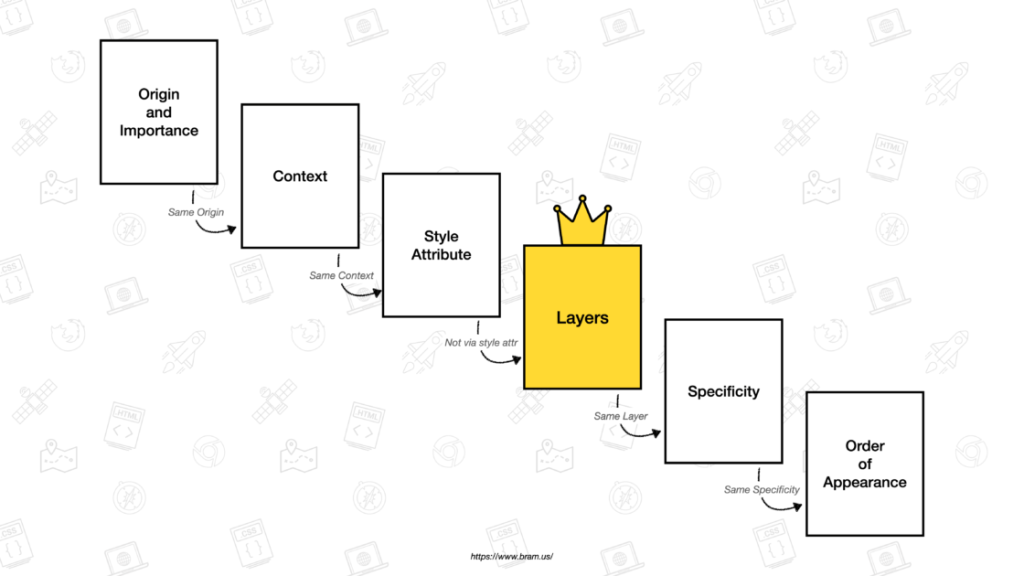
The true power of Cascade Layers comes from its unique position in the Cascade: before Selector Specificity and Order Of Appearance. Because of that we don’t need to worry about the Selector Specificity of the CSS that is used in other Layers, nor about the order in which we load CSS into these Layers — something that will come in very handy for larger teams or when loading in third-party CSS.
Perhaps even nicer is his illustration showing where Cascade Layers fall in the cascade:

At the beginning of this article, I mentioned ITCSS — a way of taming the cascade by specifying the load-order of generic styles, components etc. Cascade Layers allow us to inject a stylesheet at a given location. So a simplified version of this structure in Cascade Layers looks like this:
@layer generic, components;With this single line, we’ve decided the order of our layers. First come the generic styles, followed by the component-specific ones.
Let’s pretend that we’re loading our generic styles somewhere much later than our component styles:
@layer components { body { background-color: lightseagreen; }
} /* MUCH, much later... */ @layer generic { body { background-color: tomato; }
}
The background-color will be lightseagreen because our component styles layer is set after the generic styles layer. So, the styles in the components layer “win” even if they are written before the generic layer styles.
Again, just another tool for controlling how the CSS cascade applies styles, allowing us more flexibility to organize things logically rather than wrestling with specificity.
Now you’re in control!
The whole point here is that the CSS cascade is becoming a lot easier to wrangle, thanks to new features. We saw how the :where and :is pseudo-selectors allows us to control specificity, either by stripping out the specificity of an entire ruleset or taking on the specificity of the most specific argument, respectively. Then we used CSS Custom Properties to override styles without writing a new class to override another. From there, we took a slight detour down data-attribute lane to help us add more flexibility to create component variations merely by adding arguments to the HTML. And, finally, we poked at Cascade Layers which should prove handy for specifying the loading order or styles using @layer.
If you leave with only one takeaway from this article, I hope it’s that the CSS cascade is no longer the enemy it’s often made to be. We are gaining the tools to stop fighting it and start leaning into even more.
Header photo by Stephen Leonardi on Unsplash


