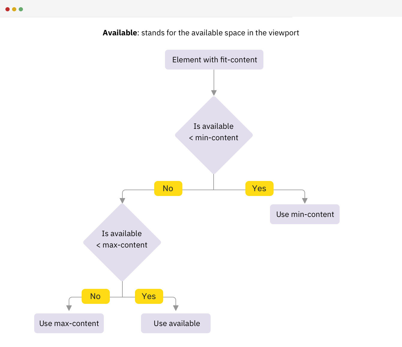
Ahmad Shadeed covers the CSS fit-content sizing keyword. It’s useful! It just doesn’t come up super often. I find myself using min-content a lot more, like when setting up the height of a grid-template-row.
The fit-content keyword is actually closely related to min-content and max-content — it just has a little heuristic it follows that Ahmad nicely illustrates as a flow chart.

My favorite use case is covered here: sizing a <figure> with fit-content, so that it neatly wraps around the <img>. That way, even if the image doesn’t fill the parent space, and it can remain block-level.
We also covered PPK’s deep dive on fit-content last year. One of the key takeaways for understanding it is knowing that is it essentially a shorthand way of writing:
.box { width: fit-content; /* ... is the same as ... */ width: auto; min-width: min-content; max-width: max-content;
}
Direct Link →


