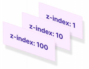
The z-index is a property used to control the ordering of layers in the document. Elements with a higher z-index value appear above elements with lower values. Much like how the x and y axes on a page determine where an element placed horizontally and vertically, z-index controls how they stacked on top of each other on the z-axis.

Default Stacking
Table of Contents
When writing our HTML, elements that appear lower down in the document, naturally stack above elements further up.
<body>
<header class="site-header"></header>
<main class="site-content"></main>
<footer class="site-footer"></footer>
</body>
Given this snippet of HTML, the footer would stack on top of the main content area which would stack on top of the header if they were all positioned to overlap each other.
Elements can be overlapped by using a combination of position properties and offset properties top, right, bottom and left.
If I set position: absolute on each of these elements, they will all layout on top of each other. The footer comes last in the document so by default stacks on top of the previous two elements.
.site-header, .site-content, .site-footer {
position: absolute;
width: 400px;
padding: 20px;
}
.site-header {top: 0; left: 0;}
.site-content {top: 50px; left: 50px;}
.site-footer {top: 100px; left: 100px;}
If I use the offset properties, top and left, we can see the order more clearly.
Stacking Context
Whilst using position: absolute which creates elements that overlap each other, we’ve not yet created what’s known as a stacking context.
A stacking context is created in any of the following ways:
- an element with position
absoluteorrelativeand az-indexvalue that’s notauto - a flexbox item with
z-indexvalue that’s notauto - an element with an
opacityless than 1 - an element with
transformset to anything other thannone
By far the most common way of creating and using stacking context is the first example in this list so let’s focus on that for a minute.
Going back to the earlier example, we have three elements positioned on top of each other but currently, they do not have a z-index value.
The z-index property allows us to control the order of the stacking.
If I set z-index: 1 on the footer, z-index: 2 on the main and z-index: 3 on the header, the order of the default stack can be completely reversed.
This looks quite simple on the surface; the higher the z-index the higher the element stacks – so a z-index: 9999 will always be on top of z-index: 9. Unfortunately, it’s a bit more complex than that.
z-index within stacking contexts
<header class="site-header blue">header</header>
<main class="site-content green">content
<div class="box yellow"></div>
</main>
<footer class="site-footer pink">footer</footer>
If I add a box inside of the site-content container and position it just outside the bottom right corner, we can see that it is above the green box and below the pink box.
.box {
position: absolute;
bottom: -25px;
right: -25px;
z-index: 4; width: 75px;
height: 75px;
border: 1px solid #000;
}
.site-header {top: 0; left: 0; z-index: -1;}
.site-content {top: 50px; left: 50px;}
.site-footer {top: 100px; left: 100px; z-index: 3;}
Based on our knowledge of z-index, we might think that to make this yellow box appear above the pink box, we can just set a higher value for z-index.
If I set z-index: 4, which is higher than z-index: 3 we see no change. It’s common for people to try and force the stacking by trying a really huge number like 9999 but doing this has no effect either. Seeing z-index values like this peppered throughout a codebase is a bit of a code smell so try and avoid it if you can.
The reason that we’re not able to get the desired result of the yellow box on top of the pink box is due to how z-index behaves within a stacking context.
In order to demonstrate this, let’s look at a slightly more involved example which I’ve borrowed from the MDN website.
<header class="site-header blue">
<h1>Header</h1>
<code>position: relative;<br/>
z-index: 5;</code>
</header> <main class="site-content pink">
<div class="box1 yellow">
<h1>Content box 1</h1>
<code>position: relative;<br/>
z-index: 6;</code>
</div> <h1>Main content</h1>
<code>position: absolute;<br/>
z-index: 4;</code> <div class="box2 yellow">
<h1>Content box 2</h1>
<code>position: relative;<br/>
z-index: 1;</code>
</div> <div class="box3 yellow">
<h1>Content box 3</h1>
<code>position: absolute;<br/>
z-index: 3;</code>
</div>
</main> <footer class="site-footer green">
<h1>Footer</h1>
<code>position: relative;<br/>
z-index: 2;</code>
</footer>
.blue {background: hsla(190,81%,67%,0.8); color: #1c1c1c;}
.purple {background: hsla(261,100%,75%,0.8);}
.green {background: hsla(84,76%,53%,0.8); color: #1c1c1c;}
.yellow {background: hsla(61,59%,66%,0.8); color: #1c1c1c;}
.pink {background: hsla(329,58%,52%,0.8);} header, footer, main, div {
position: relative;
border: 1px dashed #000;
}
h1 {
font: inherit;
font-weight: bold;
}
.site-header, .site-footer {
padding: 10px;
}
.site-header {
z-index: 5;
top: -30px;
margin-bottom: 210px;
}
.site-footer {
z-index: 2;
}
.site-content {
z-index: 4;
opacity: 1;
position: absolute;
top: 40px;
left: 180px;
width: 330px;
padding: 40px 20px 20px;
}
.box1 {
z-index: 6;
margin-bottom: 15px;
padding: 25px 10px 5px;
}
.box2 {
z-index: 1;
width: 400px;
margin-top: 15px;
padding: 5px 10px;
}
.box3 {
z-index: 3;
position: absolute;
top: 20px;
left: 180px;
width: 150px;
height: 250px;
padding-top: 125px;
text-align: center;
}Here we have a header, footer and main content container as before but inside the site-content we have three boxes which have all been positioned and given a z-index.
Let’s look at the three primary containers first – the header, footer and main.
The header has a z-index of 5 so appears stacked above the main content which has z index: 4. The footer has a z-index of 2 so appears below the mainwith a higher z-index of 4. All good so far? Good.
Things get a bit confusing with the three boxes inside of the main container.
Content box 1 has a z-index of 6 but appears to be beneath the header with a lower z-index of 5.
Content box 2 has a z-index of 1 but appears above the footer which has a higher z-index of 2.
So, what’s going on?
All of this can be explained by the fact that all z-index values are resolved within their parent stacking context. Because the parent container .site-content has a higher z-index than the footer, any positioned elements within the .site-content are evaluated within that context.
A good way to think about stacking order within a stacking context is to this of it like a sub-item in a nested ordered list.
This could be written as follows:
- Header:
z-index: 5 - Main:
z-index: 4- Box 1:
z-index: 4.6 - Box 2:
z-index: 4.1 - Box 3:
z-index: 4.3
- Box 1:
- Footer:
z-index: 2
So even though, the header is z-index: 5 and content box 1 is z-index: 6, it’s rendering order is 4.6 which is still less than 5. As such, content box 1 appears below the header.
It’s a little confusing at first, but with practice, it does start to make sense!
z-index only works for positioned elements
If you want to control the stacking order of elements, you can do so with z-index. But z-index will only take affect if the element also has a position value of absolute, relative or fixed.
Placing elements precisely with position is great for building up complex layouts or interesting UI patterns but it’s common to want to control stacking order without moving the element from its original place on the page.
If this is the case, you can just set position: relative but not provide any values for top, right, bottom or left. The element will remain in its original place on the page, the document flow won’t be interrupted and z-index values will take effect.
You can have negative z-index
Layering elements is often done to build up complex shapes or UI components. This often means layering elements on top of each other, with ever-increasing values of z-index. To place an element on a layer below another one, it just has to have a lower value of z-index but that lower value can be negative.
One area where this is useful is when using pseudo elements and wanting to position them behind the content of their parent element.
Due to the way stacking context works, a negative value of z-index is needed on any :before or :after elements if they are to be positioned behind the text content of their parent element.
Take a look at the following Codepen and experiment with various values of z-index.
See the Pen GNgvxO by SitePoint (@SitePoint) on CodePen.
z-index strategy
Let’s wrap up with a simple strategy I use for applying z-index throughout a project.
Earlier we used single digit increments for z-index values but what if you wanted to add a new element between two that are set with z-index: 3 and z-index: 4? You’d have to change a lot of values – possibly throughout an entire codebase which could become problematic and prone to CSS breaking on other parts of the site.
Use steps of 100 for setting z-index
When dealing with z-index, it’s not uncommon to see code like this:
.modal {
z-index: 99999;
}
This just looks hacky to me (and only gets worse when appended with !important). Seeing values like this is often symptomatic of a developer not understanding stacking context and trying to force one layer to be on top of another.
Instead of using arbitrary numbers like 9999 or 53 or 12, we can systemise our z-index scale and bring a bit more order to proceedings. This isn’t (just) because I have developer OCD. Honest.
Instead of using single digit increments for my z-index, I use increments of 100.
.layer-one {z-index: 100;}
.layer-two {z-index: 200;}
.layer-three {z-index: 300;}
I do this to keep things organized, but also to be mindful of the numerous different layers being used throughout a project. Another benefit is that if a new layer needs to be added between two others, there are 99 potential values to pick from in between.
When building a z-index system, this manual approach is pretty solid but can be made more flexible when combined with the powers of a pre-processor like Sass.


