The modern world is teeming with fonts and their number is still growing. It’s time to learn how to distinguish them!
There are many types of font classification. For example, you can search them based on their style: there are vintage, monogram, Art Nouveau, chalkboard font types and many more. Or you can look for the specific outline: geometric, freestyle, hand-written, etc. However, the basic classification of fonts includes only 5 types: serif, sans serif, script, monospaced and display. It’s important to know the difference among them as the design theory helps a lot to create a well-balanced project.
In this article, you’ll get to know what to look for to understand what font you see, as here we will cover their distinctive features. Also, you’ll see which kind of font you should use for certain graphic design projects. Taking time to immerse yourself into this studying will pay off since in many cases it is typography that can elevate good and bad designs. So, let’s get into the topic.
Serif Fonts
First of all, it’s important to state what the serifs are. By definition, it’s small strokes and lines at the ends of the main characters in a font. They can be also described as “hooks”. Speaking of examples, we can think of famous Times Roman, Souvenir and Garamond — the typefaces that are installed on every device — and these ones are the most recognizable serif fonts.
Such typography plays many roles in design projects. They can be used purely for decorative functions or to make the printed text more readable. That’s why these fonts can be often found on items like books, typography, magazines and newspapers.
Historically, serif fonts were based on human handwriting, and it explains why they are on the softer side of typography types with their curves and smooth lines. At first, they had low line contrast and diagonal stress. But as time went by, these types changed a lot. The contemporary serifs use vertical stress, extreme high line contrast and the serifs themselves are fine and long. Due to such features and peculiarities, these typefaces are pretty easy to recognize.
Sans Serif Fonts
As I told before, serifs are little strokes and lines at the ends of letters of the font. Now, what’s the sans serif font, then? Sans stands for ‘without’ in French. So, if you combine the meanings of the words in the name, you get “the fonts without strokes”. That’s how simple it is.
To give you a more clear idea of what I’m speaking of, I’ll give you an example of such type. One of the most common fonts that are installed on devices — Arial — is a sans serif. It looks clean and simple, and the ends of the characters are square-shaped without any extra flair. Other famous fonts that are also classified as sans serifs are Futura, Calibri and Helvetica.
Sans serifs are commonly used in web design since they are the easiest to read on the screen. You can see them on social media, websites, and blogs. Sans serifs are usually divided into four main groups:
- grotesque — bold letterforms, usually without lowercase characters;
- neo-grotesque — more straightforward than the grotesque ones, the stroke width variations are limited;
- geometric — based on the geometric shapes, near-perfect circles and squares;
- humanist — inspired by calligraphy with softer lines.
Though being different, these types can be recognized due to their edgy letterforms, which are perfect for adding simplicity and minimalism to the artwork.
Script Fonts
When you see a type that mimics human handwriting with all its curves and smooth lines, it is a script font. Such typography can also be called handwriting or calligraphy. They are usually made with a calligraphy pen or a brush manually, with fluid strokes attached. The letters usually flow to each other, making the words you type look like they are actually connected. Such fonts bring much personality to it, so they were initially used for signages.
Script fonts look elegant, creative, and stylish and that’s the exact your work will have with them. Their handwriting look differs from the serif typefaces: while they both have soft lines, serifs seem to be more machine-like, while the scripts bring humanity feeling. However, as they have both common and opposite features, such typography looks great combined in one artwork.
These fonts are the easiest ones to recognize from first sight: their curl and extended flourishes catch the eye immediately. Scripts are divided into two categories: formal (the letterforms are based on the ones of 17th and 18th century writing masters that look more strict) and casual (less formal look with more strokes and curves).
Monospaced Fonts
Monospaced fonts were first used back in the times of typewriters. They were also popular on the first computers since their graphical capabilities were limited. The letters were typed on a grid, both horizontally and vertically. That’s why the distinguishing feature of such typography is a fixed width of the letterforms or the same amount of horizontal space.
Such fonts give a nostalgic feeling to the project, but they can be quite hard to read, especially the old ones. These days designers learned how to balance the monospaced style and the legibility, so they can be successfully used for both print and digital projects, especially if you want to recreate the vibe of old posters and titles. The most popular fonts of this style are Courier, Space Mono, and Roboto Mono.
It can be quite hard to recognize a monospaced font at first, but once you get used to it, you’ll be able to distinguish them from one glance. As I said before, these types have a fixed width and space between the characters, so once you see a font in which you can draw the same square around each letter, that’s a monospaced one.
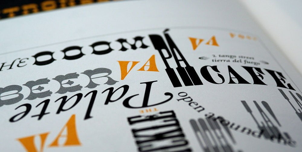
Display Fonts
Have you seen those bold, large typefaces that are usually used in the headings to catch the audience’s attention? That’s exactly what the display fonts are. Their main feature — the size — is their pro and con at the same time: though they are perfect for headings, they can be absolutely out of place in the body text.
These types’ main purpose is to intrigue and motivate the customer to keep reading. They are one of the most versatile ones, especially in comparison with more reserved fonts: they come in distinct styles, shapes and sizes. Due to such a wide range of forms, you can find a perfect type for any concept you are working on. Elegant, minimalistic, quirky — there is no style that display fonts can’t pull off.
Display fonts are often called decorative and they can help you keep the theme you are sticked to throughout your project. When you see these fonts you can literally hear them screaming “Hey, look at me!”. And as they are made to attract attention, they don’t have text variations to use for the body.