CSS Scroll Snap allows websites to snap the web page or any other scroll container to a specific scroll position when the user performs a scrolling operation. This feature has been supported in all modern browsers for over two years, but many websites that could benefit from it are still not using it.
Scroll snapping is probably most associated with horizontal carousels (see Chris’s CSS-only approach) and particular web pages divided into full-screen slides. But why stop there? I believe that snapping can improve the scrolling experience on any web page that lays out items in a grid or feed.
For example, most shopping websites show products in a grid. Ideally, the user would like to jump between the grid rows with minimal effort. The user can press Space to scroll the page by roughly one screen (viewport height), but depending on the height of the grid rows, the scroll position will eventually get “out of sync” with the grid, and the user will have to re-adjust it manually.
If we add scroll snapping to this page, the user can consistently scroll to the next row with the Space key (pressing Shift + Space will scroll to the previous row). It’s pretty effortless.
I think that scroll snapping would be a welcome addition to this website. And it’s not even that complicated to implement. The CSS code that I used for this example is relatively simple:
html { scroll-snap-type: y proximity;
} .product-item { scroll-snap-align: start; scroll-margin-top: 75px; /* height of web page’s sticky header */
}
You don’t have to wait if a website you visit regularly hasn’t yet added scroll snapping and you think it would improve your scrolling experience. You can add scroll snapping yourself — with user styles.
Adding user styles to websites
Table of Contents
In the video above, you can see that I selected a user.css file in Safari’s advanced preferences. This file is a user style sheet. It contains CSS styles that I’ve written, stored in a local .css file, and added to Safari. These “user styles” are then applied to every web page I open in Safari.
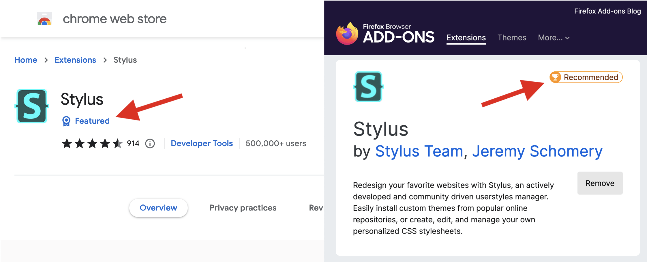
Chrome and Firefox do not allow users to select a user style sheet. Firefox supported a similar feature called userContent.css in the past, but that feature was deprecated and disabled by default in 2019. I recommend the Stylus browser extension for these two browsers (and other Chromium-based browsers).
One significant advantage of Stylus is that it allows you to write user styles for specific websites and URLs. Safari’s user style sheet applies to all websites, but this can be worked around, e.g., by using the new :has() pseudo-class to create selectors that only match specific websites.

The CSS Cascading module defines a User Origin for styles the user adds. Safari’s user style sheet belongs to this origin, but the Stylus extension injects user styles to the Author Origin, where the website’s style sheets live. Specifically, Stylus inserts user styles directly to the page via a <style> element at the end of <html> which makes it the final style sheet on the page. Technically, this means styles added via Stylus are classified as author styles since they’re not in the User Origin, but I will continue to call them user styles because the user adds them.
However, it’s worth keeping this distinction in mind because it affects the cascade. When selector specificity is equal, a real user style is weaker than the page’s own style. This makes user styles an excellent fit for user defaults. Under the same conditions, a style added via Stylus is stronger than the page‘s style, so Stylus cannot as easily be used to define user defaults.
If we add !important to the mix, both real user styles and styles added via Stylus are stronger than the page’s styles. So when you want to impose your user styles on a website, it doesn’t matter if you use Safari’s “Style sheet” option or the Stylus extension. Your !important styles will win either way.
In the next section, I will use a set of !important user styles to enforce scroll snapping on the timeline page of Twitter’s website. My goal is to speed up the process of reading my Twitter timeline by avoiding awkward scroll positions where the topmost tweet is only partially on screen.
Scroll snap for Twitter’s timeline
After some experimentation, I’ve settled on the following CSS code. These styles work well in Firefox, but I’ve experienced some issues in Chrome and Safari. I will describe these issues in more detail later in the article, but for now, let’s focus on the behavior in Firefox.
html { scroll-snap-type: y mandatory !important;
} /* tweets in the timeline are <article> elements */
article { scroll-snap-align: start !important;
} /* un-stick the sticky header and make it “snappable” as well */
[aria-label="Home timeline"] > :first-child { position: static !important; scroll-snap-align: start !important;
} /* hide the “new Tweets available” floating toast notification */
[aria-label="New Tweets are available."] { display: none !important;
}
It is necessary to add !important to each declaration because all the user styles must win over the web page’s own styles for our custom scroll snapping implementation to work correctly. I wish that instead of repeatedly writing !important, I could just put my user styles in an “important layer,” but such a CSS feature does not exist (yet).
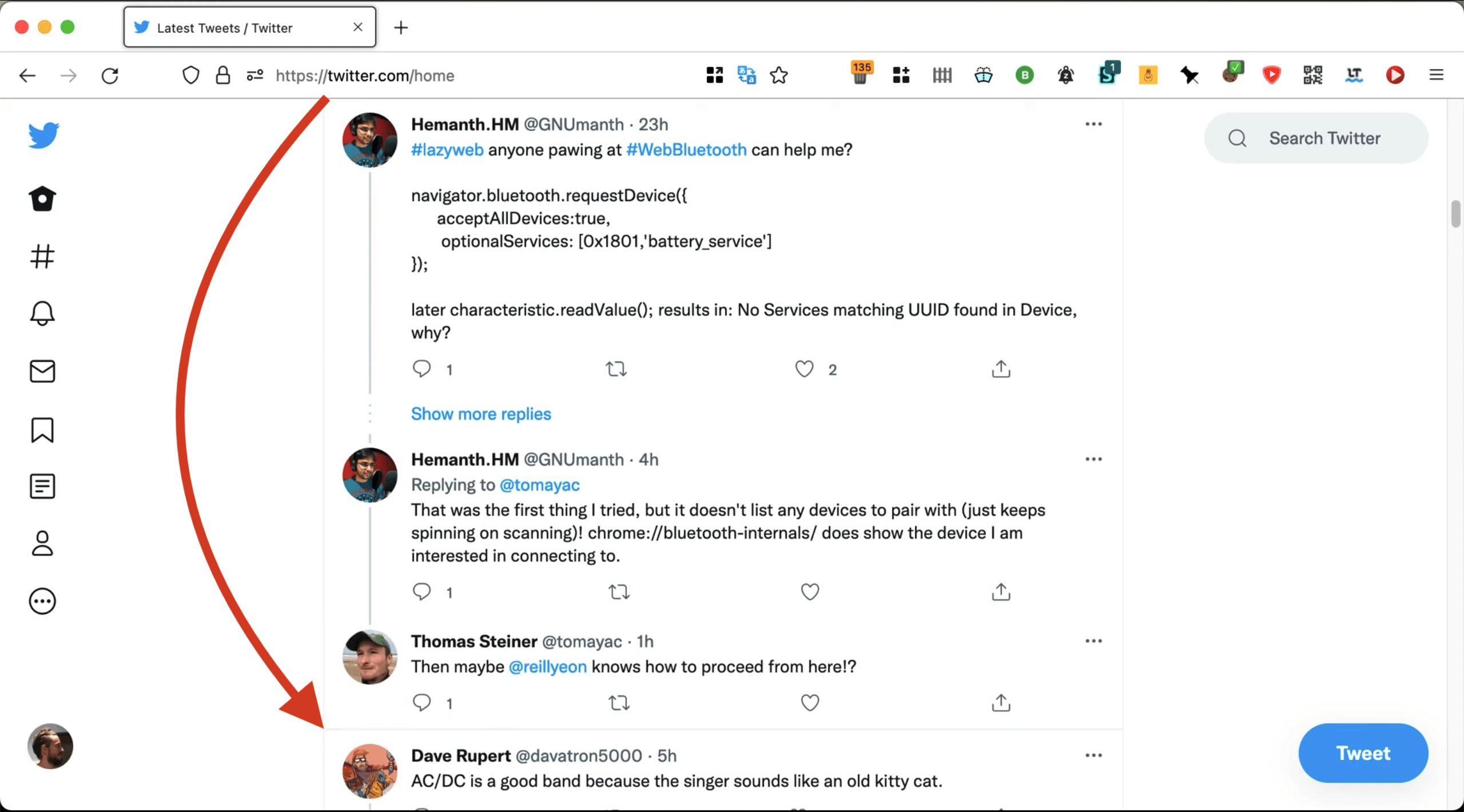
Watch the video below to see my scroll snap user styles in action. Notice how each press on the Space key scrolls the next set of tweets into view, and the first tweet of each set is aligned to the top edge of the viewport. This allows me to read my timeline more quickly. When I need to go back to the previous set of tweets, I can press Shift + Space.
What I like about this type of scroll snapping is that it allows me to predict how far the page will scroll whenever I press Space. Each scroll distance equals the combined heights of the visible tweets that are entirely on the screen. In other words, the partially visible tweet at the bottom of the screen will move to the top of the screen, which is precisely what I want.

Space will scroll Dave’s tweet to the top of the screen.To try out my scroll snap user styles on your own Twitter timeline, follow these steps:
- Install the Stylus extension with Firefox Add-ons or the Chrome Web Store.
- Navigate to your Twitter timeline at https://twitter.com/home.
- Click the Stylus icon in the browser’s toolbar and click “this URL” in the pop-up.
- Stylus will open a code editor in a new browser tab. Copy-paste my scroll snap user styles into the editor and press the Save button in the sidebar on the left. The styles will be applied to your Twitter timeline immediately (no need to reload the page).
- You can update the styles at any time. Click the Stylus icon and the Pencil icon to open the editor again.
Inability to override snapping
My implementation of scroll snapping for Twitter’s timeline has one major flaw. If a tweet is taller than the viewport, it is impossible to scroll the page to reveal the bottom part of that tweet (e.g., if you want to like or retweet that tweet) because the browser forcefully snaps the page to show the top of the tweet (or the top of the following tweet).
The severity of this problem depends on the user’s display. Viewing Twitter’s timeline on a large desktop monitor at a small page zoom factor, you may not encounter any tweets taller than the viewport.
I have asked the CSS Working Group if it would be possible to add a mechanism allowing the user to override the browser’s mandatory scroll snapping. I should probably mention that this problem could, at least in theory, be resolved by switching from mandatory to proximity snapping. I’ve tested proximity snapping in Chrome and Firefox, and I found it inconsistent and confusing. The browser would often snap when I didn’t expect it to, and vice versa. Maybe Twitter’s code is interfering with the proximity algorithm, the browsers are still a bit buggy, or perhaps I’m just “scrolling it wrong,” if that’s even possible. I don’t know.
But the main reason why I went with mandatory snapping is that I wanted to avoid situations where the topmost tweet is only partially on screen after a scroll. The type of fast-scrolling between sets of tweets that I’ve shown in the video above is only possible with mandatory snapping.
If you, like me, prefer mandatory snapping, I can suggest the following two workarounds for the “tall tweet” problem:
- You can open the tweet on its own page and return to the timeline afterward.
- If you only want to click the Like or Retweet buttons, you can Shift-click the tweet to select it and then press L to like it, or T followed by Enter to retweet it.
Issues in Chrome and Safari
My scroll snap user styles produce noticeably different scroll snapping behaviors in Chrome, Safari, and Firefox. Those differences are in part since the exact implementation of the snapping mechanism is left up to the browser:
The CSS Scroll Snap Module intentionally does not specify nor mandate any precise animations or physics used to enforce snap positions; this is left up to the user agent.
The current version of Safari has a bug that prevents scroll snapping from working correctly on the Twitter timeline. I have reported this bug.
In Chrome, I have encountered the following problems:
- The scrolling operations animate inconsistently. Sometimes the animation is slow, sometimes it’s instant, and sometimes it starts slow but is then cut short. I found this irritating.
- The scrolling operations animate too slowly in general. I performed a test in Chrome and Firefox (20 Space presses), and it took me 70% more time to cover the same distance on my Twitter timeline in Chrome than in Firefox (18.5 seconds in Chrome vs. 11 seconds in Firefox).
- When I scroll using my laptop’s trackpad, the page flickers a lot. When I attempt to scroll fast by holding down the Space key, the page scrolls very slowly and oscillates. I suspect that both issues are caused by the same algorithm. It seems that Chrome re-snaps at a very high rate in these cases. I have reported this bug.
These browser bugs and differences between browsers can be a problem for websites considering implementing scroll snapping. For example, a web developer might hold back because they don’t like how scroll snapping behaves in one particular browser. Browsers can mitigate this problem by becoming more interoperable. In fact, Scroll Snap is one of the areas of focus of the cross-browser Interop 2022 effort.
Another way the situation could be improved is by introducing new CSS properties that would make scroll snapping more configurable. This could include the duration of the snapping animation, the length of the proximity threshold for snapping, and a mechanism to override mandatory snapping.
To snap or not to snap?
I’ve been using my scroll snap user styles on Twitter’s timeline for a couple of weeks, and I don’t want to go back. The ability to quickly flip through my feed with only the Space key is just on another level.
However, I consider this an advanced feature that probably isn’t for everyone. There’s a reason why I’ve enabled it only on the timeline (/home path) and nowhere else on Twitter’s website. Snapping is a significant change in how the page scrolls, and it takes some time to get used to. It can work great for a specific use case, but it can also get in the way and frustrate the user.
Websites with feeds should therefore consider offering scroll snapping only as an optional feature, after careful consideration and plenty of testing in different browsers and with different input methods (mouse, keyboard, trackpad, touch screen, etc.).
Before you go…
Finally, I highly recommend installing and trying out the Stylus browser extension. Web developers (or anyone who knows CSS) have the power to style any website in their browser. You can apply minor improvements and fixes to your favorite websites. I mostly use it to hide page elements that I find annoying, such as sticky headers, video pop-ups, and vote counts.
But more importantly, Stylus allows you to quickly test new CSS features on any website and report browser bugs, if necessary. By doing this, you can help make the web platform a little better.


