Alright, so the last time we checked in, we were using CSS Grid and combining them with CSS clip-path and mask techniques to create grids with fancy shapes.
Here’s just one of the fantastic grids we made together:
Ready for the second round? We are still working with CSS Grid, clip-path, and mask, but by the end of this article, we’ll end up with different ways to arrange images on the grid, including some rad hover effects that make for an authentic, interactive experience to view pictures.
And guess what? We’re using the same markup that we used last time. Here’s that again:
<div class="gallery"> <img src="..." alt="..."> <img src="..." alt="..."> <img src="..." alt="..."> <img src="..." alt="..."> <!-- as many times as we want -->
</div>
Like the previous article, we only need a container with images inside. Nothing more!
Nested Image Grid
Last time, our grids were, well, typical image grids. Other than the neat shapes we masked them with, they were pretty standard symmetrical grids as far as how we positioned the images inside.
Let’s try nesting an image in the center of the grid:
We start by setting a 2✕2 grid for four images:
.gallery { --s: 200px; /* controls the image size */ --g: 10px; /* controls the gap between images */ display: grid; gap: var(--g); grid-template-columns: repeat(2, auto);
}
.gallery > img { width: var(--s); aspect-ratio: 1; object-fit: cover;
}
Nothing complex yet. The next step is to cut the corner of our images to create the space for the nested image. I already have a detailed article on how to cut corners using clip-path and mask. You can also use my online generator to get the CSS for masking corners.
What we need here is to cut out the corners at an angle equal to 90deg. We can use the same conic-gradient technique from that article to do that:
.gallery > img { mask: conic-gradient(from var(--_a), #0000 90deg, #000 0);
}
.gallery > img:nth-child(1) { --_a: 90deg; }
.gallery > img:nth-child(2) { --_a: 180deg; }
.gallery > img:nth-child(3) { --_a: 0deg; }
.gallery > img:nth-child(4) { --_a:-90deg; }
We could use the clip-path method for cutting corners from that same article, but masking with gradients is more suitable here because we have the same configuration for all the images — all we need is a rotation (defined with the variable --_a) get the effect, so we’re masking from the inside instead of the outside edges.
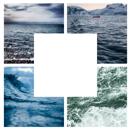
Now we can place the nested image inside the masked space. First, let’s make sure we have a fifth image element in the HTML:
<div class="gallery"> <img src="..." alt="..."> <img src="..." alt="..."> <img src="..." alt="..."> <img src="..." alt="..."> <img src="..." alt="...">
</div>
We are going to rely on the good ol’ absolute positioning to place it in there:
.gallery > img:nth-child(5) { position: absolute; inset: calc(50% - .5*var(--s)); clip-path: inset(calc(var(--g) / 4));
}
The inset property allows us to place the image at the center using a single declaration. We know the size of the image (defined with the variable --s), and we know that the container’s size equals 100%. We do some math, and the distance from each edge should be equal to (100% - var(--s))/2.
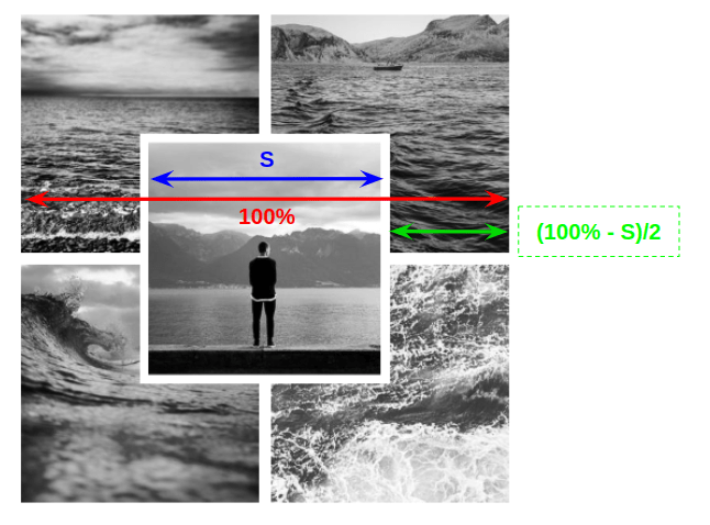
You might be wondering why we’re using clip-path at all here. We’re using it with the nested image to have a consistent gap. If we were to remove it, you would notice that we don’t have the same gap between all the images. This way, we’re cutting a little bit from the fifth image to get the proper spacing around it.
The complete code again:
.gallery { --s: 200px; /* controls the image size */ --g: 10px; /* controls the gap between images */ display: grid; gap: var(--g); grid-template-columns: repeat(2, auto); position: relative;
} .gallery > img { width: var(--s); aspect-ratio: 1; object-fit: cover; mask: conic-gradient(from var(--_a), #0000 90deg, #000 0);
} .gallery > img:nth-child(1) {--_a: 90deg}
.gallery > img:nth-child(2) {--_a:180deg}
.gallery > img:nth-child(3) {--_a: 0deg}
.gallery > img:nth-child(4) {--_a:-90deg}
.gallery > img:nth-child(5) { position: absolute; inset: calc(50% - .5*var(--s)); clip-path: inset(calc(var(--g) / 4));
}
Now, many of you might also be wondering: why all the complex stuff when we can place the last image on the top and add a border to it? That would hide the images underneath the nested image without a mask, right?
That’s true, and we will get the following:
No mask, no clip-path. Yes, the code is easy to understand, but there is a little drawback: the border color needs to be the same as the main background to make the illusion perfect. This little drawback is enough for me to make the code more complex in exchange for real transparency independent of the background. I am not saying a border approach is bad or wrong. I would recommend it in most cases where the background is known. But we are here to explore new stuff and, most important, build components that don’t depend on their environment.
Let’s try another shape this time:
This time, we made the nested image a circle instead of a square. That’s an easy task with border-radius But we need to use a circular cut-out for the other images. This time, though, we will rely on a radial-gradient() instead of a conic-gradient() to get that nice rounded look.
.gallery > img { mask: radial-gradient(farthest-side at var(--_a), #0000 calc(50% + var(--g)/2), #000 calc(51% + var(--g)/2));
}
.gallery > img:nth-child(1) { --_a: calc(100% + var(--g)/2) calc(100% + var(--g)/2); }
.gallery > img:nth-child(2) { --_a: calc(0% - var(--g)/2) calc(100% + var(--g)/2); }
.gallery > img:nth-child(3) { --_a: calc(100% + var(--g)/2) calc(0% - var(--g)/2); }
.gallery > img:nth-child(4) { --_a: calc(0% - var(--g)/2) calc(0% - var(--g)/2); }
All the images use the same configuration as the previous example, but we update the center point each time.
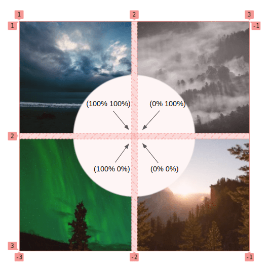
The above figure illustrates the center point for each circle. Still, in the actual code, you will notice that I am also accounting for the gap to ensure all the points are at the same position (the center of the grid) to get a continuous circle if we combine them.
Now that we have our layout let’s talk about the hover effect. In case you didn’t notice, a cool hover effect increases the size of the nested image and adjusts everything else accordingly. Increasing the size is a relatively easy task, but updating the gradient is more complicated since, by default, gradients cannot be animated. To overcome this, I will use a font-size hack to be able to animate the radial gradient.
If you check the code of the gradient, you can see that I am adding 1em:
mask: radial-gradient(farthest-side at var(--_a), #0000 calc(50% + var(--g)/2 + 1em), #000 calc(51% + var(--g)/2 + 1em));It’s known that em units are relative to the parent element’s font-size, so changing the font-size of the .gallery will also change the computed em value — this is the trick we are using. We are animating the font-size from a value of 0 to a given value and, as a result, the gradient is animated, making the cut-out part larger, following the size of the nested image that is getting bigger.
Here is the code that highlights the parts involved in the hover effect:
.gallery { --s: 200px; /* controls the image size */ --g: 10px; /* controls the gaps between images */ font-size: 0; /* initially we have 1em = 0 */ transition: .5s;
}
/* we increase the cut-out by 1em */
.gallery > img { mask: radial-gradient(farthest-side at var(--_a), #0000 calc(50% + var(--g)/2 + 1em), #000 calc(51% + var(--g)/2 + 1em));
}
/* we increase the size by 2em */
.gallery > img:nth-child(5) { width: calc(var(--s) + 2em);
}
/* on hover 1em = S/5 */
.gallery:hover { font-size: calc(var(--s) / 5);
}
The font-size trick is helpful if we want to animate gradients or other properties that cannot be animated. Custom properties defined with @property can solve such a problem, but support for it is still lacking at the time of writing.
I discovered the font-size trick from @SelenIT2 while trying to solve a challenge on Twitter.
Another shape? Let’s go!
This time we clipped the nested image into the shape of a rhombus. I’ll let you dissect the code as an exercise to figure out how we got here. You will notice that the structure is the same as in our examples. The only differences are how we’re using the gradient to create the shape. Dig in and learn!
Circular Image Grid
We can combine what we’ve learned here and in previous articles to make an even more exciting image grid. This time, let’s make all the images in our grid circular and, on hover, expand an image to reveal the entire thing as it covers the rest of the photos.
The HTML and CSS structure of the grid is nothing new from before, so let’s skip that part and focus instead on the circular shape and hover effect we want.
We are going to use clip-path and its circle() function to — you guessed it! — cut a circle out of the images.
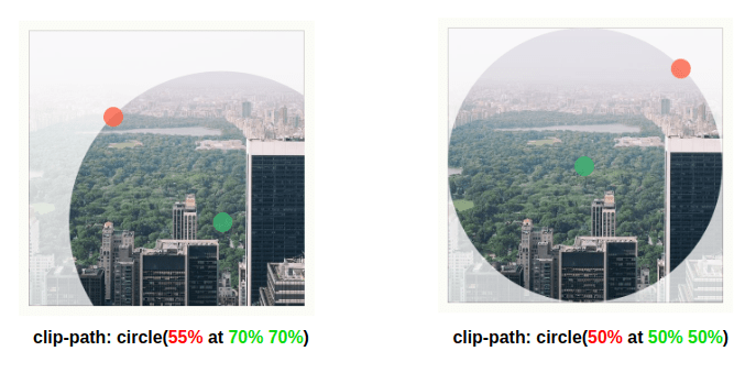
That figure illustrates the clip-path used for the first image. The left side shows the image’s initial state, while the right shows the hovered state. You can use this online tool to play and visualize the clip-path values.
For the other images, we can update the center of the circle (70% 70%) to get the following code:
.gallery > img:hover { --_c: 50%; /* same as "50% at 50% 50%" */
}
.gallery > img:nth-child(1) { clip-path: circle(var(--_c, 55% at 70% 70%));
}
.gallery > img:nth-child(2) { clip-path: circle(var(--_c, 55% at 30% 70%));
}
.gallery > img:nth-child(3) { clip-path: circle(var(--_c, 55% at 70% 30%));
}
.gallery > img:nth-child(4) { clip-path: circle(var(--_c, 55% at 30% 30%));
}
Note how we are defining the clip-path values as a fallback inside var(). This way allows us to more easily update the value on hover by setting the value of the --_c variable. When using circle(), the default position of the center point is 50% 50%, so we get to omit that for more concise code. That’s why you see that we are only setting 50% instead of 50% at 50% 50%.
Then we increase the size of our image on hover to the overall size of the grid so we can cover the other images. We also ensure the z-index has a higher value on the hovered image, so it is the top one in our stacking context.
.gallery { --s: 200px; /* controls the image size */ --g: 8px; /* controls the gap between images */ display: grid; grid: auto-flow var(--s) / repeat(2, var(--s)); gap: var(--g);
} .gallery > img { width: 100%; aspect-ratio: 1; cursor: pointer; z-index: 0; transition: .25s, z-index 0s .25s;
}
.gallery > img:hover { --_c: 50%; /* change the center point on hover */ width: calc(200% + var(--g)); z-index: 1; transition: .4s, z-index 0s;
} .gallery > img:nth-child(1){ clip-path: circle(var(--_c, 55% at 70% 70%)); place-self: start;
}
.gallery > img:nth-child(2){ clip-path: circle(var(--_c, 55% at 30% 70%)); place-self: start end;
}
.gallery > img:nth-child(3){ clip-path: circle(var(--_c, 55% at 70% 30%)); place-self: end start;
}
.gallery > img:nth-child(4){ clip-path: circle(var(--_c, 55% at 30% 30%)); place-self: end;
}
What’s going on with the
place-selfproperty? Why do we need it and why does each image have a specific value?
Do you remember the issue we had in the previous article when creating the grid of puzzle pieces? We increased the size of the images to create an overflow, but the overflow of some images was incorrect. We fixed them using the place-self property.
Same issue here. We are increasing the size of the images so each one overflows its grid cells. But if we do nothing, all of them will overflow on the right and bottom sides of the grid. What we need is:
- the first image to overflow the bottom-right edge (the default behavior),
- the second image to overflow the bottom-left edge,
- the third image to overflow the top-right edge, and
- the fourth image to overflow the top-left edge.
To get that, we need to place each image correctly using the place-self property.
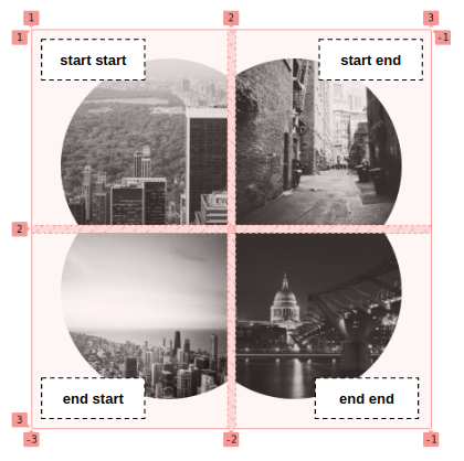
In case you are not familiar with place-self, it’s the shorthand for justify-self and align-self to place the element horizontally and vertically. When it takes one value, both alignments use that same value.
Expanding Image Panels
In a previous article, I created a cool zoom effect that applies to a grid of images where we can control everything: number of rows, number of columns, sizes, scale factor, etc.
A particular case was the classic expanding panels, where we only have one row and a full-width container.
We will take this example and combine it with shapes!
Before we continue, I highly recommend reading my other article to understand how the tricks we’re about to cover work. Check that out, and we’ll continue here to focus on creating the panel shapes.
First, let’s start by simplifying the code and removing some variables
We only need one row and the number of columns should adjust based on the number of images. That means we no longer need variables for the number of rows (--n) and columns (--m ) but we need to use grid-auto-flow: column, allowing the grid to auto-generate columns as we add new images. We will consider a fixed height for our container; by default, it will be full-width.
Let’s clip the images into a slanted shape:
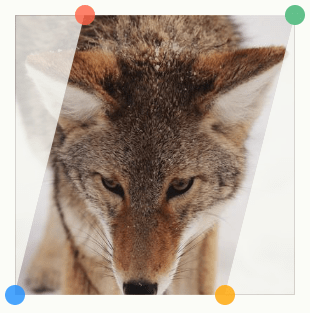
clip-path: polygon(S 0%, 100% 0%, (100% - S) 100%, 0% 100%);Once again, each image is contained in its grid cell, so there’s more space between the images than we’d like:
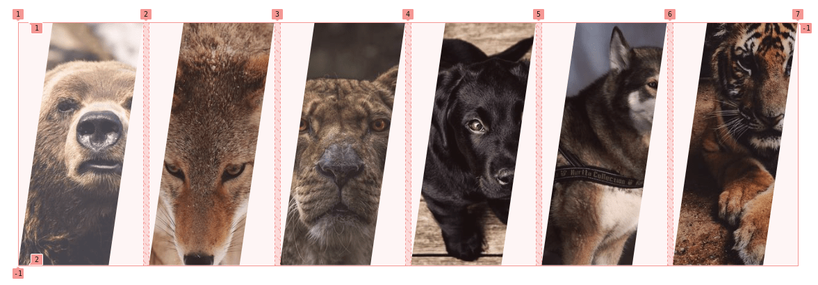
We need to increase the width of the images to create an overlap. We replace min-width: 100% with min-width: calc(100% + var(--s)), where --s is a new variable that controls the shape.
Now we need to fix the first and last images, so they sort of bleed off the page without gaps. In other words, we can remove the slant from the left side of the first image and the slant from the right side of the last image. We need a new clip-path specifically for those two images.
We also need to rectify the overflow. By default, all the images will overflow on both sides, but for the first one, we need an overflow on the right side while we need a left overflow for the last image.
.gallery > img:first-child { min-width: calc(100% + var(--s)/2); place-self: start; clip-path: polygon(0 0,100% 0,calc(100% - var(--s)) 100%,0 100%);
}
.gallery > img:last-child { min-width: calc(100% + var(--s)/2); place-self: end; clip-path: polygon(var(--s) 0,100% 0,100% 100%,0 100%);
}
The final result is a nice expanding panel of slanted images!
We can add as many images as you want, and the grid will adjust automatically. Plus, we only need to control one value to control the shape!
We could have made this same layout with flexbox since we are dealing with a single row of elements. Here is my implementation.
Sure, slanted images are cool, but what about a zig-zag pattern? I already teased this one at the end of the last article.
All I’m doing here is replacing clip-path with mask… and guess what? I already have a detailed article on creating that zig-zag shape — not to mention an online generator to get the code. See how all everything comes together?
The trickiest part here is to make sure the zig-zags are perfectly aligned, and for this, we need to add an offset for every :nth-child(odd) image element.
.gallery > img { mask: conic-gradient(from -135deg at right, #0000, #000 1deg 89deg, #0000 90deg) 100% calc(50% + var(--_p, 0%))/51% calc(2*var(--s)) repeat-y, conic-gradient(from 45deg at left, #0000, #000 1deg 89deg, #0000 90deg) 0% calc(50% + var(--_p, 0%))/51% calc(2*var(--s)) repeat-y;
}
/* we add an offset to the odd elements */
.gallery > img:nth-child(odd) { --_p: var(--s);
}
.gallery > img:first-child { mask: conic-gradient(from -135deg at right, #0000, #000 1deg 89deg, #0000 90deg) 0 calc(50% + var(--_p, 0%))/100% calc(2*var(--s));
}
.gallery > img:last-child { mask: conic-gradient(from 45deg at left, #0000, #000 1deg 89deg, #0000 90deg) 0 calc(50% + var(--_p, 0%)) /100% calc(2*var(--s));
}
Note the use of the --_p variable, which will fall back to 0% but will be equal to --_s for the odd images.
Here is a demo that illustrates the issue. Hover to see how the offset — defined by --_p — is fixing the alignment.
Also, notice how we use a different mask for the first and last image as we did in the previous example. We only need a zig-zag on the right side of the first image and the left side of the last image.
And why not rounded sides? Let’s do it!
I know that the code may look scary and tough to understand, but all that’s going on is a combination of different tricks we’ve covered in this and other articles I’ve already shared. In this case, I use the same code structure as the zig-zag and the slanted shapes. Compare it with those examples, and you will find no difference! Those are the same tricks in my previous article about the zoom effect. Then, I am using my other writing and my online generator to get the code for the mask that creates those rounded shapes.
If you recall what we did for the zig-zag, we had used the same mask for all the images but then had to add an offset to the odd images to create a perfect overlap. In this case, we need a different mask for the odd-numbered images.
The first mask:
mask: linear-gradient(-90deg,#0000 calc(2*var(--s)),#000 0) var(--s), radial-gradient(var(--s),#000 98%,#0000) 50% / calc(2*var(--s)) calc(1.8*var(--s)) space repeat;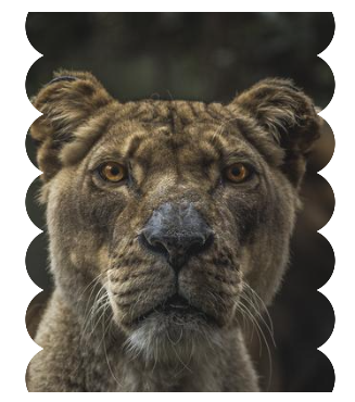
The second one:
mask: radial-gradient(calc(var(--s) + var(--g)) at calc(var(--s) + var(--g)) 50%,#0000 98% ,#000) calc(50% - var(--s) - var(--g)) / 100% calc(1.8*var(--s))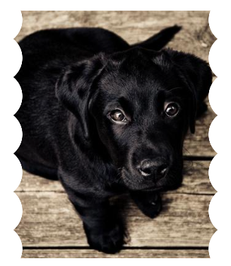
The only effort I did here is update the second mask to include the gap variable (--g) to create that space between the images.
The final touch is to fix the first and last image. Like all the previous examples, the first image needs a straight left edge while the last one needs a straight right edge.
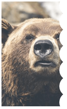
For the first image, we always know the mask it needs to have, which is the following:
.gallery > img:first-child { mask: radial-gradient(calc(var(--s) + var(--g)) at right, #0000 98%, #000) 50% / 100% calc(1.8 * var(--s));
}
For the last image, it depends on the number of elements, so it matters if that element is :nth-child(odd) or :nth-child(even).
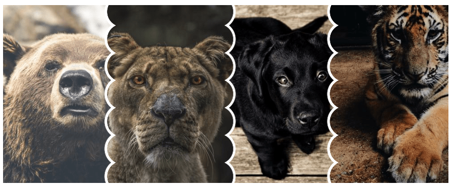
.gallery > img:last-child:nth-child(even) { mask: linear-gradient(to right,#0000 var(--s),#000 0), radial-gradient(var(--s),#000 98%,#0000) left / calc(2*var(--s)) calc(1.8*var(--s)) repeat-y
}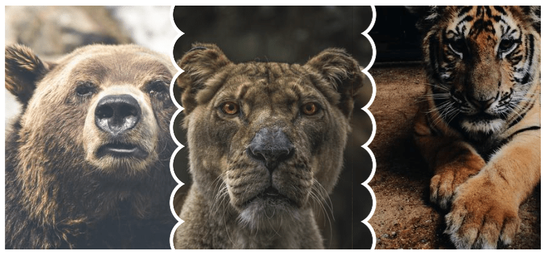
.gallery > img:last-child:nth-child(odd) { mask: radial-gradient(calc(var(--s) + var(--g)) at left,#0000 98%,#000) 50% / 100% calc(1.8*var(--s))
}
That’s all! Three different layouts but the same CSS tricks each time:
- the code structure to create the zoom effect
- a mask or clip-path to create the shapes
- a separate configuration for the odd elements in some cases to make sure we have a perfect overlap
- a specific configuration for the first and last image to keep the shape on only one side.
And here is a big demo with all of them together. All you need is to add a class to activate the layout you want to see.
And here is the one with the Flexbox implementation
Wrapping up
Oof, we are done! I know there are many CSS tricks and examples between this article and the last one, not to mention all of the other tricks I’ve referenced here from other articles I’ve written. It took me time to put everything together, and you don’t have to understand everything at once. One reading will give you a good overview of all the layouts, but you may need to read the article more than once and focus on each example to grasp all the tricks.
Did you notice that we didn’t touch the HTML at all other than perhaps the number of images in the markup? All the layouts we made share the same HTML code, which is nothing but a list of images.
Before I end, I will leave you with one last example. It’s a “versus” between two anime characters with a cool hover effect.
What about you? Can you create something based on what you have learned? It doesn’t need to be complex — imagine something cool or funny like I did with that anime matchup. It can be a good exercise for you, and we may end with an excellent collection in the comment section.

