The way we write CSS for WordPress themes is in the midst of sweeping changes. I recently shared a technique for adding fluid type support in WordPress by way of theme.json, a new file that WordPress has been pushing hard to become a central source of truth for defining styles in WordPress themes that support full-site editing (FSE) features.
Wait, no style.css file? We still have that. In fact, style.css is still a required file in block themes, though its role is greatly reduced to meta information used for registering the theme. That said, the fact is that theme.json is still in active development, meaning we’re in a transitional period where you might find styles defined there, in styles.css or even at the block level.
So, what does styling actually look like in these WordPress FSE days? That’s what I want to cover in this article. There’s a lack of documentation for styling block themes in the WordPress Theme Developer Handbook, so everything we’re covering here is what I’ve gathered about where things currently are as well as discussions about the future of WordPress theming.
The evolution of WordPress styles
Table of Contents
The new developmental features that are included in WordPress 6.1 get us closer to a system of styles that are completely defined in theme.json, but there is still be plenty of work to do before we can fully lean on it. One way we can get an idea of what’s coming in future releases is by using the Gutenberg plugin. This is where experimental features are often given a dry run.
Another way we can get a feel for where we are is by looking at the evolution of default WordPress themes. To date, there are three default themes that support full-site editing:
But don’t start trading the CSS in style.css for JSON property-value pairs in theme.json just yet. There are still CSS styling rules that need to be supported in theme.json before we think about doing that. The remaining significant issues are currently being discussed with an aim to fully move all the CSS style rules into theme.json and consolidate different sources of theme.json into a UI for for setting global styles directly in the WordPress Site Editor.
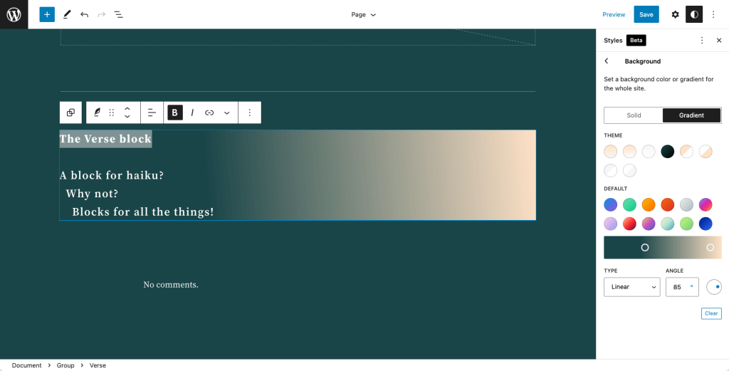
That leaves us in a relatively tough spot. Not only is there no clear path for overriding theme styles, but it’s unclear where the source of those styles even come from — is it from different layers of theme.json files, style.css, the Gutenberg plugin, or somewhere else?
Why theme.json instead of style.css?
You might be wondering why WordPress is moving toward a JSON-based definition of styles instead of a traditional CSS file. Ben Dwyer from the Gutenberg development team eloquently articulates why the theme.json approach is a benefit for theme developers.
It’s worth reading Ben’s post, but the meat is in this quote:
Overriding CSS, whether layout, preset, or block styles, presents an obstacle to integration and interoperability: visual parity between the frontend and editor becomes more difficult to maintain, upgrades to block internals may conflict with overrides. Custom CSS is, furthermore, less portable across other block themes.
By encouraging theme authors to use
theme.jsonAPI where possible, the hierarchy of “base > theme > user” defined styles can be resolved correctly.
One of the major benefits of moving CSS to JSON is that JSON is a machine-readable format, which means it can be exposed in the WordPress Site Editor UI by fetching an API, thus allowing users to modify default values and customize a site’s appearance without writing any CSS at all. It also provides a way to style blocks consistently, while providing a structure that creates layers of specificity such that the user settings take the highest priority over those defined in theme.json. That interplay between theme-level styles in theme.json and the user-defined styles in the Global Styles UI is what makes the JSON approach so appealing.
Developers maintain consistency in JSON, and users gain flexibility with code-less customizations. That’s a win-win.
There are other benefits, for sure, and Mike McAlister from WP Engine lists several in this Twitter thread. You can find even more benefits in this in-depth discussion over at the Make WordPress Core blog. And once you’ve given that a read, compare the benefits of the JSON approach with the available ways to define and override styles in classic themes.
Defining styles with JSON elements
We’ve already seen a lot of progress as far as what parts of a theme theme.json is capable of styling. Prior to WordPress 6.1, all we could really do was style headings and links. Now, with WordPress 6.1, we can add buttons, captions, citations, and headings to the mix.
And we do that by defining JSON elements. Think of elements as individual components that live in a WordPress block. Say we have a block that contains a heading, a paragraph, and a button. Those individual pieces are elements, and there’s an elements object in theme.json where we define their styles:
{ "version": 2, "settings": {}, // etc. "styles": { // etc. "elements": { "button": { ... }, "h1": { ... }, "heading": { ... }, }, }, "templateParts": {}
}
A better way to describe JSON elements is as low-level components for themes and blocks that do not need the complexity of blocks. They are representations of HTML primitives that are not defined in a block but can be used across blocks. How they are supported in WordPress (and the Gutenberg plugin) is described in the Block Editor Handbook and this Full Site Editing tutorial by Carolina Nymark.
For example, links are styled in the elements object but are not a block in their own right. But a link can be used in a block and it will inherit the styles defined on the elements.link object in theme.json. This doesn’t fully encapsulate the definition of an element, though, as some elements are also registered as blocks, such as the Heading and Button blocks — but those blocks can still be used within other blocks.
Here is a table of the elements that are currently available to style in theme.json, courtesy of Carolina:
| Element | Selector | Where it’s supported |
|---|---|---|
link |
<a> |
WordPress Core |
h1 – h6 |
The HTML tag for each heading level: <h1>, <h2>, <h3>, <h4>, <h5> and <h6> |
WordPress Core |
heading |
Styles all headings globally by individual HTML tag: <h1>, <h2>, <h3>, <h4>, <h5> and <h6> |
Gutenberg plugin |
button |
.wp-element-button.wp-block-button__link |
Gutenberg plugin |
caption |
.wp-element-caption,.wp-block-audio figcaption,.wp-block-embed figcaption,.wp-block-gallery figcaption,.wp-block-image figcaption,.wp-block-table figcaption,.wp-block-video figcaption |
Gutenberg plugin |
cite |
.wp-block-pullquote cite |
Gutenberg plugin |
As you can see, it’s still early days and plenty still needs to move from the Gutenberg plugin into WordPress Core. But you can see how quick it would be to do something like style all headings in a theme globally without hunting for selectors in CSS files or DevTools.
Further, you can also start to see how the structure of theme.json sort of forms layers of specificity, going from global elements (e.g. headings) to individual elements (e.g. h1), and block-level styles (e.g. h1 contained in a block).
Additional information on JSON elements is available in this Make WordPress proposal and this open ticket in the Gutenberg plugin’s GitHub repo.
JSON and CSS specificity
Let’s keep talking about CSS specificity. I mentioned earlier that the JSON approach to styling establishes a hierarchy. And it’s true. Styles that are defined on JSON elements in theme.json are considered default theme styles. And anything that is set by the user in the Global Styles UI will override the defaults.
In other words: user styles carry more specificity than default theme styles. Let’s take a look at the Button block to get a feel for how this works.
I’m using Emptytheme, a blank WordPress theme with no CSS styling. I’m going to add a Button block on a new page.

OK, we know that WordPress Core ships with some light styling. Now, I’m going to switch to the default TT3 theme from WordPress 6.1 and activate it. If I refresh my page with the button, the button changes styles.

You can see exactly where those new styles are coming from in TT3’s theme.json file. This tells us that the JSON element styles take precedence over WordPress Core styles.
Now I am going to modify TT3 by overriding it with a theme.json file in a child theme, where the default background color of the Button block is set to red.
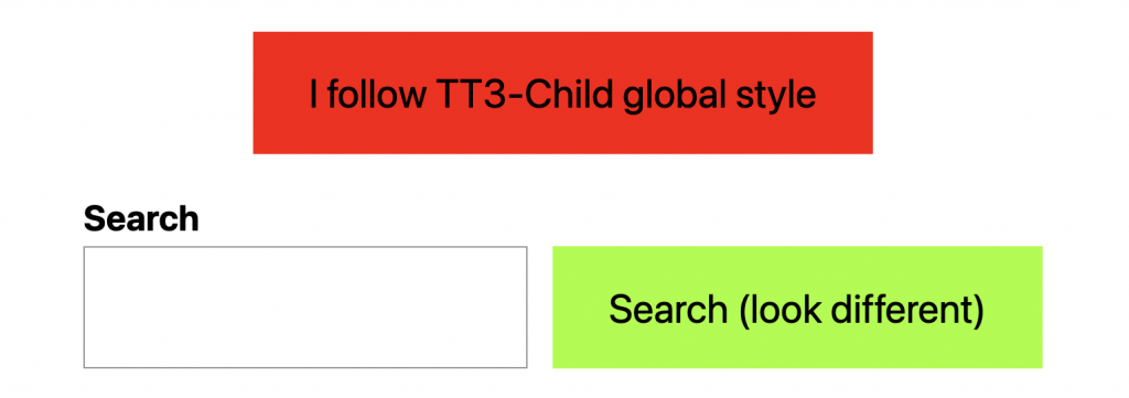
But notice the search button in that last screenshot. It should be red, too, right? That must mean it is styled at another level if the change I made is at the global level. If we want to change both buttons, we could do it at the user level using the Global Styles UI in the site editor.
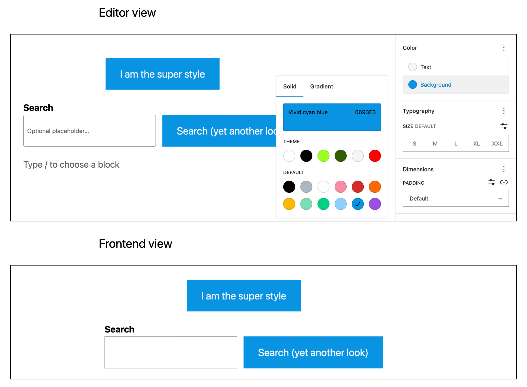
We changed the background color of both buttons to blue and modified the text as well using the Global styles UI. Notice that the blue from there took precedence over the theme styles!
The Style Engine
That’s a very quick, but good, idea of how CSS specificity is managed in WordPress block themes. But it’s not the complete picture because it’s still unclear where those styles are generated. WordPress has its own default styles that come from somewhere, consumes the data in theme.json for more style rules, and overrides those with anything set in Global Styles.
Are those styles inline? Are they in a separate stylesheet? Maybe they’re injected on the page in a <script>?
That’s what the new Style Engine is hopefully going to solve. The Style Engine is a new API in WordPress 6.1 that is meant to bring consistency to how styles are generated and where styles are applied. In other words, it takes all of the possible sources of styling and is singularly responsible for properly generating block styles. I know, I know. Yet another abstraction on top of other abstractions just to author some styles. But having a centralized API for styles is probably the most elegant solution given that styles can come from a number of places.
We’re only getting a first look at the Style Engine. In fact, here’s what has been completed so far, according to the ticket:
- Audit and consolidate where the code generates block support CSS in the back end so that they are delivered from the same place (as opposed to multiple places). This covers CSS rules such as margin, padding, typography, colors, and borders.
- Remove repetitive layout-specific styles and generate semantic class names.
- Reduce the number of inline style tags we print to the page for block, layout, and element support.
Basically, this is the foundation for establishing a single API that contains all the CSS style rules for a theme, wherever they come from. It cleans up the way WordPress would inject inline styles pre-6.1 and establishes a system for semantic class names.
Further details on the long-term and short-term goals of Style Engine can be found in this Make WordPress Core discussion. You can also follow the tracking issue and project board for more updates.
Working with JSON elements
We talked a bit about JSON elements in the theme.json file and how they are basically HTML primitives for defining default styles for things like headings, buttons, and links, among others. Now, let’s look at actually using a JSON element and how it behaves in various styling contexts.
JSON elements generally have two contexts: the global level and the block level. The global level styles are defined with less specificity than they are at the block level to ensure that block-specific styles take precedence for consistency wherever blocks are used.
Global styles for JSON elements
Let’s look at the new default TT3 theme and examine how its buttons are styled. The following is an abbreviated copy-paste of the TT3 theme.json file (here’s the full code) showing the global styles section, but you can find the original code here.
View code
{ "version": 2, "settings": {}, // ... "styles": { // ... "elements": { "button": { "border": { "radius": "0" }, "color": { "background": "var(--wp--preset--color--primary)", "text": "var(--wp--preset--color--contrast)" }, ":hover": { "color": { "background": "var(--wp--preset--color--contrast)", "text": "var(--wp--preset--color--base)" } }, ":focus": { "color": { "background": "var(--wp--preset--color--contrast)", "text": "var(--wp--preset--color--base)" } }, ":active": { "color": { "background": "var(--wp--preset--color--secondary)", "text": "var(--wp--preset--color--base)" } } }, "h1": { "typography": { } }, // ... "heading": { "typography": { "fontWeight": "400", "lineHeight": "1.4" } }, "link": { "color": { "text": "var(--wp--preset--color--contrast)" }, ":hover": { "typography": { "textDecoration": "none" } }, ":focus": { "typography": { "textDecoration": "underline dashed" } }, ":active": { "color": { "text": "var(--wp--preset--color--secondary)" }, "typography": { "textDecoration": "none" } }, "typography": { "textDecoration": "underline" } } }, // ... }, "templateParts": {}
}
All buttons are styled at the global level (styles.elements.button).
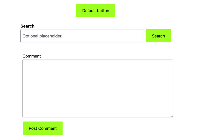
--wp--preset--color--primary CSS variable, or #B4FD55.We can confirm this in DevTools as well. Notice that a class called .wp-element-button is the selector. The same class is used to style the interactive states as well.

Again, this styling is all happening at the global level, coming from theme.json. Whenever we use a button, it is going to have the same background because they share the same selector and no other style rules are overriding it.
As an aside, WordPress 6.1 added support for styling interactive states for certain elements, like buttons and links, using pseudo-classes in theme.json — including :hover, :focus, and :active — or the Global Styles UI. Automattic Engineer Dave Smith demonstrates this feature in a YouTube video.
We could override the button’s background color either in theme.json (preferably in a child theme since we’re using a default WordPress theme) or in the Global Styles settings in the site editor (no child theme needed since it does not require a code change).
But then the buttons will change all at once. What if we want to override the background color when the button is part of a certain block? That’s where block-level styles come into play.
Block-level styles for elements
To understand how we can use and customize styles at the block level, let’s change the background color of the button that is contained in the Search block. Remember, there is a Button block, but what we’re doing is overriding the background color at the block level of the Search block. That way, we’re only applying the new color there as opposed to applying it globally to all buttons.
To do that, we define the styles on the styles.blocks object in theme.json. That’s right, if we define the global styles for all buttons on styles.elements, we can define the block-specific styles for button elements on styles.block, which follows a similar structure:
{ "version": 2, // ... "styles": { // Global-level syles "elements": { }, // Block-level styles "blocks": { "core/search": { "elements": { "button": { "color": { "background": "var(--wp--preset--color--quaternary)", "text": "var(--wp--preset--color--base)" } } }, // ... } } }
}
See that? I set the background and text properties on styles.blocks.core/search.elements.button with two CSS variables that are preset in WordPress.
The result? The search button is now red (--wp--preset--color--quaternary), and the default Button block retains its bright green background.

We can see the change in DevTools as well.

The same is true if we want to style buttons that are included in other blocks. And buttons are merely one example, so let’s look at another one.
Example: Styling headings at each level
Let’s drive all this information home with an example. This time, we will:
- Style all headings globally
- Style all Heading 2 elements
- Style Heading 2 elements in the Query Loop block
First, let’s start with the basic structure for theme.json:
{ "version": 2, "styles": { // Global-level syles "elements": { }, // Block-level styles "blocks": { } }
}
This establishes the outline for our global and block-level styles.
Style all headings globally
Let’s add the headings object to our global styles and apply some styles:
{ "version": 2, "styles": { // Global-level syles "elements": { "heading": { "color": "var(--wp--preset--color--base)" }, }, // Block-level styles "blocks": { } }
}
That sets the color for all headings to the preset base color in WordPress. Let’s change the color and font size of Heading 2 elements at the global level as well:
{ "version": 2, "styles": { // Global-level syles "elements": { "heading": { "color": "var(--wp--preset--color--base)" }, "h2": { "color": "var(--wp--preset--color--primary)", "typography": { "fontSize": "clamp(2.625rem, calc(2.625rem + ((1vw - 0.48rem) * 8.4135)), 3.25rem)" } } }, // Block-level styles "blocks": { } }
}
Now, all Heading 2 elements are set to be the primary preset color with a fluid font size. But maybe we want a fixed fontSize for the Heading 2 element when it is used in the Query Look block:
{ "version": 2, "styles": { // Global-level syles "elements": { "heading": { "color": "var(--wp--preset--color--base)" }, "h2": { "color": "var(--wp--preset--color--primary)", "typography": { "fontSize": "clamp(2.625rem, calc(2.625rem + ((1vw - 0.48rem) * 8.4135)), 3.25rem)" } } }, // Block-level styles "blocks": { "core/query": { "elements": { "h2": { "typography": { "fontSize": 3.25rem } } } } } }
}
Now we have three levels of styles for Heading 2 elements: all headings, all Heading 2 elements, and Heading 2 elements that are used in the Query Loop block.
Existing theme examples
While we only looked at the styling examples for buttons and headings in this article, WordPress 6.1 supports styling additional elements. There’s a table outlining them in the “Defining styles with JSON elements” section.
You’re probably wondering which JSON elements support which CSS properties, not to mention how you would even declare those. While we wait for official documentation, the best resources we have are going to be the theme.json files for existing themes. I’m going to provide links to themes based on the elements they customize, and point out what properties are customized.
| Theme | What’s customized | Theme JSON |
|---|---|---|
| Blockbase | Buttons, headings, links, core blocks | Source code |
| Block Canvas | Buttons, headings, links, core blocks | Source code |
| Disco | Buttons, headings, core blocks | Source code |
| Frost | Buttons, headings, links, captions, cite, core blocks | Source code |
| Pixl | Buttons, headings, links, core blocks | Source code |
| Rainfall | Buttons, headings, links, core blocks | Source code |
| Twenty Twenty-Three | Buttons, headings, links, core blocks | Source code |
| Vivre | Buttons, headings, links, core blocks | Source code |
Be sure to give each theme.json file a good look because these themes include excellent examples of block-level styling on the styles.blocks object.
Wrapping up
Frequent changes to the full-site editor are becoming a major sources of irritation to many people, including tech-savvy Gutenberg users. Even very simple CSS rules, which work well with classic themes, don’t seem to work for block themes because of the new layers of specificity we covered earlier.
Regarding a GitHub proposal to re-design the site editor in a new browser mode, Sara Gooding writes in a WP Tavern post:
It’s easy to get lost while trying to get around the Site Editor unless you are working day and night inside the tool. The navigation is jumpy and confusing, especially when going from template browsing to template editing to modifying individual blocks.
Even as a keen early rider in the world of Gutenberg block editor and block-eye themes, I do have tons of my own frustrations. I’m optimistic, though, and anticipate that the site editor, once completed, will be a revolutionary tool for users and techno-savvy theme developers alike. This hopeful tweet already confirms that. In the meantime, it seems that we should be preparing for more changes, and perhaps even a bumpy ride.
References
I’m listing all of the resources I used while researching information for this article.
JSON elements
Global Styles
Style Engine
Thanks for reading! I’d love to hear your own reflections on using the block themes and how you managing your CSS.

