Image sliders (also called carousels) are everywhere. There are a lot of CSS tricks to create the common slider where the images slide from left to right (or the opposite). It’s the same deal with the many JavaScript libraries out there that create fancy sliders with complex animations. We are not going to do any of that in this post.
Through a little series of articles, we are going to explore some fancy and uncommon CSS-only sliders. If you are of tired seeing the same ol’ classic sliders, then you are in the right place!
CSS Sliders series
For this first article, we will start with something I call the “circular rotating image slider”:
Cool right? let’s dissect the code!
The HTML markup
If you followed my series of fancy image decorations or CSS grid and custom shapes, then you know that my first rule is to work with the smallest HTML possible. I always try hard to find CSS solutions before cluttering my code with a lot <div>s and other stuff.
The same rule applies here — our code is nothing but a list of images in a container.
Let’s say we’re working with four images:
<div class="gallery"> <img src="" alt=""> <img src="" alt=""> <img src="" alt=""> <img src="" alt="">
</div>
That’s it! Now let’s move to the interesting part of the code. But first, we’re going to dive into this to understand the logic of how our slider works.
How does it work?
Here is a video where I remove overflow: hidden from the CSS so we can better understand how the images are moving:
It’s like our four images are placed on a large circle that rotates counter-clockwise.

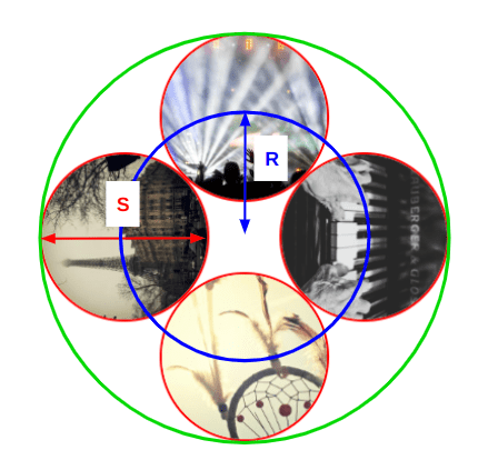
All the images have the same size (denoted by S in the figure). Note the blue circle which is the circle that intersects with the center of all the images and has a radius (R). We will need this value later for our animation. R is equal to 0.707 * S. (I’m going to skip the geometry that gives us that equation.)
Let’s write some CSS!
We will be using CSS Grid to place all the images in the same area above each other:
.gallery { --s: 280px; /* control the size */ display: grid; width: var(--s); aspect-ratio: 1; padding: calc(var(--s) / 20); /* we will see the utility of this later */ border-radius: 50%;
}
.gallery > img { grid-area: 1 / 1; width: 100%; height: 100%; object-fit: cover; border-radius: inherit;
}
Nothing too complex so far. The tricky part is the animation.
We talked about rotating a big circle, but in reality, we will rotate each image individually creating the illusion of a big rotating circle. So, let’s define an animation, m, and apply it to the image elements:
.gallery > img { /* same as before */ animation: m 8s infinite linear; transform-origin: 50% 120.7%;
} @keyframes m { 100% { transform: rotate(-360deg); }
}
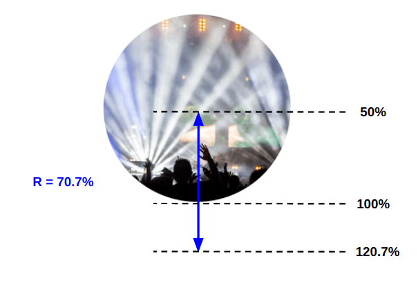
The main trick relies on that highlighted line. By default, the CSS transform-origin property is equal to center (or 50% 50%) which makes the image rotate around its center, but we don’t need it to do that. We need the image to rotate around the center of the big circle that contains our images hence the new value for transform-origin.
Since R is equal to 0.707 * S, we can say that R is equal to 70.7% of the image size. Here’s a figure to illustrate how we got the 120.7% value:

Let’s run the animation and see what happens:
I know, I know. The result is far from what we want, but in reality we are very close. It may looks like there’s just one image there, but don’t forget that we have stacked all the images on top of each other. All of them are rotating at the same time and only the top image is visible. What we need is to delay the animation of each image to avoid this overlap.
.gallery > img:nth-child(2) { animation-delay: -2s; } /* -1 * 8s / 4 */
.gallery > img:nth-child(3) { animation-delay: -4s; } /* -2 * 8s / 4 */
.gallery > img:nth-child(4) { animation-delay: -6s; } /* -3 * 8s / 4 */
Things are already getting better!
If we hide the overflow on the container we can already see a slider, but we will update the animation a little so that each image remains visible for a short period before it moves along.
We’re going to update our animation keyframes to do just that:
@keyframes m { 0%, 3% { transform: rotate(0); } 22%, 27% { transform: rotate(-90deg); } 47%, 52% { transform: rotate(-180deg); } 72%, 77% { transform: rotate(-270deg); } 98%, 100% { transform: rotate(-360deg); }
}
For each 90deg (360deg/4, where 4 is the number of images) we will add a small pause. Each image will remain visible for 5% of the overall duration before we slide to the next one (27%-22%, 52%-47%, etc.). I’m going to update the animation-timing-function using a cubic-bezier() function to make the animation a bit fancier:
Now our slider is perfect! Well, almost perfect because we are still missing the final touch: the colorful circular border that rotates around our images. We can use a pseudo-element on the .gallery wrapper to make it:
.gallery { padding: calc(var(--s) / 20); /* the padding is needed here */ position: relative;
}
.gallery::after { content: ""; position: absolute; inset: 0; padding: inherit; /* Inherits the same padding */ border-radius: 50%; background: repeating-conic-gradient(#789048 0 30deg, #DFBA69 0 60deg); mask: linear-gradient(#fff 0 0) content-box, linear-gradient(#fff 0 0); mask-composite: exclude;
}
.gallery::after,
.gallery >img { animation: m 8s infinite cubic-bezier(.5, -0.2, .5, 1.2);
}
I have created a circle with a repeating conic gradient for the background while using a masking trick that only shows the padded area. Then I apply to it the same animation we defined for the images.
We are done! We have a cool circular slider:
Let’s add more images
Working with four images is good, but it would be better if we can scale it to any number of images. After all, this is the purpose of an image slider. We should be able to consider N images.
For this, we are going to make the code more generic by introducing Sass. First, we define a variable for the number of images ($n) and we will update every part where we hard-coded the number of images (4).
Let’s start with the delays:
.gallery > img:nth-child(2) { animation-delay: -2s; } /* -1 * 8s / 4 */
.gallery > img:nth-child(3) { animation-delay: -4s; } /* -2 * 8s / 4 */
.gallery > img:nth-child(4) { animation-delay: -6s; } /* -3 * 8s / 4 */
The formula for the delay is (1 - $i)*duration/$n, which gives us the following Sass loop:
@for $i from 2 to ($n + 1) { .gallery > img:nth-child(#{$i}) { animation-delay: calc(#{(1 - $i) / $n} * 8s); }
}
We can make the duration a variable as well if we really want to. But let’s move on to the animation:
@keyframes m { 0%, 3% { transform: rotate(0); } 22%, 27% { transform: rotate(-90deg); } 47%, 52% { transform: rotate(-180deg); } 72%, 77% { transform: rotate(-270deg); } 98%, 100% {transform: rotate(-360deg); }
}
Let’s simplify it to get a better view of the pattern:
@keyframes m { 0% { transform: rotate(0); } 25% { transform: rotate(-90deg); } 50% { transform: rotate(-180deg); } 75% { transform: rotate(-270deg); } 100% { transform: rotate(-360deg); }
}
The step between each state is equal to 25% — which is 100%/4 — and we add a -90deg angle — which is -360deg/4. That means we can write our loop like this instead:
@keyframes m { 0% { transform: rotate(0); } @for $i from 1 to $n { #{($i / $n) * 100}% { transform: rotate(#{($i / $n) * -360}deg); } } 100% { transform: rotate(-360deg); }
}
Since each image takes 5% of the animation, we change this:
#{($i / $n) * 100}%…with this:
#{($i / $n) * 100 - 2}%, #{($i / $n) * 100 + 3}%It should be noted that 5% is an arbitrary value I choose for this example. We can also make it a variable to control how much time each image should stay visible. I am going to skip that for the sake of simplicity, but for homework, you can try to do it and share your implementation in the comments!
@keyframes m { 0%,3% { transform: rotate(0); } @for $i from 1 to $n { #{($i / $n) * 100 - 2}%, #{($i / $n) * 100 + 3}% { transform: rotate(#{($i / $n) * -360}deg); } } 98%,100% { transform: rotate(-360deg); }
}
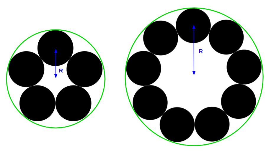
The last bit is to update transform-origin. We will need some geometry tricks. Whatever the number of images, the configuration is always the same. We have our images (small circles) placed inside a big circle and we need to find the value of the radius, R.

You probably don’t want a boring geometry explanation so here’s how we find R:
R = S / (2 * sin(180deg / N))If we express that as a percentage, that gives us:
R = 100% / (2 * sin(180deg / N)) = 50% / sin(180deg / N)…which means the transform-origin value is equal to:
transform-origin: 50% (50% / math.sin(180deg / $n) + 50%);We’re done! We have a slider that works with any number images!
Let’s toss nine images in there:
Add as many images as you want and update the $n variable with the total number of images.
Wrapping up
With a few tricks using CSS transforms and standard geometry, we created a nice circular slider that doesn’t require a lot of code. What is cool about this slider is that we don’t need to bother duplicating the images to keep the infinite animation since we have a circle. After a full rotation, we will get back to the first image!


