Someone recently asked me how I approach debugging inline SVGs. Because it is part of the DOM, we can inspect any inline SVG in any browser DevTools. And because of that, we have the ability to scope things out and uncover any potential issues or opportunities to optimize the SVG.
But sometimes, we can’t even see our SVGs at all. In those cases, there are six specific things that I look for when I’m debugging.
1. The viewBox values
Table of Contents
The viewBox is a common point of confusion when working with SVG. It’s technically fine to use inline SVG without it, but we would lose one of its most significant benefits: scaling with the container. At the same time, it can work against us when improperly configured, resulting in unwanted clipping.
The elements are there when they’re clipped — they’re just in a part of the coordinate system that we don’t see. If we were to open the file in some graphics editing program, it might look like this:
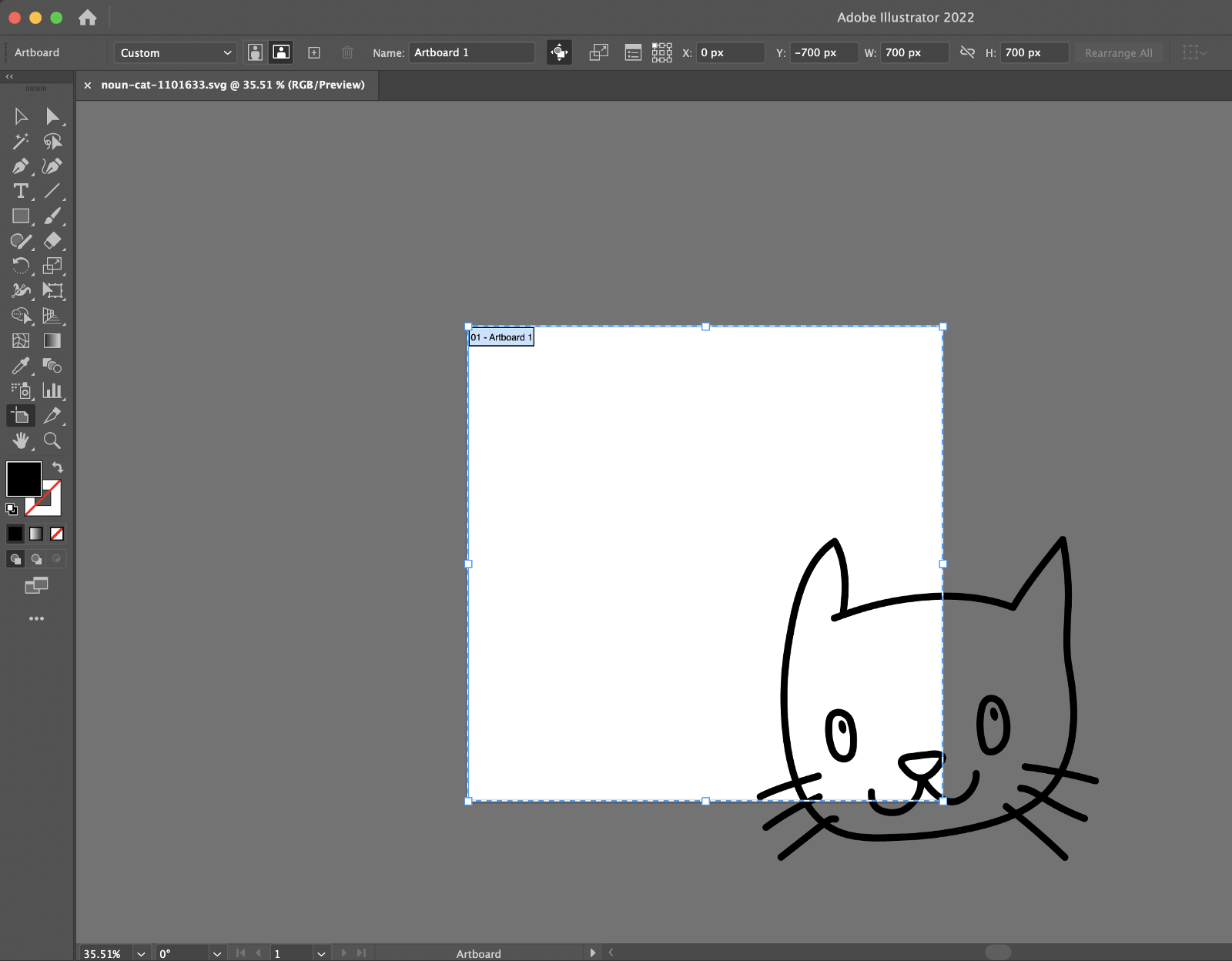
The easiest way to fix this? Add overflow="visible" to the SVG, whether it’s in our stylesheet, inline on the style attribute or directly as an SVG presentation attribute. But if we also apply a background-color to the SVG or if we have other elements around it, things might look a little bit off. In this case, the best option will be to edit the viewBox to show that part of the coordinate system that was hidden:
overflow="hidden" and editing the viewBox.There are a few additional things about the viewBox that are worth covering while we’re on the topic:
How does the viewBox work?
SVG is an infinite canvas, but we can control what we see and how we see it through the viewport and the viewBox.
The viewport is a window frame on the infinite canvas. Its dimensions are defined by width and height attributes, or in CSS with the corresponding width and height properties. We can specify any length unit we want, but if we provide unitless numbers, they default to pixels.
The viewBox is defined by four values. The first two are the starting point at the upper-left corner (x and y values, negative numbers allowed). I’m editing these to reframe the image. The last two are the width and height of the coordinate system inside the viewport — this is where we can edit the scale of the grid (which we’ll get into in the section on Zooming).
Here’s simplified markup showing the SVG viewBox and the width and height attributes both set on the <svg>:
<svg viewBox="0 0 700 700" width="700" height="700"> <!-- etc. -->
</svg>
Reframing
So, this:
<svg viewBox="0 0 700 700">…maps to this:
<svg viewBox="start-x-axis start-y-axis width height">The viewport we see starts where 0 on the x-axis and 0 on the y-axis meet.
By changing this:
<svg viewBox="0 0 700 700">…to this:
<svg viewBox="300 200 700 700">…the width and height remain the same (700 units each), but the start of the coordinate system is now at the 300 point on the x-axis and 200 on the y-axis.
In the following video I’m adding a red <circle> to the SVG with its center at the 300 point on the x-axis and 200 on the y-axis. Notice how changing the viewBox coordinates to the same values also changes the circle’s placement to the upper-left corner of the frame while the rendered size of the SVG remains the same (700×700). All I did was “reframe” things with the viewBox.
Zooming
We can change the last two values inside the viewBox to zoom in or out of the image. The larger the values, the more SVG units are added to fit in the viewport, resulting in a smaller image. If we want to keep a 1:1 ratio, our viewBox width and height must match our viewport width and height values.
Let’s see what happens in Illustrator when we change these parameters. The artboard is the viewport which is represented by a white 700px square. Everything else outside that area is our infinite SVG canvas and gets clipped by default.
Figure 1 below shows a blue dot at 900 along the x-axis and 900 along the y-axis. If I change the last two viewBox values from 700 to 900 like this:
<svg viewBox="300 200 900 900" width="700" height="700">…then the blue dot is almost fully back in view, as seen in Figure 2 below. Our image is scaled down because we increased the viewBox values, but the SVG’s actual width and height dimensions remained the same, and the blue dot made its way back closer to the unclipped area.
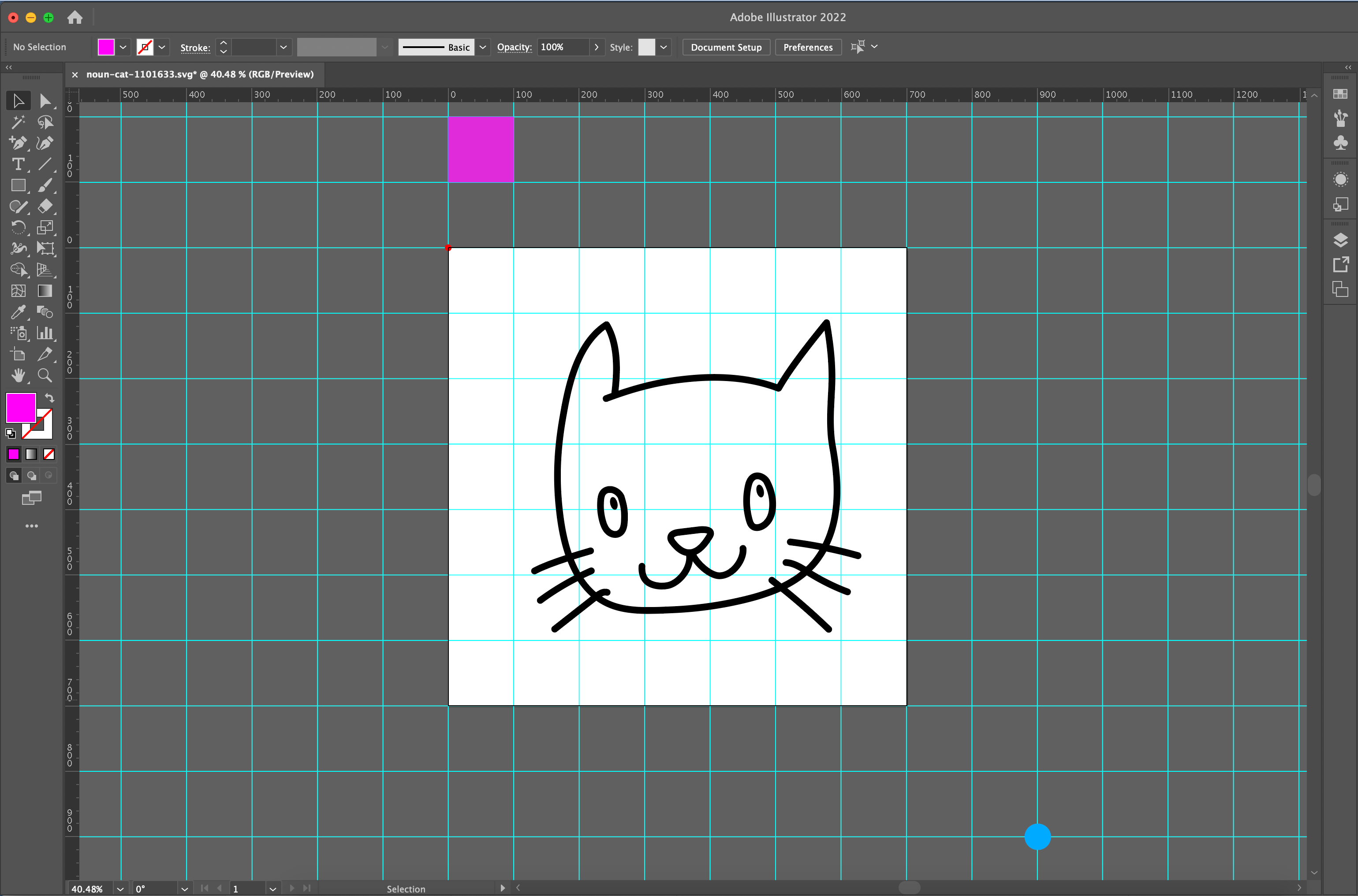
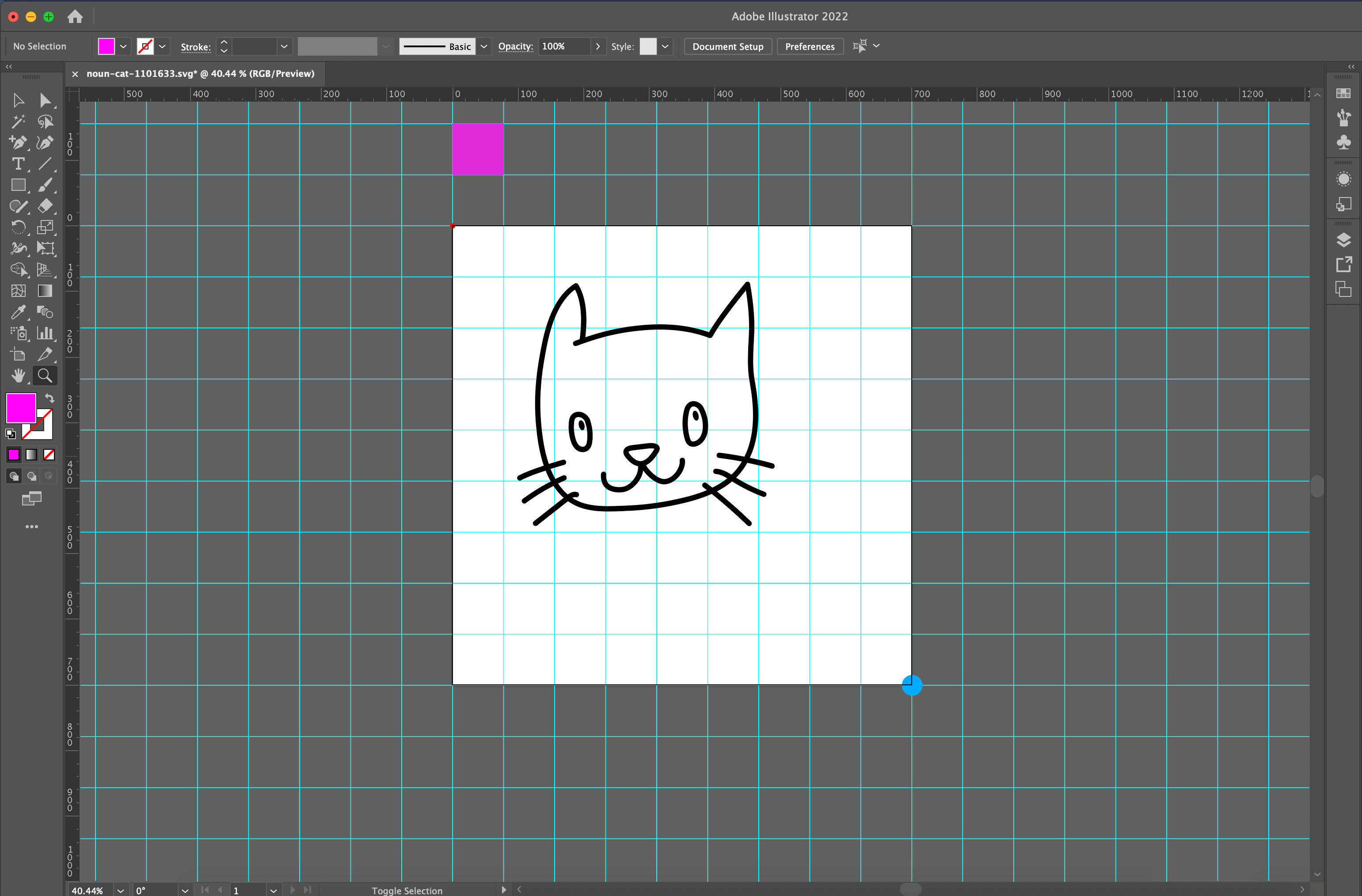
There is a pink square as evidence of how the grid scales to fit the viewport: the unit gets smaller, and more grid lines fit into the same viewport area. You can play with the same values in the following Pen to see that work in action:
2. Missing width and height
Another common thing I look at when debugging inline SVG is whether the markup contains the width or height attributes. This is no big deal in many cases unless the SVG is inside a container with absolute positioning or a flexible container (as Safari computes the SVG width value with 0px instead of auto). Excluding width or height in these cases prevents us from seeing the full image, as we can see by opening this CodePen demo and comparing it in Chrome, Safari, and Firefox (tap images for larger view).
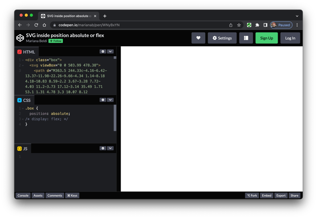
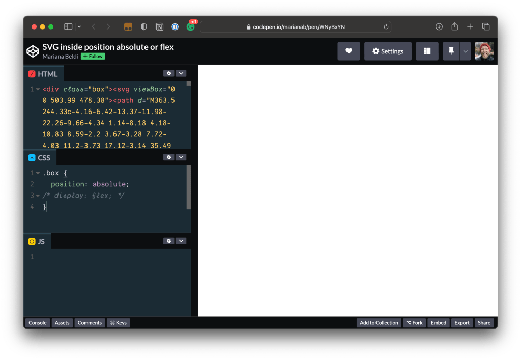
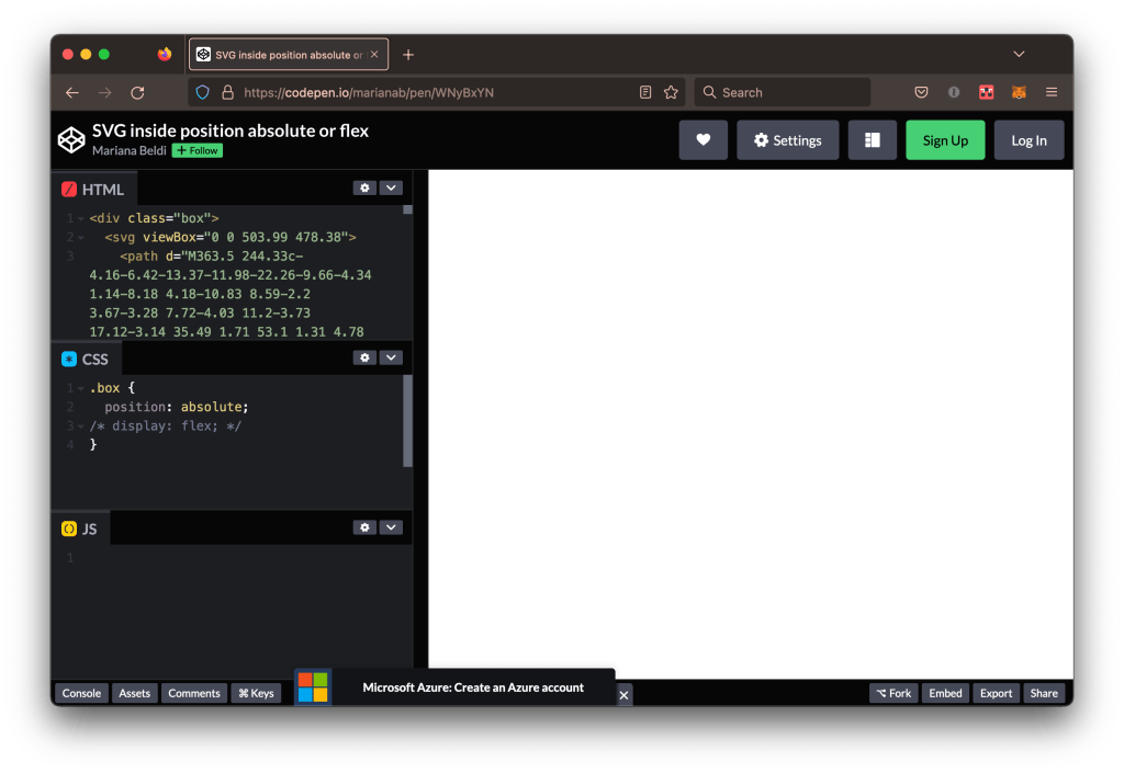
The solution? Add a width or height, whether as a presentation attribute, inline in the style attribute, or in CSS. Avoid using height by itself, particularly when it is set to 100% or auto. Another workaround is to set the right and left values.
You can play around with the following Pen and combine the different options.
3. Inadvertent fill and stroke colors
It may also be that we are applying color to the <svg> tag, whether it’s an inline style or coming from CSS. That’s fine, but there could be other color values throughout the markup or styles that conflict with the color set on the <svg>, causing parts to be invisible.
That’s why I tend to look for the fill and stroke attributes in the SVG’s markup and wipe them out. The following video shows an SVG I styled in CSS with a red fill. There are a couple of instances where parts of the SVG are filled in white directly in the markup that I removed to reveal the missing pieces.
4. Missing IDs
This one might seem super obvious, but you’d be surprised how often I see it come up. Let’s say we made an SVG file in Illustrator and were very diligent about naming our layers so that you get nice matching IDs in the markup when exporting the file. And let’s say we plan to style that SVG in CSS by hooking into those IDs.
That’s a nice way to do things. But there are plenty of times where I’ve seen the same SVG file exported a second time to the same location and the IDs are different, usually when copy/pasting the vectors directly. Maybe a new layer was added, or one of the existing ones was renamed or something. Whatever the case, the CSS rules no longer match the IDs in the SVG markup, causing the SVG to render differently than you’d expect.

In large SVG files we might find it difficult to find those IDs. This is a good time to open the DevTools, inspect that part of the graphic that’s not working, and see if those IDs are still matching.
So, I’d say it’s worth opening an exported SVG file in a code editor and comparing it to the original before swapping things out. Apps like Illustrator, Figma, and Sketch are smart, but that doesn’t mean we aren’t responsible for vetting them.
5. Checklist for clipping and masking
If an SVG is unexpectedly clipped and the viewBox checks out alright, I usually look at the CSS for clip-path or mask properties that might interfere with the image. It’s tempting to keep looking at the inline markup, but it’s good to remember that an SVG’s styling might be happening elsewhere.
CSS clipping and masking allow us to “hide” parts of an image or element. In SVG, <clipPath> is a vector operation that cuts parts of an image with no halfway results. The <mask> tag is a pixel operation that allows transparency, semi-transparency effects, and blurred edges.
This is a small checklist for debugging cases where clipping and masking are involved:
- Make sure the clipping path (or mask) and the graphic overlap one another. The overlapping parts are what gets displayed.
- If you have a complex path that is not intersecting your graphic, try applying transforms until they match.
- You can still inspect the inner code with the DevTools even though the
<clipPath>or<mask>are not rendered, so use it! - Copy the markup inside
<clipPath>and<mask>and paste it before closing the</svg>tag. Then add afillto those shapes and check the SVG’s coordinates and dimensions. If you still do not see the image, try addingoverflow="hidden"to the<svg>tag. - Check that a unique ID is used for the
<clipPath>or<mask>, and that the same ID is applied to the shapes or group of shapes that are clipped or masked. A mismatched ID will break the appearance. - Check for typos in the markup between the
<clipPath>or<mask>tags. fill,stroke,opacity, or some other styles applied to the elements inside<clipPath>are useless — the only useful part is the fill-region geometry of those elements. That’s why if you use a<polyline>it will behave as a<polygon>and if you use a<line>you won’t see any clipping effect.- If you don’t see your image after applying a
<mask>, make sure that thefillof the masking content is not entirely black. The luminance of the masking element determines the opacity of the final graphic. You’ll be able to see through the brighter parts, and the darker parts will hide your image’s content.
You can play with masked and clipped elements in this Pen.
6. Namespaces
Did you know that SVG is an XML-based markup language? Well, it is! The namespace for SVG is set on the xmlns attribute:
<svg xmlns="http://www.w3.org/2000/svg"> <!-- etc. -->
</svg>
There’s a lot to know about namespacing in XML and MDN has a great primer on it. Suffice to say, the namespace provides context to the browser, informing it that the markup is specific to SVG. The idea is that namespaces help prevent conflicts when more than one type of XML is in the same file, like SVG and XHTML. This is a much less common issue in modern browsers but could help explain SVG rendering issues in older browsers or browsers like Gecko that are strict when defining doctypes and namespaces.
The SVG 2 specification does not require namespacing when using HTML syntax. But it’s crucial if support for legacy browsers is a priority — plus, it doesn’t hurt anything to add it. That way, when the <html> element’s xmlns attribute is defined, it will not conflict in those rare cases.
<html lang="en" xmlns="http://www.w3.org/1999/xhtml"> <body> <svg xmlns="http://www.w3.org/2000/svg" width="700px" height="700px"> <!-- etc. --> </svg> </body>
</html>
This is also true when using inline SVG in CSS, like setting it as a background image. In the following example, a checkmark icon appears on the input after successful validation. This is what the CSS looks like:
textarea:valid { background: white url('data:image/svg+xml, <svg xmlns="http://www.w3.org/2000/svg" width="26" height="26"> <circle cx="13" cy="13" r="13" fill="%23abedd8"/> <path fill="none" stroke="white" stroke-width="2" d="M5 15.2l5 5 10-12"/> </svg>') no-repeat 98% 5px;
}
When we remove the namespace inside the SVG in the background property, the image disappears:
Another common namespace prefix is xlink:href. We use it a lot when referencing other parts of the SVG like: patterns, filters, animations or gradients. The recommendation is to start replacing it with href as the other one is being deprecated since SVG 2, but there might be compatibility issues with older browsers. In that case, we can use both. Just remember to include the namespace xmlns:xlink="http://www.w3.org/1999/xlink" if you are still using xlink:href.
Level up your SVG skills!
I hope these tips help save you a ton of time if you find yourself troubleshooting improperly rendered inline SVGs. These are just the things I look for. Maybe you have different red flags you watch for — if so, tell me in the comments!
The bottom line is that it pays to have at least a basic understanding of the various ways SVG can be used. CodePen Challenges often incorporate SVG and offer good practice. Here are a few more resources to level up:
There are a few people I suggest following for SVG-related goodness:


