Do you know that kind of effect where someone’s head is poking through a circle or hole? The famous Porky Pig animation where he waves goodbye while popping out of a series of red rings is the perfect example, and Kilian Valkhof actually re-created that here on CSS-Tricks a while back.
I have a similar idea but tackled a different way and with a sprinkle of animation. I think it’s pretty practical and makes for a neat hover effect you can use on something like your own avatar.
See that? We’re going to make a scaling animation where the avatar seems to pop right out of the circle it’s in. Cool, right? Don’t look at the code and let’s build this animation together step-by-step.
The HTML: Just one element
Table of Contents
If you haven’t checked the code of the demo and you are wondering how many divs this’ll take, then stop right there, because our markup is nothing but a single image element:
<img src="" alt="">Yes, a single element! The challenging part of this exercise is using the smallest amount of code possible. If you have been following me for a while, you should be used to this. I try hard to find CSS solutions that can be achieved with the smallest, most maintainable code possible.
I wrote a series of articles here on CSS-Tricks where I explore different hover effects using the same HTML markup containing a single element. I go into detail on gradients, masking, clipping, outlines, and even layout techniques. I highly recommend checking those out because I will re-use many of the tricks in this post.
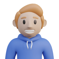
An image file that’s square with a transparent background will work best for what we’re doing. Here’s the one I’m using if you want start with that.

I’m hoping to see lots of examples of this as possible using real images — so please share your final result in the comments when you’re done so we can build a collection!
Before jumping into CSS, let’s first dissect the effect. The image gets bigger on hover, so we’ll for sure use transform: scale() in there. There’s a circle behind the avatar, and a radial gradient should do the trick. Finally, we need a way to create a border at the bottom of the circle that creates the appearance of the avatar behind the circle.
Let’s get to work!
The scale effect
Let’s start by adding the transform:
img { width: 280px; aspect-ratio: 1; cursor: pointer; transition: .5s;
}
img:hover { transform: scale(1.35);
}
Nothing complicated yet, right? Let’s move on.
The circle
We said that the background would be a radial gradient. That’s perfect because we can create hard stops between the colors of a radial gradient, which make it look like we’re drawing a circle with solid lines.
img { --b: 5px; /* border width */ width: 280px; aspect-ratio: 1; background: radial-gradient( circle closest-side, #ECD078 calc(99% - var(--b)), #C02942 calc(100% - var(--b)) 99%, #0000 ); cursor: pointer; transition: .5s;
}
img:hover { transform: scale(1.35);
}
Note the CSS variable, --b, I’m using there. It represents the thickness of the “border” which is really just being used to define the hard color stops for the red part of the radial gradient.
The next step is to play with the gradient size on hover. The circle needs to keep its size as the image grows. Since we are applying a scale() transformation, we actually need to decrease the size of the circle because it otherwise scales up with the avatar. So, while the image scales up, we need the gradient to scale down.
Let’s start by defining a CSS variable, --f, that defines the “scale factor”, and use it to set the size of the circle. I’m using 1 as the default value, as in that’s the initial scale for the image and the circle that we transform from.
Here is a demo to illustrate the trick. Hover to see what is happening behind the scenes:
I added a third color to the radial-gradient to better identify the area of the gradient on hover:
radial-gradient( circle closest-side, #ECD078 calc(99% - var(--b)), #C02942 calc(100% - var(--b)) 99%, lightblue
);
Now we have to position our background at the center of the circle and make sure it takes up the full height. I like to declare everything directly on the background shorthand property, so we can add our background positioning and make sure it doesn’t repeat by tacking on those values right after the radial-gradient():
background: radial-gradient() 50% / calc(100% / var(--f)) 100% no-repeat;The background is placed at the center (50%), has a width equal to calc(100%/var(--f)), and has a height equal to 100%.
Nothing scales when --f is equal to 1 — again, our initial scale. Meanwhile, the gradient takes up the full width of the container. When we increase --f, the element’s size grows — thanks to the scale() transform — and the gradient’s size decreases.
Here’s what we get when we apply all of this to our demo:
We’re getting closer! We have the overflow effect at the top, but we still need to hide the bottom part of the image, so it looks like it is popping out of the circle rather than sitting in front of it. That’s the tricky part of this whole thing and is what we’re going to do next.
The bottom border
I first tried tackling this with the border-bottom property, but I was unable to find a way to match the size of the border to the size to the circle. Here’s the best I could get and you can immediately see it’s wrong:
The actual solution is to use the outline property. Yes, outline, not border. In a previous article, I show how outline is powerful and allows us to create cool hover effects. Combined with outline-offset, we have exactly what we need for our effect.
The idea is to set an outline on the image and adjust its offset to create the bottom border. The offset will depend on the scaling factor the same way the gradient size did.
Now we have our bottom “border” (actually an outline) combined with the “border” created by the gradient to create a full circle. We still need to hide portions of the outline (from the top and the sides), which we’ll get to in a moment.
Here’s our code so far, including a couple more CSS variables you can use to configure the image size (--s) and the “border” color (--c):
img { --s: 280px; /* image size */ --b: 5px; /* border thickness */ --c: #C02942; /* border color */ --f: 1; /* initial scale */ width: var(--s); aspect-ratio: 1; cursor: pointer; border-radius: 0 0 999px 999px; outline: var(--b) solid var(--c); outline-offset: calc((1 / var(--f) - 1) * var(--s) / 2 - var(--b)); background: radial-gradient( circle closest-side, #ECD078 calc(99% - var(--b)), var(--c) calc(100% - var(--b)) 99%, #0000 ) 50% / calc(100% / var(--f)) 100% no-repeat; transform: scale(var(--f)); transition: .5s;
}
img:hover { --f: 1.35; /* hover scale */
}
Since we need a circular bottom border, we added a border-radius on the bottom side, allowing the outline to match the curvature of the gradient.
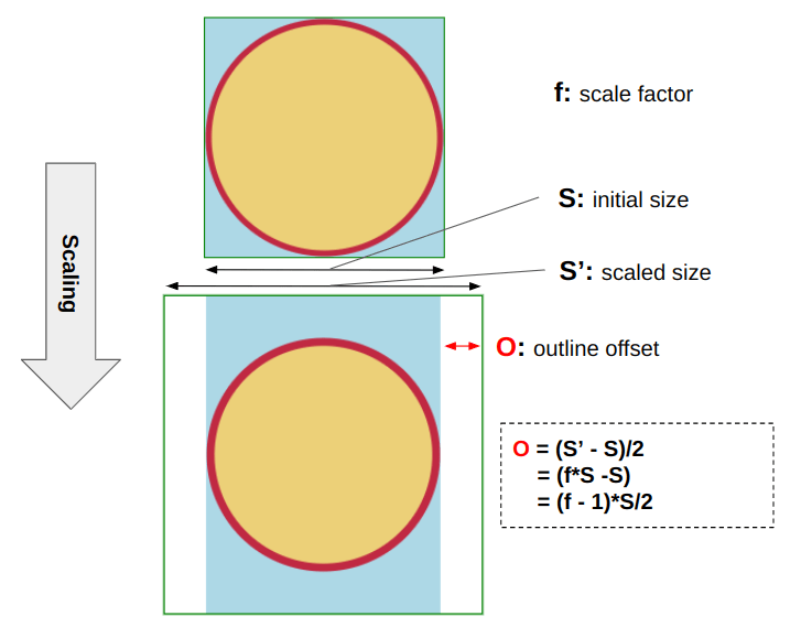
The calculation used on outline-offset is a lot more straightforward than it looks. By default, outline is drawn outside of the element’s box. And in our case, we need it to overlap the element. More precisely, we need it to follow the circle created by the gradient.

When we scale the element, we see the space between the circle and the edge. Let’s not forget that the idea is to keep the circle at the same size after the scale transformation runs, which leaves us with the space we will use to define the outline’s offset as illustrated in the above figure.
Let’s not forget that the second element is scaled, so our result is also scaled… which means we need to divide the result by f to get the real offset value:
Offset = ((f - 1) * S/2) / f = (1 - 1/f) * S/2We add a negative sign since we need the outline to go from the outside to the inside:
Offset = (1/f - 1) * S/2Here’s a quick demo that shows how the outline follows the gradient:
You may already see it, but we still need the bottom outline to overlap the circle rather than letting it bleed through it. We can do that by removing the border’s size from the offset:
outline-offset: calc((1 / var(--f) - 1) * var(--s) / 2) - var(--b));Now we need to find how to remove the top part from the outline. In other words, we only want the bottom part of the image’s outline.
First, let’s add space at the top with padding to help avoid the overlap at the top:
img { --s: 280px; /* image size */ --b: 5px; /* border thickness */ --c: #C02942; /* border color */ --f: 1; /* initial scale */ width: var(--s); aspect-ratio: 1; padding-block-start: calc(var(--s)/5); /* etc. */
}
img:hover { --f: 1.35; /* hover scale */
}
There is no particular logic to that top padding. The idea is to ensure the outline doesn’t touch the avatar’s head. I used the element’s size to define that space to always have the same proportion.
Note that I have added the content-box value to the background:
background: radial-gradient( circle closest-side, #ECD078 calc(99% - var(--b)), var(--c) calc(100% - var(--b)) 99%, #0000 ) 50%/calc(100%/var(--f)) 100% no-repeat content-box;We need this because we added padding and we only want the background set to the content box, so we must explicitly tell the background to stop there.
Adding CSS mask to the mix
We reached the last part! All we need to do is to hide some pieces, and we are done. For this, we will rely on the mask property and, of course, gradients.
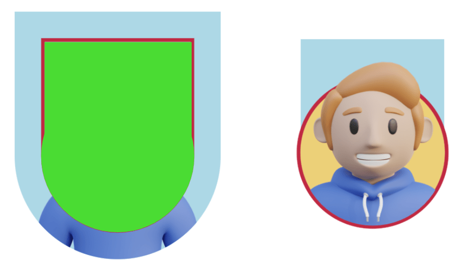
Here is a figure to illustrate what we need to hide or what we need to show to be more accurate

The left image is what we currently have, and the right is what we want. The green part illustrates the mask we must apply to the original image to get the final result.
We can identify two parts of our mask:
- A circular part at the bottom that has the same dimension and curvature as the radial gradient we used to create the circle behind the avatar
- A rectangle at the top that covers the area inside the outline. Notice how the outline is outside the green area at the top — that’s the most important part, as it allows the outline to be cut so that only the bottom part is visible.
Here’s our final CSS:
img { --s: 280px; /* image size */ --b: 5px; /* border thickness */ --c: #C02942; /* border color */ --f: 1; /* initial scale */ --_g: 50% / calc(100% / var(--f)) 100% no-repeat content-box; --_o: calc((1 / var(--f) - 1) * var(--s) / 2 - var(--b)); width: var(--s); aspect-ratio: 1; padding-top: calc(var(--s)/5); cursor: pointer; border-radius: 0 0 999px 999px; outline: var(--b) solid var(--c); outline-offset: var(--_o); background: radial-gradient( circle closest-side, #ECD078 calc(99% - var(--b)), var(--c) calc(100% - var(--b)) 99%, #0000) var(--_g); mask: linear-gradient(#000 0 0) no-repeat 50% calc(-1 * var(--_o)) / calc(100% / var(--f) - 2 * var(--b)) 50%, radial-gradient( circle closest-side, #000 99%, #0000) var(--_g); transform: scale(var(--f)); transition: .5s;
}
img:hover { --f: 1.35; /* hover scale */
}
Let’s break down that mask property. For starters, notice that a similar radial-gradient() from the background property is in there. I created a new variable, --_g, for the common parts to make things less cluttered.
--_g: 50% / calc(100% / var(--f)) 100% no-repeat content-box; mask: radial-gradient( circle closest-side, #000 99%, #0000) var(--_g);Next, there’s a linear-gradient() in there as well:
--_g: 50% / calc(100% / var(--f)) 100% no-repeat content-box; mask: linear-gradient(#000 0 0) no-repeat 50% calc(-1 * var(--_o)) / calc(100% / var(--f) - 2 * var(--b)) 50%, radial-gradient( circle closest-side, #000 99%, #0000) var(--_g);This creates the rectangle part of the mask. Its width is equal to the radial gradient’s width minus twice the border thickness:
calc(100% / var(--f) - 2 * var(--b))The rectangle’s height is equal to half, 50%, of the element’s size.
We also need the linear gradient placed at the horizontal center (50%) and offset from the top by the same value as the outline’s offset. I created another CSS variable, --_o, for the offset we previously defined:
--_o: calc((1 / var(--f) - 1) * var(--s) / 2 - var(--b));One of the confusing things here is that we need a negative offset for the outline (to move it from outside to inside) but a positive offset for the gradient (to move from top to bottom). So, if you’re wondering why we multiply the offset, --_o, by -1, well, now you know!
Here is a demo to illustrate the mask’s gradient configuration:
Hover the above and see how everything move together. The middle box illustrates the mask layer composed of two gradients. Imagine it as the visible part of the left image, and you get the final result on the right!
Wrapping up
Oof, we’re done! And not only did we wind up with a slick hover animation, but we did it all with a single HTML <img> element. Just that and less than 20 lines of CSS trickery!
Sure, we relied on some little tricks and math formulas to reach such a complex effect. But we knew exactly what to do since we identified the pieces we needed up-front.
Could we have simplified the CSS if we allowed ourselves more HTML? Absolutely. But we’re here to learn new CSS tricks! This was a good exercise to explore CSS gradients, masking, the outline property’s behavior, transformations, and a whole bunch more. If you felt lost at any point, then definitely check out my series that uses the same general concepts. It sometimes helps to see more examples and use cases to drive a point home.
I will leave you with one last demo that uses photos of popular CSS developers. Don’t forget to show me a demo with your own image so I can add it to the collection!


