Advertisement
Developing a jewelry website that captures the essence of your business while also providing an amazing shopping experience can be difficult. Looking at some of the most outstanding jewelry website designs, on the other hand, can provide you with inspiration and insight into what makes a great online store.
In this post, we will look at some of the most beautiful and functional jewelry website designs, emphasizing their distinctive characteristics and benefits. This post will present you with wonderful examples to utilize as inspiration, whether you’re a new jewelry designer trying to construct a website for your company or an existing firm wishing to overhaul your online presence.
These websites demonstrate the best of jewelry website design, ranging from simple and modern to lavish and opulent.
Outstanding jewelry website designs
Table of Contents
- 1 Outstanding jewelry website designs
- 1.1 Voylla
- 1.2 Tiffany and Co.
- 1.3 Pandora
- 1.4 Gemfields
- 1.5 Carlo Barberis
- 1.6 Mejuri
- 1.7 Limnia
- 1.8 Daniella Draper
- 1.9 Leen Heyne
- 1.10 Mable Jewelry
- 1.11 Lin Shiao Tung
- 1.12 Charriol
- 1.13 Pipabella
- 1.14 Ananta
- 1.15 ANI and ALEX
- 1.16 Paris Jewellers
- 1.17 Aurate New York
- 1.18 Kitsch
- 1.19 ID Jewelry
- 1.20 Soklich Jewelers
- 1.21 ORRA Fine Jewellery
- 2 FAQ about jewelry website design
- 2.1 What kind of color scheme should I use for my jewelry website?
- 2.2 How can I make my website look professional and trustworthy to potential customers?
- 2.3 What are some essential features that a jewelry website should have?
- 2.4 How can I make my website easy to navigate for visitors looking for specific products?
- 2.5 How can I showcase my products in a visually appealing and enticing way?
- 2.6 What type of content should I include on my jewelry website to engage visitors?
- 2.7 How can I optimize my website for search engines to increase traffic and visibility?
- 2.8 Should I include a blog on my jewelry website, and if so, what topics should I cover?
- 2.9 How can I make my website mobile-friendly for visitors who access it on their smartphones or tablets?
- 2.10 What are some best practices for designing a user-friendly and effective jewelry website?
- 3 Conclusion on jewelry website designs
Voylla
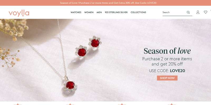
The jewelry website design’s only color scheme is blue and red, which adds to the faint ocean blue appearance and gives the impression that it is vibrant and vivid.
On the main page, jewelry photos are shown, each with a call to action button. To draw in more clients, it features a special function that displays the “Deal of the Day.”
The viewer may see the information and website designs in a movie after the document. It features several picture boxes that show the jewelry merchandise that is offered on the website.
/*div{padding-right:0!important;padding-bottom:10px}.ml-form-formContent.horozintalForm .ml-button-horizontal{width:100%!important}.ml-form-formContent.horozintalForm .ml-button-horizontal.labelsOn{padding-top:0!important}}
/*]]>*/
/**/
![]()
To aid visitors from other planets, it also features a language choice at the top right.
Tiffany and Co.
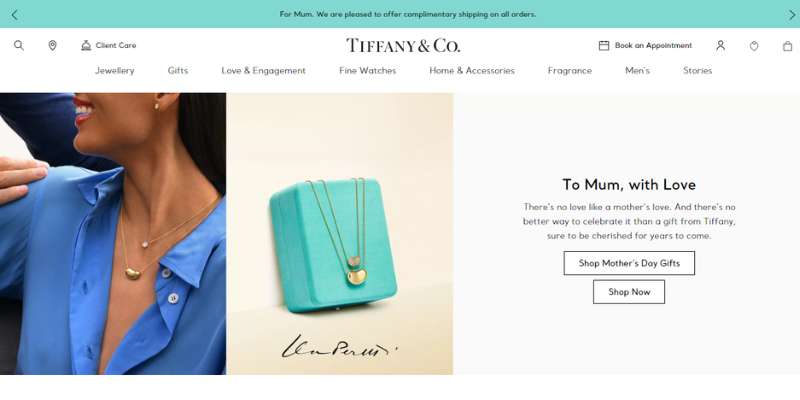
One of the most tasteful website layouts ever created for jewelry-related uses. The homepage components of the Tiffany & Co. website are visually divided using a subdued color scheme and shadowing.
The first picture and sentence alone show how the brand is being used. The firm sells stunning diamond rings, which are accurately shown in the black-and-white backdrop image of a girl and her fiancé.
The typeface is chosen such that it charmingly reveals the website’s overarching idea.
Pandora
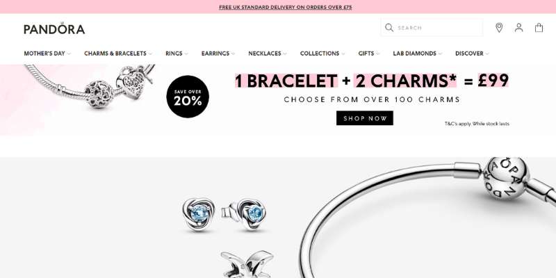
The website offers every aspect a jewelry website design needs for a positive shopping experience. It is simple, clear, and refined.
The “Find the Store” symbol, which enables users to instantly find the physical store, is the website’s distinguishing feature. The website’s header and footer both show all of the categories at the top.
A “Shop now” button in the website’s center directs visitors to the payment page while the new jewelry line is shown via picture boxes.
Gemfields
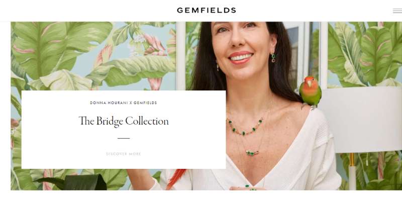
Gemfields is a world leading supplier of colorful gemstones from ethical mines. The website features a polished and imaginative style that may motivate any participant in this sector.
Our company is prepared to immerse visitors in the hero scenario with its educational and fascinating video integration. Moreover, it celebrates the ability of white space to develop understandable web components throughout the whole webpage.
Additionally, it includes a stylish and original style for the news and diary as well as a sticky header to highlight branding and keep navigation accessible.
Advertisement
Carlo Barberis
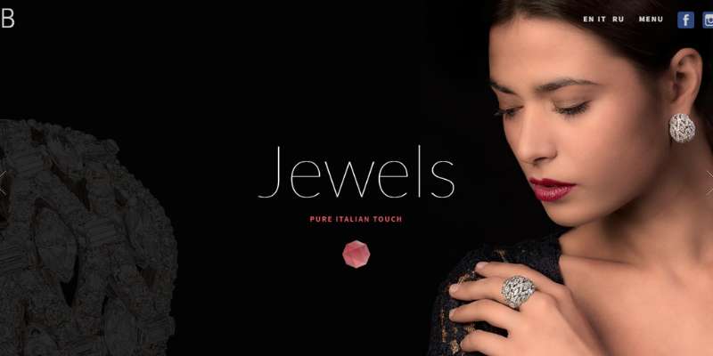
It’s an Italian-inspired jewelry line with a deep love of nature, beauty, and gems. The site has a fullscreen layout and includes digital marketing, social media, branding, and navigational indicators.
Using the GSAP animation, it even appears vibrant and inviting as it slides to other web pages. Each page has a fantastic and original design.
Mejuri
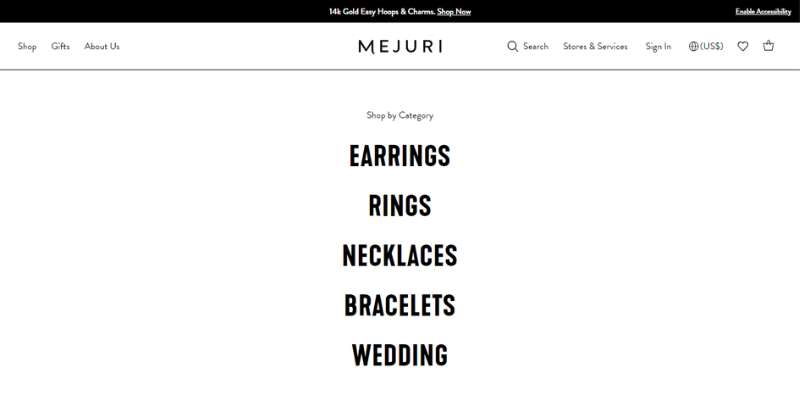
The jewelry website design for Mejuri is impressive, professional, and understated. It greets viewers with a fluid slider that highlights stunning jewelry photos.
This e-commerce website makes use of the visual hierarchy and effective typography to arrange and spice up the material. It makes use of the sticky header, as many other jewelry websites do nowadays, to increase client retention.
The giant menu, newsletter, social networking icons, and more are additional helpful features.
Limnia
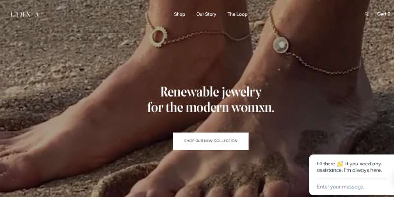
Fine jewelry made from the most pleasing materials and valuable stones is available at Limnia. The quality of its goods is reflected in the design of its jewelry website.
The web designer has jam-packed the jewelry website with helpful components grouped in an orderly fashion in addition to captivating animation provided by GSAP.
The video’s backdrop, which includes a headline and an evocative call to action, strengthens the hero moment. This jewelry website design’s asymmetrical layout incorporates a fascinating animation while also bringing beauty to the overall design.
Daniella Draper
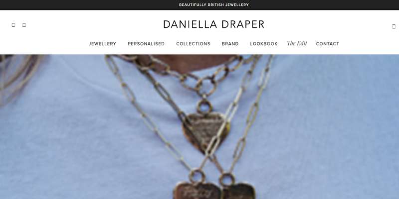
British jewelry designer Danielle Draper is multiple award-winning individual. A slider is used to show off individuals wearing her renowned items in the hero scene. The jewelry categories also look fantastic and clear with a tile arrangement, and the sticky menu is still usable.
Leen Heyne
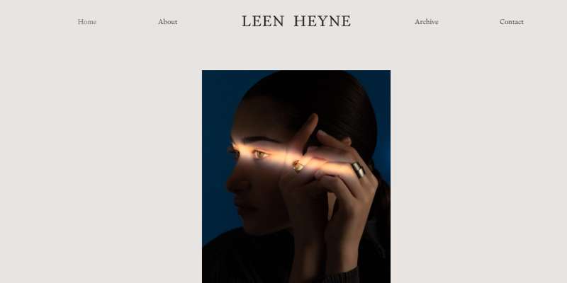
The jewelry created by Leen Heyne is exquisitely delicate and exact. Even though the site design is straightforward, it exudes elegance because of the blue backdrop and appealing jewelry goods.
It uses a seamless slider to present some of its great selections. The visitor may simply browse to other important pages, such as news, jewelers, and contacts since it makes advantage of the sticky header.
Also, this jewelry website design implements the transition using a fantastic side scroll.
Mable Jewelry
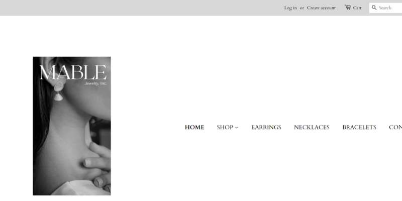
Mable Jewelry curates one-of-a-kind silver jewelry pieces and sells them for reasonable pricing.
In the hero header, photos are shown using a slider, and catalogs are displayed using square boxes. This website also features a highlighted product with a social sharing function.
This great website presents customer testimonials in an easy-to-read format since they help to increase the reputation of the company. Social media connections, an Instagram feed, a newsletter, and other features are also helpful.
Lin Shiao Tung
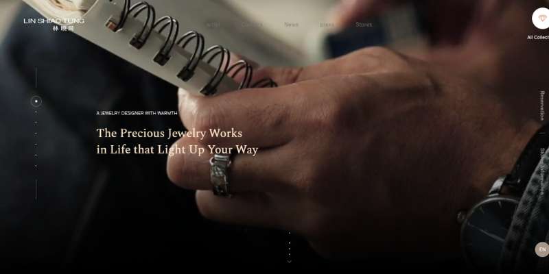
The eye-catching jewelry website design has been created and is made more alluring by the GSAP animation. The hero scene, in particular, has a great video background, headline, and menu.
The user may scroll the page or use the side slider to move around. Moreover, it incorporates a film to effectively explain the brand and a giant menu to enlarge the menu.
Charriol
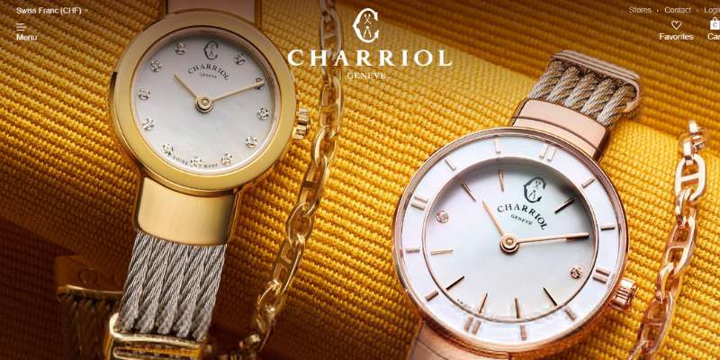
Luxurious high quality pieces and beautiful perfect jewelry are produced by Charriol in Switzerland. This website features a great off-canvas menu and a background picture with the name of the company in the hero header.
Pipabella
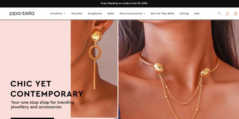
A single-page website called Pipabella draws users in with its vibrant backdrop patterns. The combination jewelry packages are shown in picture blocks that are broken up into sections.
There are several categories on the website. Users may traverse the website according to their requirements and interests thanks to the six breadcrumbs at the top. Users may quickly search for the needed item using the search box located at the top right of the page.
Besides the search button, there is a shopping basket that consumers may use to secure checkout after their purchase is complete.
Ananta

Ananta, which in Sanskrit means “eternity,” is a pioneer in the retail trade of diamonds with GIA certification in Thailand. The website’s layout is straightforward, yet it’s ready to provide jewelry buyers with a fantastic purchasing experience.
The hero scene uses a fluid slider to show a variety of photos. The categories look fantastic now that thumbnails and CTAs have been included.
Moreover, branding, navigation, and collections are made apparent using the sticky header.
ANI and ALEX
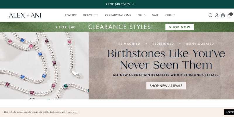
It includes some amazing jewelry in tones of silver, gold, and copper. Also, the website was created with their jewelry line in mind. Their display photographs draw our focus on the jewelry and away from the models.
The webpage is easy to focus on. Also, the typeface blends along with the design of the whole display.
Paris Jewellers
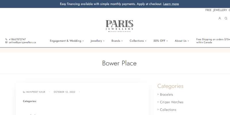
With 28 locations around the country, Paris Jewelers is a jewelry company owned by Canadians. It features a fantastic jewelry website design with plenty of great photos, beautiful fonts, great color schemes, etc.
The purchasing experience will be smooth with a decent website. This jewelry eCommerce website is prepared to wow clients and serve as a role model for other jewelry business owners.
Aurate New York
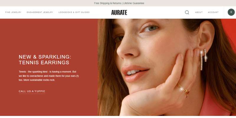
One jewelry company, Aurate New York, looks forward to offering excellent jewelry to every lady. The jewelry website design makes good use of white space to aid in reading and understanding.
The site includes crucial components including obvious CTAs, top-notch pictures, video integration, sliders, and more. Accessing the store, blog, and account is fast with a sticky header. The usage of a great slider also makes the best-selling items stand out.
Kitsch
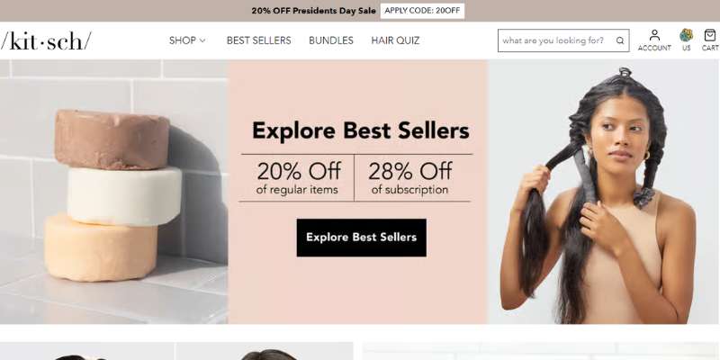
It combines color, subtlety, and sophistication. It accurately conveys the product’s elegance. The motif elegantly harmonizes with the goods.
Customers can easily browse through the whole website thanks to the three kinds of page breadcrumbs that are presented directly at the top of the page. Uniquely from a lot of other jewelry websites, this website’s usability and responsiveness have not been impacted by its modernism.
ID Jewelry
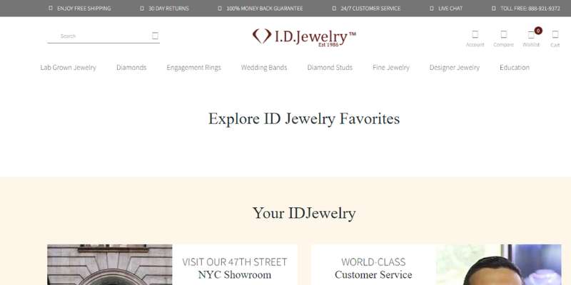
Here is ID Jewelry, a jeweler that sells exquisite diamond jewelry such as bespoke rings and other types of jewelry. The jewelry website design has a clean, minimalistic style and is gorgeous and amazing.
The smooth slider is used in the hero scene to emphasize high quality images with obvious call-to-actions and headlines.
Soklich Jewelers
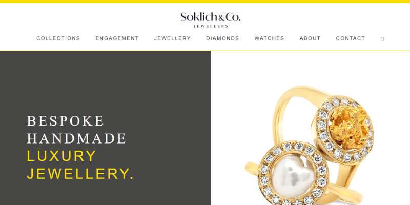
It is a brief one-page jewelry website that draws visitors right away. The presentation of the products is quite selective, which discourages potential customers from making a purchase.
Several product categories are shown under the “Feature jewelry” section. A little biography at the conclusion aids shoppers in recognizing a certain diamond. The shop’s location and contact information are shown in a short footer section.
ORRA Fine Jewellery
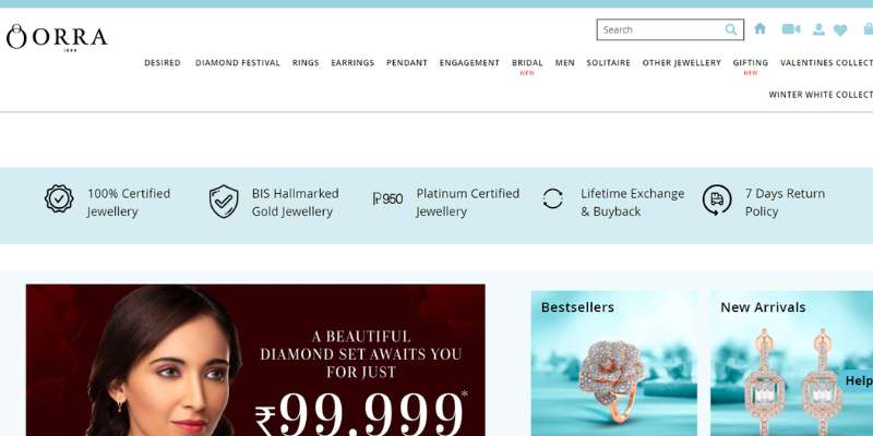
This jewelry website design enthralls users with its pink and lilac color scheme. To provide the website’s visitors with a positive user experience and user interface, the typeface was chosen based on the color scheme.
It contains several classifications, such as Gold, Diamond, and Platinum, which are made evident in the website’s page title. In comparison to other jewelry websites, it is organized a bit differently for everyday wear, evening party attire, engagement, wedding celebrations, etc.
It enables consumers to quickly and easily access the needed page and reach the shopping section.
FAQ about jewelry website design
What kind of color scheme should I use for my jewelry website?
A jewelry website’s color palette should be attractive and refined, and it should complement the things sold.
Colors such as silver, gold, and white can express a sense of richness and exclusivity, but softer tones such as pastel pink and blue can give a feminine touch.
Try employing a uniform color palette throughout the website to create a unified and polished appearance.
How can I make my website look professional and trustworthy to potential customers?
Use high-quality photographs and content, make your website easy to use, and offer clear information on product quality and materials to make your website look professional and trustworthy.
Use professional design components such as a custom logo, consistent typography, and a tidy layout. Provide clear contact information as well as links to social media profiles.
What are some essential features that a jewelry website should have?
A jewelry website must have a selection of available products, pricing information, product descriptions and materials, contact information, and a shopping cart or checkout method.
A wish list, a product comparison tool, and customer reviews are all examples of valuable tools.
Use clear and simple labels for each page and area, include a search bar, and make sure your menu is easily accessible and arranged to make your website easy to use.
To break up language and make the material easier to skim, use headings and subheadings.
Try employing filters and sorting tools to assist visitors in finding the products they seek.
How can I showcase my products in a visually appealing and enticing way?
Use high-quality photographs and videos that highlight the nuances and characteristics of each product to exhibit your products in a visually appealing and enticing way.
Consider utilizing lifestyle photographs to demonstrate how the products are used, or a 360-degree view to provide visitors with a closer look. Consider using product recommendations or packages to entice visitors to look at additional products.
What type of content should I include on my jewelry website to engage visitors?
Provide relevant and entertaining jewelry and fashion articles to engage visitors.
Consider creating blog posts or articles on themes such as jewelry trends, fashion advice, and celebrity jewelry inspiration. You might also offer useful information such as product reviews, suggestions, or Questions.
How can I optimize my website for search engines to increase traffic and visibility?
Use relevant keywords in your content, including meta tags and descriptions, utilize alt text for photos, and make sure your website is mobile-friendly and loads quickly to optimize it for search engines.
Try obtaining links to your website from other related websites and promoting your content through social media.
Should I include a blog on my jewelry website, and if so, what topics should I cover?
Adding a blog on your jewelry website can help you engage visitors while also improving your search engine rankings.
Subjects to cover could include jewelry trends, styling suggestions, and fashion industry news and trends. Try combining written and visual content, as well as inviting guest bloggers or experts to participate.
How can I make my website mobile-friendly for visitors who access it on their smartphones or tablets?
Choose a responsive design that automatically adjusts to fit the screen size of the device being used to make your website mobile-friendly.
Make sure your website loads swiftly and has readable fonts and photos. Try employing larger buttons and touch-friendly features for a better mobile user experience.
What are some best practices for designing a user-friendly and effective jewelry website?
Using a clean and consistent design, prioritizing ease of use and accessibility, using high-quality images and content, providing clear and concise information about products and services, and ensuring that the shopping process is easy and intuitive are all best practices for designing a user-friendly and effective jewelry website.
It’s also critical to keep your website up to date with new items and information, and to test its usability and performance on a number of devices and browsers.
Finally, consider incorporating user feedback and making adjustments based on user behavior to continuously improve the usefulness of your website.
Conclusion on jewelry website designs
And these are all the top examples of the best jewelry website designs we could find. We hope that you have received enough assistance from our jewelry websites to create a fantastic jewelry website.
The presentation and description of the products should be the major considerations while developing jewelry websites. To prevent post-sale misunderstanding or buyer regret, the clients must get the proper description of the desired goods.
If you enjoyed reading this article about jewelry website designs, you should read these as well:


