You must have seen skeuomorphic design at work, but maybe didn’t know that it was called that. If you’ve lived through the various stages of the iPhone, you would know that Steve Jobs favored skeuomorphic design at the beginning of development.
But what makes a design skeuomorphic in modern UI/UX? What key challenges and criticisms are there in modern-day skeuomorphic design? And, does skeuomorphism still apply to today’s UI/UX? We’ll take a look at how skeuomorphism began and its application to today’s mobile and web designs — despite its reasonable criticisms, you do still occasionally see skeuomorphism employed well.
Are you ready to take a deep dive into what should belong to your grandma’s dictionary: skeuomorphic design?
What is skeuomorphism?
Table of Contents
Let’s take a look at the Merriam-Webster Online Dictionary. Skeuomorphic is defined as “an ornament or design representing an implement.” What does that mean? It means that when a certain design is skeuomorphic, it brings out the elements of the utility or implement as a representation of that object. In short, the design on the screen mimics the real-life object that’s being depicted.
On the screen, it makes more sense. For example, when there’s a camera on your desktop screen, the icon will be a representation of the camera.
<img width="300" height="300" src="https://technobabble.com.au/wp-content/uploads/2023/03/skeuomorphism-in-ux-what-it-is-and-why-it-disappeared.jpg" class="attachment-full size-full" alt="Minimalist camera icon" decoding="async" loading="lazy" link="none" size="full" ids="164453,164456" orderby="post__in" include="164453,164456" srcset="https://technobabble.com.au/wp-content/uploads/2023/03/skeuomorphism-in-ux-what-it-is-and-why-it-disappeared.jpg 300w, https://blog.logrocket.com/wp-content/uploads/2023/03/minimalist-camera-icon-e1679614690680-150×150.jpg?crop=1 150w" sizes="(max-width: 300px) 100vw, 300px" data-attachment-id="164453" data-permalink="https://blog.logrocket.com/ux-design/skeuomorphism-ux-what-it-is-why-it-disappeared/attachment/minimalist-camera-icon/" data-orig-file="https://technobabble.com.au/wp-content/uploads/2023/03/skeuomorphism-in-ux-what-it-is-and-why-it-disappeared.jpg" data-orig-size="300,300" data-comments-opened="1" data-image-meta="{"aperture":"0","credit":"","camera":"","caption":"","created_timestamp":"1679640409","copyright":"","focal_length":"0","iso":"0","shutter_speed":"0","title":"","orientation":"1"}" data-image-title="minimalist-camera-icon" data-image-description data-image-caption="
Minimalist camera icon.” data-medium-file=”https://blog.logrocket.com/wp-content/uploads/2023/03/minimalist-camera-icon-e1679614343338-300×300.jpg” data-large-file=”https://technobabble.com.au/wp-content/uploads/2023/03/skeuomorphism-in-ux-what-it-is-and-why-it-disappeared.jpg”> <img width="300" height="300" src="https://technobabble.com.au/wp-content/uploads/2023/03/skeuomorphism-in-ux-what-it-is-and-why-it-disappeared-1.jpg" class="attachment-full size-full" alt="Skeuomorphic camera icon" decoding="async" loading="lazy" link="none" size="full" ids="164453,164456" orderby="post__in" include="164453,164456" srcset="https://technobabble.com.au/wp-content/uploads/2023/03/skeuomorphism-in-ux-what-it-is-and-why-it-disappeared-1.jpg 300w, https://blog.logrocket.com/wp-content/uploads/2023/03/skeuomorphic-camera-icon-e1679614677711-150×150.jpg?crop=1 150w" sizes="(max-width: 300px) 100vw, 300px" data-attachment-id="164456" data-permalink="https://blog.logrocket.com/ux-design/skeuomorphism-ux-what-it-is-why-it-disappeared/attachment/skeuomorphic-camera-icon/" data-orig-file="https://technobabble.com.au/wp-content/uploads/2023/03/skeuomorphism-in-ux-what-it-is-and-why-it-disappeared-1.jpg" data-orig-size="300,300" data-comments-opened="1" data-image-meta="{"aperture":"0","credit":"","camera":"","caption":"","created_timestamp":"1679640394","copyright":"","focal_length":"0","iso":"0","shutter_speed":"0","title":"","orientation":"1"}" data-image-title="Skeuomorphic camera icon" data-image-description data-image-caption=" Skeuomorphic camera icon.” data-medium-file=”https://blog.logrocket.com/wp-content/uploads/2023/03/skeuomorphic-camera-icon-e1679614332473-300×300.jpg” data-large-file=”https://technobabble.com.au/wp-content/uploads/2023/03/skeuomorphism-in-ux-what-it-is-and-why-it-disappeared-1.jpg”>But not all representations are skeuomorphic. Skeuomorphism requires realistic representation. What makes it skeuomorphic is that, for example, the button is rounded so it looks like an actual button. Or that the camera icon looks morphed as an actual depiction of a camera’s eye. Or for another example, the recycle/trash bin should look like an actual bin, so users would feel compelled to drag trash there.
The opposite of skeuomorphic design is neuromorphic design or flat design, which is not morphed but instead shows a minimalist or flat depiction of the icon. We’re still a long way away from understanding skeuomorphism, but let’s move on so we can get a better picture of it.
A brief history of skeuomorphism
Before we really take a look at skeuomorphic design, we have to know where it came from. So here’s a brief history of skeuomorphism:
- 1980s — Steve Jobs is the major proponent of skeuomorphic design. He is all about the user and thinks that the user experience will be enhanced with skeuomorphism, so that each user can feel as if the experience online mirrors their offline experiences
- 1988 — Don Norman, commonly called the father of user design, comes out with a book, “The Design of Everyday Things,” which mapped out the concept of affordances — how much a design is intuitive and easy to use, or how much a design is user friendly. He has this to say about skeuomorphic design at its height: “Skeuomorphic designs are often comfortable for traditionalists, and indeed the history of technology shows that new technologies and materials often slavishly imitate the old for no apparent reason except that is what people know how to do. Early automobiles looked like horse-driven carriages without the horses (which is also why they were called horseless carriages); early plastics were designed to look like wood; folders in computer file systems often look the same as paper folders, complete with tabs.”
- 2007 — Apple’s iPhone OS, the first mobile operating system of Apple, is unveiled, called iOS 1.0. The iPhone OS or iOS 1.0 features skeuomorphic design, as you can see here:
- 2013 — Forbes Magazine foretells the death of skeuomorphic design in their article “Apple’s iOS 7, Well, It Was Time for Skeuomorphic Design to Die.” They cover the reveal of Apple’s iOS 7, which tends toward flat design or minimalist design rather than skeuomorphic design. It is two years after the passing of Steve Jobs, the major proponent of skeuomorphic design
There you have it: the timeline of the birth and eventual death of skeuomorphic design. But why did it die? Read on.
Why isn’t skeuomorphism commonly used today?
The Forbes article outlined the various reasons why skeuomorphism “died.” For one, it was used in the 80s to come up with reasons for how to manage the evolution of the internet. It just wasn’t feasible that the way in which we use technology in the 80s and technology in the early 2010s will be the same. In order to evolve with technology, we have to let go of old patterns.
And this included, in 2013, a redesign of iOS 7.0 from skeuomorphic to minimalist — why? Ultimately to serve the user, who was already used to the skeuomorphic cues and needed something new, only a hint of the old design. All of which made minimalism make sense.
Overview of issues with skeuomorphism
Let’s take a look closely at the issues of skeuomorphism, because although overall it wasn’t working, there were issues with specific functions that make it ultimately harder for the 2023 user to understand.
Case study: Apple’s iOS
To further this discussion, let’s take the example of Apple’s iOS. In their first release of iOS 1.0, they featured a skeuomorphic design, with the clear functionality of each icon taken from ordinary life.
Take, for example, the camera icon, which shows a close-up image of the shutters of a camera, making it symbolic of the skeuomorphic design. Check out, too, the calendar icon, which has a red tab that makes it look like a real paper calendar. All of the icons have a seemingly rounded shape, making these skeuomorphic buttons indicative of something to be pressed by the hand.
In today’s Apple iPhone OS, iOS 16.0, the camera icon has a silhouette of a flat camera, showing the flat design they ended up with. However, note that the whole camera button still has a rounder shape — which we’ll end up talking about later. In comparison, the calendar button in iOS 16 is completely flat and only says the date and day in flat text.
<img data-attachment-id="164325" data-permalink="https://blog.logrocket.com/ux-design/skeuomorphism-ux-what-it-is-why-it-disappeared/attachment/rounder-icon-shape/" data-orig-file="https://technobabble.com.au/wp-content/uploads/2023/03/skeuomorphism-in-ux-what-it-is-and-why-it-disappeared-3.jpg" data-orig-size="730,534" data-comments-opened="1" data-image-meta="{"aperture":"0","credit":"","camera":"","caption":"","created_timestamp":"0","copyright":"","focal_length":"0","iso":"0","shutter_speed":"0","title":"","orientation":"0"}" data-image-title="Rounder icon shape" data-image-description data-image-caption="
ddd” data-medium-file=”https://blog.logrocket.com/wp-content/uploads/2023/03/rounder-icon-shape-300×219.jpg” data-large-file=”https://technobabble.com.au/wp-content/uploads/2023/03/skeuomorphism-in-ux-what-it-is-and-why-it-disappeared-3.jpg” decoding=”async” loading=”lazy” class=”size-full wp-image-164325 aligncenter” src=”https://technobabble.com.au/wp-content/uploads/2023/03/skeuomorphism-in-ux-what-it-is-and-why-it-disappeared-3.jpg” alt=”Rounder Icon Ahape” width=”730″ height=”534″ srcset=”https://technobabble.com.au/wp-content/uploads/2023/03/skeuomorphism-in-ux-what-it-is-and-why-it-disappeared-3.jpg 730w, https://blog.logrocket.com/wp-content/uploads/2023/03/rounder-icon-shape-300×219.jpg 300w” sizes=”(max-width: 730px) 100vw, 730px”>
The design principle of form follows function
The Bauhaus School of Art dictated that form follows function. They came after the Art Nouveau movement, which imitated organic forms. These, the Bauhaus felt, were what was wrong with the old schools of art — they prioritized forms that were principally ornamental in purpose with no practical value. In fact, the Bauhaus resolutely believed in forms that were useful and purposeful according to a clearly defined need.
What does this have to do with UX? One of the key design principles of UX/UI is “form follows function.” So, everything that is designed must have a specific function, and moreover, it must be in a functional form.
In addition, to tie in the Bauhaus critique with what we are discussing today, skeuomorphism seemed to be the old method of working with old forms: it seemed in its essence ornamental.
Why work with skeuomorphism that would warp a button into something that looks like an aspect of the real thing when you could just have a button that seems to be inspired by its material, or a flatter design that conflates your mind to a representation of that thing instead? This is why skeuomorphism seems to no longer be in use while Material and flat design are more common.
Skeuomorphic vs. Material vs. flat design
We’ve established what skeuomorphic design means and have tracked its death, but what about other types of UX/UI design that seem more commonly in use nowadays? Skeuomorphic design is just one type of design. There are others, such as Material and flat design that users seem to favor these days.
As they are evolving with newer concepts of technology, such as virtual reality and hyperreality, users seem to favor flat design and Material Design over skeuomorphic design. What really is the difference?
Material Design
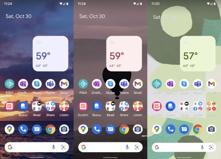
We’ve talked a lot about Apple’s iOS, but what about others’ OS? Google developed Material Design language and released it on June 25, 2014, for iOS and Android. Material Design uses the elements of light, shadow, and color, using grid-like layouts and patterns in the design. This design is informed by print design methods, such as typography, grids, color, and other imagery.
In contrast with skeuomorphism, Material Design prioritizes the layout much more. While skeuomorphism privileges the depictions to be as real in the representations as possible, Material Design privileges the design element of imagery to be as varied and as imaginative as possible. Seemingly the complete opposite of skeuomorphic design, Material Design, however, is still just as user friendly since it mimics what users often see in print.
One example of Material Design is the Google Pixel 6 and Pixel 6 Pro UI, pictured below:
Flat design
And lastly, flat design is just that — a design element that uses two-dimensional representations with vibrant colors. It debuted in 2013 with Apple’s iOS 7, Windows 8, and Google’s Material Design, which all featured flat design.
In contrast with skeuomorphism, the two-dimensional nature of flat design makes it more minimalistic. It is more responsive, with simpler shapes that can be loaded faster.
Material Design and flat design can be seen together in the Pixel 6. They often go together because material design gets its inspiration from print, whereas print design is usually two-dimensional. But in contrast with Material Design, flat design has an emphasis on the design elements being flat, not necessarily the layouts or colors that Material Design is concerned with.
Key examples of good skeuomorphic use
Now that you know how to differentiate between different design elements, you might have found that skeuomorphism, though popular in its heyday, is not as commonly used now as Material or flat design. But where does skeuomorphism still apply, and what are the key examples of good skeuomorphic use?
Let’s go back to the camera icon of iOS 16.0:
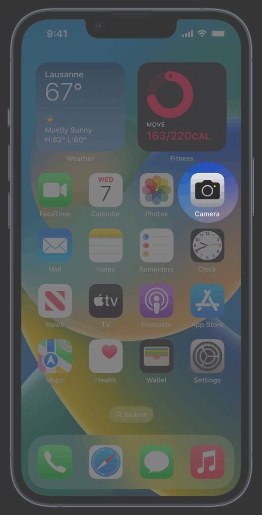
Did you notice it’s still skeuomorphic? Apple might have changed a few things — the old iOS 1.0 camera icon showed a shutter’s eye, while this one has a small outlined shape of a camera — but it’s still a raised icon, still three-dimensional. This is because it still has its affordance, borrowing a term from Don Norman. It’s still intuitive to keep it as a skeuomorphic design.
Let’s take another example. WatchOS and WearOS still feature skeuomorphic design for the most part, showing the time on the watch as a representation of the analog watch. Is it a watch? Is it a computer on your wrist? It’s both and skeuomorphism just shows the duality of both realities.
Conclusion
All in all, it seems that skeuomorphism isn’t the tech evil it was before. As users are switching to virtual reality, they need imagistic representations of their lives on virtual platforms. No flat design or skeuomorphic design could ever really mirror reality, just as you need a fine intuition between virtual reality and lived reality. But UX/UI designers can try.
Header image source: Freepik
The post Skeuomorphism in UX: What it is and why it disappeared appeared first on LogRocket Blog.
from LogRocket Blog https://ift.tt/io2RlCe
Gain $200 in a week
via Read more