Uh, what’s @property? It’s a new CSS feature! It gives you superpowers. No joke, there is stuff that @property can do that unlocks things in CSS we’ve never been able to do before.
While everything about @property is exciting, perhaps the most interesting thing is that it provides a way to specify a type for custom CSS properties. A type provides more contextual information to the browser, and that results in something cool: We can give the browser the information is needs to transition and animate those properties!
But before we get too giddy about this, it’s worth noting that support isn’t quite there. As it current stands at the time of this writing, @property is supported in Chrome and, by extension, Edge. We need to keep an eye on browser support for when we get to use this in other places, like Firefox and Safari.
First off, we get type checking
Table of Contents
@property --spinAngle { /* An initial value for our custom property */ initial-value: 0deg; /* Whether it inherits from parent set values or not */ inherits: false; /* The type. Yes, the type. You thought TypeScript was cool */ syntax: '<angle>';
} @keyframes spin { to { --spinAngle: 360deg; }
}
That’s right! Type checking in CSS. It’s sorta like creating our very own mini CSS specification. And that’s a simple example. Check out all of the various types we have at our disposal:
lengthnumberpercentagelength-percentagecolorimageurlintegerangletimeresolutiontransform-listtransform-functioncustom-ident(a custom identifier string)
Before any of this, we may have relied on using “tricks” for powering animations with custom properties.
CSS variables are awesome, right? But scope power is often overlooked. For example, take this demo, 3 different animations but only 1 animation defined ???? That means dynamic animations ???? https://t.co/VN02NlC4G8 via @CodePen #CSS #animation #webdev #webdesign #coding pic.twitter.com/ig8baxr7F3
— Jhey ???????? (@jh3yy) November 5, 2019
What cool stuff can we do then? Let’s take a look to spark our imaginations.
Let’s animate color
How might you animate an element either through a series of colors or between them? I’m a big advocate for the HSL color space which breaks things down into fairly understandable numbers: hue, saturation, and lightness, respectively.
Animating a hue feels like something fun we can do. What’s colorful? A rainbow! There’s a variety of ways we could make a rainbow. Here’s one:
In this example, CSS Custom Properties are set on the different bands of the rainbow using :nth-child() to scope them to individual bands. Each band also has an --index set to help with sizing.
To animate those bands, we might use that --index to set some negative animation delays, but then use the same keyframe animation to cycle through hues.
.rainbow__band { border-color: hsl(var(--hue, 10), 80%, 50%); animation: rainbow 2s calc(var(--index, 0) * -0.2s) infinite linear;
} @keyframes rainbow { 0%, 100% { --hue: 10; } 14% { --hue: 35; } 28% { --hue: 55; } 42% { --hue: 110; } 56% { --hue: 200; } 70% { --hue: 230; } 84% { --hue: 280; }
}
That might work out okay if you want a “stepped” effect. But, those keyframe steps aren’t particularly accurate. I’ve used steps of 14% as a rough jump.
We could animate the border-color and that would get the job done. But, we’d still have a keyframe step calculation issue. And we need to write a lot of CSS to get this done:
@keyframes rainbow { 0%, 100% { border-color: hsl(10, 80%, 50%); } 14% { border-color: hsl(35, 80%, 50%); } 28% { border-color: hsl(55, 80%, 50%); } 42% { border-color: hsl(110, 80%, 50%); } 56% { border-color: hsl(200, 80%, 50%); } 70% { border-color: hsl(230, 80%, 50%); } 84% { border-color: hsl(280, 80%, 50%); }
}
Enter @property. Let’s start by defining a custom property for hue. This tells the browser our custom property, --hue, is going to be a number (not a string that looks like a number):
@property --hue { initial-value: 0; inherits: false; syntax: '<number>';
}
Hue values in HSL can go from 0 to 360. We start with an initial value of 0. The value isn’t going to inherit. And our value, in this case, is a number. The animation is as straightforward as:
@keyframes rainbow { to { --hue: 360; }
}
Yep, that’s the ticket:
To get the starting points accurate, we could play with delays for each band. This gives us some cool flexibility. For example, we can up the animation-duration and we get a slow cycle. Have a play with the speed in this demo.
It may not be the “wildest” of examples, but I think animating color has some fun opportunities when we use color spaces that make logical use of numbers. Animating through the color wheel before required some trickiness. For example, generating keyframes with a preprocessor, like Stylus:
@keyframes party for $frame in (0..100) {$frame * 1%} background 'hsl(%s, 65%, 40%)' % ($frame * 3.6)We do this purely because this isn’t understood by the browser. It sees going from 0 to 360 on the color wheel as an instant transition because both hsl values show the same color.
@keyframes party { from { background: hsl(0, 80%, 50%); } to { background: hsl(360, 80%, 50%); }
}
The keyframes are the same, so the browser assumes the animation stays at the same background value when what we actually want is for the browser to go through the entire hue spectrum, starting at one value and ending at that same value after it goes through the motions.
Think of all the other opportunities we have here. We can:
- animate the saturation
- use different easings
- animate the lightness
- Try
rgb() - Try degrees in
hsl()and declare our custom property type as<angle>
What’s neat is that we can share that animated value across elements with scoping! Consider this button. The border and shadow animate through the color wheel on hover.
Animating color leads me think… wow!
Straight-up numbering
Because we can define types for numbers—like integer and number—that means we can also animate numbers instead of using those numbers as part of something else. Carter Li actually wrote an article on this right here on CSS-Tricks. The trick is to use an integer in combination with CSS counters. This is similar to how we can work the counter in “Pure CSS” games like this one.
The use of counter and pseudo-elements provides a way to convert a number to a string. Then we can use that string for the content of a pseudo-element. Here are the important bits:
@property --milliseconds { inherits: false; initial-value: 0; syntax: '<integer>';
} .counter { counter-reset: ms var(--milliseconds); animation: count 1s steps(100) infinite;
} .counter:after { content: counter(ms);
} @keyframes count { to { --milliseconds: 100; }
}
Which gives us something like this. Pretty cool.
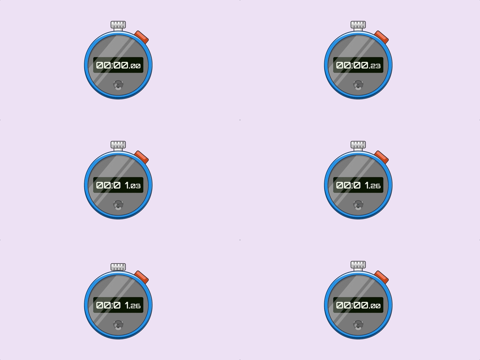
Take that a little further and you’ve got yourself a working stopwatch made with nothing but CSS and HTML. Click the buttons! The rad thing here is that this actually works as a timer. It won’t suffer from drift. In some ways it may be more accurate than the JavaScript solutions we often reach for such as setInterval. Check out this great video from Google Chrome Developer about JavaScript counters.
What other things could you use animated numbers for? A countdown perhaps?
Animated gradients
You know the ones, linear, radial, and conic. Ever been in a spot where you wanted to transition or animate the color stops? Well, @property can do that!
Consider a gradient where we‘re creating some waves on a beach. Once we’ve layered up some images we could make something like this.
body { background-image: linear-gradient(transparent 0 calc(35% + (var(--wave) * 0.5)), var(--wave-four) calc(75% + var(--wave)) 100%), linear-gradient(transparent 0 calc(35% + (var(--wave) * 0.5)), var(--wave-three) calc(50% + var(--wave)) calc(75% + var(--wave))), linear-gradient(transparent 0 calc(20% + (var(--wave) * 0.5)), var(--wave-two) calc(35% + var(--wave)) calc(50% + var(--wave))), linear-gradient(transparent 0 calc(15% + (var(--wave) * 0.5)), var(--wave-one) calc(25% + var(--wave)) calc(35% + var(--wave))), var(--sand);
}
There is quite a bit going on there. But, to break it down, we’re creating each color stop with calc(). And in that calculation, we add the value of --wave. The neat trick here is that when we animate that --wave value, all the wave layers move.
This is all the code we needed to make that happen:
body { animation: waves 5s infinite ease-in-out;
}
@keyframes waves { 50% { --wave: 25%; }
}
Without the use of @property, our waves would step between high and low tide. But, with it, we get a nice chilled effect like this.
It’s exciting to think other neat opportunities that we get when manipulating images. Like rotation. Or how about animating the angle of a conic-gradient… but, within a border-image. Bramus Van Damme does a brilliant job covering this concept.
Let’s break it down by creating a charging indicator. We’re going to animate an angle and a hue at the same time. We can start with two custom properties:
@property --angle { initial-value: 0deg; inherits: false; syntax: '<number>';
} @property --hue { initial-value: 0; inherits: false; syntax: '<angle>';
}
The animation will update the angle and hue with a slight pause on each iteration.
@keyframes load { 0%, 10% { --angle: 0deg; --hue: 0; } 100% { --angle: 360deg; --hue: 100; }
}
Now let’s apply it as the border-image of an element.
.loader { --charge: hsl(var(--hue), 80%, 50%); border-image: conic-gradient(var(--charge) var(--angle), transparent calc(var(--angle) * 0.5deg)) 30; animation: load 2s infinite ease-in-out;
}
Pretty cool.
Unfortunately, border-image doesn‘t play nice with border-radius. But, we could use a pseudo-element behind it. Combine it with the number animation tricks from before and we’ve got a full charging/loading animation. (Yep, it changes when it gets to 100%.)
Transforms are cool, too
One issue with animating transforms is transitioning between certain parts. It often ends up breaking or not looking how it should. Consider the classic example of a ball being throw. We want it to go from point A to point B while imitating the effect of gravity.
An initial attempt might look like this
@keyframes throw { 0% { transform: translate(-500%, 0); } 50% { transform: translate(0, -250%); } 100% { transform: translate(500%, 0); }
}
But, we’ll soon see that it doesn’t look anything like we want.
Before, we may have reached for wrapper elements and animated them in isolation. But, with @property, we can animate the individual values of the transform. And all on one timeline. Let’s flip the way this works by defining custom properties and then setting a transform on the ball.
@property --x { inherits: false; initial-value: 0%; syntax: '<percentage>';
} @property --y { inherits: false; initial-value: 0%; syntax: '<percentage>';
} @property --rotate { inherits: false; initial-value: 0deg; syntax: '<angle>';
} .ball { animation: throw 1s infinite alternate ease-in-out; transform: translateX(var(--x)) translateY(var(--y)) rotate(var(--rotate));
}
Now for our animation, we can compose the transform we want against the keyframes:
@keyframes throw { 0% { --x: -500%; --rotate: 0deg; } 50% { --y: -250%; } 100% { --x: 500%; --rotate: 360deg; }
}
The result? The curved path we had hoped for. And we can make that look different depending on the different timing functions we use. We could split the animation into three ways and use different timing functions. That would give us different results for the way the ball moves.
Consider another example where we have a car that we want to drive around a square with rounded corners.
We can use a similar approach to what we did with the ball:
@property --x { inherits: false; initial-value: -22.5; syntax: '<number>';
} @property --y { inherits: false; initial-value: 0; syntax: '<number>';
} @property --r { inherits: false; initial-value: 0deg; syntax: '<angle>';
}
The car’s transform is using calculated with vmin to keep things responsive:
.car { transform: translate(calc(var(--x) * 1vmin), calc(var(--y) * 1vmin)) rotate(var(--r));
}
Now can write an extremely accurate frame-by-frame journey for the car. We could start with the value of --x.
@keyframes journey { 0%, 100% { --x: -22.5; } 25% { --x: 0; } 50% { --x: 22.5; } 75% { --x: 0; }
}
The car makes the right journey on the x-axis.
Then we build upon that by adding the travel for the y-axis:
@keyframes journey { 0%, 100% { --x: -22.5; --y: 0; } 25% { --x: 0; --y: -22.5; } 50% { --x: 22.5; --y: 0; } 75% { --x: 0; --y: 22.5; }
}
Well, that’s not quite right.
Let’s drop some extra steps into our @keyframes to smooth things out:
@keyframes journey { 0%, 100% { --x: -22.5; --y: 0; } 12.5% { --x: -22.5; --y: -22.5; } 25% { --x: 0; --y: -22.5; } 37.5% { --y: -22.5; --x: 22.5; } 50% { --x: 22.5; --y: 0; } 62.5% { --x: 22.5; --y: 22.5; } 75% { --x: 0; --y: 22.5; } 87.5% { --x: -22.5; --y: 22.5; }
}
Ah, much better now:
All that‘s left is the car‘s rotation. We‘re going with a 5% window around the corners. It’s not precise but it definitely shows the potential of what’s possible:
@keyframes journey { 0% { --x: -22.5; --y: 0; --r: 0deg; } 10% { --r: 0deg; } 12.5% { --x: -22.5; --y: -22.5; } 15% { --r: 90deg; } 25% { --x: 0; --y: -22.5; } 35% { --r: 90deg; } 37.5% { --y: -22.5; --x: 22.5; } 40% { --r: 180deg; } 50% { --x: 22.5; --y: 0; } 60% { --r: 180deg; } 62.5% { --x: 22.5; --y: 22.5; } 65% { --r: 270deg; } 75% { --x: 0; --y: 22.5; } 85% { --r: 270deg; } 87.5% { --x: -22.5; --y: 22.5; } 90% { --r: 360deg; } 100% { --x: -22.5; --y: 0; --r: 360deg; }
}
And there we have it, a car driving around a curved square! No wrappers, no need for complex Math. And we composed it all with custom properties.
Powering an entire scene with variables
We‘ve seen some pretty neat @property possibilities so far, but putting everything we’ve looked at here together can take things to another level. For example, we can power entire scenes with just a few custom properties.
Consider the following concept for a 404 page. Two registered properties power the different moving parts. We have a moving gradient that’s clipped with -webkit-background-clip. The shadow moves by reading the values of the properties. And we swing another element for the light effect.
That’s it!
It’s exciting to think about what types of things we can do with the ability to define types with @property. By giving the browser additional context about a custom property, we can go nuts in ways we couldn’t before with basic strings.
What ideas do you have for the other types? Time and resolution would make for interesting transitions, though I’ll admit I wasn’t able to make them work that way I was hoping. url could also be neat, like perhaps transitioning between a range of sources the way an image carousel typically does. Just brainstorming here!
I hope this quick look at @property inspires you to go check it out and make your own awesome demos! I look forward to seeing what you make. In fact, please share them with me here in the comments!


