I want to introduce you to a new, experimental form control called <selectmenu>. We’ll get deep into it, including how much easier it is to style than a traditional <select> element. But first, let’s fill in some context about why something like <selectmenu> is needed in the first place, as it’s still evolving and in development.

Ask any web developer what they think is missing from the web platform today, chances are the ability to style form controls will be on their list. In fact, form styling was voted as one of the top-10 missing things in the State of CSS Survey in 2020. It was then further surveyed by Greg Whitworth who showed that <select> was the control web developers were having the most problems styling with CSS.
While it’s relatively easy to style the appearance of the button part of a <select> (the thing you see in the page when the popup is closed), it’s almost impossible to style the options (the thing you see when the popup is open), let alone add more content within the popup.
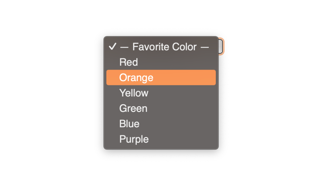
<select> element in SafariAs a result, design systems and component libraries have been rolling out their own selects, made from scratch using custom HTML markup, CSS, and often a lot of JavaScript, in order to have something that integrates nicely with the other components.
Unfortunately, doing so correctly with the right accessibility semantics, keyboard support, and popup positioning is not easy. Web developers have poured hours and hours over the years, trying to solve the same problems over and over, and there are many inaccessible selects out there.
It’s about time we got a properly style-able built-in <select> so we don’t have to write this code ever again!
The Open UI initiative
Table of Contents

Open UI is a group of developers, designers, and browser implementers who set out to solve this exact problem, and while they’re at it, tackle other missing controls too.
The purpose of Open UI is to eventually make it possible for web developers to style and extend built-in UI controls (this includes <select>, but dropdowns, checkboxes, radio buttons, and others too). To achieve this, they produce specifications for how these controls should be implemented in the web platform as well as the accessibility requirements they should address.
The project is still in its infancy, but things are moving fast and, as we’ll see below, exciting things are already happening.
You can join the group and participate in the meetings, research, and specification efforts.
Based on the Open UI’s <select> proposal, the implementation of a new <selectmenu> control has started in Chromium! The work is done by the Microsoft Edge team, in collaboration with the Google Chrome team. It’s even already available in Chromium-based browsers by enabling the “Experimental Web Platform features” flag in the about:flags page.
<selectmenu> is a new built-in control that provides an option selection user experience, just like <select>, with a button showing the selected value label, a popup that appears when that button is clicked, and a list of options that get displayed.
Why a new name?
Why not just replace the existing <select> control? The name “selectmenu” started as a working name, but it seems to have stuck so far, and no one has come up with anything better yet.
More importantly, the existing <select> control has been used on the web for a very long time. As such, it can probably never be changed in any significant way without causing major compatibility issues.
So, the plan (and remember this is all still very experimental) is for <selectmenu> to be a new control, independent from <select>.
Try it out today
This isn’t ready for production use yet, but if you’re as excited as I am about using it, here’s how:
- Open a Canary version of a Chromium-based browser (Chrome, Edge).
- Switch the “Experimental Web Platform features” flag in the
about:flagspage and restart. - Replace any
<select>by<selectmenu>in a web page!
That’s it! It won’t do much by default, but as we’ll see later, you’ll be able to style and extend the control quite extensively with this one tag name change.
We love feedback!
Before we go into how to use the control, if you do use it, the Open UI group and people working on the implementation in Chromium would love to hear your feedback if you have any.
By being an early tester, you can actively help them make the control better for everyone. So, if you encounter bugs or limitations with the design of the control, please send your feedback by creating an issue on the Open UI GitHub repository!
And now, let’s talk about how the control works.
Because the various parts of the selectmenu can be styled, it’s important to first understand its internal anatomy.
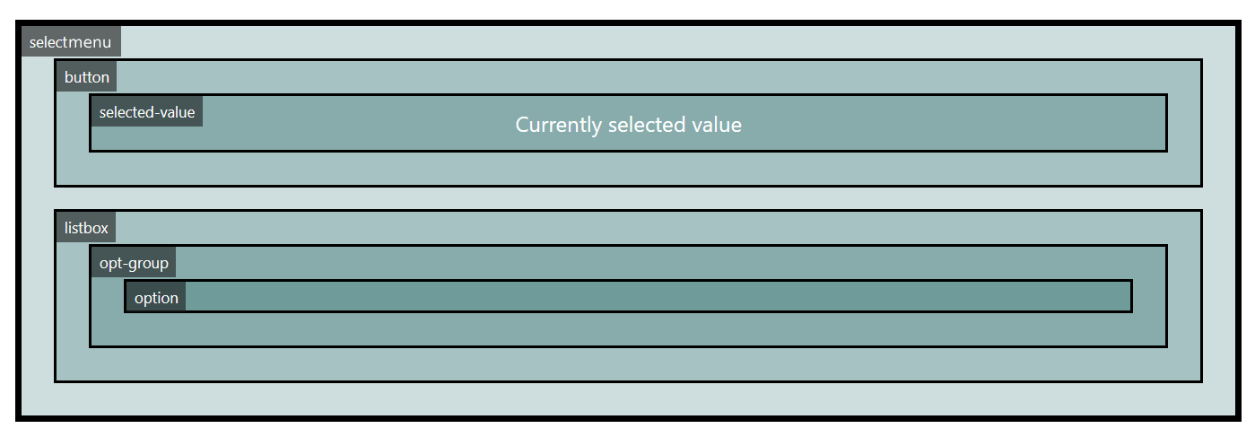
<selectmenu>is the root element that contains the button and listbox.<button>is the element that triggers the visibility of the listbox.<selected-value>is the element that displays the value of the currently selection option (optional). Note that this part does not necessarily have to be placed inside the<button>part.<listbox>is the wrapper that contains the<option>s and<optgroup>s.<optgroup>groups s together with an optional label.<option>represents the potential value that can be chosen by the user. There can be one or more.
Default behavior
The default behavior of the <selectmenu> control mimics the behavior of the <select> control. You can use it just like a native <select>, with the following minimal markup.
<selectmenu> <option>Option 1</option> <option>Option 2</option> <option>Option 3</option>
</selectmenu>
When doing so, the default <button>, <selected-value>, and <listbox >are created for you.
Styling parts of the control
This is where things become interesting! One way to style the control to match your requirements is to use the CSS ::part() pseudo-element to select the different parts within the control’s anatomy that you wish to style.
Consider the following example where ::part() is used to style the button and the listbox parts:
<style> .my-select-menu::part(button) { color: white; background-color: #f00; padding: 5px; border-radius: 5px; } .my-select-menu::part(listbox) { padding: 10px; margin-top: 5px; border: 1px solid red; border-radius: 5px; }
</style>
<selectmenu class="my-select-menu"> <option>Option 1</option> <option>Option 2</option> <option>Option 3</option>
</selectmenu>
The above example results in the following style:
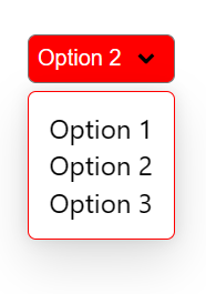
::part() can be used to style the <button>, <selected-value>, and <listbox> parts of the control.
Use your own markup
If the above isn’t enough for your needs, you can customize the control much more by providing your own markup to replace the default one, and extend or re-order the parts.
A <selectmenu> has named slots that can be referenced to replace the default parts. For example, to replace the default button with your own, you can do the following:
<style> .my-custom-select [slot='button'] { display: flex; align-content: center; } .my-custom-select button { padding: 5px; border: none; background: #f06; border-radius: 5px 0 0 5px; color: white; font-weight: bold; } .my-custom-select .label { padding: 5px; border: 1px solid #f06; border-radius: 0 5px 5px 0; }
</style>
<selectmenu class="my-custom-select"> <div slot="button"> <button behavior="button">Open</button> <span class="label">Choose an option</span> </div> <option>Option 1</option> <option>Option 2</option> <option>Option 3</option>
</selectmenu>
The slot="button" attribute on the outer <div> tells the <selectmenu> to replace its default button with the contents of the <div>.
The behavior="button" attribute on the inner <button> tells the browser that this element is what we want to use as the new button. The browser will automatically apply all the click and keyboard handling behavior to this element as well as the appropriate accessibility semantics.
The above code snippet results in the following style:
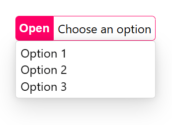
Note that the slot and behavior attributes can also be used on the same element.
You can replace the default listbox part in a similar fashion:
<style> .my-custom-select popup { width: 300px; display: grid; grid-template-columns: repeat(auto-fit, minmax(100px, 1fr)); gap: 10px; padding: 10px; box-shadow: none; margin: 10px 0; border: 1px solid; background: #f7f7f7; }
</style>
<selectmenu class="my-custom-select"> <div slot="listbox"> <popup behavior="listbox"> <option>Option 1</option> <option>Option 2</option> <option>Option 3</option> <option>Option 4</option> <option>Option 5</option> </popup> </div>
</selectmenu>
Interestingly, the <popup> used here is also being proposed by Open UI and implemented in Chromium at the moment.
The element with behavior="listbox" is required to be a <popup>. Applying behavior="listbox" tells the browser to open this element when the <selectmenu> button is clicked, and the user can select <option>s inside it with mouse, arrow keys, and touch.
The above code snippet results in the following style:
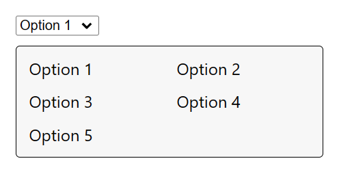
Extending the markup
Not only can you replace the default parts with your own, as seen above, you can also extend the control’s markup by adding new elements. This can be useful to augment the listbox or button with extra information, or to add new functionality.
Consider the following example:
<style> .my-custom-select [slot='button'] { display: flex; align-items: center; gap: 1rem; } .my-custom-select button { border: none; margin: 0; padding: 0; width: 2rem; height: 2rem; border-radius: 50%; display: grid; place-content: center; } .my-custom-select button::before { content: '25BC'; } .my-custom-select popup { padding: 0; } .my-custom-select .section { padding: 1rem 0 0; background: radial-gradient(ellipse 60% 50px at center top, #000a 0%, transparent 130%); } .my-custom-select h3 { margin: 0 0 1rem 0; text-align: center; color: white; } .my-custom-select option { text-align: center; padding: 0.5rem; }
</style>
<selectmenu class="my-custom-select"> <div slot="button"> <span class="label">Choose a plant</span> <span behavior="selected-value" slot="selected-value"></span> <button behavior="button"></button> </div> <div slot="listbox"> <popup behavior="listbox"> <div class="section"> <h3>Flowers</h3> <option>Rose</option> <option>Lily</option> <option>Orchid</option> <option>Tulip</option> </div> <div class="section"> <h3>Trees</h3> <option>Weeping willow</option> <option>Dragon tree</option> <option>Giant sequoia</option> </div> </popup> </div>
</selectmenu>
Here we’re using custom markup to wrap the list of options and create our own content as seen below:
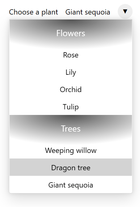
Replacing the entire shadow DOM
Finally, and if the above wasn’t enough, you can also extend the control’s markup by replacing its default shadow DOM altogether by calling attachShadow(). For example, the demo in the previous section could be modified as follows:
<selectmenu id="my-custom-select"></selectmenu>
<script> const myCustomSelect = document.querySelector('#my-custom-select') const shadow = myCustomSelect.attachShadow({ mode: 'closed' }) shadow.innerHTML = ` <style> .button-container { display: flex; align-items: center; gap: 1rem; } button { border: none; margin: 0; padding: 0; width: 2rem; height: 2rem; border-radius: 50%; display: grid; place-content: center; } button::before { content: '\0025BC'; } popup { padding: 0; } .section { padding: 1rem 0 0; background: radial-gradient(ellipse 60% 50px at center top, #000a 0%, transparent 130%); } h3 { margin: 0 0 1rem 0; text-align: center; color: white; } option { text-align: center; padding: 0.5rem; } option:hover { background-color: lightgrey; } </style> <div class="button-container"> <span class="label">Choose a plant</span> <span behavior="selected-value" slot="selected-value"></span> <button behavior="button"></button> </div> <popup behavior="listbox"> <div class="section"> <h3>Flowers</h3> <option>Rose</option> <option>Lily</option> <option>Orchid</option> <option>Tulip</option> </div> <div class="section"> <h3>Trees</h3> <option>Weeping willow</option> <option>Dragon tree</option> <option>Giant sequoia</option> </div> </popup> `
</script>
Written this way, the <selectmenu>‘s custom markup is fully encapsulated in its shadow DOM. The <selectmenu> can therefore be dropped into any page without risk of interference from the surrounding content’s styles.
As we’ve seen, the new experimental <selectmenu> control offers a lot of flexibility when it comes to styling and even extending a traditional <select>. And it does this in all the right ways, because it’s built into the browser where accessibility and viewport-aware positioning are handled for you.
Open UI has more documentation about <selectmenu>, and if you want to see more code showing how to use the <selectmenu>, here are a few demos as well.
Again, this is work in progress and will most certainly change as a result of feedback received by the Open UI group.
I can’t wait to see specifications start to appear in HTML and CSS standard bodies, and for the implementation to become more stable, as well as see other browser engines getting interested in this. You can help make this happen! Testing the control, reporting issues, or getting involved are all great ways to help push this effort forward.

