In this article, we’ll take Editor X for a test drive to see whether it is a viable solution for any developer or designer to create a fantastic and fully functional website. We know we could build a lot of websites ourselves but sometimes it’s worth looking at any other option that could make this easier, faster and more maintainable.
What is Editor X?
Table of Contents
Editor X is a fully functional and comprehensive website builder. While there’s every chance you’re unfamiliar with the Editor X product name, you more likely know the company behind it – Wix.
So, are Editor X and Wix the same?
No, they are quite different. The Wix platform was conceived from the outset to simplify website creation by guiding users towards a handful of sensible presets. Of course, this limits the ways things can go wrong, but it’s not so appealing if you’re a user who demands more control over how their site works.
Rather than complicating Wix, Editor X seems to have been built to cater to more technically savvy, demanding users – i.e. many of us in the SitePoint community.
As with the recent Webflow review, this is NOT a standard ‘Does this product work?’ review. We’ll be Reviewing Editor For Developers and those capable of building their own website with other tools. We’ll cover:
- What functionality and flexibility does Editor X offer?
- What are the difficulties and/or limitations?
- Is Editor X a viable alternative to building a custom site from scratch?
What are we building?
To properly test features, I’m going to start with a blank template and build this Figma design from scratch. I’ll do the same with other services and be able to compare their strengths and weaknesses
The Judging Criteria
We’re going to break the review into the following five categories.
- Layout & design tools: Would a competent designer have enough power to do most things?
- CMS/data management: Can it handle datasets such as products or posts?
- Integrations: Ecommerce, multimedia and other custom stuff.
- Mobile performance: You built on a laptop – can you make it work on mobile?
- Pricing: The bottom-line.
With that in mind, let’s get started.
Getting set up
Editor X says hello with the nice onboarding process, walking you through their interface. These onboarding sections re-spawn at useful moments as you move through the app.
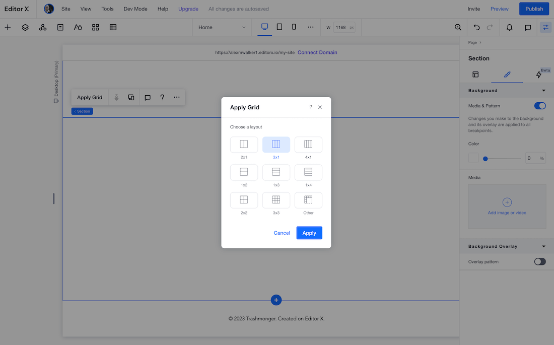
Editor X provides a range of tools for ‘blocking out the bones’ of your layout. Interestingly, most (if not all) layouts are generated using CSS grid layout code, rather than flexbox. Depending on whether you’re already well-versed in using CSS grid, this could be either a pro or a con. Of course, Editor X auto-generates the code, but it’s still helpful to working knowledge of the CSS grid model to get the most out of it.
As with most builds, it’s easiest to begin by visually subdividing your layout into broad container sections.
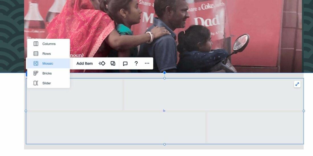
You can then insert more sophisticated layout modules such as mosaics, bricks, and sliders into your base containers. Now, I’m not a CSS grid guru, but I’ve yet to think up a layout idea I couldn’t build with these tools.
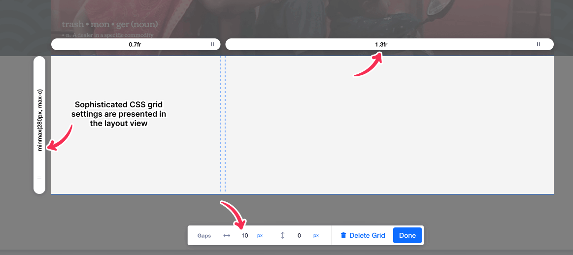
The Editor X layout tools strike a nice balance between providing an intuitive visual layout creator, while still keeping you in touch with the underlying CSS grid code.
Inserting static content into your layout (i.e. text, imagery, videos, etc) is mostly point and click with some styling tweaking in the righthand panel. Most useful CSS properties are exposed in the righthand panel.
However, I did have a few head-scratching moments. The best example: If you’ve had even minimal exposure to writing CSS, you’ll know that all four-sided measurements (i.e. margins, paddings, borders, etc) are coded from the top in a clockwise direction – TOP RIGHT BOTTOM LEFT.
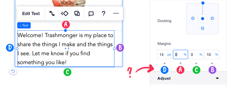
Weirdly, Editor X’s controls are ordered as LEFT TOP BOTTOM RIGHT. If you are targeting experienced users, I can’t think of any reasonable explanation for not following the standard W3C spec numbering scheme.
Also, though it was easy to add a standard CSS border to containers, I couldn’t find any easy way to control border-widths or border-colors separately. This rules out a lot of useful CSS techniques for generating underlines, breaks, separators, and even more complex CSS shapes.
What are Layers in Editor X?
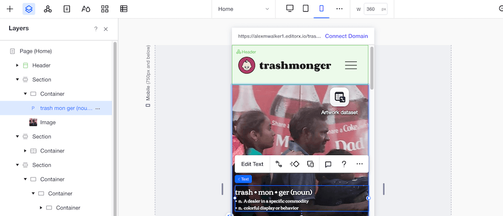
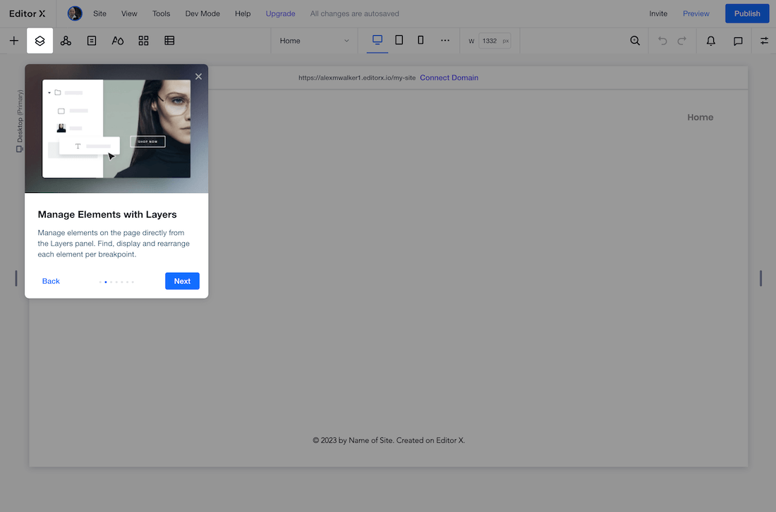
There is a dockable ‘Layers’ panel to the left of your visual layout that shows the structure of your layout (see above). I found this panel handy for three reasons:
- It clarifies how your components are nested. This can often be often less clear in the visual layout view.
- This panel is a good place to reorder your layout. Just drag and drop items around in the stack.
- This panel provides a place to precisely target your styling tweaks to components. For instance, you can apply a ‘Don’t display’ directive to an item for a specified breakpoint.
What are Masters in Editor X?
Editor X lets you add UI components to a library that calls ‘Masters’. You can then create ‘instances’ based on these masters across multiple pages. Any updates to your master are instantly transmitted down to all slaves instances.
Obviously this makes sense for repeating UI components such as mastheads, navigation, and footers.
SVG Support
If you’re working with Figma, XD, or Sketch, it’s helpful to keep your images as lightweight SVG vectors whenever you can – as long as they not blocked from upload. Happily, Editor X had no problems with even the most complicated SVGs I gave it (using symbols and patterns). A big tick from me ✓.
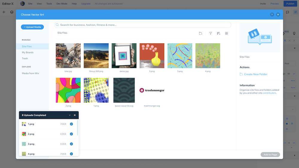
Another nice touch: Editor X automatically extracted the colors from my logo SVG and added them to the internal color palette.
On the downside: Though I was able to upload my wavy pattern SVG and position it as an image, Editor X wouldn’t let me use the SVG as a background. Apparently, at least for now, backgrounds are bitmap images only. ????
Dev Mode
One of the most obvious indications that Editor X is targeting developers is the very prominent ‘Dev Mode’ option in the main menu. Activate it and you’ll see something like this.
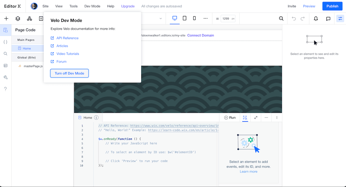
As you can see (above), Editor X has its own name-spaced $w.onReady() function waiting for you to select a target ID and add a trigger and action.
Wix already has its own super-comprehensive JavaScript platform called Velo (who knew, eh?). This allows you to script your own complex interactions with almost any component in your site. You can code new components from scratch or build on top existing code.
For a few examples of what’s possible, developers have already shown off:
- Dynamic Pricing for Bookings: Adjust service prices based on visitor selections.
- Send SMS on Booking Confirmation: Generate a confirmation SMS when customers book a service.
- Create a Quiz: Create a quiz that randomly selects questions from a database collection.
The scripting examples are many and varied, and there seems to be little you aren’t able to do. If you’re at all comfortable with JavaScript, Editor X’s scripting abilities should be a strong drawcard.
Interestingly, I think it may be easier to control your CSS border-widths with JavaScript than it is with CSS.
CMS/data management
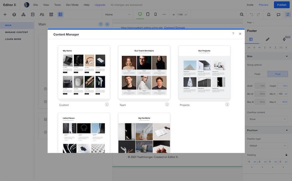
Editor X provides a flexible CMS builder. It comes with a few common preset data models – projects, team members, portfolio items, and news data. However, if you create a custom database for ‘vintage fishing lures’ or ‘jazz guitar tabulature’, it’s not difficult to build your own custom data model from scratch.
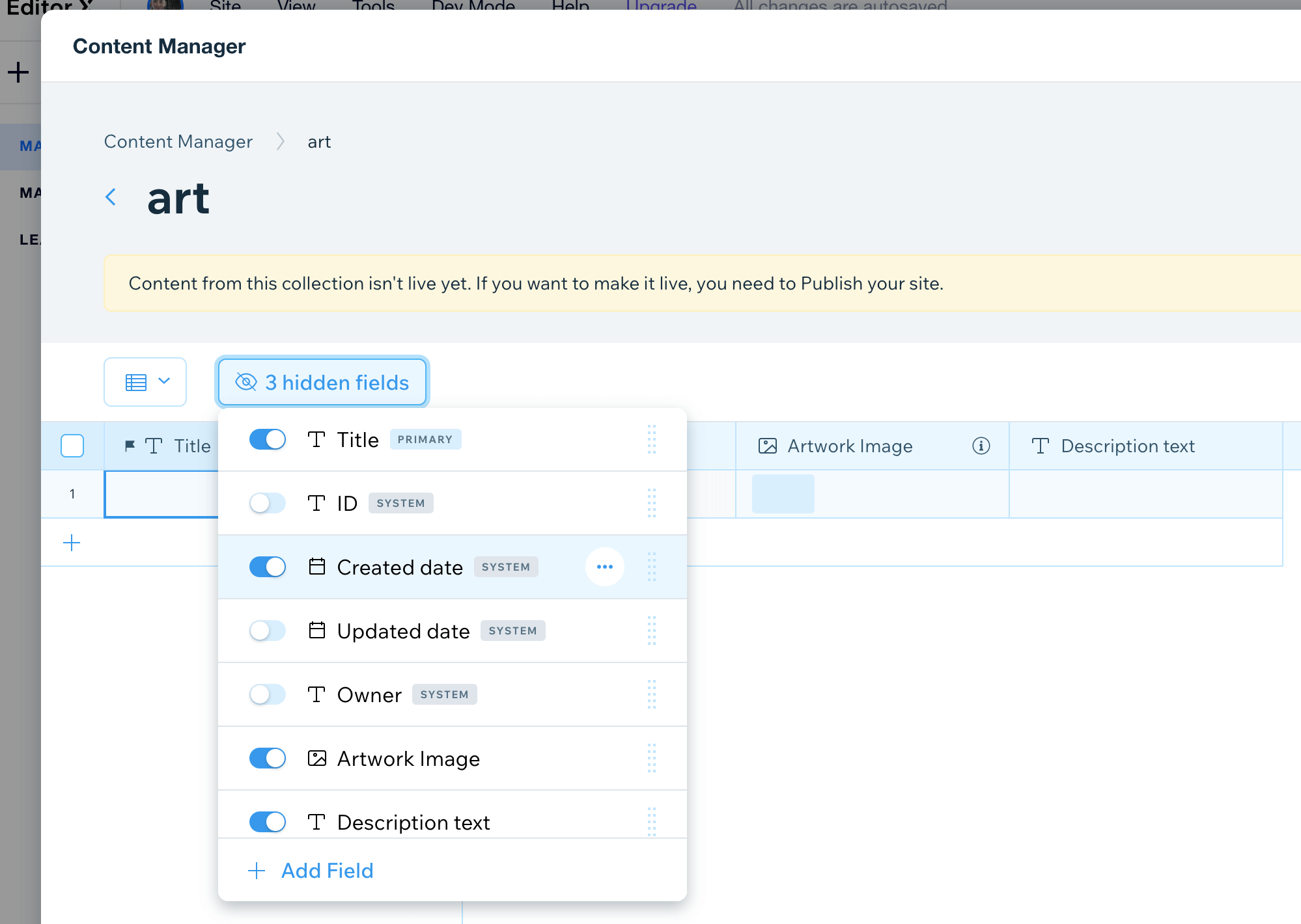
In my case, I probably could have used the ‘Portfolio’ preset, but decided to build my artwork CMS collection from scratch. It’s simple to add new fields with date, image, and file upload types available.
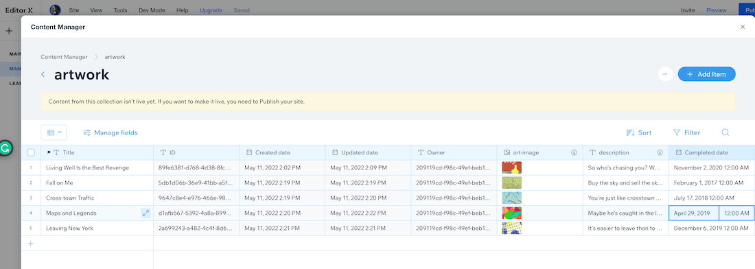
I found I could add a ‘Created date’ field but wasn’t allowed to edit it, as this is a ‘SYSTEM’ value for when the file is created. – a little confusing till I worked it out. Ultimately, I added a separate date field for my ‘artwork creation date’ that I could edit.
Injecting your new CMS data into your layout is fairly self-apparent too. I used Editor X’s ‘Repeater’ layout module to create a static, 5-unit, card gallery.
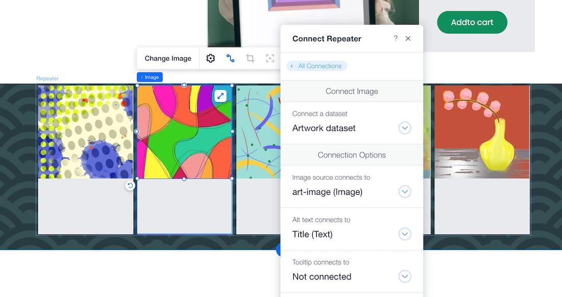
Clicking on those static card elements gives you the option to connect to your new dataset and replace the static page elements with dynamic CMS data.

All up, the CMS facilities built into even the free plan are hard to fault. I found them quite flexible, powerful, and easy to use.
Integrations
Third-Party Apps
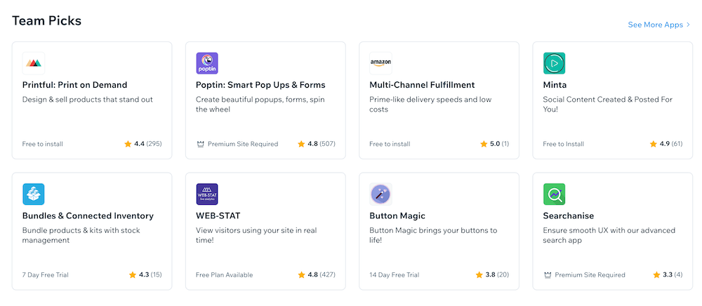
Sometimes it’s quicker to write your own code – other times you need well-tested functionality that plugs straight into your site. Editor X leans on the Wix App Store to provide third-party apps.
The list of apps is too long to detail here, but includes:
- Advanced search UX
- Automated social media posting
- Live chat
- Advanced web stats
- Product fulfilment
Mobile Performance
Editor X comes set up with three breakpoints – mobile, tablet and laptop – and adding new breakpoints is quick and painless.
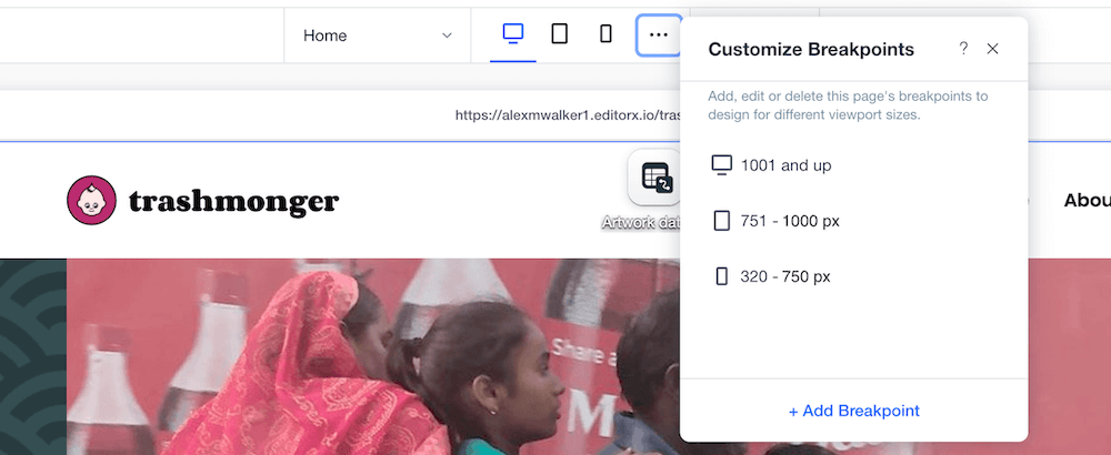
As I expected, Editor X considers the desktop layout to be the default view, with extra rules layered on to customize the tablet and mobile views (as Webflow does). I don’t believe there is any way to create a ‘mobile-first’ responsive design.
Perhaps there’s an argument that it would be counter-intuitive to create a desktop-based website builder that immediately asks you to begin with the mobile layout – even if that method ultimately produced a better outcome.
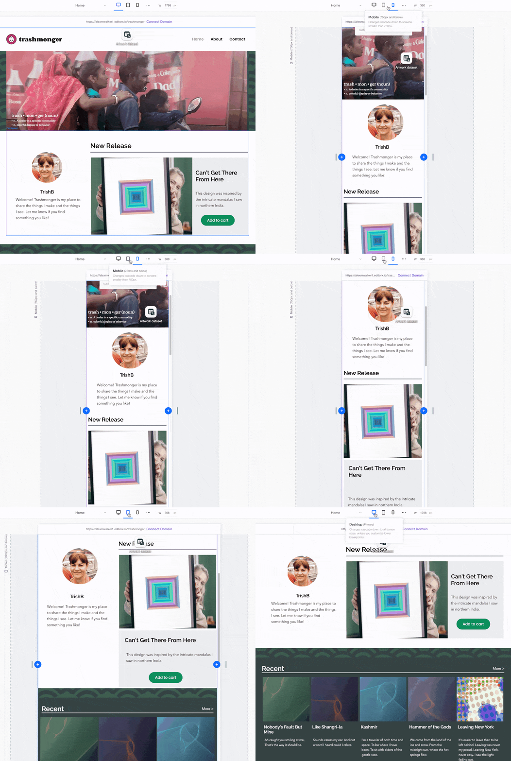
Editor X also lets you mark a focal point on each image, which allows you to control the cropping and framing of imagery as it resizes for different responsive layouts. Clever.
Overall, I found it very easy to adjust and reshape the layout at each breakpoint.
However, I also found it more difficult to have a comprehensive, considered responsive strategy. Maybe it’s just me, but it’s easy to just keep accumulating piecemeal responsive tweaks, but harder to get a higher level overview of what’s happening.
How would the Editor X UI even display your responsive strategy? I’m not sure, so perhaps it’s an unfair critique. I just felt like my mobile design was getting ‘technically messy’ and I wasn’t sure how to approach fixing that.
Pricing
Editor X offers a three-tiered pricing model for a standard website.
-
- Essential – $26/mon (up to 10GB storage & 1hr Video)
- Extra – from $40/mon (up to 25GB storage & 2hr Video)
- Ultra – from $54.50/mon (up to 35GB storage & 5hr Video)
There’s a second pricing model for Ecommerce-enabled sites.
- Launch – from $32/mon
- Boost – from $69/mon
- Scale – from $219/mon
The core difference between their pricing tiers is storage. You pay for space, so be mindful of this if you plan to host large image, video, or audio files.
Assuming you’re NOT pushing a lot of video, I’d think that the 10GB starter will suffice for the majority of use cases – at least for a while.
Arguably Editor X’s base level Ecommerce plan (called ‘Launch’) is their most compelling offering when comparing to Webflow. Though they are currently priced similarly, Editor X has no inventory cap, while adding shopping cart recovery and the ability to sell on Facebook/Instagram.
TLDR
Compared to most online website builders I’ve seen, Editor X provides more of the freedom and flexibility that web-savvy user will be looking for.
I have to admit I was surprised by how much the built-in JavaScript scripting facilities allow you to do. It’s much more ambitious than I was expecting from an online builder.
Using CSS Grid for layouts is a two-edged sword. Grid offers you some layout superpowers, but there are still a lot of frontend devs more familiar with using flexbox for the heavy lifting.
Pricing is similar to most of the comparable competition, though it gets expensive for big video and data storage.
Adding an ecommerce facility is marginally more than some competitors, though their base ecommerce package offers no inventory caps and more sophisticated tools to help conversions and sales. You get what you pay for.