In every project where I use Tailwind CSS, I end up adding something to it. Some of these things I add in every single project. I’ll share these with you, but I’m also curious what y’all are adding to your tailwind.css files.
I’ll start with myself. In each project:
- I define
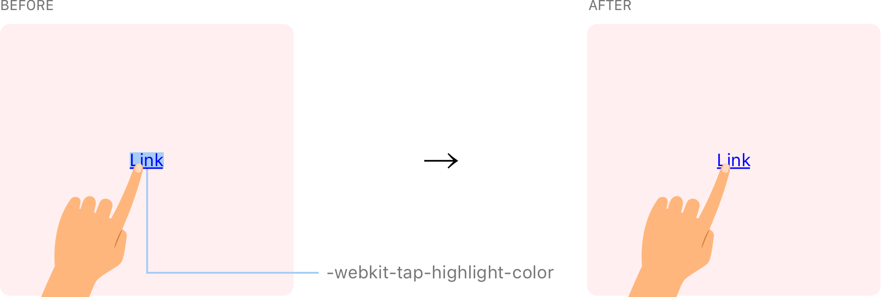
-webkit-tap-highlight-color. - I add a bottom padding set to
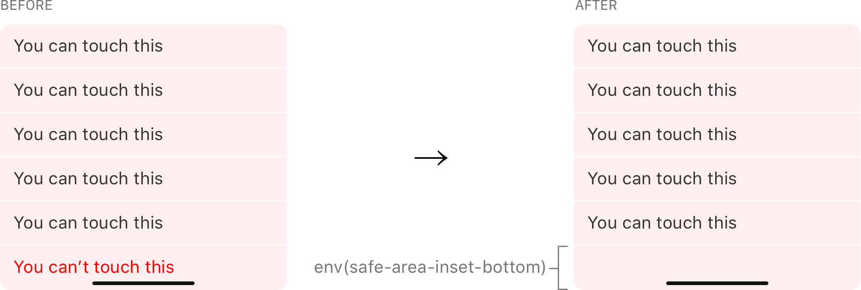
env(safe-area-inset-bottom). - I dress up unordered lists with interpuncts.
Allow me to elaborate on all three.
-webkit-tap-highlight-color
Table of Contents
Android highlights taps on links. I’m not a fan because it obscures the element, so I turn it off for a nicer experience.

@layer base { html { -webkit-tap-highlight-color: transparent; }
}
@layer is a Tailwind directive. It helps avoid specificity issues by telling Tailwind which “bucket” contains a set of custom styles. It’s like pretending the cascade doesn’t exist, so there’s less to worry about when it comes to ordering CSS.
Simply removing the tap highlight color might trigger an accessibility issue since that hides an interactive cue. So, if you go this route, it’s probably a good idea (and I’m still looking for research on this if you have it) to enable :active to define provide some response to those actions. Chris has a snippet for that.
env(safe-area-inset-bottom)
This utility class handles the bottom bar on newer iPhones without the “Home” button. Without it, some elements can fall under the bar, making them unreadable and tough to tap.

@layer utilities { .pb-safe { padding-bottom: env(safe-area-inset-bottom); }
}
Interpuncts
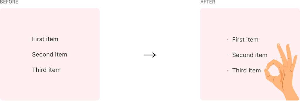
I love using interpuncts with unordered lists. I won’t penalize you for looking that up. We’re basically talking about the bullet points in unordered lists. Tailwind removes them by default via Normalize. I smuggle interpuncts into each and every one of my projects.

Here’s how I go about it:
@layer utilities { .list-interpunct > li::before { content: '・'; display: inline-block; float: left; margin: 0 0 0 -0.9em; width: 0.9em; } @media (min-width: 992px) { .list-interpunct > li::before { margin: 0 0 0 -1.5em; width: 1.5em; } }
}
We also now have ::marker to do the same thing and it’s a little easier to work with. Why am I not using it? I prefer to have control of the spacing between interpuncts and the text and I just don’t get that with ::marker. But that’s just me!
Now it’s your turn
Alright, I shared what I add to all of my Tailwind projects, so now it’s your turn. What do you add to Tailwind in your projects? Is there something you can’t do without? Let me know in the comments! I’d love ideas to start incorporating into other projects.


