Ever since the dawn of time, humanity has dreamed of having more control over form elements. OK, I might be overselling it a tiny bit, but creating or customizing form components has been a holy grail of front-end web development for years.
One of the lesser-heralded, but most powerful features of custom elements (e.g. <my-custom-element>) has quietly made its way into Google Chrome as of version 77 and is working its way into other browsers. The ElementInternals standard is a very exciting set of features with a very unassuming name. Among the features internals adds are the ability to participate in forms and an API around accessibility controls.
In this article, we’re going to look at how to create a custom form control, integrate constraint validation, introduce the basics of internal accessibility and see a way to combine these features to create a highly-portable macro form control.
Let’s start by creating a very simple custom element that matches our design system. Our element will hold all of its styles within the shadow DOM and ensure some basic accessibility. We’ll use the wonderful LitElement library from the Polymer team at Google for our code examples and, although you definitely don’t need it, it does provide a great abstraction for writing custom elements.
In this Pen, we’ve created a <rad-input> that has some basic design to it. We have also added a second input to our form that is a vanilla HTML input, and added a default value (so you can simply press submit and see it work).
When we click our submit button a few things happen. First, the submit event’s preventDefault method is called, in this case, to ensure our page doesn’t reload. After this, we create a FormData object which gives us access to information about our form which we use to construct a JSON string and append it to an <output> element. Notice, however, that the only value added to our output is from the element with name="lame".
That’s because our element doesn’t know how to interact with the form just yet, so let’s set up our <rad-input> with an ElementInternals instance to help it live up to its name. To start, we’ll need to call our method’s attachInternals method in the element’s constructor, we’ll also be importing an ElementInternals polyfill into our page to work with browsers that don’t support the spec yet.
The attachInternals method returns a new element internals instance which contains some new APIs we can use in our method. In order to let our element take advantage of these APIs, we need to add a static formAssociated getter that returns true.
class RadInput extends LitElement { static get formAssociated() { return true; } constructor() { super(); this.internals(); }
}
Let’s take a look at some of the APIs in our element’s internals property:
setFormValue(value: string|FormData|File, state?: any): void— This method will set the element’s value on its parent form if one is present. If the value isnull, the element will not participate in the form submission process.form— A reference to our element’s parent form, if one exists.setValidity(flags: Partial<ValidityState>, message?: string, anchor?: HTMLElement): void— ThesetValiditymethod will help control our element’s validity state within the form. If the form is invalid, a validation message must be present.willValidate— Will betrueif the element will be evaluated when the form is submitted.validity— A validity object that matches the APIs and semantics attached toHTMLInputElement.prototype.validity.validationMessage— If the control has been set as invalid withsetValidity, this is the message that was passed in describing the error.checkValidity— Will returntrueif the element is valid, otherwise this will returnfalseand fire aninvalidevent on the element.reportValidity— Does the same ascheckValidity, and will report problems to the user if the event isn’t cancelled.labels— A list of elements that label this element using thelabel[for]attribute.- A number of other controls used to set aria information on the element.
Setting a custom element’s value
Table of Contents
Let’s modify our <rad-input> to take advantage of some of these APIs:
Here we’ve modified the element’s _onInput method to include a call to this.internals.setFormValue. This tells the form our element wants to register a value with the form under its given name (which is set as an attribute in our HTML). We’ve also added a firstUpdated method (loosely analogous with connectedCallback when not using LitElement) which sets the element’s value to an empty string whenever the element is done rendering. This is to make sure our element always has a value with the form (and though it is not necessary, you may want to exclude your element from the form by passing in a null value).
Now when we add a value to our input and submit the form, we will see that we have a radInput value in our <output> element. We can also see our element has been added to the HTMLFormElement’s radInput property. One thing you might have noticed, however, is that despite the fact that despite the fact that our element doesn’t have a value, it will still allow the form submission to take place. Let’s add some validation to our element next.
Adding constraint validation
In order to set our field’s validation, we need to modify our element a little bit to make use of the setValidity method on our element internals object. This method will take in three arguments (the second one is only required if the element is invalid, the third is always optional). The first argument is a partial ValidityState object. If any flag is set to true the control will be marked as invalid. If one of the built-in validity keys doesn’t meet your needs, there is a catch-all customError key that should work. Lastly, if the control is valid, we pass in an object literal ({}) to reset the control’s validity.
The second argument here is the control’s validity message. This argument is required if the control is invalid, and not allowed if the control is valid. The third argument is an optional validation target that will control the user’s focus if and when the form is submitted as invalid or reportValidity is called.
We’re going to introduce a new method to our <rad-input> that will take care of this logic for us:
_manageRequired() { const { value } = this; const input = this.shadowRoot.querySelector('input'); if (value === '' && this.required) { this.internals.setValidity({ valueMissing: true }, 'This field is required', input); } else { this.internals.setValidity({}); }
}
This function gets the control’s value and input. If the value is equal to an empty string and the element is marked as required, we’ll call the internals.setValidity and toggle the control’s validity. Now we all we need to do is call this method in our firstUpdated and _onInput methods and we’ll have added some basic validation to our element.
Clicking the submit button before a value is entered into our <rad-input> will now display an error message in browsers that support the ElementInternals spec. Unfortunately, displaying validation errors is still not supported by the polyfill as there isn’t any reliable way to trigger the built-in validation popup in non-supporting browsers.
We’ve also added some basic accessibility information to our example by using our internals object. We’ve added an additional property to our element, _required, which will serve as a proxy for this.required and as a getter/setter for required.
get required() { return this._required;
} set required(isRequired) { this._required = isRequired; this.internals.ariaRequired = isRequired;
}
By passing the required property to internals.ariaRequired, we are alerting screen readers that our element is currently expecting a value. In the polyfill, this is done by adding an aria-required attribute; however, in supporting browsers, the attribute won’t be added to the element because that property is inherent to the element.
Creating a micro-form
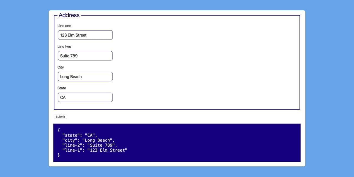
Now that we have a working input that meets our design system, we might want to begin composing our elements into patterns that we can reuse throughout several applications. One of the most compelling features for ElementInternals is that the setFormValue method can take not only string and file data, but also FormData objects. So let’s say we want to create a common address form that might be used in multiple organizations, we can do that easily with our newly-created elements.
In this example, we have a form created inside our element’s shadow root where we have composed four <rad-input> elements to make an address form. Instead of calling setFormValue with a string, this time we’ve chosen to pass along the entire value of our form. As a result, our element passes along the values of each individual element inside its child form to the outer form.
Adding constraint validation to this form would be a fairly straightforward process, as would providing additional styles, behaviors and slotting in content. Using these newer APIs finally allows developers to unlock a ton of potential inside custom elements and finally gives us free-range on controlling our user experiences.


