The HTML <hr> element adds a horizontal rule (or line) wherever you place it. A horizontal rule is used to provide a visual break and divide content. Like other HTML elements, horizontal rules can be styled using CSS (and SVG). This means that they don’t have to look like boring, plain horizontal lines. You can get a little creative with them, adding a nice little personal touch to your content and designs.
If you’re a frequent reader of this blog, then you’ve most likely already seen what a horizontal rule looks like on here. In fact, if you haven’t seen it before, then you might have just done that. The birds-on-a-wire illustration above this very paragraph is a styled <hr> element.
If you’re reading this article in a reading app Web browser’s reader mode, then the above horizontal rule will not appear with my custom styles, and you’ll just see a horizontal line. Here is a picture of what the horizontal rule looks like:
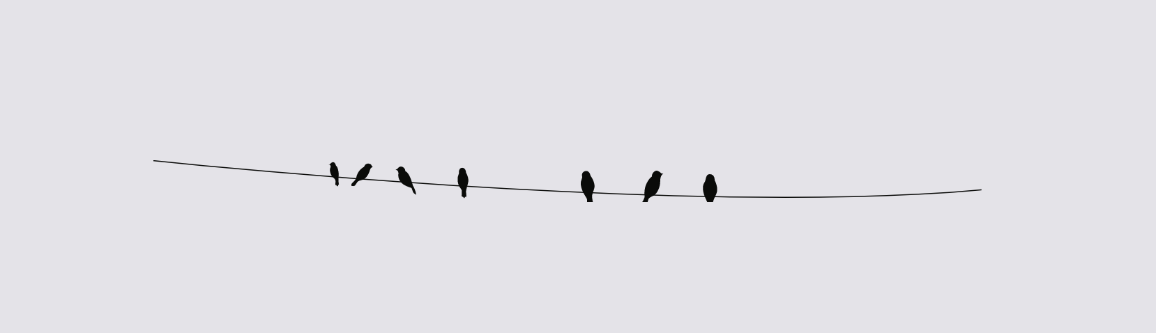
Prior to creating this horizontal rule style, my horizontal rules looked as boring as you could possibly imagine. Until one day, I looked at that boring line and imagined a bunch of birds sitting on it (because, well, BIRDS!). And then it clicked! I got an SVG image of a bunch of birds (silhouettes) on a wire, modified it to look like I wanted it to, and used it to style my <hr> elements to look like what you can see above.
In this post, I’ll go over how I did it, and how my horizontal rules can possibly be improved further, so that they adapt to various contexts, while remaining semantic and accessible.
Semantics and accessibility
Table of Contents
An HTML horizontal rule is, by definition, not just a visual divider. It has semantics and plays a meaningful role in the context of its surrounding content:
The HTML
<hr>element represents a paragraph-level thematic break, e.g. a scene change in a story, or a transition to another topic within a section of a reference book.
The hr element has an implicit role of separator. As such, <hr> is understood and announced by screen readers. A hr is announced as “Horizontal Splitter” by VoiceOver on macOS. The hr is also displayed as a horizontal line by reading apps and reader modes, where your CSS is typically stripped out and HTML semantics are used to determine how an element is styled by the reading app.
What’s interesting is that a horizontal rule has an implicit orientation which is horizontal by default. This means that if you’re using vertical rules to split content, you can inform screen readers that the rule is vertical by setting the aria-orientation attribute value to vertical:
<hr aria-orientation="vertical">
<!-- Note that you needn’t & shouldn’t explicitly set `role="separator"` on the `hr` element because its semantics are implicit -->
VoiceOver on macOS announces horizontal rules with a vertical orientation as “Vertical Splitter”.
In addition to separating paragraphs in an article, horizontal rules can be used for separating groups of menu items in a menu, for example. They can also be interactive.
Further reading:
Since horizontal rules are semantic elements announced by screen readers, then unless you’re using a horizontal rule to semantically divide content, you should hide it from screen readers using aria-hidden="true". In other words: use aria-hidden="true" to hide decorational horizontal lines. Do not hide them if they are providing semantic, thematic content breaks.
Styling <hr>s with CSS
Like other empty HTML elements, the <hr> element can be limitedly styled using CSS. For example, you can change its width and height, border, and background color, as well as use gradients or apply a background image, etc. And even though it’s a content-less element, it seems that you can even create simple hr styles using ::before and ::after pseudo-elements, too.
To create the birds-on-a-wire horizontal rules used on this site, all I did was set the dimensions of the hr, and apply the SVG image as a background image in CSS:
hr { width: ..; height: ..; background-image: url("data:image/svg+xml,..."); background-repeat: no-repeat; background-size: 100% auto; /* .. */
}
There’s nothing too fancy going on in the CSS. But the above styles have irked me ever since I wrote them. Generally, I try to avoid using background images for anything that’s not purely decoration. And the horizontal rules, as mentioned earlier, are not pure decoration. I also prefer to avoid using SVGs as background images and tend to inline them whenever I can so that I can take full advantage of their stylability with CSS.
An SVG implemented as a background image cannot be styled from its containing (or referencing) stylesheet. I want the hr to be adaptive. I want to be able to customize it for different themes, and have the ability to modify and control its color(s) via CSS whenever I want. I also want to style it so that it remains accessible in user-controlled environments (such as Windows High Contrast Mode, for example). And while I don’t plan on animating the horizontal rules on this blog, I’d still like to have the option to add a subtle animation should I ever want to. After all, SVGs are handy because they are so powerful and flexible—they’re about more than crisp lines and illustrations.
To style the horizontal rule to match various themes, I could possibly change the background image on the hr for each theme. This would work. But if the images are inlined in the CSS, then I’ll end with a larger CSS file. And if they’re not inlined, I’ll end up with multiple requests to multiple images, which isn’t great for performance. Not to mention having to create and maintain multiple images, which is not the best workflow for something that could be simpler.
Additionally, in Windows High Contrast Mode, we have no control over the active theme colors. So if I want to make sure the horizontal rule always has enough contrast with the background, then I’ll need to be able to change and control its colors in my CSS, which I can’t do if if the SVG is a background image. This means that I might end with a black horizontal rule on a black background, for example.
(On the other hand, if you don’t really care about the horizontal rule’s styles in WHCM and you just want it to remain properly accessible, you could just strip away the background image and let WHCM style the hr the way it would do by default.)
I could just use a background image on the <hr> and stop at that point. But if if I want the horizontal rule to be truly adaptive, then I need a little more flexibility that the <hr> element itself doesn’t provide…
A more flexible and adaptive implementation with inline SVG and ARIA
The best way to get the full flexibility of an SVG is by inlining it. But the <hr> element is content-less — it has no opening and closing tags within which you can place other elements.
The only way to work around the limitations of <hr> while preserving semantics for screen reader users is to use a div and provide the semantics of an hr using ARIA. Yes, I am cringing at the idea as I type this. But hear me out. I think it’s worth exploring and going down this road if you want to get creative with your horizontal rules while also making sure they remain visually accessible and customizable in various contexts and environments.
The alternative approach to creating flexible horizontal rules would essentially look like this:
<div role="separator"> <!-- hide the SVG from screen readers to avoid them announcing it --> <svg aria-hidden="true" focusable="false" width="..." height="..." viewBox="..."> <!-- svg content --> </svg>
</div>
Or, as my friend Scott pointed out, the separator role could be directly applied to the svg, in which case there’s no need to hide the SVG with aria-hidden anymore:
<svg role="separator" width="794px" height="51px" viewBox="0 0 794 51" xmlns:xlink="http://www.w3.org/1999/xlink"> <!-- svg content -->
</svg>
Using the above markup:
- we create a semantic horizontal rule that is understood and properly announced by screen readers, and
- the illustration, being an inline SVG now, becomes easier to style and control with CSS.
For convenience, the above horizontal rule markup could be wrapped in a custom component, or separated into a template partial or a shortcode, so that it can be more efficiently inserted where a <hr> would otherwise go.
With the SVG inlined, I can use CSS custom properties to control what the SVG looks like in different contexts. For example, with CSS custom properties sprinkled inside the SVG, I could then control that content using CSS, modifying and changing its colors. For example, in Windows High Contrast Mode, I could set the color of the SVG to whatever is the current text color:
/* IE and Legacy Edge */
@media screen and (-ms-high-contrast: active) { div[role="separator"] svg { --hr-color: windowText; }
}
/* Using the new standards for forced colors, currently supported in Chromium Edge */
@media screen and (forced-colors: active) { div[role="separator"] svg { --hr-color: CanvasText; }
}
That way, the horizontal rule will always have enough contrast with the background behind it.
If the content of the SVG is multi-colored, you can define and set values for multiple variables in the same manner, thus creating different versions—or themes—of the horizontal rule for different contexts or environments.
Further reading:
Using this technique:
- The horizontal rule is styleable and customizable using CSS.
- It can be animated with CSS and/or JavaScript.
- It will display like it is intended to (birds on a wire) even in environments where my CSS is stripped off, such as reading apps. Because the it is now an image, it will be displayed just the way it is, as opposed to an
<hr>that would be displayed and styled by the reading app. - Using the high contrast media query, it can be adapted to always remain accessible with whatever user theme is currently active.
Here is a video of me changing the color of my birds-on-a-wire horizontal rule in realtime using Chrome devtools. This is made possible by using inline SVG and CSS custom properties to apply the color to the SVG content:
[embedded content]
Closing Thoughts
Just like using inline SVG for icons is the best practice to ensure the icons remain adaptive and accessible, SVG can similarly provide better resilience for horizontal rules when you want to get more creative with them. Whether or not you use this technique, it’s good to have in your knowledge base, just in case you ever need it.