Before starting a new campaign, one should be very clear about the reasons behind starting it. Palpable goals are the foundation of a successful landing page. It is essential for you to have a clear idea of the expected results from the page. When the desired results are clear, you can work in a specific direction to achieve those.
That time is gone when businesses used to have a single landing page for all their campaigns. Now you need to define goals and their subsequent metric to keep a check on the path you’re heading. However, defining these goals is not as straightforward as it might seem. Let’s get into it and see some of the common landing page goals of various marketing campaigns.
Source: iStock
Some Common Landing Page Goals
Table of Contents
You cannot create landing pages like the same sized Pringles. All of them need to have some distinct quality and features. But keeping the design and campaign factor aside, there are some common goals that all the landing pages should have.
Single Conversion Objective
It doesn’t matter what a landing page looks like or what’s its purpose; it should still only have one conversion object. This conversion object can be anything from filling a form to accessing a free trial. The key is to provide the visitors with some sort of low-cost value(lead magnet) in exchange for their information. The landing page should send the visitors on a single lane to perform a desired action. A fixed path for performing an action eliminates confusion. Moreover, the objective should be visible clearly on the landing page- the fewer questions asked about what to do, the better.
Providing a Valuable Lead Magnet
For any landing page, the generation of leads is always a critical metric to determine its effectiveness. Therefore, having a valuable lead magnet becomes crucial to persuade visitors to share their information. Convincing the visitors to share personal information is always tricky, which makes lead magnets more critical. The more valuable the lead magnet is, the smoother the process will be for you and your visitors.
Collecting an Email
Many people shy away from admitting it, but email is still the relevant and most converting form of digital marketing. It is one of the most personal and effective ways to reach your customers, which makes it the golden goose of marketing.
The emails you collect through the landing page are your direct hotline to the customers, both converted and potential. The potential ones are most likely to be converted through email marketing because they are already familiar with your brand. All landing pages should have one field to collect the emails of the visitors.
Unique Selling Proposition
While visiting your landing page, customers often have various questions in their minds. All of it boils down to one simple thing- why should they give their email or hard-earned cash?
You should answer these questions on the landing page and let visitors know everything you serve that is better than your competitors. The more satisfactory your answer is, the more likely you are to get your customers’ information, or perhaps, make a sale.
A Robust CTA
All the efforts you put into designing a solid landing page comes to this point- the CTA. Make the CTA as specific as you can to ensure that the visitors know what they’re getting into. A specific call to action is crucial because just the “submit” is not strong enough. Some examples of strong CTA are:
- Subscribe to our free blog now
- Send me my free e-book now
- Start my free trial now
Different Designs for Different Goals
When creating the landing page for different campaigns and purposes, you don’t need to reinvent the wheel completely. However, you must optimise the page for your target audience. Let’s how you can do this across landing pages for newsletter signups, generating leads, and selling products.
Newsletter Sign Up
If your goal is to get more newsletter sign-ups, which is relatively easier than selling products, your landing page should be clean and straightforward to avoid any sort of distraction. Here, you don’t ask your visitors a lot of information, and the commitment level is low, so you should keep the text to a minimum.
Avoid CTA confusion by making the goal clear (sign up for the newsletter). Moreover, this page should have a minimalistic design with a lot of whitespaces to avoid distractions. The content should be easy to read, and it must include the benefits a user will have after signing up for the newsletter.
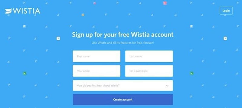
The signup landing page of Wistia is an excellent example of a page with minimalist design, easy to read content, simple colours, and a basic form.

Source: Wistia
Lead Generation
Collecting personal information of the visitors as for lead gen lies somewhere between newsletter signup and selling a product. With lead generation marketing campaigns and landing pages, you can get a little creative because there are different ways you can use to collect the information. You can run various competitions or get visitors to download some sort of report or document.
As it is mentioned above, the golden rule is to provide them with a lead magnet that balances the information you are asking for. If the report you’re offering is specific, highly researched, unique, then you can ask for more information. On the flip side, if visitors can get the same report somewhere else, you should ask for as little information as possible.
Moreover, a lead gen landing page should have a form tailored for the value of the product you’re offering. If you can add customer testimonials that vouch for your brand, visitors will be more interested in moving forward.
Selling a Product
If you are trying to sell a product or service, the check-out button on the landing page should lie above should be incorporated above the fold. In addition to this check-out button, there should be a carefully positioned product image and description to let the customer know about it.
Because it is a sales page, it should have a decent amount of copy present to solve any common doubt that occurs in the mind of the visitor. But keep in mind to not overwhelm customers with the copy. The key is to have it in a balanced amount. Furthermore, the product landing page should have more than one CTA at different points, but all should have the same goal, i.e., to make the purchase. It should be interactive, and the product image and description should be catchy. By incorporating these details, your landing page will produce much better results.
Practices to Follow Irrespective of the Landing Page Goals
Irrespective of the type of landing page you have, and no matter what its goal is, there are some best practices that always help. Let’s see what they are:
Consistency with content: The look and feel of the landing pages should be consistent with the website and the page from which the user landed. The images, the headlines, the colours, and the content, should align properly. For any landing page, content is the game-changer. You can run SEO checks using the on-page SEO checker tool available in the market. This tool can help you find a comprehensive list of errors that have a negative impact on the landing page. Improve those errors, and you’re good to go.
Define your audience: If you have a clear idea about your potential visitor and who they are, then you can tweak some changes in your landing page to make it compatible with them. The language, the images, and the overall design should be based on who your audience is.
Never stop testing: There’s never a guarantee that your landing page will make the conversion because there’s human behaviour involved in the game. So, there is no exact science behind creating a landing page. But with the help of A/B testing, you can figure out some general principles like specific words in your CTA that improve the conversion rates, fonts and colours that users prefer, and how they respond to videos, etc. Knowing these aspects can help you improve the conversions.
Let’s Wrap it Up
If you are looking to define landing page goals for your next marketing campaign, then looking at what works and does not work for other companies is a great way to start. Moreover, it is crucial to be very specific with the goals that you set and keep checking the progress you make. When both design and goals align with each other, the chances of conversion will increase, and you’ll be making more sales.
Author Bio: Marya Kazakova is a Head of Outreach at SE Ranking. She likes sharing her experience in outreach marketing, link building, content marketing, and SEO with readers. You can contact her on LinkedIn.

