Browse through Dribbble or Behance, and you’ll find designers using a simple technique to add texture to an image: noise. Adding noise makes otherwise solid colors or smooth gradients, such as shadows, more realistic. But despite designers’ affinity for texture, noise is rarely used in web design.
In this article, we’ll generate colorful noise to add texture to a gradient with only a small amount of CSS and SVG. Alright, let’s make some noise!
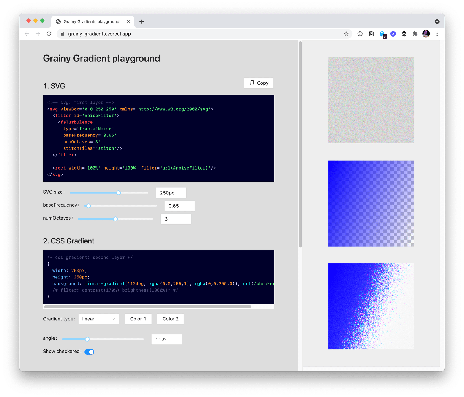
Interactive playground
Table of Contents
Check it out here. The quickest way to understand what’s happening is to play with the parameters that make up the layers.

The trick: SVG noise and CSS gradients

The core technique in this article is built on top of a Stack Overflow answer by Chris Pachl to the question: Can you add noise to a CSS gradient?
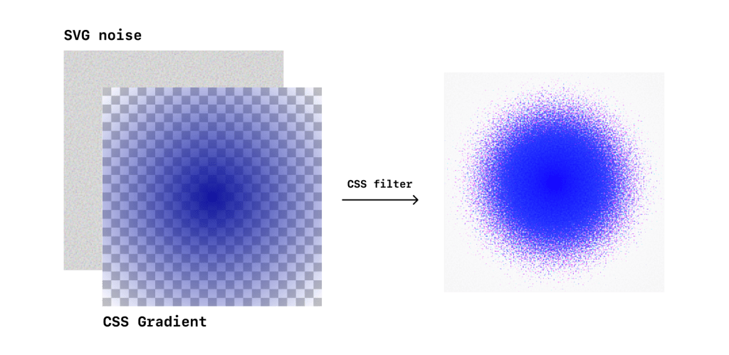
The trick is to use an SVG filter to create the noise, then apply that noise as a background. Layer it underneath a gradient, boost the brightness and contrast, and that’s it — you have gradient that gradually dithers away.
The key ingredients
Here’s what we’re working with under the hood:
- SVG turbulence: This is our noise filter.
- Background with gradient and SVG: Next, we drop that filter into CSS as a background image that combines the filter with a CSS gradient.
- Boost brightness and contrast: Then we turn to CSS
filterto increase the brightness and contrast of the noise. - Blend gradients: Finally, we optionally use
mix-blend-modeto further filter out colors and blend gradients together.
Let’s go into detail on each of these parts.
Using SVG turbulence
Within the realm of SVG, we can define filters, and one such filter lets us create Perlin noise. It’s called <feTurbulence> and we can define attributes, such as whether it is “turbulence” or “noise” and how fine or coarse it is. Bence Szabó explains it in much more detail as he demonstrates how it can be used to create patterns.
<svg viewBox="0 0 200 200" xmlns='http://www.w3.org/2000/svg'> <filter id='noiseFilter'> <feTurbulence type='fractalNoise' baseFrequency='0.65' numOctaves='3' stitchTiles='stitch' /> </filter> <rect width='100%' height='100%' filter='url(#noiseFilter)' />
</svg>
This SVG example creates a filter and renders a <rect> element that we can use for our grainy gradients. Notice that the SVG <filter> is defined separately from the <rect>, and the <rect> simply references it.
Play around with changing some of the properties of <feTurbulence>
We’re going to save this SVG as a separate file. We reference an external link to grab the SVG in the demos throughout in this article. In practice, though, you would reference a local file or your own CDN. It doesn’t work to reference the SVG by its id in CSS, for some quirky reason, but you can inline the SVG, as we show in the playground demo. We don’t do this in the demos for legibility reasons.
Creating a CSS background with SVG and a gradient
After we have the SVG file stored somewhere we can reference it by a URL or path, we can now use it in a CSS background, combined with a gradient.
.noise { /* ... */ background: linear-gradient(to right, blue, transparent), url(https://grainy-gradients.vercel.app/noise.svg);
}
Order matters here. In this particular example, we want a solid color (i.e. no noise) to transition into noise and then into another color. We also want one end of the gradient to be transparent so that the noise shows through.
Like this:
However, this isn’t particularly nice because the noise is too muddled. We need to fray it and make it grainier. We can do that by…
Boosting the brightness and contrast
Adding a CSS filter makes the noise more stark, pushing the most faded colors towards white or black. The filter applies to the entire <div>, so the leftmost blue is a different blue than the pure blue we started with.
.noise { /* ... */ background: linear-gradient(to right, blue, transparent), url(https://grainy-gradients.vercel.app/noise.svg); filter: contrast(170%) brightness(1000%); }You can play around with how contrast and brightness affect the gradient. Boosting the brightness and contrast pushes out the muddled grays in the follow demo.
The noise is not uniform in color
If you zoom in, you’ll notice that the noise is made up of many colors. The SVG filter was colorful to begin with, and increasing the brightness and contrast emphasized certain colors. Although hardly noticeable, if this confetti is unwelcome, we can continue to filter out colors with CSS blending (i.e. mix-blend-mode and background-blend-mode ).
CSS blending
Let’s make a grainy gradient that transitions between two colors. CSS blending allows us to stack layers of color. In the next example, we’re adding another <div> to the markup, positioning it over the original gradient, then applying mix-blend-mode: multiply; to smooth things out.
<section> <div class="isolate"> <div class="noise"></div> <div class="overlay"></div> </div>
</section>
.noise { /* ... */ background: linear-gradient(20deg, rebeccapurple, transparent), url(https://grainy-gradients.vercel.app/noise.svg); contrast(170%) brightness(1000%);
}
.overlay { /* ... */ background: moccasin; mix-blend-mode: multiply;
}We can use the CSS isolation property to create a new stacking context and choose what gets blended. If we were to leave out isolation in the next example, the gradient and overlay would blend with the background color. Try it in the Pen and comment out that line!
/* Same as before */ .isolate { isolation: isolate; /* ... */
}
Some use cases
We’ve looked at a pretty simple example of how to make a noisy gradient, but where might you use one? Let’s consider several use cases.
Light and shadows, with grain
Where do gradients naturally occur? Light and shadows, for one. We can take advantage of the CSS property mix-blend-mode to smoothly blend gradients and selectively filter the colors we want to see in the noise.
In the “shadow” example, we create a dark gradient, and invert it to create the effect in the “light” example. In both cases, mix-blend-mode allows us to blend it with other gradients.
Holographic foil
The drastic brightness and contrast boost creates a rainbow effect that’s reminiscent of holographic foil.
Taking things further
Try the playground and mess around with the different parameters to see how they affect the texture.
Beyond that, here are some ways to continue fiddling with this technique:
- Use a different SVG: All of the gradients in this article use the same SVG, but you can toy with the parameters that generates the noise to adjust the coarseness as well as the look and feel in the playground.
- Try different gradients: Besides
linear-gradient, CSS offers four more types of gradients. Can you name them? (Here’s one.) - Add more layers: With CSS blending, you can stack as many any layers as you’d like and blend them down.
- Apply different SVG filters: There are all kinds of filters, including Gaussian blur and different types of lighting. Plus, they can be referenced in a CSS filter and applied to any element in addition to SVG.
What else can you think of? Please let us know what you discover in the comments.
Browser support
We can’t escape talking about browser support here. The core of this technique is supported by all modern browsers. As you might expect, it does not work in Internet Explorer. That said, Internet Explorer does support SVG as a background in CSS (just not with the actual CSS filter property).
SVG as a CSS background image
Desktop
| Chrome | Firefox | IE | Edge | Safari |
|---|---|---|---|---|
| 5 | 24 | 9 | 16 | 5 |
Mobile / Tablet
| Android Chrome | Android Firefox | Android | iOS Safari |
|---|---|---|---|
| 93 | 92 | 3 | 4.2-4.3 |
CSS filter effects
Desktop
| Chrome | Firefox | IE | Edge | Safari |
|---|---|---|---|---|
| 18* | 35 | No | 79 | 6* |
Mobile / Tablet
| Android Chrome | Android Firefox | Android | iOS Safari |
|---|---|---|---|
| 93 | 92 | 4.4* | 6.0-6.1* |
I’ve also noticed that Blink-based browsers (e.g. Safari) and WebKit-based one (e.g. Chrome) implement mix-blend-mode slightly differently, so please be sure to test across browsers if using CSS blending. In my own projects, I’ve used browser-specific media queries to manually reconcile the visual differences with small tweaks to CSS.
That’s it! Now that you have a grasp of SVG filters and how to combine them with CSS filters as a background, you have yet another neat visual effect to add depth and texture to a design.


