Earlier this year, I self-published an ebook called Understanding JavaScript Promises (free for download). Even though I didn’t have any intention of turning it into a print book, enough people reached out inquiring about a print version that I decided to self-publish that as well .I thought it would be an easy exercise using HTML and CSS to generate a PDF and then send it off to the printer. What I didn’t realize was that I didn’t have an answer to an important part of a print book: the table of contents.
The makeup of a table of contents
Table of Contents
At its core, a table of contents is fairly simple. Each line represents a part of a book or webpage and indicates where you can find that content. Typically, the lines contain three parts:
- The title of the chapter or section
- Leaders (i.e. those dots, dashes, or lines) that visually connect the title to the page number
- The page number
A table of contents is easy to generate inside of word processing tools like Microsoft Word or Google Docs, but because my content was in Markdown and then transformed into HTML, that wasn’t a good option for me. I wanted something automated that would work with HTML to generate the table of contents in a format that was suitable for print. I also wanted each line to be a link so it could be used in webpages and PDFs to navigate around the document. I also wanted dot leaders between the title and page number.
And so I began researching.
I came across two excellent blog posts on creating a table of contents with HTML and CSS. The first was “Build a Table of Contents from your HTML” by Julie Blanc. Julie worked on PagedJS, a polyfill for missing paged media features in web browsers that properly formats documents for print. I started with Julie’s example, but found that it didn’t quite work for me. Next, I found Christoph Grabo’s “Responsive TOC leader lines with CSS” post, which introduced the concept of using CSS Grid (as opposed to Julie’s float-based approach) to make alignment easier. Once again, though, his approach wasn’t quite right for my purposes.
After reading these two posts, though, I felt I had a good enough understanding of the layout issues to embark on my own. I used pieces from both blog posts as well as adding some new HTML and CSS concepts into the approach to come up with a result I’m happy with.
Choosing the correct markup
When deciding on the correct markup for a table of contents, I thought primarily about the correct semantics. Fundamentally, a table of contents is about a title (chapter or subsection) being tied to a page number, almost like a key-value pair. That led me to two options:
- One option is to use a table (
<table>) with one column for the title and one column for the page. - Then there’s the often unused and forgotten definition list (
<dl>) element. It also acts as a key-value map. So, once again, the relationship between the title and the page number would be obvious.
Either of these seemed like good options until I realized that they really only work for single-level tables of contents, namely, only if I wanted to have a table of contents with just chapter names. If I wanted to show subsections in the table of contents, though, I didn’t have any good options. Table elements aren’t great for hierarchical data, and while definition lists can technically be nested, the semantics didn’t seem correct. So, I went back to the drawing board.
I decided to build off of Julie’s approach and use a list; however, I opted for an ordered list (<ol>) instead of an unordered list (<ul>). I think an ordered list is more appropriate in this case. A table of contents represents a list of chapters and subheadings in the order in which they appear in the content. The order matters and shouldn’t get lost in the markup.
Unfortunately, using an ordered list means losing the semantic relationship between the title and the page number, so my next step was to re-establish that relationship within each list item. The easiest way to solve this is to simply insert the word “page” before the page number. That way, the relationship of the number relative to the text is clear, even without any other visual distinction.
Here’s a simple HTML skeleton that formed the basis of my markup:
<ol class="toc-list"> <li> <a href="#link_to_heading"> <span class="title">Chapter or subsection title</span> <span class="page">Page 1</span> </a> <ol> <!-- subsection items --> </ol> </li>
</ol>
Applying styles to the table of contents
Once I had established the markup I planned to use, the next step was to apply some styles.
First, I removed the autogenerated numbers. You can choose to keep the autogenerated numbers in your own project if you’d like, but it’s common for books to have unnumbered forewords and afterwords included in the list of chapters, which makes the autogenerated numbers incorrect.
For my purpose, I would fill in the chapter numbers manually then adjust the layout so the top-level list doesn’t have any padding (thus aligning it with paragraphs) and each embedded list is indented by two spaces. I chose to use a 2ch padding value because I still wasn’t quite sure which font I would use. The ch length unit allows the padding to be relative to the width of a character — no matter what font is used — rather than an absolute pixel size that could wind up looking inconsistent.
Here’s the CSS I ended up with:
.toc-list, .toc-list ol { list-style-type: none;
} .toc-list { padding: 0;
} .toc-list ol { padding-inline-start: 2ch;
}
Sara Soueidan pointed out to me that WebKit browsers remove list semantics when list-style-type is none, so I needed to add role="list" into the HTML to preserve it:
<ol class="toc-list" role="list"> <li> <a href="#link_to_heading"> <span class="title">Chapter or subsection title</span> <span class="page">Page 1</span> </a> <ol role="list"> <!-- subsection items --> </ol> </li>
</ol>
Styling the title and page number
With the list styled to my liking, it was time to move on to styling an individual list item. For each item in the table of contents, the title and page number must be on the same line, with the title to the left and the page number aligned to the right.
You might be thinking, “No problem, that’s what flexbox is for!” You aren’t wrong! Flexbox can indeed achieve the correct title-page alignment. But there are some tricky alignment issues when the leaders are added, so I instead opted to go with Christoph’s approach using a grid, which as a bonus as it also helps with multiline titles. Here is the CSS for an individual item:
.toc-list li > a { text-decoration: none; display: grid; grid-template-columns: auto max-content; align-items: end;
} .toc-list li > a > .page { text-align: right;
}
The grid has two columns, the first of which is auto-sized to fill up the entire width of the container, minus the second column, which is sized to max-content. The page number is aligned to the right, as is traditional in a table of contents.
The only other change I made at this point was to hide the “Page” text. This is helpful for screen readers but unnecessary visually, so I used a traditional visually-hidden class to hide it from view:
.visually-hidden { clip: rect(0 0 0 0); clip-path: inset(100%); height: 1px; overflow: hidden; position: absolute; width: 1px; white-space: nowrap;
}
And, of course, the HTML needs to be updated to use that class:
<ol class="toc-list" role="list"> <li> <a href="#link_to_heading"> <span class="title">Chapter or subsection title</span> <span class="page"><span class="visually-hidden">Page</span> 1</span> </a> <ol role="list"> <!-- subsection items --> </ol> </li>
</ol>
With this foundation in place, I moved on to address the leaders between the title and the page.
Creating dot leaders
Leaders are so common in print media that you might be wondering, why doesn’t CSS already support that? The answer is: it does. Well, kind of.
There is actually a leader() function defined in the CSS Generated Content for Paged Media specification. However, as with much of the paged media specifications, this function isn’t implemented in any browsers, therefore excluding it as an option (at least at the time I’m writing this). It’s not even listed on caniuse.com, presumably because no one has implemented it and there are no plans or signals that they will.
Fortunately, both Julie and Christoph already addressed this problem in their respective posts. To insert the dot leaders, they both used a ::after pseudo-element with its content property set to a very long string of dots, like this:
.toc-list li > a > .title { position: relative; overflow: hidden;
} .toc-list li > a .title::after { position: absolute; padding-left: .25ch; content: " . . . . . . . . . . . . . . . . . . . " ". . . . . . . . . . . . . . . . . . . . . . . " ". . . . . . . . . . . . . . . . . . . . . . . " ". . . . . . . . . . . . . . . . . . . . . . . " ". . . . . . . . . . . . . . . . . . . . . . . " ". . . . . . . . . . . . . . . . . . . . . . . " ". . . . . . . . . . . . . . . . . . . . . . . "; text-align: right;
}
The ::after pseudo-element is set to an absolute position to take it out of the flow of the page and avoid wrapping to other lines. The text is aligned to the right because we want the last dots of each line flush to the number at the end of the line. (More on the complexities of this later.) The .title element is set to have a relative position so the ::after pseudo-element doesn’t break out of its box. Meanwhile, the overflow is hidden so all those extra dots invisible. The result is a pretty table of contents with dot leaders.
However, there’s something else that needs consideration.
Sara also pointed out to me that all of those dots count as text to screen readers. So what do you hear? “Introduction dot dot dot dot…” until all of the dots are announced. That’s an awful experience for screen reader users.
The solution is to insert an additional element with aria-hidden set to true and then use that element to insert the dots. So the HTML becomes:
<ol class="toc-list" role="list"> <li> <a href="#link_to_heading"> <span class="title">Chapter or subsection title<span class="leaders" area-hidden="true"></span></span> <span class="page"><span class="visually-hidden">Page</span> 1</span> </a> <ol role="list"> <!-- subsection items --> </ol> </li>
</ol>
And the CSS becomes:
.toc-list li > a > .title { position: relative; overflow: hidden;
} .toc-list li > a .leaders::after { position: absolute; padding-left: .25ch; content: " . . . . . . . . . . . . . . . . . . . " ". . . . . . . . . . . . . . . . . . . . . . . " ". . . . . . . . . . . . . . . . . . . . . . . " ". . . . . . . . . . . . . . . . . . . . . . . " ". . . . . . . . . . . . . . . . . . . . . . . " ". . . . . . . . . . . . . . . . . . . . . . . " ". . . . . . . . . . . . . . . . . . . . . . . "; text-align: right;
}
Now screen readers will ignore the dots and spare users the frustration of listening to multiple dots being announced.
Finishing touches
At this point, the table of contents component looks pretty good, but it could use some minor detail work. To start, most books visually offset chapter titles from subsection titles, so I made the top-level items bold and introduced a margin to separate subsections from the chapters that followed:
.toc-list > li > a { font-weight: bold; margin-block-start: 1em;
}
Next, I wanted to clean up the alignment of the page numbers. Everything looked okay when I was using a fixed-width font, but for variable-width fonts, the leader dots could end up forming a zigzag pattern as they adjust to the width of a page number. For instance, any page number with a 1 would be narrower than others, resulting in leader dots that are misaligned with the dots on previous or following lines.
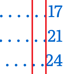
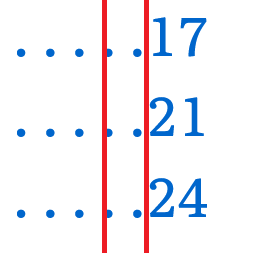
To fix this problem, I set font-variant-numeric to tabular-nums so all numbers are treated with the same width. By also setting the minimum width to 2ch, I ensured that all numbers with one or two digits are perfectly aligned. (You may want to set this to 3ch if your project has more than 100 pages.) Here is the final CSS for the page number:
.toc-list li > a > .page { min-width: 2ch; font-variant-numeric: tabular-nums; text-align: right;
}
And with that, the table of contents is complete!
Conclusion
Creating a table of contents with nothing but HTML and CSS was more of a challenge than I expected, but I’m very happy with the result. Not only is this approach flexible enough to accommodate chapters and subsections, but it handles sub-subsections nicely without updating the CSS. The overall approach works on web pages where you want to link to the various locations of content, as well as PDFs where you want the table of contents to link to different pages. And of course, it also looks great in print if you’re ever inclined to use it in a brochure or book.
I’d like to thank Julie Blanc and Christoph Grabo for their excellent blog posts on creating a table of contents, as both of those were invaluable when I was getting started. I’d also like to thank Sara Soueidan for her accessibility feedback as I worked on this project.